10 Jade and Cream Crochet Button Tab Scarf Ideas
Jade and cream give a crochet button tab scarf enough contrast to make the closure visible without forcing every part of the scarf to compete for attention. Jade can carry the main scarf body, cream can isolate the tab or edging, or the two colors can trade roles for a lighter overall look.
The important decision is not simply which two yarn colors to choose. On a button tab scarf, color placement affects how clearly the overlap, button area, edges, and stitch texture read when the scarf is worn. The tutorial links below support buttoned scarf, neck-warmer, or cowl construction concepts; the jade-and-cream palettes are independent color adaptations rather than claims about the colors used by the creators.
Quick List
- Jade Body And Cream Tab Crochet Button Tab Scarf
- Cream Body And Jade Tab Crochet Button Tab Scarf
- Jade And Cream Color Block Crochet Button Tab Scarf
- Jade And Cream Striped Crochet Button Tab Scarf
- Jade Crochet Button Tab Scarf With A Cream Frame
- Deep Jade Soft Jade And Cream Crochet Button Tab Scarf
- Jade Cream And Camel Crochet Button Tab Scarf
- Jade Cream And Charcoal Crochet Button Tab Scarf
- Jade Cream And Dusty Rose Crochet Button Tab Scarf
- Jade Cream And Soft Gold Crochet Button Tab Scarf
Balance Jade and Cream Around the Button Tab
The button tab is a natural focal point because it interrupts the longer line of the scarf. If jade covers most of the scarf, using cream on or immediately around the tab gives the closure a clear visual boundary. Reversing that arrangement creates a lighter scarf while allowing a jade tab to become the strongest color feature.
Also compare the colors where the scarf overlaps. A cream tab can disappear against a cream section underneath it, even when the overall scarf contains plenty of jade. Plan the color at the actual overlap instead of evaluating the pieces separately.
Use Jade and Cream Contrast to Protect Crochet Texture
Different hues do not automatically create strong visual separation. A very pale jade and a similarly light cream can blend from a distance, while a deeper jade beside cream usually produces clearer light-and-dark contrast.
This matters around ribbing, raised texture, openwork, and the tab edge. If the stitch pattern is visually important, place the shade with the stronger contrast beside that area rather than dividing both colors evenly. Comparing the yarns side by side or viewing a quick grayscale photo can help reveal whether the values are too similar.
1. Jade Body And Cream Tab Crochet Button Tab Scarf
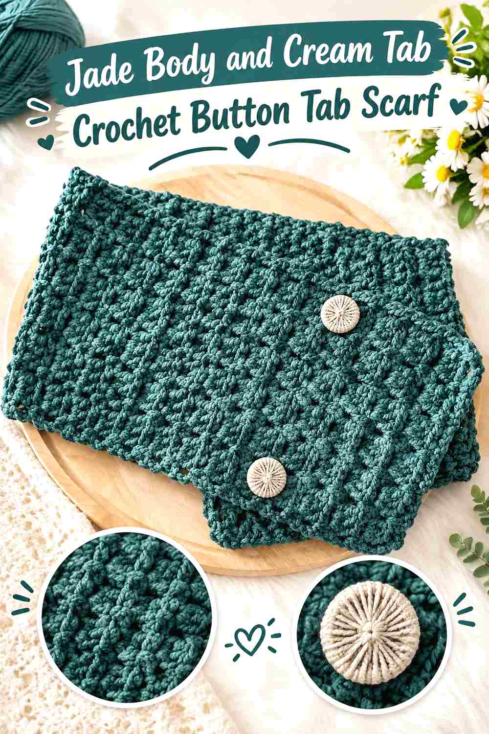
This arrangement gives jade the largest visual area and reserves cream for the closure. It works especially well when you want the scarf itself to read clearly as jade while still making the button tab easy to locate. Keeping cream concentrated near the tab also prevents the lighter shade from breaking the scarf body into too many competing sections.
Let Jade Cover Most of the Crochet Scarf Body
Use jade across the long scarf panel when the green should define the finished accessory. A largely uninterrupted jade field also gives textured stitches room to repeat without frequent color changes dividing the surface. If the scarf has strong ribbing or another directional texture, evaluate that texture in jade before adding additional cream elsewhere.
Cream Gives the Jade Button Tab a Clear Boundary
Cream can work particularly well on the tab because the lighter value separates the closure from a jade scarf body underneath it. Check the scarf in its buttoned position before finalizing the placement; the useful contrast is the contrast visible at the overlap, not just while the pieces are lying flat.
Repeat a Small Amount of Cream Without Weakening the Jade Focus
If a cream tab feels isolated, repeat cream once in a restrained location such as a narrow outer edge or a small end detail. The repetition connects the closure to the rest of the scarf while allowing jade to remain dominant. Avoid spreading cream evenly over every section if the original goal is a strong jade-led look.
Creator Credit: Majovel crochet
2. Cream Body And Jade Tab Crochet Button Tab Scarf
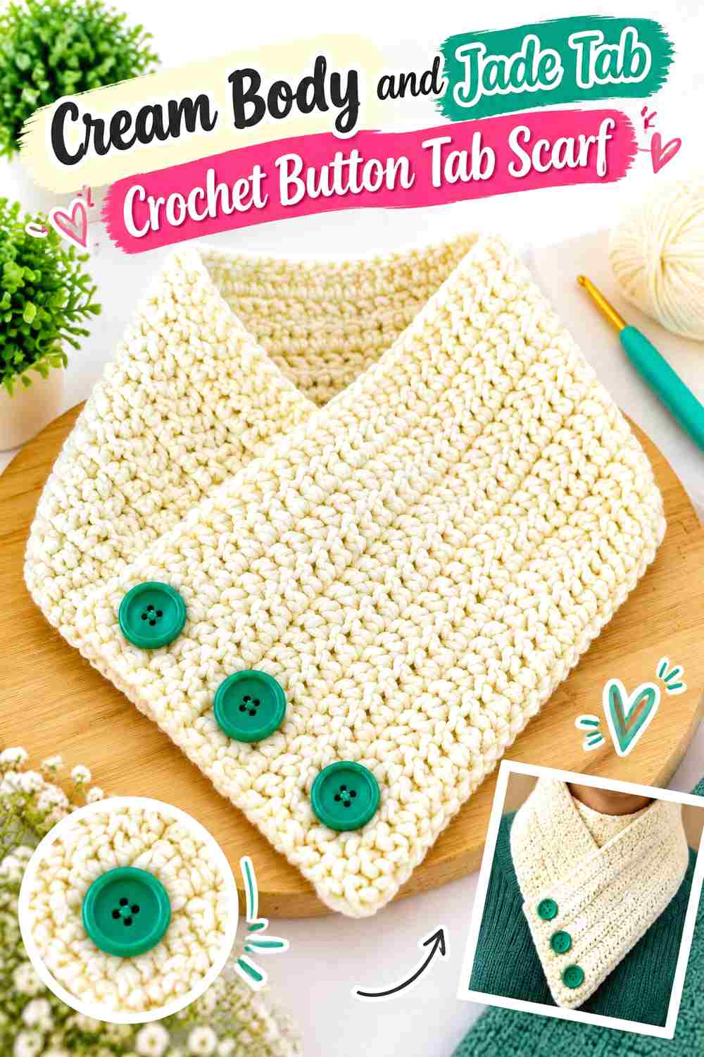
Reverse the first palette when you want a lighter scarf with a stronger closure accent. Cream can cover most of the scarf while jade is concentrated at the tab, overlap, or nearby edging. Because the darkest color occupies less area, placement becomes especially important: the jade should look intentional rather than like an unrelated patch added at the end.
Cream Can Lead While Jade Marks the Scarf Closure
A cream-dominant scarf gives the button tab an opportunity to become the main jade feature. Place jade where the scarf actually fastens so the eye can distinguish the closure from the larger cream field. This also keeps the stronger green from fragmenting the full length of the scarf.
Jade Works Better When the Button Tab Has Enough Visual Area
If the jade section is extremely small, it may read as a minor spot instead of part of the palette. Carry jade across the complete tab or another clearly defined closure section rather than sprinkling tiny green stitches around the scarf without a hierarchy.
Keep Cream Around Jade Texture for Stronger Separation
When the jade tab includes raised or ribbed texture, the surrounding cream can help define its outline. Avoid placing another similarly dark accent immediately beside the jade unless you intentionally want a heavier closure area. The cream space around the tab gives the green room to register.
Creator Credit: Tolle Wolle
3. Jade And Cream Color Block Crochet Button Tab Scarf
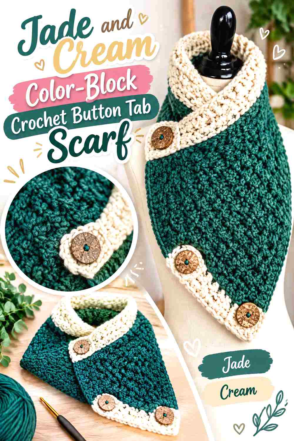
Broad color blocks create a more balanced jade-and-cream scarf without the visual activity of frequent stripes. One portion of the scarf can stay jade while another becomes cream, with the button tab placed deliberately against the opposite shade. This is useful when you want both colors to have substantial presence rather than assigning one to a tiny accent role.
Keep Jade and Cream Blocks Large Enough to Read Clearly
Broad blocks preserve the long shape of the scarf better than numerous short color changes. Decide where one color should end by looking at the scarf while wrapped, since part of each block may disappear underneath the overlap. The visible division should still look intentional after fastening.
Place the Cream Closure Against a Jade Block When Possible
If the tab is cream, allowing it to cross a jade section creates an immediate light-and-dark distinction at the functional part of the scarf. If the wrap naturally puts cream over cream instead, consider reversing the tab color or moving the larger block transition so the closure does not visually disappear.
Repeat Jade Beyond One End of the Cream Block
A strongly divided scarf can feel like two separate pieces if jade exists only on one end and cream only on the other. A narrow jade detail near the cream section can reconnect the palette without turning the scarf into stripes. Keep that repetition secondary to the main blocks.
Creator Credit: Amanda Crochets
4. Jade And Cream Striped Crochet Button Tab Scarf
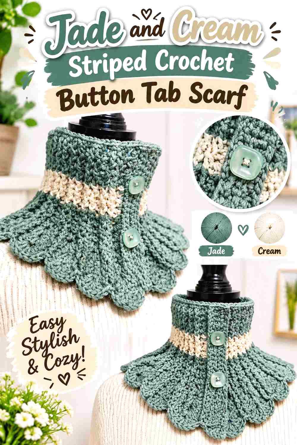
Stripes distribute both colors throughout the scarf, making this direction more rhythmic than the broad-block version. Jade can remain slightly more prominent through wider bands, while cream provides regular breaks that reveal the direction of the crochet fabric. The tab should stay visually simpler so it does not disappear among the stripes.
Use Jade as the Wider Stripe When Green Should Still Lead
Making jade visually broader than cream maintains the article’s main color while allowing cream to repeat consistently. Equal-width stripes create a more balanced two-color result, while wider jade sections produce a stronger green identity. Choose the relationship intentionally instead of changing stripe proportions at random.
A Solid Jade Tab Can Control a Busy Jade-and-Cream Stripe Pattern
When both colors alternate repeatedly across the scarf body, a solid jade tab gives the closure a single visual shape. That makes it easier to distinguish from the striped fabric underneath. A cream tab can work too, but check whether it lands over a cream stripe when buttoned.
Check Jade and Cream Stripes at the Actual Scarf Overlap
The wrap can stack stripes on top of one another and create an unexpectedly busy area around the button. Before committing to the final color placement, fold or wrap the work approximately as it will be worn. If several narrow stripes converge around the tab, simplify that section with a solid jade or cream area.
Creator Credit: Everything Arts And Crafts
5. Jade Crochet Button Tab Scarf With A Cream Frame
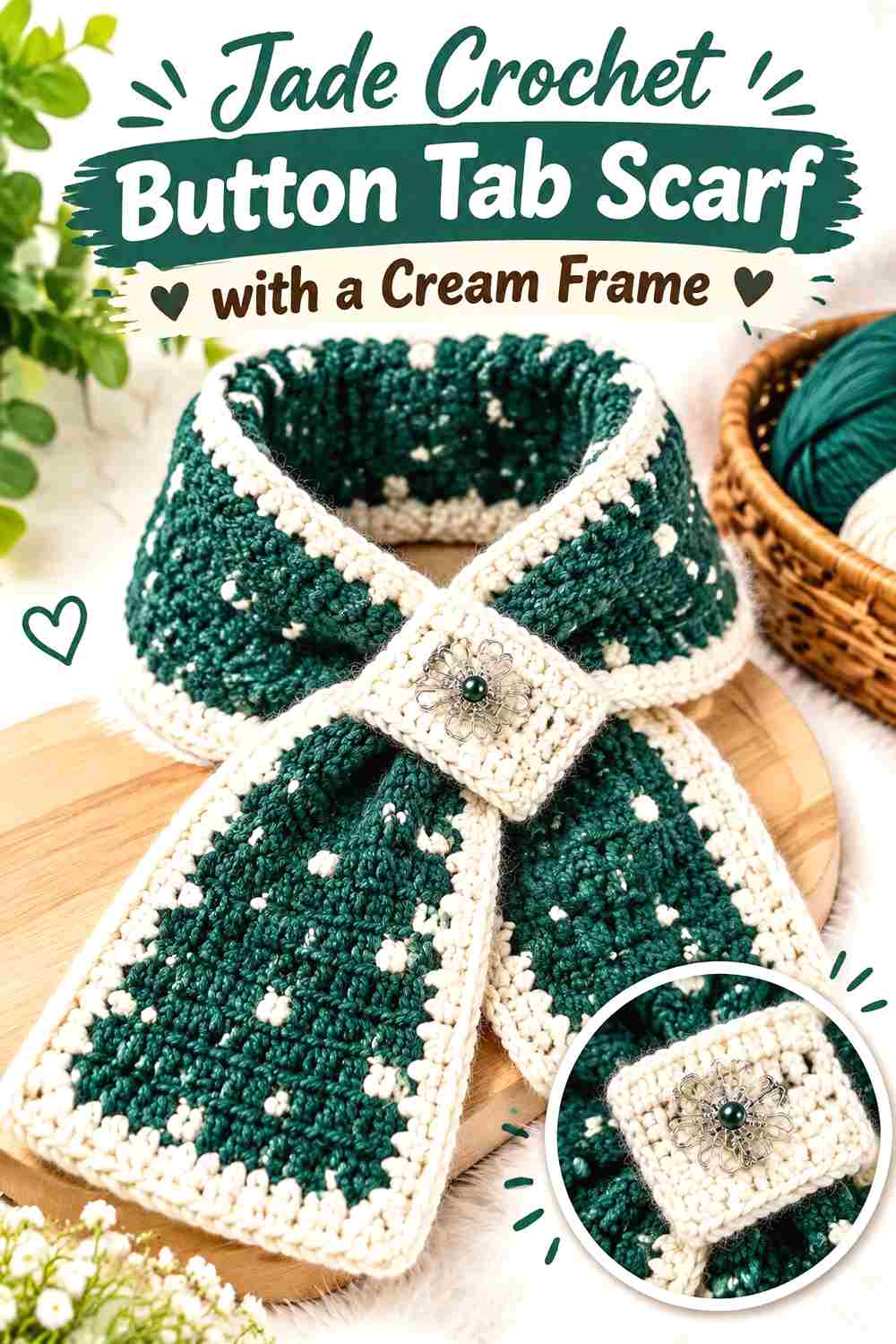
Instead of placing large cream sections through the body, use cream to frame a predominantly jade scarf. A light outer edge can define the long silhouette, separate the green from outerwear, and connect visually with a cream tab. This direction keeps color changes concentrated around structural boundaries rather than through the middle of the stitch pattern.
Let Jade Texture Fill the Center of the Scarf
Keeping the main field jade allows cables, ribbing, clusters, or other visible texture to read as one continuous surface. Cream can then act as a boundary rather than interrupting the pattern. This is especially useful when the texture itself is one of the reasons you chose the scarf construction.
A Cream Edge Can Outline Jade Without Taking Over
Keep the cream framing relatively restrained when jade is supposed to remain the dominant color. The purpose of the lighter edge is to define the scarf, not divide it into equal green-and-cream areas. Compare the border visually with the width of the scarf before deciding whether it needs additional cream.
Connect the Cream Frame to the Jade Button Tab Area
If the tab itself is jade, let the cream border approach or surround the closure so the tab still has a visible outline. If the tab is cream, the frame already provides a natural color connection. Either arrangement works better when the edge and closure appear planned as one color system.
Creator Credit: The Impertinent Creative
6. Deep Jade Soft Jade And Cream Crochet Button Tab Scarf
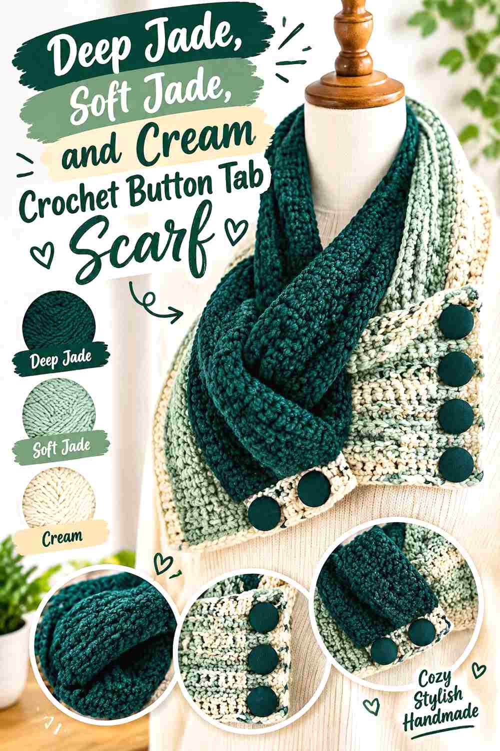
Adding two values of jade creates a tonal variation while cream supplies the clearest light contrast. Use deep jade for the visual anchor, a softer jade for transition areas, and cream where you need separation around the closure or edging. This approach gives more depth than a strict two-color palette without moving away from the jade-and-cream theme.
Deep Jade Should Anchor the Tonal Jade Scarf
Give the deepest jade a clear job, such as the main body, end section, or closure-facing panel. If deep and soft jade are scattered in similar quantities everywhere, the tonal hierarchy can become hard to read. One jade should lead and the other should support it.
Cream Prevents Two Jade Shades from Blending Together
Two greens can look distinct in separate skeins yet merge once crocheted, particularly when their values are close. A cream break between selected deep-jade and soft-jade sections can make the tonal change easier to see without outlining every single color transition.
Substitute Jade Shades by Preserving Their Light-and-Dark Order
If your available jade colors differ from the ones you first imagined, focus on the relationship rather than an exact shade name. Keep one jade noticeably deeper than the other and retain cream as the lightest part of the palette. That hierarchy matters more than matching a particular commercial color.
Creator Credit: Pattern Princess
7. Jade Cream And Camel Crochet Button Tab Scarf
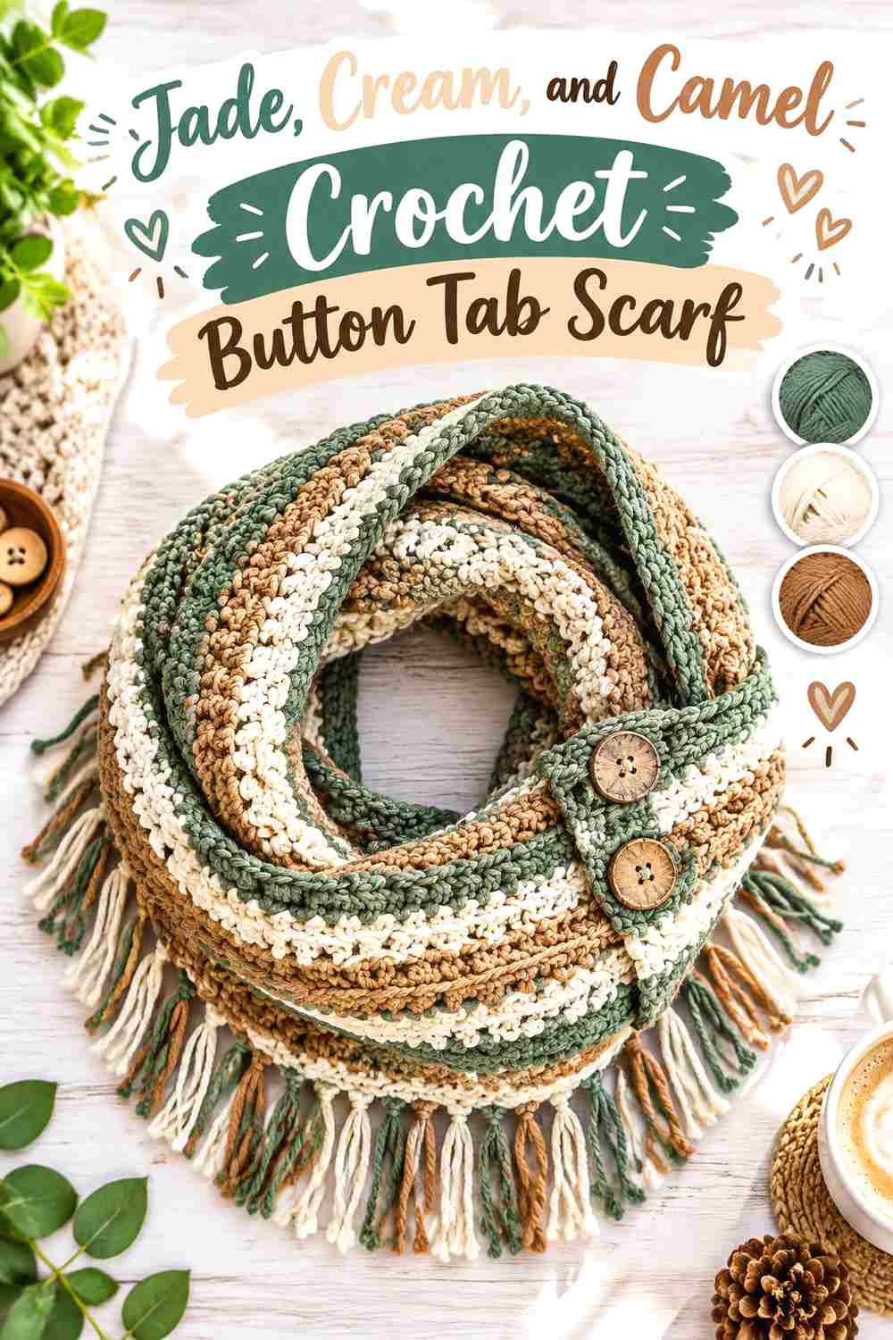
Camel adds warmth to jade and cream without needing equal visual space. Treat it as a controlled accent rather than a third dominant color. Jade can still cover most of the scarf, cream can provide light separation, and camel can appear near the tab, narrow trim, or a repeated end detail.
Keep Jade Dominant When Camel Joins the Palette
Jade should still occupy the largest or most visually important area if you want the scarf to remain recognizably jade and cream. Give camel a smaller supporting role. Using all three shades in equal amounts creates a different, busier color story and reduces the clarity of the original two-color concept.
Cream Can Separate Jade and Camel Around the Button Tab
Because jade and camel both carry more visual weight than cream, a narrow cream area between them can prevent the closure from becoming visually dense. This is particularly useful if the camel appears on the tab or immediately beside the button area.
Repeat Camel Sparingly Across the Jade Scarf
If camel appears only once, it may look detached from the rest of the scarf. Repeat it in one small secondary location, such as an end accent, while leaving most of the body jade and cream. Repetition creates connection without requiring another full block of camel.
Creator Credit: Yarn and Chai
8. Jade Cream And Charcoal Crochet Button Tab Scarf
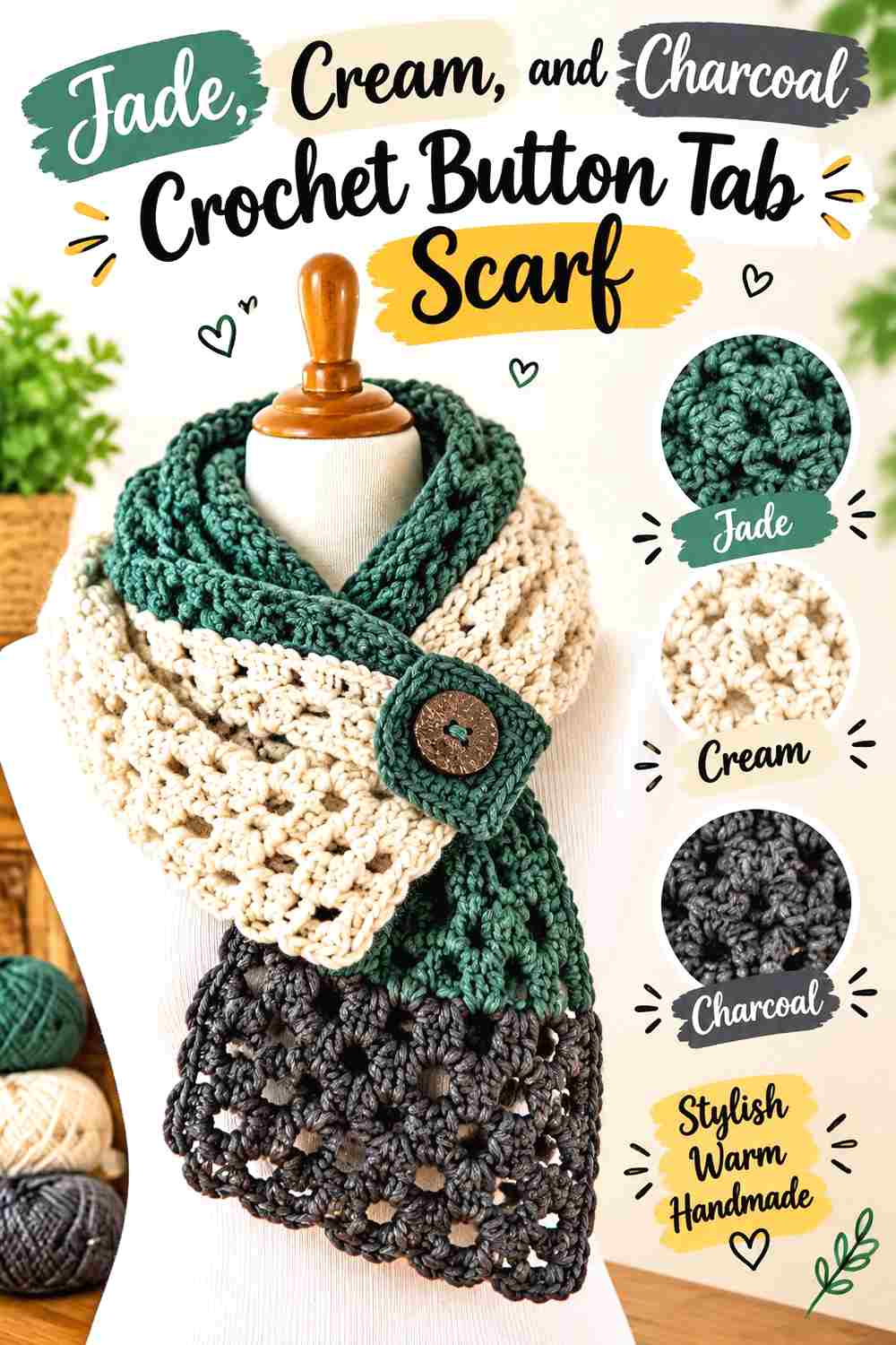
Charcoal produces a darker, more defined palette. It can sharpen the outer edge or button area, but it needs restraint because both charcoal and deeper jade can carry substantial visual weight. Cream becomes particularly useful here as a separator between the two darker shades.
Use Charcoal to Define Jade Rather Than Compete With It
Keep charcoal to a border, narrow band, or closure detail instead of giving it the same amount of space as jade. This preserves jade as the main color while allowing charcoal to provide a strong finishing line.
Cream Needs Space Between Jade and Charcoal
Placing cream between dark jade and charcoal can keep those two shades from collapsing into one heavy visual area. This is useful around a button tab, where several layers of scarf fabric may already overlap. A small light section can make the construction easier to read.
Check Deep Jade and Charcoal in Grayscale Before Finishing
Different hues do not guarantee different values. If your jade and charcoal appear nearly identical in a grayscale photo, use cream strategically around the details you want visible. The scarf can still use both dark colors, but they should not be relied upon for strong contrast with each other.
Creator Credit: Fiber Flux
9. Jade Cream And Dusty Rose Crochet Button Tab Scarf

Dusty rose creates a softer accent direction than charcoal or camel. The safest way to keep this palette connected to the title is to let jade and cream control most of the scarf and use the rose in a small, repeated role. The button tab is a logical place for that accent because it already functions as a focal area.
Let Jade and Cream Control Most of the Scarf Surface
Keep the long scarf body primarily jade and cream so dusty rose remains an accent instead of changing the project into a three-color scarf with no clear hierarchy. A jade-led body with cream breaks gives the rose enough contrast to be noticed in a smaller amount.
Dusty Rose Can Accent a Jade Button Tab Without Covering It
Use dusty rose as a narrow detail on or beside the jade tab rather than replacing the full tab if jade should remain the main focal color. The smaller rose section adds another color relationship while the green still defines the closure.
Cream Can Buffer Dusty Rose Against Jade
A cream strip or edge between rose and jade produces a gentler transition than placing the two colors directly together everywhere. This can be particularly useful if the jade is deep and the dusty rose is muted, because cream keeps the smaller accent from being visually swallowed by the darker green.
Creator Credit: Ned & Mimi
10. Jade Cream And Soft Gold Crochet Button Tab Scarf
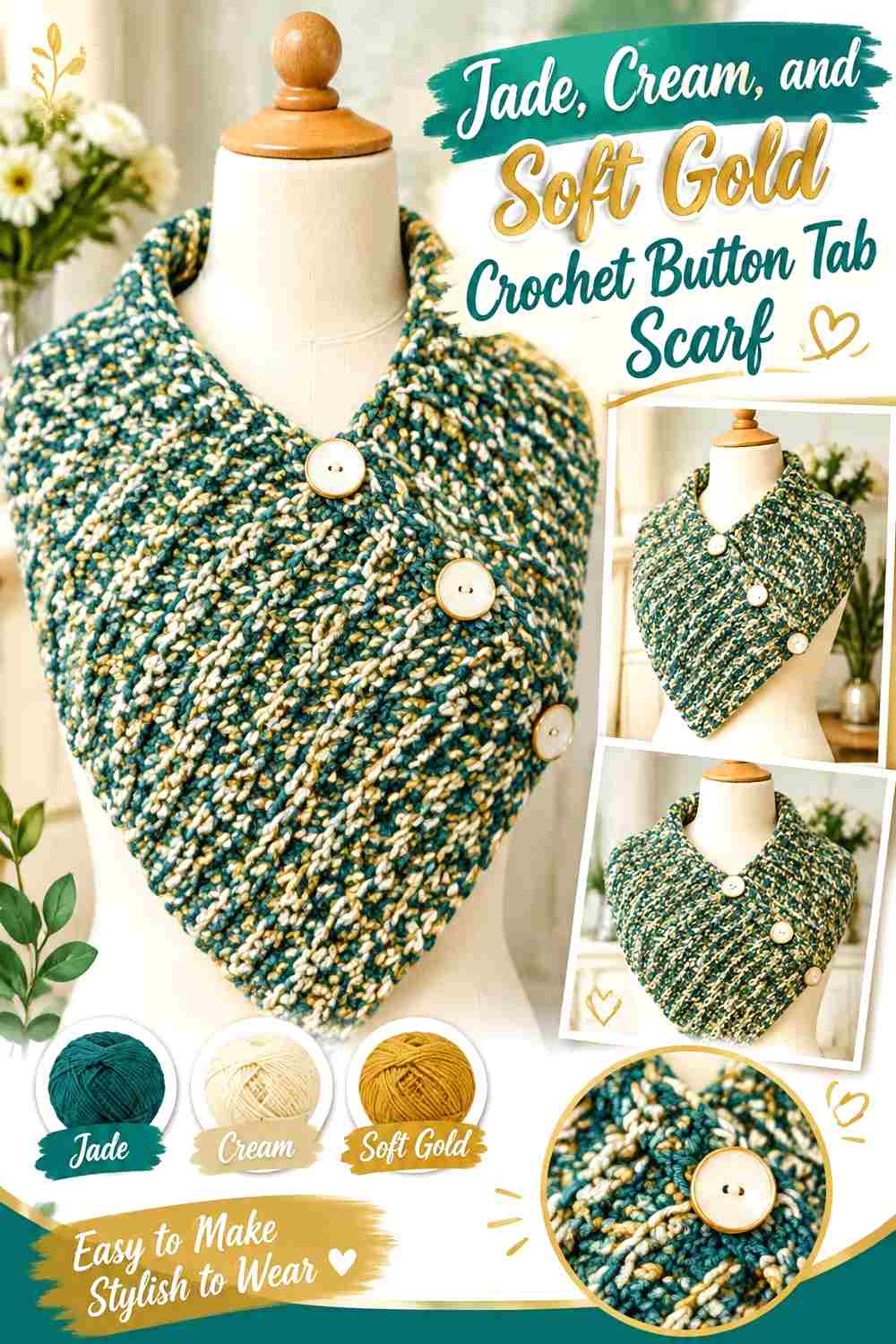
A restrained soft-gold or muted mustard accent gives jade and cream a warmer third note without requiring a complicated multicolor layout. Jade can remain the scarf’s main field, cream can lighten the border or tab, and the gold accent can be repeated in a narrow detail close to the closure.
Jade Should Stay Larger Than the Soft Gold Accent
The gold shade attracts attention more effectively when it occupies a limited area. Keep jade across the main scarf body and use gold where you want the eye to stop, such as close to the tab or one end. Enlarging the accent too much can make jade feel secondary.
Cream Keeps Jade and Soft Gold From Crowding the Closure
The button area already concentrates fabric and detail. If jade and gold both meet there, use a little cream to give the colors visual breathing room. This could be a cream tab edge, a narrow neighboring band, or another small light section that separates the stronger colors.
Repeat Soft Gold Once Without Diluting the Jade-and-Cream Palette
A second small appearance of gold elsewhere on the scarf can make the accent look intentional. Keep that repetition limited so jade and cream still account for most of the visible surface. The third color should connect the design, not compete for equal coverage.
Creator Credit: Sara Sach Crochet Designs
Comparing the Jade and Cream Color Directions
For the strongest jade presence, start with the jade-body and cream-tab idea or the cream-framed jade scarf. If you want both colors to receive similar visual weight, broad color blocks or stripes distribute jade and cream more evenly.
The deep-jade tonal option adds variation while staying close to the original two-color concept. Camel and soft gold move the palette in a warmer direction, charcoal makes it darker and more defined, and dusty rose introduces a softer contrasting accent.
For a button tab that needs to remain especially visible, prioritize contrast at the actual overlap. A palette can look balanced across the full scarf yet lose definition when the same colors stack together at the closure.
Conclusion
Jade and cream can produce very different button tab scarves depending on where each color is allowed to lead. A jade body with a cream tab gives the clearest green-focused result, while reversing those roles produces a lighter scarf with a concentrated jade closure. Color blocks and stripes give both shades more equal presence, and a cream frame keeps jade texture uninterrupted through the center.
If you want a third color, keep its role smaller than jade and cream. Camel and soft gold add warmer accents, charcoal strengthens definition, and dusty rose provides a softer contrast. Whichever direction you choose, check the scarf in its buttoned position before judging the palette. The overlap is where color placement matters most.
Use the linked creator tutorials for their exact construction directions, then apply the color distribution that suits the finished look you want.
Frequently Asked Questions
How much jade should I use in a jade and cream crochet button tab scarf?
There is no required ratio. If you want the scarf to read primarily as jade, give jade the main body and reserve cream for the tab, border, or smaller sections. For a more balanced two-color look, divide the scarf into broader jade-and-cream blocks or repeated stripes.
Should the button tab be jade or cream?
Choose the tab color according to the shade underneath it when the scarf is fastened. A cream tab over jade creates clear separation, while a jade tab can stand out strongly against a cream body. Checking the actual overlap is more useful than choosing the tab color in isolation.
How can I tell whether jade and cream have enough contrast?
Place the yarns together and view them from a short distance. You can also photograph them and check the image in grayscale. If the two shades become difficult to distinguish, choose a deeper jade or lighter cream when clear stitch, edge, or tab definition is important.
Can I replace cream with ivory in a jade crochet button tab scarf?
Yes, provided the replacement keeps the relationship you want. An ivory or warmer off-white can still fill the light supporting role. Compare it directly with your jade and make sure there is enough value difference around the button tab and any detailed stitchwork.
Where should the darkest jade go on a crochet button tab scarf?
A deeper jade can anchor the scarf body, end section, border, or closure area. Avoid concentrating every dark detail at the overlap if it makes the tab difficult to distinguish. Cream can be placed beside the darkest jade where additional definition is needed.
How do I keep jade and cream stripes from making the button tab look busy?
Simplify the closure area. A solid jade or solid cream tab can interrupt the stripe pattern and give the eye one clear shape to follow. Also check which stripe lies beneath the tab when the scarf is buttoned so the closure does not disappear into a matching band.