12 Jade and Cream Crochet Pear Coaster Ideas
Jade and cream are especially useful on crochet pear coasters because the two colors can describe different parts of the fruit while also controlling how clearly the pear silhouette shows beneath a cup. Jade can fill the pear body or act as a rind and outline, while cream can lighten the center, define the edge, or create a neutral background around a jade pear motif.
Color placement matters as much as the individual shades. The middle of a coaster is often partly covered during use, so the outer curve, narrow pear top, leaf, stem, and border need enough contrast to remain recognizable. A color scheme that looks clear when the coaster is uncovered can become much less distinct once a cup hides its center.
Most of the linked tutorials below demonstrate pear-shaped coasters or other flat pear projects suitable for coaster inspiration. A few teach a flat pear appliqué or pear granny-square construction instead; those are included as construction references for adapting a pear motif to a coaster format. The jade-and-cream palettes are independent color plans and should not be attributed to the tutorial creators.
Quick List
- Jade Body And Cream Outline Crochet Pear Coaster
- Cream Body And Jade Outline Crochet Pear Coaster
- Jade Rind And Cream Flesh Crochet Pear Slice Coaster
- Jade And Cream Split Color Crochet Pear Coaster
- Jade And Cream Striped Crochet Pear Coaster
- Jade And Cream Crochet Pear Coaster With Brown Stem Details
- Jade And Cream Crochet Pear Coaster With Charcoal Outline
- Jade And Cream Crochet Pear Coaster With Camel Accents
- Jade And Cream Crochet Pear Coaster With Dusty Rose Accents
- Jade And Cream Crochet Pear Coaster With Soft Gold Accents
- Jade Pear Motif And Cream Square Crochet Pear Coaster
Decide Whether Jade Defines the Pear Body or Its Edge
The easiest way to make a jade-and-cream pear coaster feel deliberate is to give each color a specific job. A jade pear body with a cream edge produces a green-dominant result and leaves the fruit silhouette easy to follow. Reversing that arrangement creates a lighter coaster in which the jade outline carries more responsibility for identifying the pear shape.
Avoid breaking the pear into many small jade and cream sections unless the division supports a clear concept such as stripes, a sliced pear, or two large color blocks. On a small flat object, too many isolated color changes can make the pear outline less important than the individual patches.
Keep Jade and Cream Visible Around the Cup
Before deciding where the strongest contrast belongs, place a cup or mug over a paper outline roughly representing the coaster. The center will be the least visible part during use, while the lower pear curve, shoulders, narrow top, stem, leaf, and portions of the outer edge are more likely to remain exposed.
That makes the perimeter valuable color territory. If cream is responsible for separating a jade pear from the surface beneath it, keep at least some cream near the outside. If the coaster is mostly cream, a jade border, leaf, or outer band can preserve the pear identity even when the center is covered.
Check the Value Difference Between Jade and Cream
Jade and cream usually differ in hue, but the amount of light-and-dark contrast depends on the actual yarns selected. A pale, gray-green jade can sit surprisingly close to a deeper cream in value.
Place the yarns together and look at them from a short distance before committing to small details. A grayscale photo is another useful check. If jade and cream merge in grayscale, reserve stronger contrast for the outline, leaf, stem, or other details that must stay readable.
1. Jade Body And Cream Outline Crochet Pear Coaster
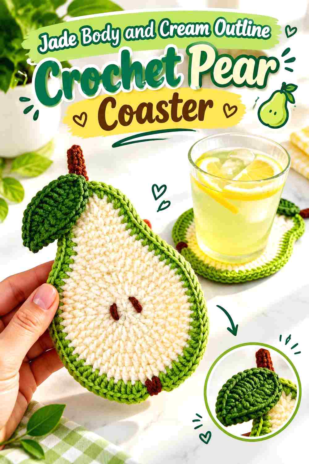
This is the most direct jade-led option. Let jade fill almost the entire pear while cream traces enough of the perimeter to separate the fruit shape from the table beneath it. The arrangement keeps the coaster recognizably green even when a cup covers much of the center, because the jade body remains visible around the outer curve.
Let Jade Carry the Broad Pear Body
Use jade across the wide lower portion and narrower upper portion as one continuous visual field. That continuity helps the distinctive pear silhouette do more of the design work instead of relying on internal color changes.
If the crochet surface has noticeable texture, keeping most of it jade also prevents frequent cream sections from breaking that texture into unrelated pieces. Judge the green across the complete pear rather than adding cream merely to fill unused areas.
Keep Cream Close to the Jade Pear Edge
Cream is most useful here where it can reinforce the silhouette. A restrained cream outline or edging can separate the jade body from a dark tabletop without challenging jade for dominance.
Pay particular attention to the inward curves around the pear’s upper shoulders. Those smaller shape changes help distinguish a pear from a simple oval, so strong jade-and-cream separation in that area can be more useful than extra cream in the center.
Creator Credit: Gul’s Cozy Crochet
2. Cream Body And Jade Outline Crochet Pear Coaster

Reversing the first palette makes cream the broad field and jade the structural color. Because cream occupies most of the pear, the jade outline needs to remain visible around enough of the perimeter to communicate the fruit shape. A jade leaf can reinforce that connection without requiring more green through the center.
Use Jade to Draw the Cream Pear Silhouette
A cream pear can lose definition on another pale surface, so give jade an important role at the edge. The dark-to-light difference between the outline and center can make the narrow top and fuller base easier to read.
Avoid reducing jade to one tiny leaf if the pear body is otherwise completely cream. Carrying jade around at least part of the body gives the palette a stronger visual relationship.
Let Cream Stay Open Through the Pear Center
Keeping the central area largely cream produces a calmer surface than alternating green and cream throughout it. This can also make any darker stem, leaf, or edge easier to isolate visually.
Since the middle may sit beneath a cup, there is little need to concentrate every decorative color change there. Put the stronger jade information closer to areas that remain visible during use.
Creator Credit: Vitrine do Crochê com Leila Matos
3. Jade Rind And Cream Flesh Crochet Pear Slice Coaster

A sliced-pear interpretation gives jade and cream distinct representational roles. Jade can form the outer rind while cream fills the cut flesh. This makes the two-color division purposeful rather than decorative, and it gives the coaster an obvious light center framed by green.
Make Jade a Continuous Rind Around Cream Flesh
Keep the jade rind visually connected around as much of the pear as the construction allows. Broken patches of green may weaken the sliced-fruit effect, whereas a continuous jade relationship makes the cream center read more clearly as pear flesh.
The rind does not have to occupy as much area as the cream. Its job is definition, so a smaller but consistent jade presence can carry substantial visual weight.
Keep Cream Large Enough to Read as the Pear Center
If the cream area becomes only a thin stripe, the coaster will read more like a jade pear with pale edging than a cut pear. Give cream enough central area to establish a clear interior.
A darker seed detail can be useful inside the cream section, but keep such accents limited. Too many small colors in the center can compete with the simple jade-rind/cream-flesh idea.
Creator Credit: XY Craft Studio
4. Jade And Cream Split Color Crochet Pear Coaster
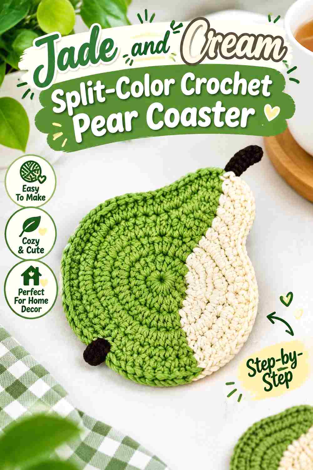
A two-part pear lets jade and cream share the surface without using repeated stripes. Divide the body into two broad color fields, either vertically for an asymmetric look or across the body if the construction makes a horizontal division easier to place. The success of this palette depends on preserving the pear outline despite the strong internal boundary.
Keep the Jade and Cream Division Broad
One large jade area beside one large cream area is easier to read than several irregular patches. The viewer can understand both the pear silhouette and the color-block idea at the same time.
If you split the pear vertically, pay attention to where the transition meets the narrow top. A clean division there keeps the shape from appearing twisted or visually heavier on one side.
Repeat Jade or Cream in the Pear Leaf
Use the leaf to connect the smaller color field back into the whole design. For example, a cream-heavy pear can use a jade leaf to strengthen the green presence, while a jade-heavy pear can carry a small cream detail near the top.
Avoid introducing an unrelated leaf color solely because leaves are normally green. Jade already performs that role naturally and helps keep the palette concise.
Creator Credit: Handmade tutorial
5. Jade And Cream Striped Crochet Pear Coaster

Stripes give this coaster more movement than broad color blocking. The key is to keep the bands large enough that the pear remains the first thing the viewer sees. Jade can occupy slightly broader stripes if you want the finished coaster to remain green-dominant, with cream acting as a regular light break.
Use Wider Jade Stripes to Keep the Pear Green-Led
Equal jade and cream stripes create a balanced two-color surface, while wider jade bands make green more dominant. Decide which relationship you want before distributing the colors rather than changing stripe width arbitrarily.
A jade section near the outer lower curve is especially useful because much of that area can stay visible around a cup.
Keep Cream Stripes Away From Tiny Pear Details
The upper pear neck, stem, and leaf already contain more shape changes than the broad lower body. Too many narrow cream transitions in that area can make the top visually fragmented.
Let one color remain relatively stable around the narrowest part and place more of the stripe rhythm across the wider body where there is room for it to read clearly.
Creator Credit: Ravella Design
6. Jade And Cream Crochet Pear Coaster With Brown Stem Details
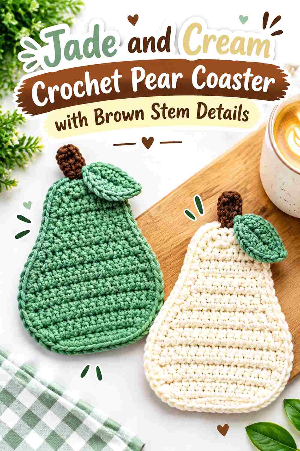
Brown is a practical third color when you want the stem or small seed details to differ from the jade pear body. Keep the brown area small so jade and cream remain the palette the viewer notices first. This approach works particularly well with a cream interior because small brown details have a lighter background around them.
Keep Brown Small Against the Jade and Cream Pear
Use brown for clearly defined fruit details rather than a broad border or large body section. A stem or restrained seed accent gives brown a logical purpose without turning the coaster into a three-color design of equal parts.
If the brown becomes visually heavy, reduce its repetition instead of adding more cream merely to compensate.
Place Cream Around Brown Details When Jade Is Dark
A brown stem or seed may merge with a deep jade body if their values are similar. Cream can create a separating area around the smaller detail, especially in a sliced-pear interpretation.
Check the shades together before finishing. If brown and jade look almost identical from a distance, rely on placement and cream separation instead of assuming hue difference alone will keep them clear.
Creator Credit: Mi’s Handmade Hobbies
7. Jade And Cream Crochet Pear Coaster With Charcoal Outline
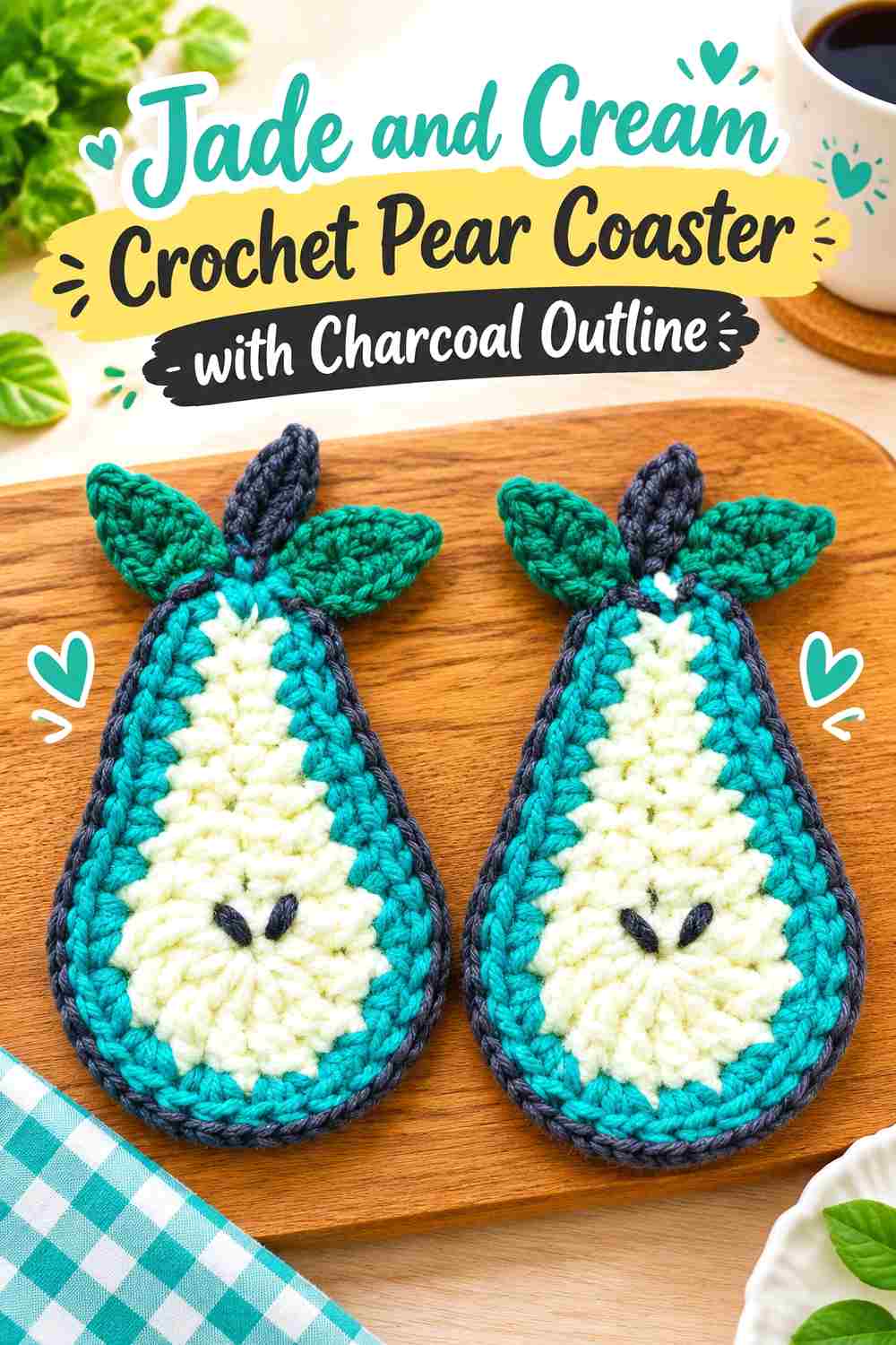
Charcoal produces the strongest dark accent in this collection. It can frame a jade-and-cream pear clearly, but it should be used carefully because too much charcoal can overpower the softer two-color relationship. Treat it as definition rather than another main field.
Use Charcoal to Sharpen the Jade Pear Silhouette
A narrow charcoal outline can separate jade from a similarly dark tabletop or provide an especially clear edge around a cream-centered pear. Focus it on the outer silhouette instead of spreading it through the body.
The narrow pear neck and lower curve benefit most from this definition because those contours communicate the fruit shape.
Keep Cream Between Charcoal and Deep Jade When Needed
Charcoal and a very deep jade can become one dark mass when placed directly together. A small cream interruption can restore separation without requiring a lighter jade.
This is most useful around the stem, leaf, or upper contour. You do not need cream between every inch of charcoal and jade if the two shades already remain distinct.
Creator Credit: Rose Crochet & Craft
8. Jade And Cream Crochet Pear Coaster With Camel Accents
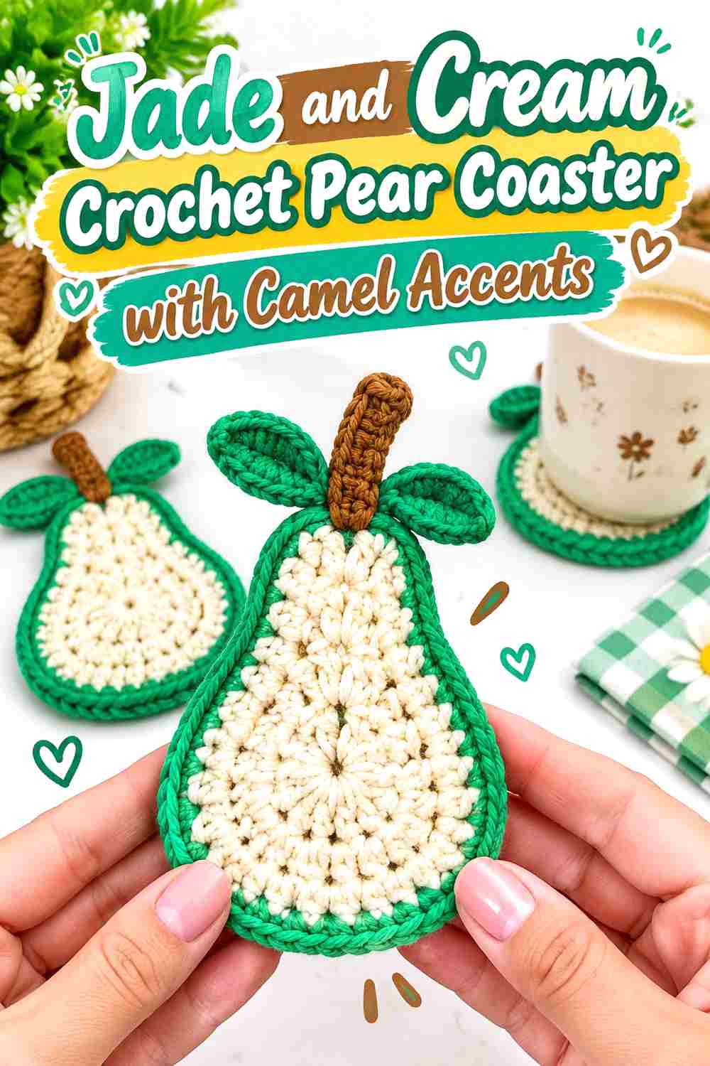
Camel provides a softer warm accent than dark brown or charcoal. It can work at the stem, in a narrow border detail, or as a small bridge between jade and cream. Because camel is closer to cream in visual weight than charcoal is, check that the two lighter colors do not blur together.
Let Jade Remain Larger Than the Camel Accent
Keep jade on the body, rind, leaf, or outline and restrict camel to a smaller structural detail. This preserves the green fruit identity while allowing the warmer shade to add variation.
A camel-heavy pear would shift the entire palette away from the requested jade-and-cream direction, so avoid equal color distribution unless that change is intentional.
Compare Camel and Cream Before Placing Them Together
Some camel shades are dark enough to stand clearly against cream; others are fairly pale. Put the yarns side by side before using camel as an outline on a cream section.
If the contrast is weak, position camel next to jade instead and let cream occupy a separate, lighter part of the pear.
Creator Credit: Mariie Crochet
9. Jade And Cream Crochet Pear Coaster With Dusty Rose Accents
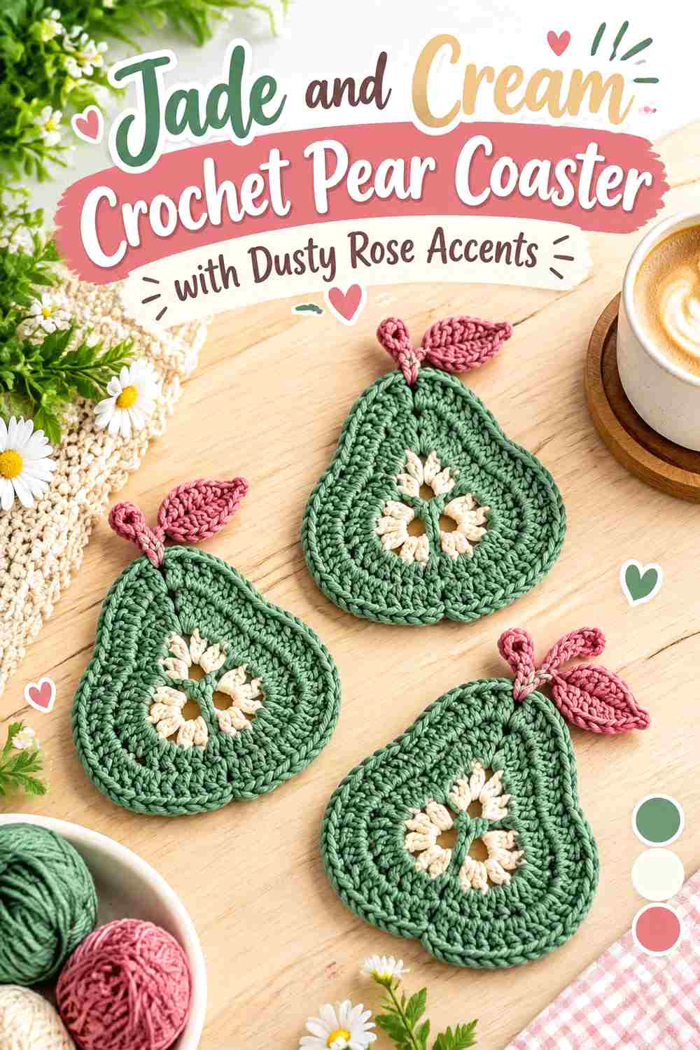
Dusty rose turns the pear coaster in a more decorative direction without requiring a bright multicolor palette. Because rose is not necessary for identifying the fruit, it works best as a controlled accent rather than a replacement for the jade body or cream background.
Keep Jade and Cream Dominant Over Dusty Rose
Let jade establish the pear and cream provide the light area before deciding where rose belongs. A narrow outer detail, small leaf accent, or restrained section near the pear top can introduce the third shade without confusing the fruit silhouette.
If rose occupies as much space as jade, the coaster will read as a general three-color pear rather than a jade-and-cream design.
Use Cream to Give Dusty Rose Space Beside Jade
Muted rose can lose clarity against a similarly muted jade. A little cream between the two can prevent the accent from disappearing into the green surface.
Use this separation selectively. The goal is to make the rose detail intentional, not to add another cream outline around every decorative area.
Creator Credit: ODRI STUDIO
10. Jade And Cream Crochet Pear Coaster With Soft Gold Accents

Soft gold or muted mustard gives the jade-and-cream combination a warmer highlight. It is especially effective when placed near the stem or in one small section of the pear rather than distributed evenly. Cream should remain the lightest shade so all three colors keep distinct roles.
Keep Soft Gold Secondary to Jade
Jade should still define most of the pear body, rind, or prominent outline. Reserve gold for an area where a warmer focal point makes sense, such as the stem-facing top, one narrow band, or a small repeated edge detail.
Using less gold also keeps it from competing with the green silhouette when much of the center is covered by a cup.
Let Cream Separate Soft Gold From Jade When Contrast Is Weak
Depending on the shades selected, muted gold and jade may have similar lightness even though their hues differ. Cream can serve as the lightest break between them.
Check the palette in grayscale if you are relying on all three colors to show separately. If jade and gold collapse into a similar value, place them in larger areas instead of expecting tiny details to remain distinct.
Creator Credit: RaffamusaDesigns – Crochet Patterns and Tutorials
11. Jade Pear Motif And Cream Square Crochet Pear Coaster
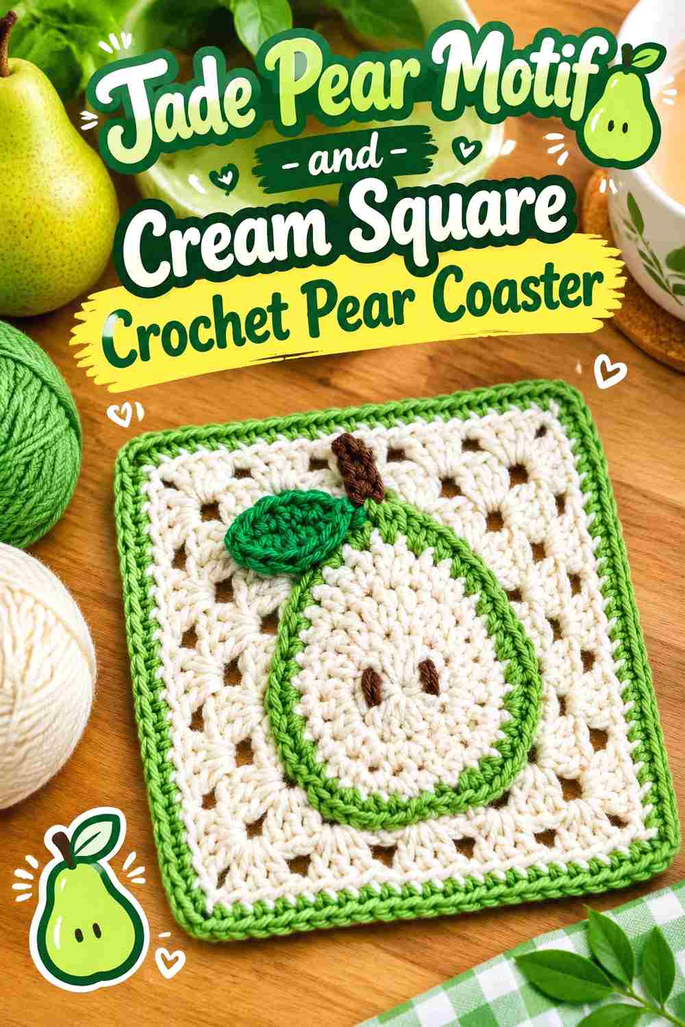
A coaster does not have to follow the outer shape of the fruit. A jade pear motif centered on a cream crochet square offers another interpretation while preserving the same subject. Here the square provides the coaster boundary and the jade pear becomes the focal image, so contrast between motif and background matters more than outlining the entire piece as a pear.
Make Jade Large Enough to Read Against the Cream Square
The pear motif needs enough visual area to remain recognizable when the coaster is viewed from above. Jade should define the broad lower fruit body and narrower top clearly against the cream background.
Avoid reducing the pear to a very small central emblem if it will usually sit beneath a cup. A larger motif leaves more jade visible around the cup’s base.
Keep Cream Quiet Around the Jade Pear Motif
A relatively consistent cream field gives the jade fruit a clear backdrop. Adding numerous other colors to the square border can draw attention away from the pear.
If the square needs an additional finishing color, repeat jade rather than introducing an unrelated fourth shade. That reconnects the outer edge with the central fruit.
Creator Credit: Bowerbird Collected
Comparing the Jade and Cream Pear Coaster Color Directions
For the strongest jade presence, the jade-body coaster, jade-and-cream striped version, and deep-jade tonal version keep green across most of the visible surface. The cream-body option reverses that emphasis and relies on jade to establish the outer pear shape.
The rind-and-flesh idea gives jade and cream the clearest fruit-specific roles. The split-color version is more graphic, while the square cream coaster with a jade pear motif changes the silhouette entirely without losing the pear theme.
For a third accent, brown gives the stem and seeds an intuitive visual role, charcoal creates stronger edge definition, camel is softer and warmer, dusty rose creates a decorative contrast, and soft gold adds a warmer highlight. In each case, keeping the third shade smaller preserves jade and cream as the main palette.
Conclusion
The most useful jade-and-cream arrangement depends on what you want to remain visible when the pear coaster is actually in use. For a strongly green result, let jade cover the pear body and place cream at the outer edge. For a lighter version, reverse that relationship and allow jade to define a cream pear. A jade rind around cream flesh is particularly effective when you want the colors to describe a sliced fruit rather than simply decorate it.
Stripes, broad color blocks, and two jade values provide variation without adding unrelated colors. When you do introduce brown, charcoal, camel, dusty rose, or soft gold, keep its purpose specific and its area smaller than the core jade-and-cream relationship.
Before settling on any palette, cover the center with the cup you expect to use and look at what remains exposed. The outer curves, pear neck, leaf, stem, and border often carry more visual responsibility than the center once the coaster is doing its job. Follow the linked tutorials for exact construction details and use the color plans here as independent adaptation ideas.
Frequently Asked Questions
Should jade or cream be the main color in a crochet pear coaster?
Either can lead, but the result changes significantly. A jade-dominant body creates a clearly green pear, while a cream body makes the coaster lighter and requires jade at the outline, leaf, or another visible area to preserve the pear identity. Decide which color should be visible around the cup before choosing the dominant shade.
How can I keep a cream crochet pear coaster from losing its pear shape?
Use jade around enough of the perimeter to define the fuller lower body, narrowing upper section, and shoulders of the pear. A jade leaf can reinforce the fruit theme, but it should not have to do all the work if the cream body blends into the surface beneath it.
Where should cream go on a jade crochet pear coaster?
Cream can outline the body, form the flesh of a sliced pear, divide two jade values, or provide a neutral background behind a jade motif. It is especially useful around small details where a deep jade could otherwise visually merge with brown, charcoal, or another dark accent.
Will a cup hide too much of the jade-and-cream pear design?
It can hide much of the center, which is why outer placement matters. Test the design with a cup before deciding where to put the most important contrast. Keeping jade, cream, or both visible around the lower curve and upper pear shape helps the design remain recognizable during use.
Can I replace jade with another green without changing the whole coaster palette?
Yes. Preserve the color relationship rather than trying to match a specific shade name. If jade was intended to be substantially darker than cream, choose another green that maintains that light-and-dark separation. If the design uses deep and soft jade together, keep one green clearly darker than the other.
How can I tell whether jade and cream have enough contrast for a pear coaster?
Place the yarns next to each other and view them from farther away, or photograph them and check the image in grayscale. If the two colors become difficult to distinguish, increase their value difference or place a stronger contrasting shade only where important details need more definition.