15 Cool Blue and Soft Gray Crochet Color Harmony
Cool blue and soft gray create a closely related crochet palette that can look calm and cohesive without becoming completely monochromatic. Blue supplies a recognizable hue, while gray gives the project a quieter neutral area. The result can range from strongly blue to almost neutral depending on which shade receives more surface area.
The main challenge is contrast. A medium cool blue and medium soft gray can be quite different in hue but still similar in light-dark value. That can be useful when you want blended stripes or gentle color transitions, but it can make small motifs, thin borders, and intricate texture harder to distinguish.
Decide where you want separation before assigning the colors. Soft gray can lighten a cool-blue cardigan around the cuffs, make a blue blanket border more visible, separate blue granny-square centers, or break up a dark scarf. Alternatively, a gray-dominant sweater or pillow can use cool blue only where a stronger focal color is useful.
Quick List
- Cool Blue And Soft Gray Crochet Cardigan
- Cool Blue And Soft Gray Crochet Blanket
- Cool Blue And Soft Gray Crochet Beanie
- Cool Blue And Soft Gray Crochet Scarf
- Cool Blue And Soft Gray Crochet Granny Square
- Cool Blue And Soft Gray Crochet Basket
- Cool Blue And Soft Gray Crochet Shawl
- Cool Blue And Soft Gray Crochet Pillow
- Cool Blue And Soft Gray Crochet Sweater
- Cool Blue And Soft Gray Crochet Vest
- Cool Blue And Soft Gray Crochet Headband
- Cool Blue And Soft Gray Crochet Fingerless Gloves
- Cool Blue And Soft Gray Crochet Cowl
- Cool Blue And Soft Gray Crochet Tote Bag
- Cool Blue And Soft Gray Crochet Coaster Set
Choose Whether Cool Blue or Soft Gray Should Lead
A cool-blue-dominant project keeps the hue immediately recognizable. Use blue across cardigan panels, blanket fields, scarf sections, or bag bodies, then place soft gray around edges and smaller construction details.
A soft-gray-dominant project is more neutral. In that arrangement, cool blue can become a stronger accent around motifs, cuffs, borders, or selected stripes. This approach is particularly useful when you want the blue to appear important without covering most of the finished piece.
Avoid automatically dividing both colors fifty-fifty. A clear dominant color often gives large crochet pieces a stronger visual structure.
Check Cool Blue and Soft Gray Before Using Tiny Crochet Details
Different hues can still have similar light-dark values. If your blue and gray look nearly identical when photographed in grayscale, very narrow stripes or small motif details may visually merge.
That is not necessarily a problem for broad sweater panels or blended scarf stripes. It matters more when one color needs to define a granny-square center, textured pillow motif, cuff edge, or thin border.
Make one sample section first when those details are important. Increasing the width of the lighter area may solve the problem without introducing another color.
Use Soft Gray to Give Cool Blue Crochet Room to Breathe
Soft gray can function as visual space between repeated blue elements. Around granny squares, it can separate motifs. On a blanket, a gray band can interrupt several large blue sections. On a cardigan, gray cuffs can give the sleeves a clear ending.
The neutral does not need to appear everywhere. Repeating it in two or three connected locations usually creates enough consistency while allowing cool blue to remain the main identity of the project.
1. Cool Blue And Soft Gray Crochet Cardigan

Cool blue works naturally across the large front, back, and sleeve areas of a cardigan, while soft gray can highlight the parts that already frame the garment. Using gray at the cuffs, front band, neckline, or lower edge creates separation without turning the body into alternating color blocks. If you want a quieter result, reverse the balance and use blue mainly around the finishing details.
Cool Blue Should Carry the Main Crochet Cardigan Panels
Keep the largest front and back sections cool blue when you want the cardigan to read clearly as a blue garment. Large uninterrupted areas also allow cables, ribbing, or other visible surface texture to stand on their own rather than competing with frequent color changes.
If separate panels are involved, consider the whole garment before placing gray sections. A small gray area on each individual panel can add up to considerably more neutral color once everything is assembled.
Soft Gray Can Define Cool Blue Crochet Cardigan Cuffs and Edges
Cuffs provide a useful place for soft gray because both sleeves automatically repeat the accent. A narrow gray front band or neckline can connect those cuffs to the body.
You do not need to outline every opening in gray. Leaving some edges cool blue prevents the lighter neutral from creating too many separate frames around the garment.
Creator Credit: TCDDIY
2. Cool Blue And Soft Gray Crochet Blanket
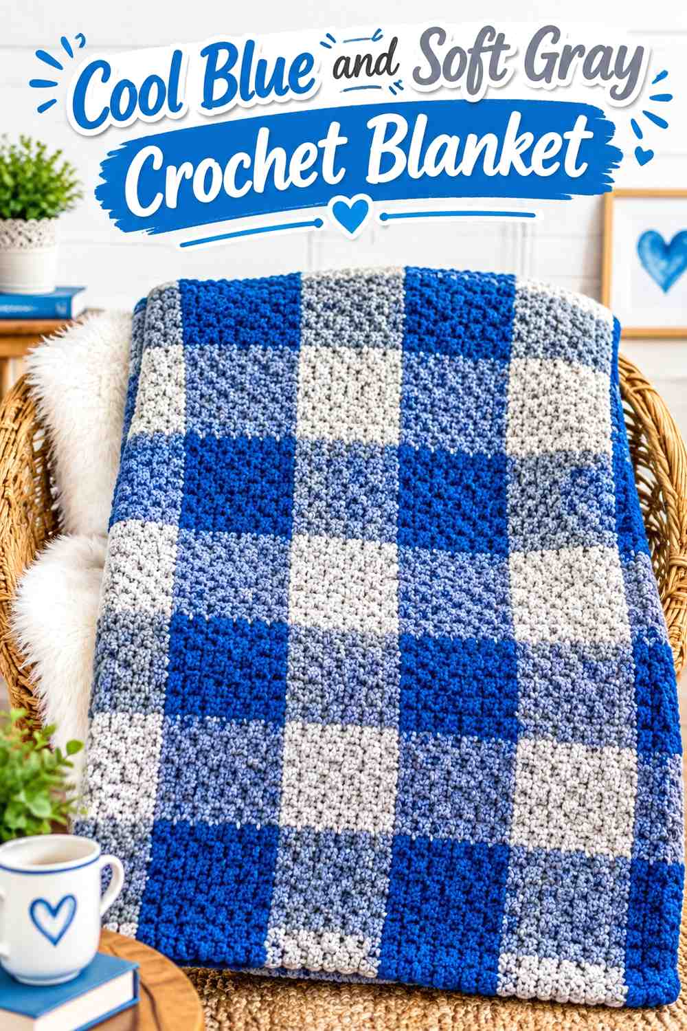
A blanket gives both shades enough surface area to show their relationship clearly. Cool blue can carry the broadest sections, while soft gray creates lighter pauses between them or forms the outer border. For a more subdued blanket, increase the gray field and reserve blue for textured bands or repeated blocks.
Cool Blue Needs Broad Crochet Blanket Sections to Remain Dominant
Use cool blue across the widest stripes or largest blocks if the finished blanket should look blue first. Frequent soft-gray interruptions can gradually make a blanket appear more evenly divided than expected.
Judge the palette after several repeats instead of after the first stripe. Color proportions become much clearer once a larger section of the blanket is visible.
Soft Gray Can Separate Cool Blue Crochet Blanket Texture
A soft-gray band can create a visual break between two cool-blue textured sections, especially when the stitches change but the dark color remains the same.
If gray is also planned for the border, repeating it within the blanket makes that final edge feel connected to the main design rather than newly introduced.
Creator Credit: Daisy Farm Crafts
3. Cool Blue And Soft Gray Crochet Beanie
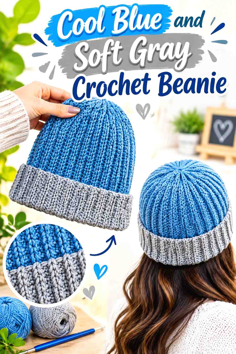
A beanie has limited space, so the palette benefits from a simple hierarchy. Cool blue can cover most of the crown while soft gray defines the brim or one narrow transition. Reversing the combination creates a lighter neutral hat with a stronger blue lower edge.
Cool Blue Can Keep the Crochet Beanie Crown Visually Unified
A continuous cool-blue crown allows the beanie’s shaping and stitch texture to remain easy to read. Several small color changes can make such a compact accessory look busier than a larger scarf or blanket using the same palette.
If the crown already has strong texture, let the stitches provide interest instead of adding multiple gray bands.
Soft Gray Gives a Cool Blue Crochet Beanie Brim Clear Separation
A soft-gray brim creates an obvious boundary between the lower ribbing and blue crown. Because the brim occupies a noticeable part of a beanie, you may not need gray anywhere else.
For a subtler result, keep most of the brim blue and use only one narrow gray line near its upper edge.
Creator Credit: VivCrochets
4. Cool Blue And Soft Gray Crochet Scarf
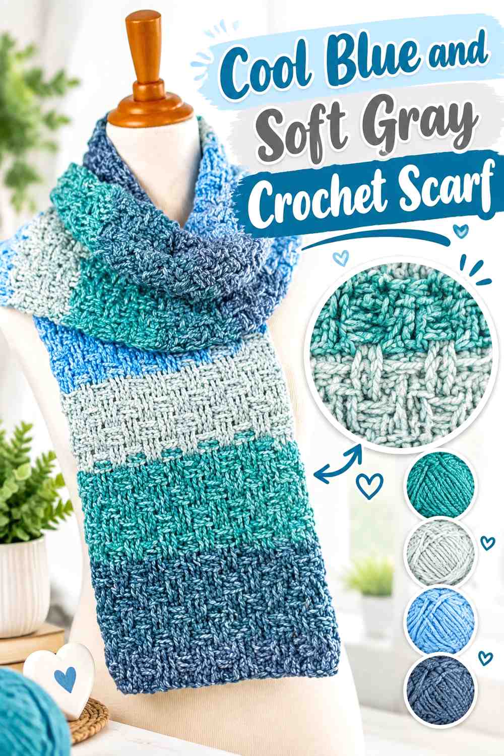
A long scarf can support repeated color changes more easily than a small accessory, but the spacing still matters. Cool blue can form longer sections while gray creates intervals along the length. If both colors are close in value, the transition will appear softer than a high-contrast stripe combination.
Cool Blue Should Occupy the Longer Crochet Scarf Sections
Long cool-blue sections give the scarf a clear dominant color and provide enough room for stitch texture to develop.
Use soft gray less frequently if the scarf has an elaborate surface pattern. Too many narrow color changes can compete with raised stitches or openwork that already creates visual movement.
Soft Gray Can Give Cool Blue Crochet Scarf Stripes a Gentler Rhythm
Instead of alternating equal blue and gray sections, use shorter gray bands between larger blue blocks. This preserves harmony while preventing the scarf from becoming a simple two-color stripe repeat.
Repeat the gray placement toward both ends so the palette looks connected along the full length.
Creator Credit: Fiber Flux
5. Cool Blue And Soft Gray Crochet Granny Square
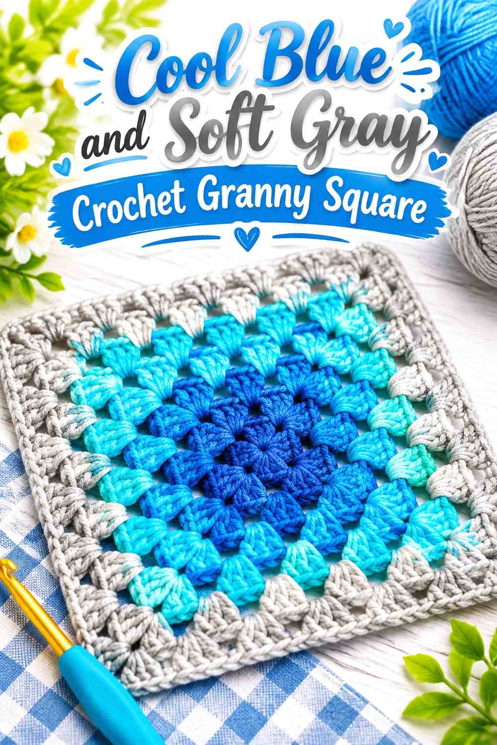
Granny squares can magnify even a small color decision because the same relationship is repeated across many motifs. Cool blue can form the center and larger middle area while soft gray defines the outside, or gray can become the center so blue surrounds it more strongly.
Cool Blue Centers Need Enough Space Inside Soft Gray Crochet Granny Squares
If blue is reduced to a very small center, it may almost disappear once many finished squares are viewed together. Give the cool-blue section enough area to remain visible at the scale of the final project.
Complete one motif before choosing proportions for an entire blanket, bag, or cardigan. Loose yarn does not show how repeated square centers will interact.
Soft Gray Can Create Calm Joins Between Cool Blue Crochet Squares
Soft gray around the outside of each motif can prevent neighboring blue areas from merging into one large dark block.
Remember that an outer gray round may become a strong grid once dozens of squares are joined. Lay several finished motifs beside one another before deciding whether that framing effect suits the project.
Creator Credit: Hooked by Robin
6. Cool Blue And Soft Gray Crochet Basket
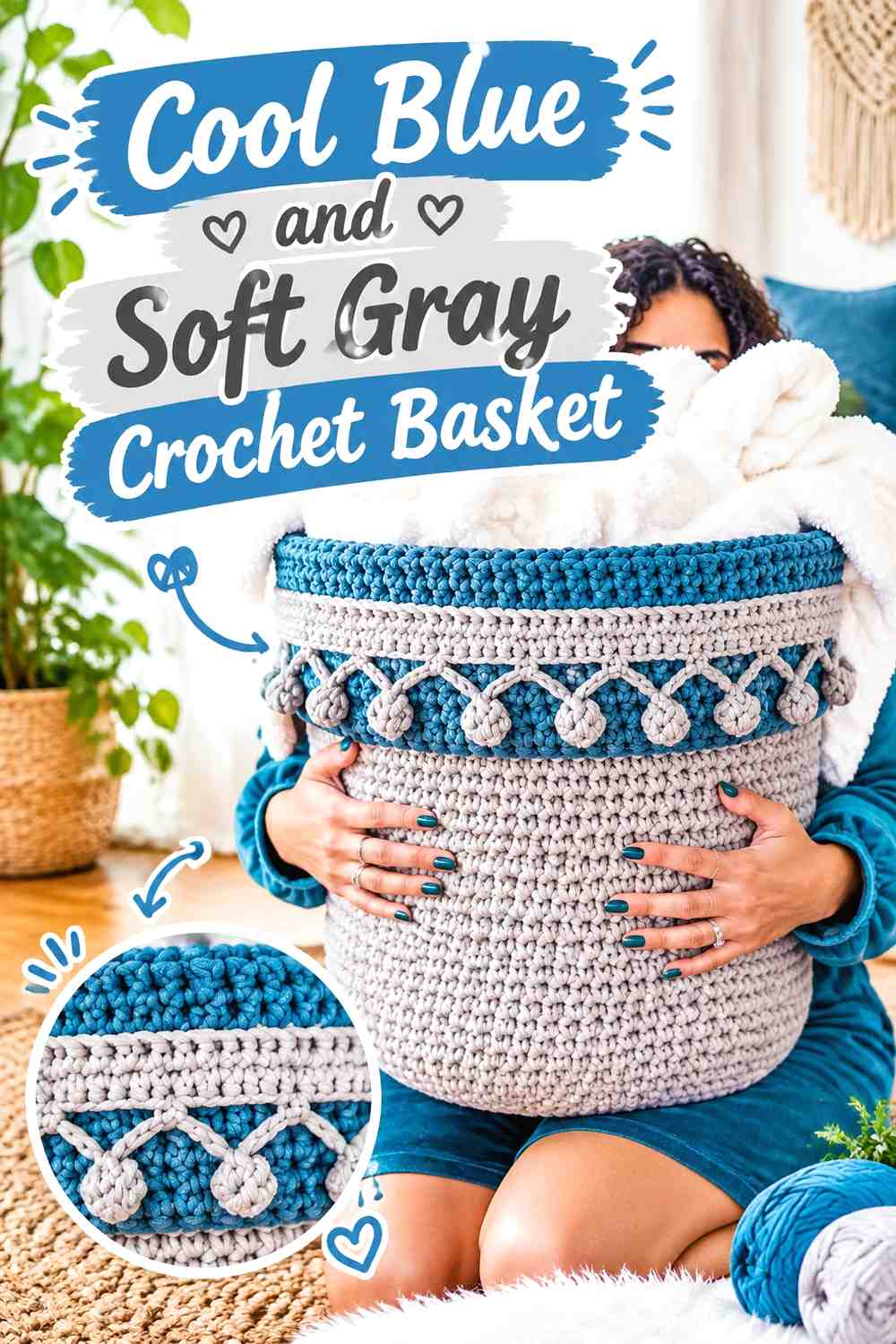
A basket naturally divides into base, sides, rim, and sometimes handles, which makes two-color placement straightforward. Cool blue can ground the lower section while soft gray lightens the upper portion. Reversing those zones creates a much lighter basket with a blue finish around the opening.
Cool Blue Can Anchor the Lower Crochet Basket
Keeping cool blue around the base and lower sides creates a clearly defined lower section without breaking up the whole basket with repeated stripes.
If the side texture is an important feature, give the blue enough uninterrupted height for the stitch pattern to remain visible.
Soft Gray Can Finish the Cool Blue Crochet Basket Rim
Soft gray around the opening gives the basket a lighter upper boundary and makes the transition from the dark body easy to see.
If handles are included, repeating soft gray there can connect the upper details. Check the basket from above as well as from the side because the rim may occupy more visible area from that angle.
Creator Credit: TL Yarn Crafts
7. Cool Blue And Soft Gray Crochet Shawl
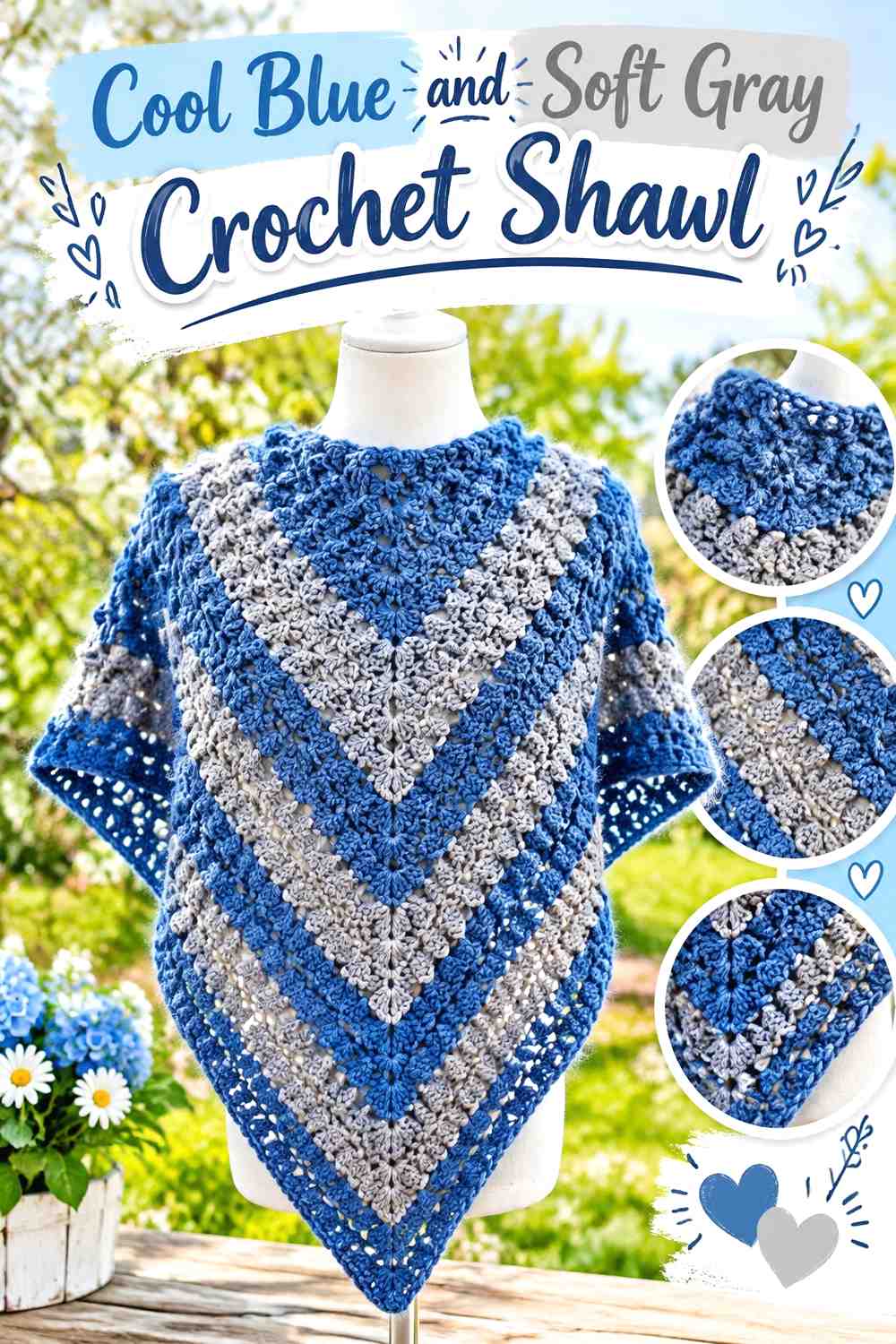
A shawl’s widening shape changes the visual importance of later color sections. Cool blue can establish the central body while soft gray gradually appears closer to the outer edge. This creates a soft transition without requiring frequent narrow stripes through the entire shawl.
Cool Blue Can Lead Across the Main Crochet Shawl Body
Use cool blue through a substantial central area when you want the finished shawl to remain strongly blue after it is spread open.
Remember that a color section near the outer edge may cover considerably more surface area than one near the beginning. Judge the balance by visible area rather than simply counting sections.
Soft Gray Can Lighten the Cool Blue Crochet Shawl Edge
A soft-gray outer section gives the shawl a lighter finish and can make decorative edging easier to distinguish.
If a wide gray border feels too separate from the blue center, repeat one smaller gray section earlier in the shawl to create a visual connection.
Creator Credit: Bag-O-Day Crochet
8. Cool Blue And Soft Gray Crochet Pillow
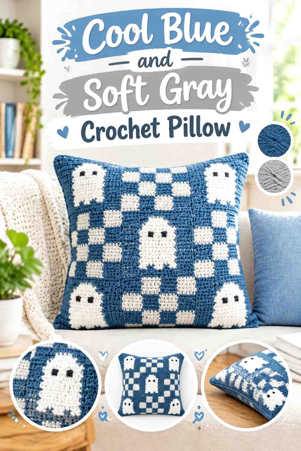
A pillow keeps the palette concentrated on one decorative surface. Cool blue can provide the main background while soft gray highlights motifs, textured bands, or an outer border. A gray-dominant pillow with a blue center works well when you want a lighter decor piece.
Cool Blue Creates a Clear Crochet Pillow Background for Soft Gray Details
A large cool-blue field gives smaller gray motifs enough surrounding space to stand apart. This is particularly useful when the pillow includes raised texture that could become visually crowded with many color changes.
Choose which texture deserves contrast rather than outlining every raised section in gray.
Soft Gray Can Frame Cool Blue Crochet Pillow Texture
A soft-gray border can visually separate the pillow face from its surroundings and repeat gray already used within the central design.
Check the border width against the finished pillow face. Even a seemingly narrow edge can occupy significant visual space on a compact square cushion.
Creator Credit: The Turtle Trunk
9. Cool Blue And Soft Gray Crochet Sweater
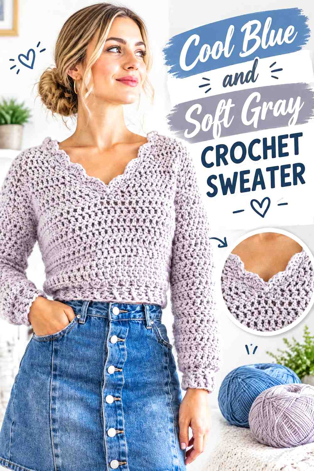
A sweater gives the two colors much more visible area than a hat or scarf. Cool blue can dominate the torso while gray appears in cuffs, ribbing, sleeve bands, or neckline details. Alternatively, a gray torso with blue finishing creates a lighter, more neutral garment.
Cool Blue Can Unify the Main Crochet Sweater Panels
Keeping the front and back mainly cool blue allows the sweater to read as one continuous color even when gray accents appear elsewhere.
If the garment is constructed from separate pieces, plan any gray stripe placement across the pieces before assembly. Unrelated color changes near side seams can make the finished sweater look less coordinated.
Soft Gray Can Break Up Cool Blue Crochet Sweater Sleeves
Cuffs or one controlled sleeve band are useful places for soft gray because the color repeats naturally on both arms.
If the sleeves already carry a strong gray treatment, use less gray on the torso. This keeps the neutral from gradually overtaking the blue as the main visible color.
Creator Credit: For The Frills
10. Cool Blue And Soft Gray Crochet Vest
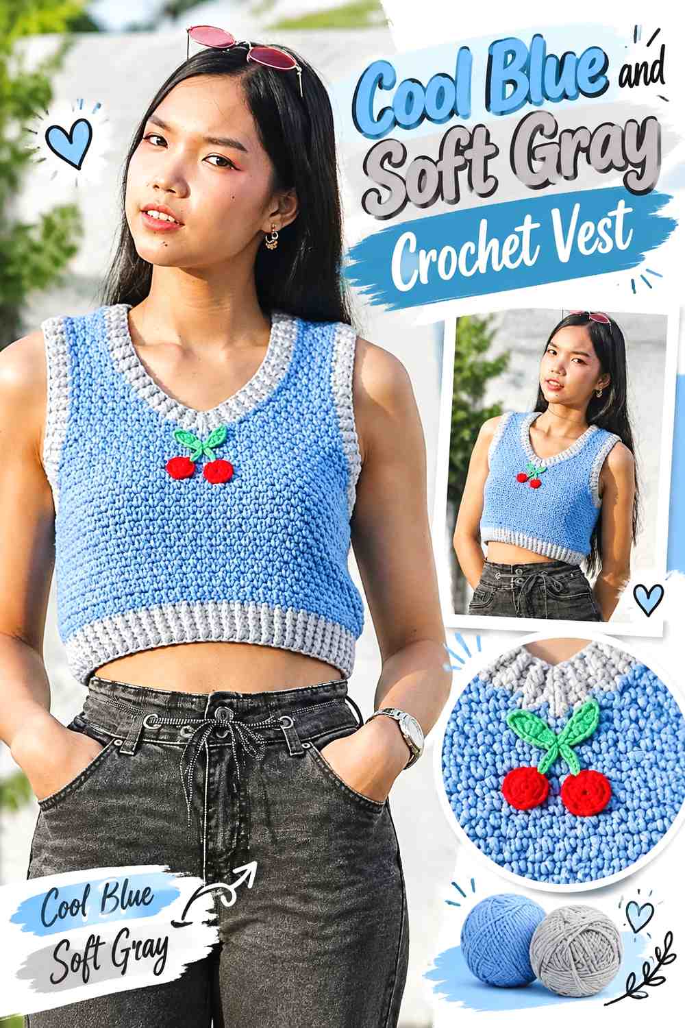
A vest has clear finishing zones around the neckline, armholes, and hem. Cool blue can dominate the body while soft gray highlights selected edges. Because several openings sit close together, using gray on all of them at equal width can create more contrast than expected.
Cool Blue Should Remain Broad Across the Crochet Vest Body
Keep the front and back panels largely cool blue if the blue is intended to lead. This gives the garment a cohesive main field that can be layered over simple neutrals.
For motif-based vests, spread the blue consistently across both front sections rather than concentrating all darker areas on one side.
Soft Gray Can Define Cool Blue Crochet Vest Ribbing Without Over-Framing It
Use soft gray on the neckline, hem, or armholes, but consider emphasizing one of those areas more strongly than the others.
For example, a wider gray hem with narrower gray armhole finishing maintains repetition while avoiding three equally prominent frames around the garment.
Creator Credit: Chenda DIY
11. Cool Blue And Soft Gray Crochet Headband
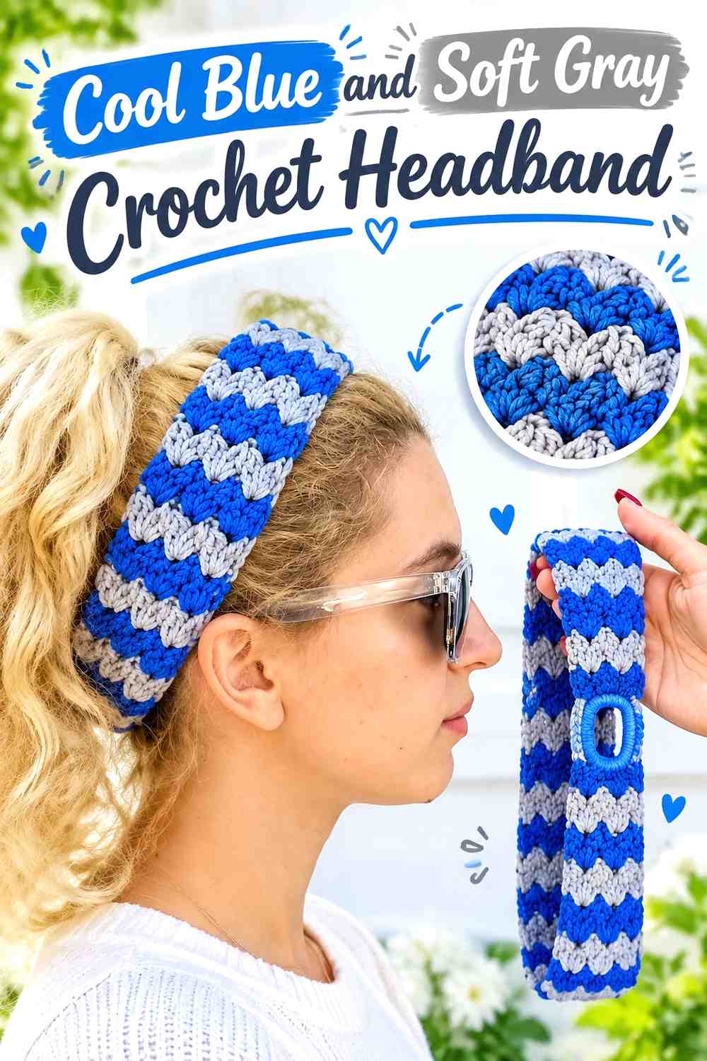
A headband offers little surface area, making a simple two-color division more effective than many tiny stripes. Cool blue can cover the main band while soft gray marks the center, ends, or another small feature.
Cool Blue Should Carry Most of the Crochet Headband
A broad cool-blue section lets ribbing or clustered texture remain visible without interruption.
If the headband includes a twist or gathered area, use that construction feature as the main focal point before deciding whether additional gray stripes are necessary.
Soft Gray Can Highlight the Center of a Cool Blue Crochet Headband
A small soft-gray section can draw attention toward the front center without splitting the entire band equally between two colors.
Check the accent after curving the headband into its worn shape. Color placement that appears centered when flat can look different once the band wraps around the head.
Creator Credit: naztazia
12. Cool Blue And Soft Gray Crochet Fingerless Gloves

Fingerless gloves provide an easy division between the hand and cuff areas. Cool blue can cover the hand while soft gray marks the wrist, or gray can form the main glove with blue at the edges. Consistency across both gloves is more important than adding many color changes.
Cool Blue Can Keep Both Crochet Fingerless Gloves Visually Connected
Use cool blue through the same major areas on both gloves so the pair reads consistently.
If the stitch texture is already pronounced, keep the color plan simple. Several alternating bands may distract from the ribbing or shaping on such a small accessory.
Soft Gray Can Give Cool Blue Crochet Fingerless Glove Cuffs a Clear Finish
A soft-gray wrist section creates an obvious boundary and repeats naturally across the pair.
If you want gray near the finger opening as well, keep that upper accent narrower so the glove body still retains enough blue to remain dominant.
Creator Credit: Diving Ducks Crochet
13. Cool Blue And Soft Gray Crochet Cowl
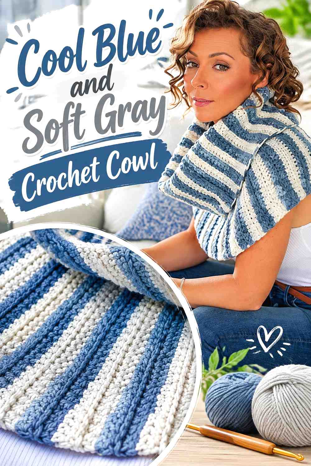
A cowl can support wider blocks than a headband while still remaining compact enough for color placement to have a strong effect. Cool blue can form the central section, with soft gray near the upper or lower edge. Wider gray sections create a more neutral appearance.
Cool Blue Can Create the Main Crochet Cowl Color Field
Use cool blue across the widest portion when you want the accessory to remain clearly blue after it gathers around the neck.
Before planning stripe spacing, loosely drape or fold the work. Sections that appear separate while the cowl is flat may sit directly next to each other when worn.
Soft Gray Can Separate Cool Blue Crochet Cowl Textures
If the cowl changes stitch texture, soft gray can mark that transition without adding another hue.
A gray band between two blue textures can be more useful than several decorative stripes because it gives both the color change and stitch change a clear purpose.
Creator Credit: Expression Fiber Arts
14. Cool Blue And Soft Gray Crochet Tote Bag
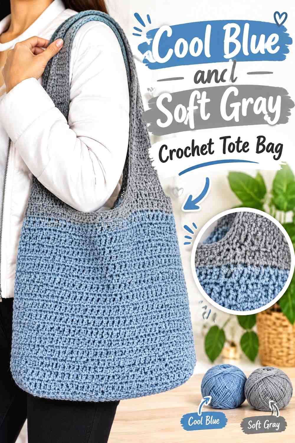
A tote provides large front and back surfaces along with smaller areas such as handles, openings, side edges, and the base. Cool blue can dominate the main bag while soft gray defines those smaller construction zones.
Cool Blue Can Keep the Crochet Tote Body Cohesive
Use cool blue across most of the visible bag panels if you want a clean, uninterrupted main field.
If the tote consists of joined motifs, lay all pieces out before assembly. This helps prevent soft-gray sections from clustering in one corner and making the color distribution look uneven.
Soft Gray Can Connect Cool Blue Crochet Tote Handles and Edging
Repeating soft gray around the upper edge and handle area gives the neutral two related places to appear.
If full gray handles seem too visually prominent, keep them cool blue and use gray only at the attachment points or opening. A smaller accent can still create a clear two-color connection.
Creator Credit: Tejelu crochet
15. Cool Blue And Soft Gray Crochet Coaster Set
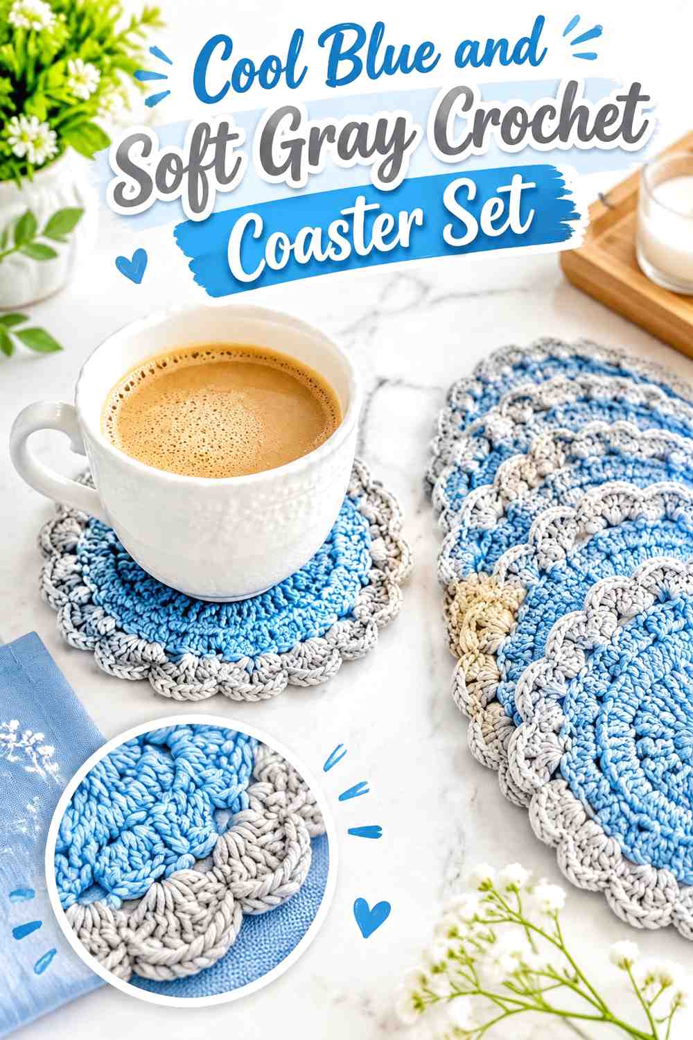
Coasters have very little surface area, so the color relationship should stay clear. Cool blue can fill most of each coaster while soft gray creates the outer edge, or the palette can be reversed for a lighter set with blue framing.
Cool Blue Should Occupy Enough of the Crochet Coaster Surface
A broad cool-blue center allows the hue to remain visible even after a soft-gray border is added.
Avoid dividing a small coaster into too many thin alternating rounds unless you specifically want a strongly striped appearance. Limited surface area makes every additional ring more prominent.
Soft Gray Can Give Cool Blue Crochet Coasters a Consistent Outer Edge
Using the same soft-gray finish on each coaster visually ties the set together and gives the blue centers a clear boundary.
If matching placemats are planned, preserve the color roles rather than copying the exact proportions. A border that works on a small coaster may need a different visual width on a larger table piece.
Creator Credit: Brunaticality
Comparing Cool Blue and Soft Gray Crochet Color Harmony
For a stronger blue presence, keep cool blue on the largest uninterrupted surfaces. The cardigan, blanket, sweater, vest, shawl, and tote all provide enough area for gray to remain secondary without disappearing.
For a softer neutral look, increase soft gray around the project body and let blue move into smaller focal zones. This works especially well for pillows, baskets, cowls, and home accessories where a lighter overall surface may be preferred.
Small projects need the most restraint. A beanie, headband, coaster, or fingerless glove may need only one gray cuff, border, or center detail. Adding several small accents can quickly turn a simple harmonious palette into a busy stripe arrangement.
Granny-square projects need to be judged at two scales. First check one motif for color separation, then place several finished squares together. An outer gray round that looks subtle on one square may create a strong grid when repeated across an entire blanket or garment.
Conclusion
Cool blue and soft gray crochet works best when the two colors have defined roles rather than competing for every section. Use cool blue across larger panels and surfaces for a stronger color-led result, then introduce soft gray around cuffs, borders, joins, handles, motif edges, or texture changes.
Reverse the hierarchy when you want a lighter, more neutral piece. Soft gray can cover the main field while smaller cool-blue details provide the strongest hue.
Because blue and gray can sometimes sit close in value, test the actual yarns before committing to tiny colorwork. A finished sample or complete motif will show whether the separation is strong enough for the texture and placement you have planned. Use the credited tutorials for exact project construction while treating the cool-blue-and-soft-gray palette as an independent color adaptation.
Frequently Asked Questions
Do cool blue and soft gray have enough contrast for crochet?
They can, but contrast depends on the exact shades. A dark cool blue beside a light soft gray creates stronger separation than two medium-value versions. Compare the yarns side by side and use a grayscale photo if you need to check their light-dark difference.
Should cool blue or soft gray dominate a crochet project?
Either can lead. Use more cool blue for a stronger color presence and more soft gray for a quieter neutral result. Establishing one dominant color usually makes borders, stripes, and motifs easier to organize.
Where should soft gray go on a cool blue crochet cardigan?
Cuffs, front edging, the neckline, or lower trim are practical areas because they already define the garment. You do not need to put gray around every opening for the palette to feel connected.
Can cool blue and soft gray work for granny squares?
Yes. One color can fill the motif center while the other forms larger surrounding areas or joins. Make and arrange several complete squares before deciding on the final distribution because repeated outer rounds can create strong grid lines.
How do I stop cool blue and soft gray crochet from looking too flat?
Create clearer differences in color area or value. Use wider blue and gray sections rather than many similar narrow stripes, or choose one shade that is noticeably lighter or darker when important motifs need more definition.
Is soft gray better for a crochet border than cool blue?
Neither is automatically better. Soft gray creates a lighter frame around a dark-blue project, while cool blue gives a gray-dominant piece a stronger dark edge. Choose according to which color you want to emphasize.
How can I substitute a different blue or gray without losing the harmony?
Preserve the original color roles. Replace cool blue with another blue that has a similar cool, softened character, and choose a gray that maintains the intended light-dark relationship. Matching the contrast and muted quality is more important than finding an exact shade name.