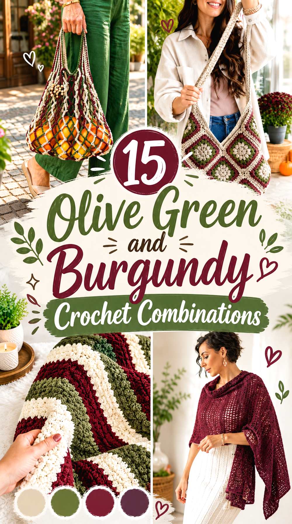
15 Olive Green and Burgundy Crochet Combinations
Olive green and burgundy make a strong crochet pairing because both colors have depth without looking identical. Olive brings a muted, earthy green direction, while burgundy introduces a dark red note. The main challenge is value: if both yarns are similarly dark, small motifs, narrow stripes, or textured stitches can lose definition.
These 15 combinations keep olive green and burgundy at the center while changing the supporting color, dominant shade, and placement strategy. Some use cream or ivory for clear separation, while others lean into darker tonal palettes with charcoal, cocoa, plum, or rust. The crochet item matters too—a blanket offers room for repeated color blocks, while a cardigan needs balanced panels, sleeves, cuffs, and edging.
Quick List
- Olive Green Burgundy And Cream Crochet Granny Square Blanket
- Burgundy Olive Green And Camel Crochet Cardigan
- Olive Green Burgundy And Oatmeal Crochet Granny Square Bag
- Olive Green Burgundy And Dusty Blush Crochet Tote Bag
- Burgundy Olive Green And Charcoal Crochet Beanie
- Olive Green Burgundy And Rust Crochet Cardigan
- Ivory Olive Green And Burgundy Crochet Striped Blanket
- Burgundy Olive Green And Dusty Rose Crochet Scarf
- Olive Green Burgundy And Mustard Crochet Cowl
- Taupe Olive Green And Burgundy Crochet Sweater Scarf
- Burgundy Olive Green And Muted Gold Crochet Tank Top
- Stone Olive Green And Burgundy Crochet Puff Square Bag
- Burgundy Olive Green And Plum Crochet Shawl
- Ecru Olive Green And Burgundy Crochet Market Bag
- Cocoa Olive Green And Burgundy Crochet Chunky Cowl
How to Balance Olive Green and Burgundy in Crochet
Start by deciding which of the two colors should occupy the largest visual area. Equal amounts can work in a geometric design, but on garments, scarves, bags, and textured crochet, a clear dominant color usually makes placement easier to control.
Olive green can provide a quieter field for burgundy borders, cuffs, straps, or motif centers. Reversing the balance creates a richer red-led project in which olive becomes an earthy accent. Before committing to equal stripes, compare the two yarns from a distance. If their lightness is similar, the color change may be less obvious than expected even though one yarn is green and the other red.
Use Light Neutrals to Separate Olive Green and Burgundy
Cream, oatmeal, ivory, stone, and ecru are especially useful when olive green and burgundy both look dark in the selected yarns. A light neutral does not need to cover much of the project. Narrow motif rounds, joins, borders, or occasional stripes can create enough separation to keep the two main colors readable.
Placement matters more than simply adding a third yarn. On a granny square, a cream round between an olive center and burgundy outer section can clarify the motif. On a cardigan, a light edging can separate the body color from darker cuffs or front bands. On a bag, a neutral joining color can organize many dark motifs without reducing the role of olive or burgundy.
Check Olive Green and Burgundy Contrast Before You Commit
Different hues do not automatically produce strong light-and-dark contrast. Put the yarns together under the lighting where you normally crochet, then look at them from several feet away. A quick grayscale photo can also reveal whether the two shades are close in value.
If they merge too much, you do not necessarily need to replace either color. Increase the size of the color blocks, introduce a lighter separator, or place burgundy and olive in different structural areas such as the body and border. Those changes preserve the palette while making the finished crochet easier to read.
1. Olive Green Burgundy And Cream Crochet Granny Square Blanket

For a granny square blanket, let olive green carry many of the larger motif areas while burgundy repeats as a smaller center or outer-round accent. Cream can sit between the two or appear consistently in the joining and border. That lighter interruption gives individual squares definition and prevents a large field of dark motifs from turning visually dense.
Cream Keeps Olive Green and Burgundy Crochet Motifs Separate
Use cream where one motif section needs to remain distinguishable from the next. A cream round between olive green and burgundy can make the geometry of each square easier to see, especially once many motifs are joined into one blanket.
Repeating cream in the joining or final border also connects the separate squares. If you replace cream, preserve its noticeably lighter value rather than choosing another medium-dark neutral that could disappear beside olive green and burgundy.
Olive Green Can Lead While Burgundy Repeats Around the Crochet Blanket
Giving olive green the largest share creates a consistent field across the blanket. Burgundy can then repeat in motif centers, selected outer rounds, or a portion of the border instead of competing for equal space in every square.
This placement is useful when you want the blanket to read primarily green from across the room but reveal burgundy details at closer range. Keep the burgundy repetition regular enough that it looks intentional rather than appearing in only one isolated area.
Creator Credit: Danii’s Ways
2. Burgundy Olive Green And Camel Crochet Cardigan
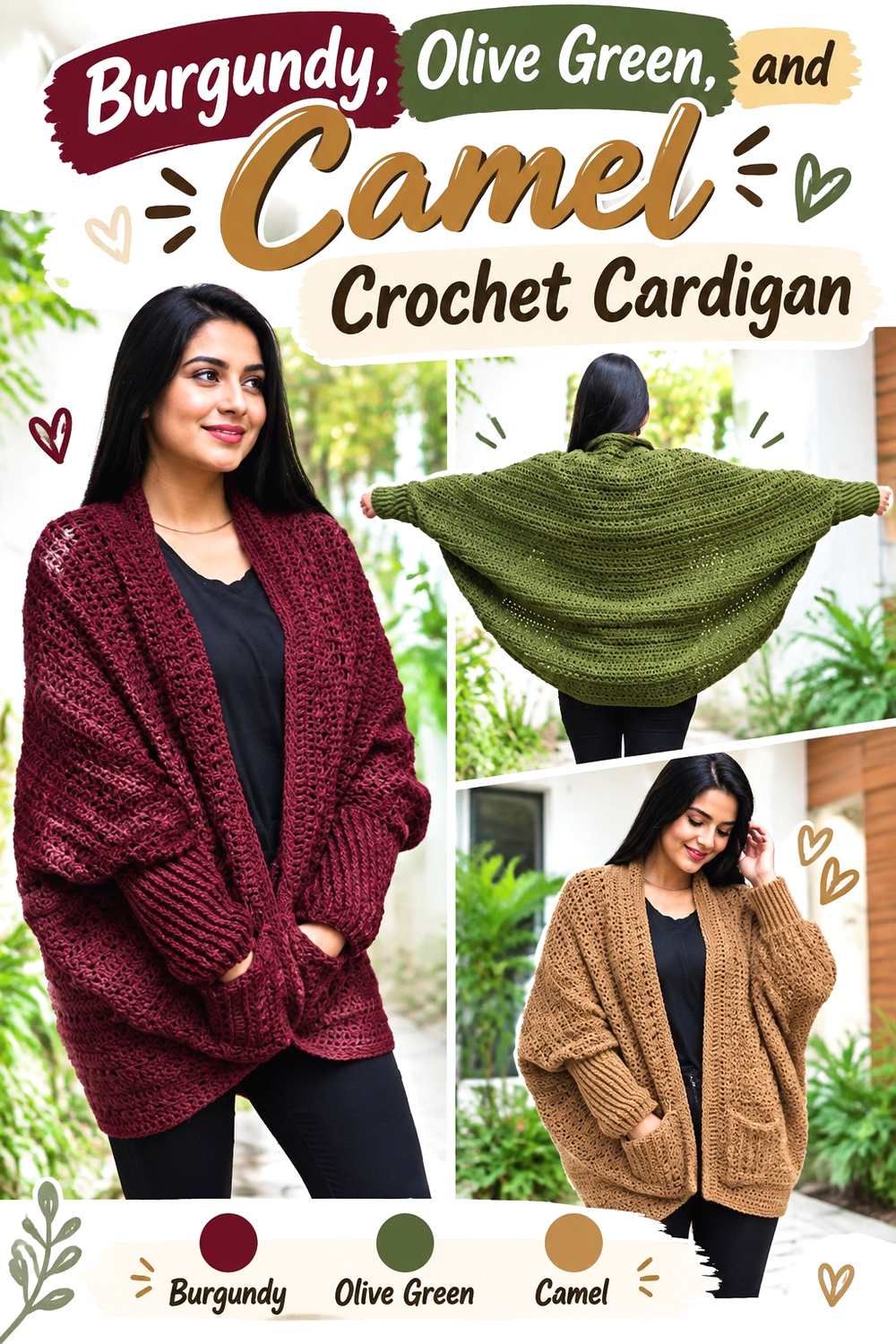
This cardigan direction puts burgundy in the dominant role. Use it across the main body panels, then reserve olive green for cuffs, front edging, or selected sleeve areas. Camel introduces a warmer, lighter middle value that can keep the two dark colors from meeting across every seam.
Burgundy Gives the Crochet Cardigan Body More Visual Weight
Burgundy works well across broad cardigan panels because the larger surface allows the color to establish itself before olive green appears. Keeping the front and back body predominantly burgundy can also reduce visual fragmentation across the garment.
Olive green can then repeat at both sleeves or along the opening so it looks balanced from front to back. Avoid placing one small olive patch on only one side unless an intentionally asymmetric look is the goal.
Camel Softens Olive Green Along Burgundy Crochet Cardigan Edging
Camel can be used sparingly around a front band, lower edge, or between burgundy and olive sleeve sections. Its lighter, warmer character provides a transition without making the cardigan as high-contrast as cream would.
If you substitute camel, look for a warm tan that remains visibly lighter than both main colors. A very dark brown may instead create three deep shades competing in the same garment.
Creator Credit: Nirvana Crochet
3. Olive Green Burgundy And Oatmeal Crochet Granny Square Bag

A granny square bag benefits from a color plan that still reads clearly after the motifs are folded, joined, and viewed from different angles. Olive green can dominate the squares, burgundy can mark selected centers or outer rounds, and oatmeal can organize the joins, upper edge, or strap.
Oatmeal Joins Keep Olive Green and Burgundy Crochet Squares Legible
Using oatmeal between motifs creates a visible grid that separates dark olive green from dark burgundy. This is particularly useful on a bag because seams and folds can place different squares directly beside each other.
Carry the oatmeal into a small amount of edging or strap detail so the joining color does not appear disconnected from the rest of the bag. You do not need equal amounts of all three shades.
Burgundy Works Better as a Repeated Accent Across Olive Green Crochet Bag Motifs
Instead of placing burgundy in only one statement square, repeat it across several motifs. It can occupy centers, corners, or the same outer section of each square while olive green remains the dominant field.
That repetition helps the bag look coordinated from both sides. Before joining, lay out all motifs in the approximate bag arrangement and check whether burgundy has accidentally clustered in one area.
Creator Credit: VivCrochets
4. Olive Green Burgundy And Dusty Blush Crochet Tote Bag

For a tote, olive green can cover most of the body while burgundy defines structural-looking areas such as the upper edge, straps, or base. Dusty blush provides a softer transition than cream, creating contrast without pushing the palette toward a sharply light-and-dark look.
Olive Green Can Cover the Crochet Tote Body While Burgundy Defines the Handles
Keeping olive green across most of the tote gives the bag a unified surface. Burgundy handles or upper edging then provide a clear finish around the area that receives the most visual attention when the bag is carried.
If burgundy is also used near the base, repeat it intentionally rather than adding several unrelated narrow stripes. Too many small changes can interrupt the clean shape of a simple tote.
Dusty Blush Prevents Burgundy From Overpowering Olive Green on the Crochet Tote
Dusty blush is useful as a narrow band between burgundy and olive green or as a small repeated stripe through the body. Because it is lighter than the two core colors, it can separate them without the brightness of white.
Choose a softened pink rather than a vivid one if you want olive green and burgundy to remain dominant. The blush should support the pair, not become the first color noticed.
Creator Credit: crochet daniela
5. Burgundy Olive Green And Charcoal Crochet Beanie

A beanie has less surface area than a blanket or cardigan, so the color hierarchy needs to be especially clear. Burgundy can cover the main crown and body, olive green can define the ribbing or lower band, and charcoal can appear only in a small finishing detail.
Burgundy Can Lead the Crochet Beanie While Olive Green Marks the Ribbing
Using burgundy through most of the beanie keeps the crown visually unified. Olive green at the ribbed band gives a clear change near the face without repeatedly breaking up the body of the hat.
You can reverse the two if olive green is your preferred dominant shade, but keep the same principle: one broad field and one clearly placed supporting section usually reads more cleanly than many narrow alternating bands.
Charcoal Should Not Crowd Olive Green and Burgundy Into One Dark Crochet Band
Charcoal is useful when you want a deeper neutral accent, but all three shades can become visually heavy if placed together in narrow stripes. Reserve charcoal for a modest detail or keep it separated from one of the other dark colors.
Compare the yarns in grayscale before adding a charcoal band. If all three appear nearly identical in value, the design will depend mostly on hue changes rather than strong visible contrast.
Creator Credit: Di’s Handicrafts (Crochet and Knitting)
6. Olive Green Burgundy And Rust Crochet Cardigan

Olive green can lead this cardigan while burgundy defines the opening, cuffs, or lower band. Rust introduces another warm earthy color, but it needs careful placement because some rust shades can sit close to burgundy.
Olive Green Gives the Crochet Cardigan a Stable Base for Burgundy Edging
Keep the largest body panels predominantly olive green so the cardigan has a consistent base. Burgundy can then frame the front opening or repeat at both cuffs, where its darker red direction creates definition around the edges.
This approach also makes color substitution easier. If your olive yarn changes, preserve its muted green role and make sure it remains distinct enough from the burgundy trim.
Rust Needs Enough Separation From Burgundy on the Olive Green Crochet Cardigan
Rust and burgundy can look closely related when both are dark and warm. Place olive green between them when possible, or use rust in smaller sections rather than running rust and burgundy together through many narrow stripes.
If the two warm shades look too similar, replace rust with a lighter terracotta direction rather than adding more colors. The goal is a visible third step, not another dark red-brown block.
Creator Credit: TCDDIY
7. Ivory Olive Green And Burgundy Crochet Striped Blanket

An ivory-led blanket gives the core colors more room to stand apart. Ivory can cover the largest area, with olive green and burgundy appearing as broad repeating stripes or selected color blocks. This creates stronger light-dark contrast than a blanket made mostly from the two deeper shades.
Ivory Makes Olive Green and Burgundy Crochet Blanket Stripes Easier to Read
Place ivory between olive and burgundy when you want each stripe to stay distinct. This is especially useful if your green and red yarns are similarly dark.
The separator does not need to be the same width as the colored stripes. A narrower ivory section can provide enough visual breathing room while still allowing olive green and burgundy to carry the main color identity.
Burgundy Works Well at the Crochet Blanket Border When Olive Green Repeats Inside
If olive green appears frequently across the blanket body, a burgundy border can provide a darker frame without requiring equal burgundy stripes throughout the center.
Check the border against the last interior stripe before committing. If the final stripe is also burgundy, introducing ivory or olive just before the outer edge can keep the border from visually disappearing into the body.
Creator Credit: Bella Coco
8. Burgundy Olive Green And Dusty Rose Crochet Scarf
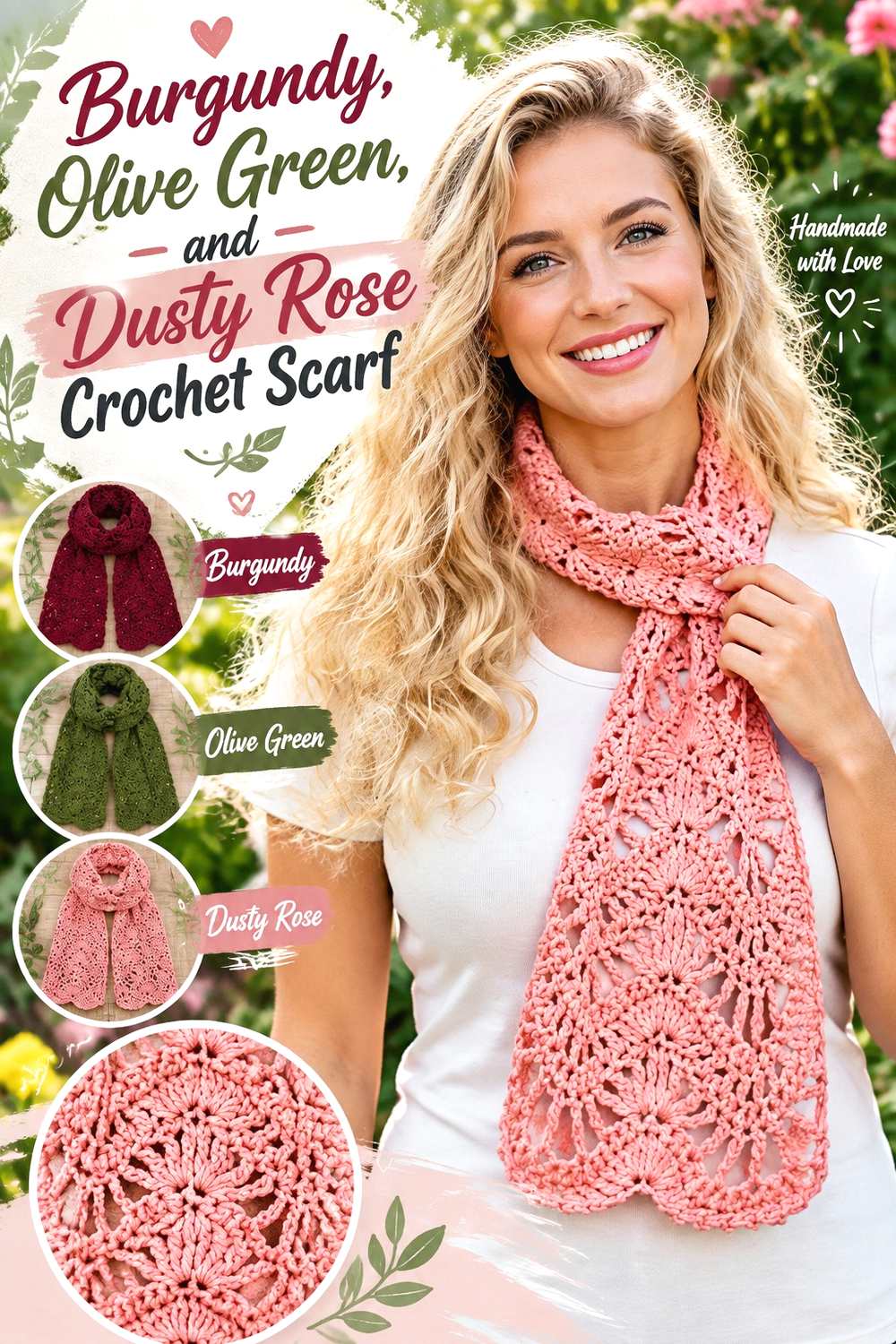
A long scarf offers room for color transitions without making each section tiny. Burgundy can dominate the center length, olive green can occupy broader end sections, and dusty rose can bridge the two.
Dusty Rose Creates a Softer Bridge Between Burgundy and Olive Green on the Crochet Scarf
Use dusty rose where the scarf changes from one deep color to the other. The lighter pink provides a visual pause and relates more closely to burgundy than a cream separator would.
Because scarves are frequently folded and wrapped, check the palette both flat and loosely draped. A transition that looks balanced on a table may place most of the light color on one side when worn.
Burgundy Should Stay Wide Enough to Hold Its Own Beside Olive Green Crochet Sections
Very narrow burgundy bands can lose impact beside wide olive green areas. Give burgundy enough length to read as a deliberate part of the scarf rather than a thin dividing line.
If you want a calmer look, use fewer, broader blocks. More frequent switching will create a busier striped effect and may make the stitch texture less noticeable from a distance.
Creator Credit: naztazia
9. Olive Green Burgundy And Mustard Crochet Cowl
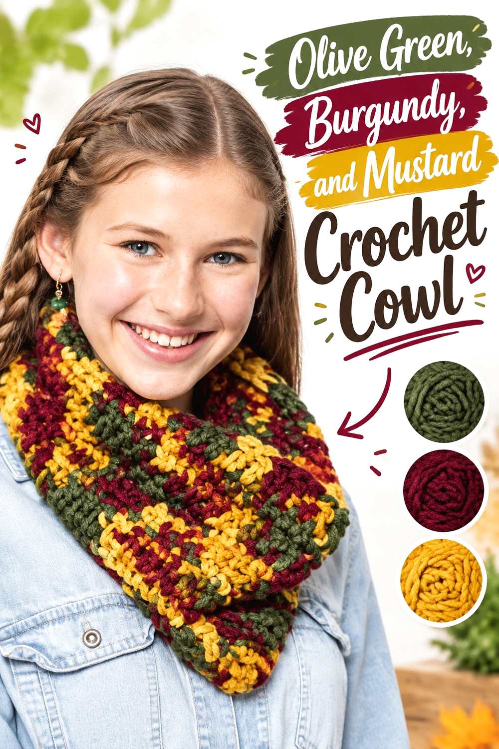
A cowl naturally places colors close together, so a three-color scheme benefits from strong hierarchy. Olive green can cover most of the tube, burgundy can frame the top or bottom edge, and mustard can appear as a narrow accent band.
Mustard Brightens Olive Green and Burgundy Without Taking Over the Crochet Cowl
A restrained mustard accent introduces a lighter warm color between the two deeper shades. Use it once or repeat it in narrow intervals rather than dividing the cowl equally into thirds.
If the mustard is highly saturated, reduce its visual area. A small amount can be enough to create separation between burgundy and olive green.
Olive Green Can Dominate the Crochet Cowl While Burgundy Frames the Neckline
Olive green across the main fabric creates a continuous field, while burgundy near the upper edge gives the cowl a clear visual boundary when worn.
Repeat a small amount of burgundy lower on the cowl if the top edge feels disconnected. The repetition does not need to be symmetrical; it simply needs to make the accent look intentional.
Creator Credit: The Crochet Crowd
10. Taupe Olive Green And Burgundy Crochet Sweater Scarf
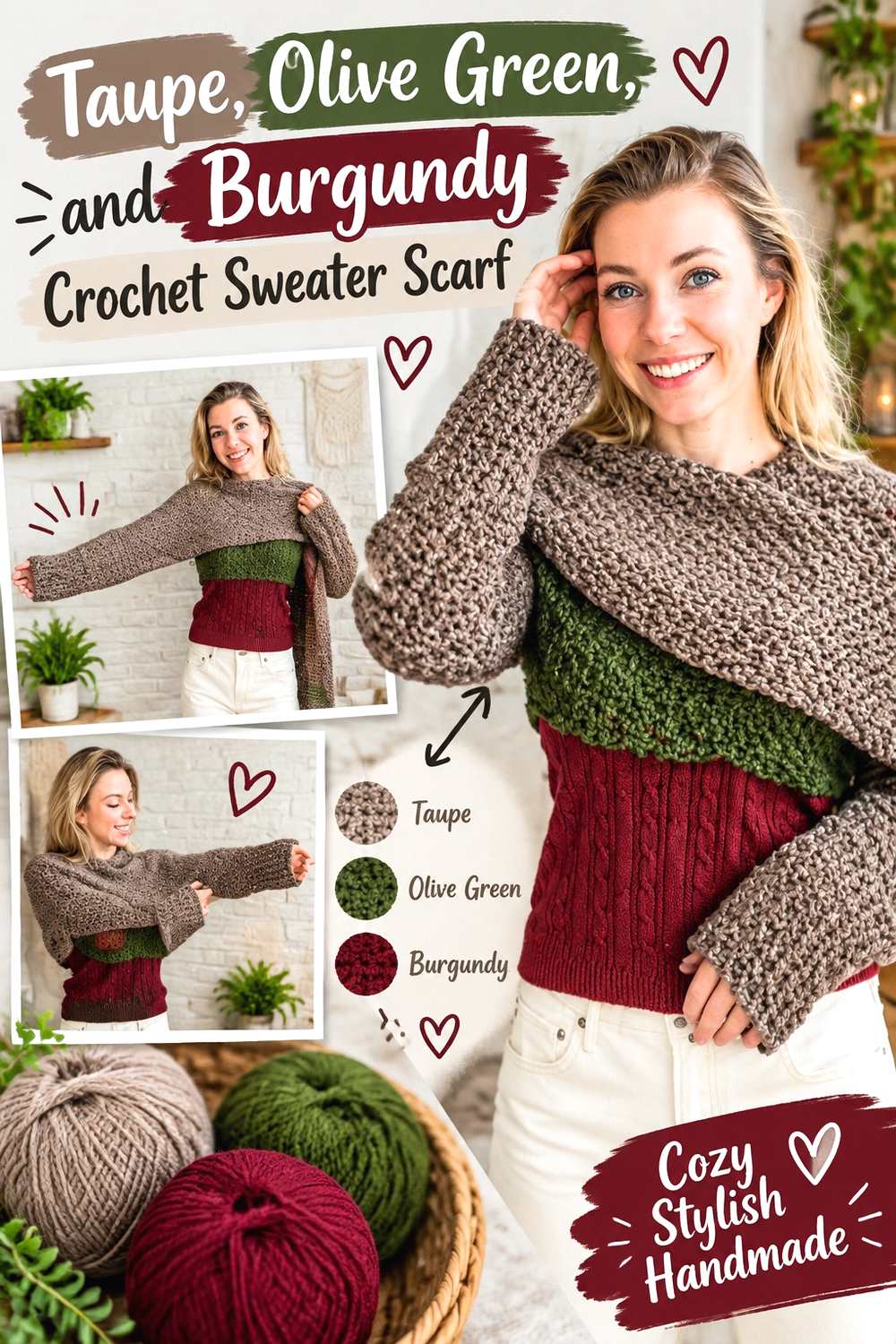
A sweater scarf has a long central section plus wearable sleeve areas, which makes color distribution more important than on a standard straight scarf. Taupe can connect the entire piece, while olive green and burgundy mark separate sections without making the garment look chopped into too many blocks.
Taupe Gives Olive Green and Burgundy Crochet Color Blocks More Breathing Room
Use taupe as a continuous central color or as a transition between olive and burgundy. The neutral can reduce competition where the scarf portion meets the sleeve sections.
Choose a taupe that is clearly lighter than the core colors if you want visible separation. A deep brownish taupe will create a more tonal result and may make the three shades appear heavier together.
Burgundy at the Crochet Sleeve Ends Can Balance Olive Green Along the Scarf
If olive green occupies a long portion of the scarf, burgundy cuffs or sleeve-end sections can add visual weight at both ends. Repeating the burgundy symmetrically can help the wearable sections feel connected.
Alternatively, use burgundy in the center and olive at the sleeve ends. What matters most is checking the piece as it will be worn rather than judging only the flat rectangle.
Creator Credit: Wilma Westenberg
11. Burgundy Olive Green And Muted Gold Crochet Tank Top

A tank top offers obvious placement zones: the main body, straps, neckline, and lower edging. Burgundy can anchor the body, olive green can define trim or straps, and muted gold can appear in the smallest proportion.
Burgundy Can Anchor the Crochet Tank Top Body While Olive Green Stays at the Trim
Using burgundy across the torso creates one uninterrupted main field. Olive green around the neckline, straps, or lower finish introduces contrast without splitting the body into multiple horizontal bands.
Because trim surrounds structural edges, even a small amount of olive green can have a strong visual presence. There is no need to match the burgundy quantity.
Muted Gold Works Best as a Small Accent Beside Burgundy and Olive Green Crochet
A muted gold accent can sit at a strap detail, thin edging section, or other limited area. Keeping it small allows the olive-and-burgundy pairing to remain the defining palette.
If the gold becomes too bright or yellow, it can pull attention away from the garment shape. A quieter mustard-gold direction will usually integrate more easily with both earthy olive and deep burgundy.
Creator Credit: forthefrills
12. Stone Olive Green And Burgundy Crochet Puff Square Bag
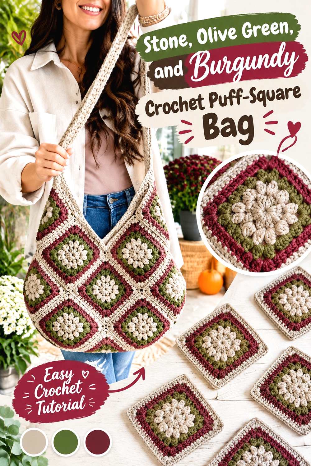
Puff motifs create a lot of visible texture, so this palette uses stone to stop the texture and dark colors from competing. Stone can form outer motif rounds or joins, olive green can fill many puff centers, and burgundy can repeat as the contrasting second motif color.
Stone Lets Olive Green and Burgundy Crochet Puff Centers Stay Distinct
When raised texture is worked in two dark shades, the motif pattern can become harder to read from a distance. Surrounding olive and burgundy centers with a lighter stone color gives each textured section a clearer boundary.
Repeat the stone consistently across motifs. Randomly using it on only a few squares may weaken the bag’s overall visual structure.
Burgundy Straps Can Connect Olive Green Crochet Motifs Across the Bag
If olive green appears most often in the motifs, burgundy can move beyond the squares and become the strap or upper edging color. That creates a visual link from one side of the bag to the other.
Check the finished motif layout before choosing the strap color. If burgundy already dominates the uppermost squares, an olive or stone strap may create better balance.
Creator Credit: MJ’s Off The Hook Designs
13. Burgundy Olive Green And Plum Crochet Shawl
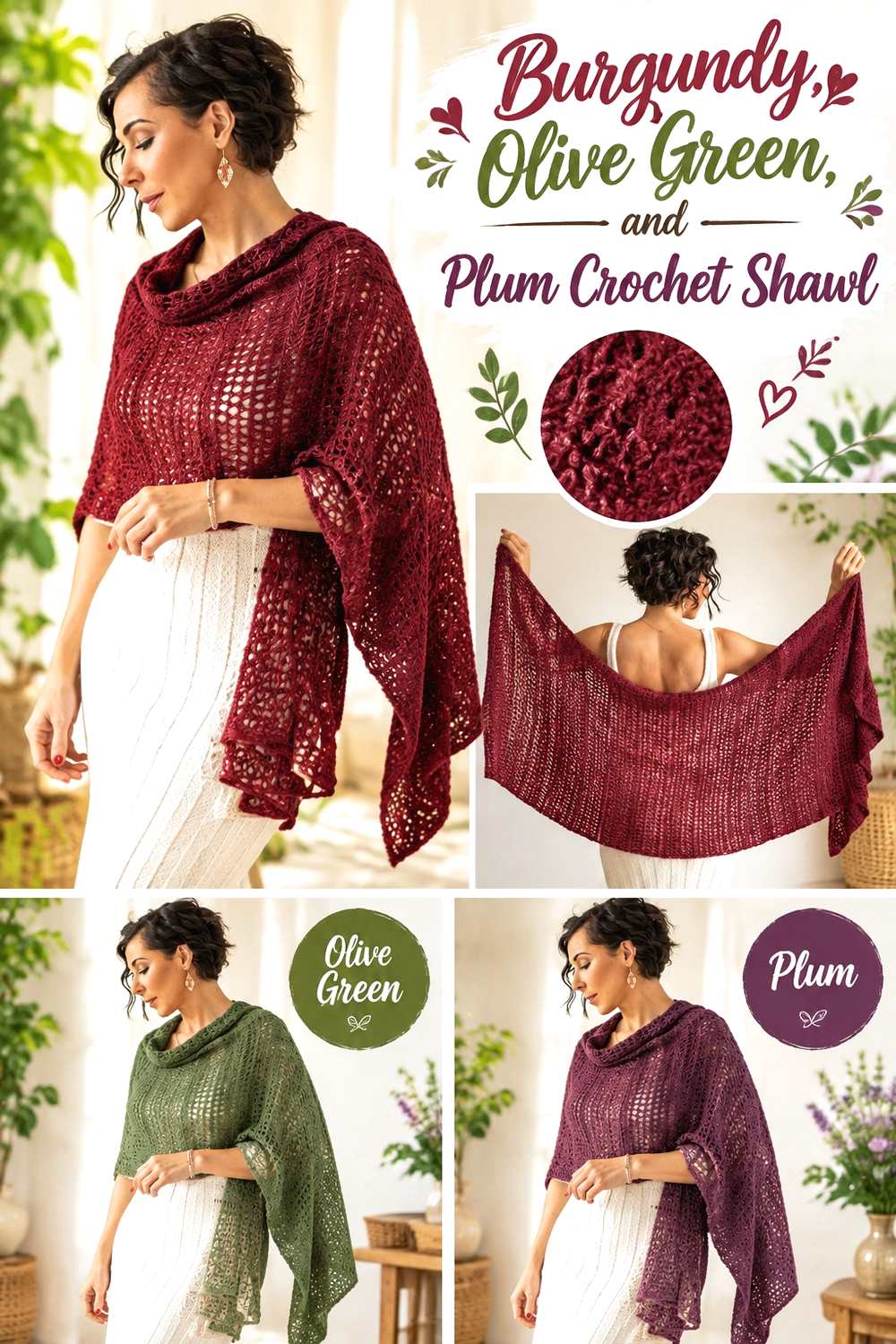
This is one of the darkest combinations in the group. Burgundy and plum can create a gradual red-purple direction across the shawl, while olive green introduces a contrasting earthy note at the edge or within selected sections.
Plum Deepens Burgundy Without Making Olive Green Disappear From the Crochet Shawl
Place plum next to burgundy when you want a tonal transition rather than a sharp color break. Because the two shades may be close in value, use broader sections so the hue change has enough area to register.
Olive green should appear in a deliberate location such as an edge or repeated band. Scattering tiny green accents through a dark burgundy-plum field may make the color look incidental.
Olive Green Works Best as a Controlled Crochet Shawl Edge Against Burgundy
An olive green edge can define the shawl shape while allowing burgundy and plum to remain dominant across the body. This is particularly useful for openwork or decorative edging because the contrasting hue makes the outer shape easier to notice.
If your olive is very dark, compare it with the burgundy before committing to the full border. A slightly lighter or more muted olive may produce clearer separation.
Creator Credit: ExpressionFiberArts
14. Ecru Olive Green And Burgundy Crochet Market Bag
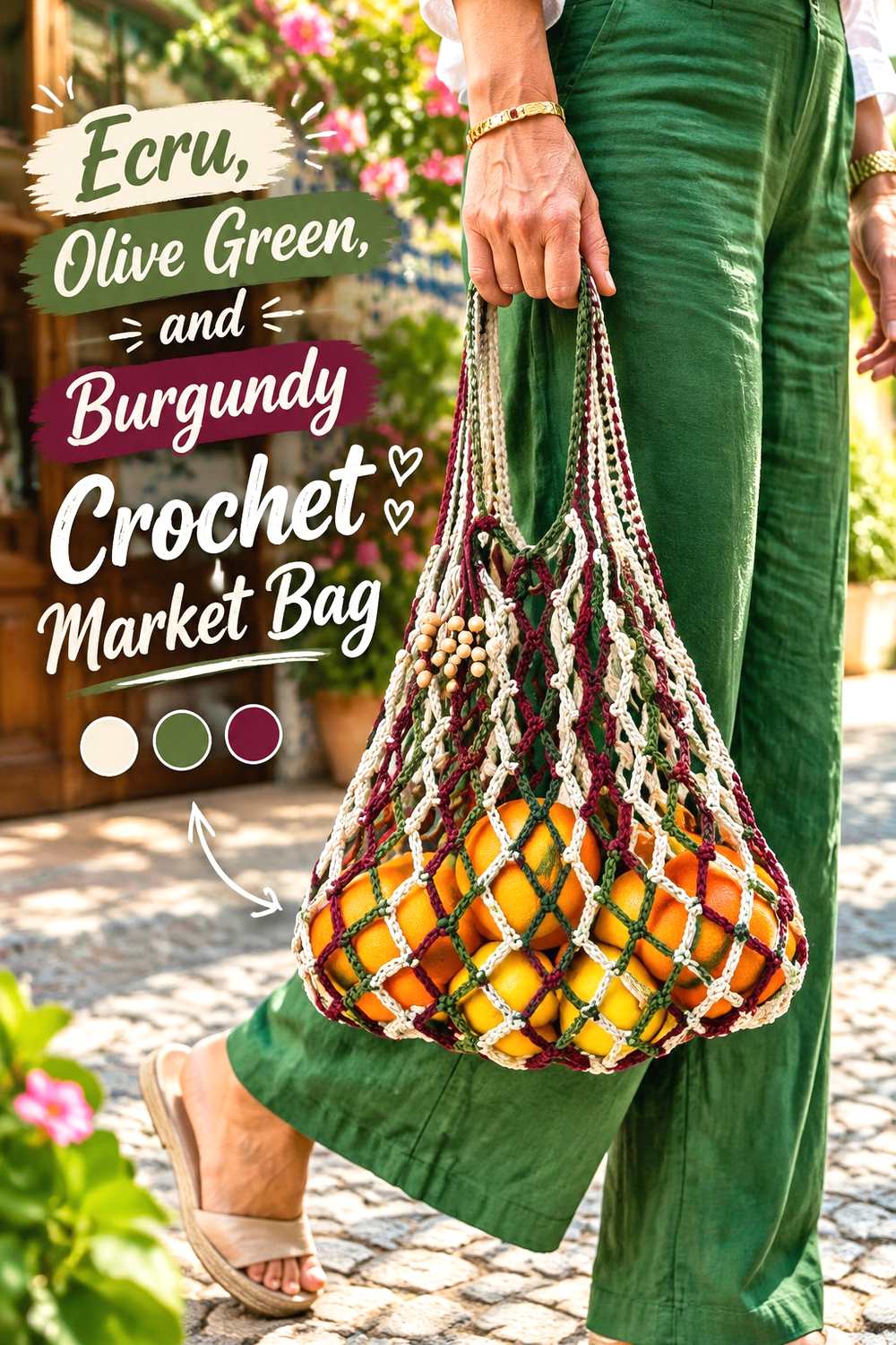
Openwork market bags expose the background through the fabric, so narrow dark color changes can look different depending on what is inside the bag. Ecru gives the design a lighter foundation, while olive green and burgundy can define the body, handles, and repeated openwork sections.
Ecru Keeps Olive Green and Burgundy Crochet Openwork Easy to See
Use ecru in a substantial section rather than only a tiny accent if you want the mesh structure to remain visually light. It can separate burgundy from olive green and prevent the body from appearing too dense.
Because open spaces show the contents behind them, assess the colors on an empty bag as well as with a neutral lining or object behind the fabric before finalizing the distribution.
Burgundy Handles Can Give an Olive Green Crochet Market Bag a Clear Finish
An olive-led body with burgundy handles creates an obvious structural division. Repeating burgundy in one lower stripe or narrow border can connect the handles to the rest of the bag.
If the handles already create enough contrast, keep additional burgundy restrained. Too many unrelated bands can compete with the openwork pattern.
Creator Credit: Home Handwork Diy
15. Cocoa Olive Green And Burgundy Crochet Chunky Cowl
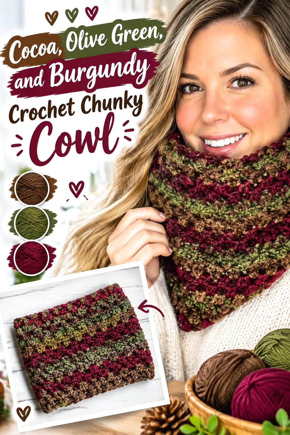
Cocoa creates the most tonal, low-contrast direction in this collection. All three shades can be deep and muted, making this combination useful when you want color changes that appear more blended than graphic. Chunky texture gives the palette additional definition through shadows and raised stitches.
Cocoa Makes Olive Green and Burgundy Crochet Feel Darker and More Tonal
Use cocoa as the connecting neutral between olive green and burgundy rather than expecting it to separate them strongly. Broad blocks are more effective here than thin stripes because each dark shade needs enough area to establish its hue.
If the cowl begins to look uniformly dark, enlarge the olive section or choose a somewhat lighter cocoa. You can increase clarity without introducing a pale neutral.
Burgundy Needs Clear Placement Beside Olive Green on a Chunky Crochet Cowl
Chunky stitches can create strong shadows, which may make already-dark yarns look even closer in value. Place burgundy in one or two substantial bands instead of scattering many narrow burgundy lines through the olive.
Check the cowl folded and doubled around the neck. Since different bands may overlap when worn, the flat color sequence does not always represent the final visual balance.
Creator Credit: Pretty Darn Adorable Crochet Tutorials
Choosing Between These Olive Green and Burgundy Crochet Combinations
For the strongest contrast, the cream, ivory, oatmeal, stone, and ecru combinations give olive green and burgundy clear visual separation. They are especially useful for granny squares, openwork, borders, and other areas where individual crochet details need to remain easy to see.
Dusty blush, dusty rose, camel, taupe, and muted gold create gentler transitions. These palettes suit projects where you want olive and burgundy to remain rich without surrounding them with a very pale neutral.
Rust, plum, charcoal, and cocoa produce darker palettes. In those combinations, placement becomes more important because the supporting color may not create much value contrast. Broader color blocks, consistent edging, and clearly assigned dominant and accent roles help prevent the shades from visually collapsing together.
Conclusion
Olive green and burgundy can move in several different directions without losing their earthy, deep-colored character. Add cream, ivory, or ecru when motif definition and strong separation matter. Choose camel, dusty rose, or taupe for a softer transition. Use plum, charcoal, rust, or cocoa when you prefer a darker, more blended palette.
The most useful decision is not simply which third color to add, but where each shade belongs on the crochet item. Blankets can support repeated motif systems and borders, while cardigans need balanced panels, cuffs, and edging. Bags benefit from planned joins and straps, and scarves or cowls need color blocks that still work once the fabric is folded or wrapped.
Use the linked creator tutorials for the exact construction details, then treat the palettes here as independent color-planning directions for your own project.
Frequently Asked Questions
Do olive green and burgundy have enough contrast for crochet?
They can, but it depends on the specific yarn shades. Hue contrast and light-dark value are different things. A deep olive and deep burgundy may look clearly different in color while appearing surprisingly similar in grayscale. If small motifs or stitch details need definition, test the yarns together before committing.
What neutral works well with olive green and burgundy crochet?
Cream, oatmeal, ivory, stone, ecru, camel, and taupe can all work, but they create different levels of contrast. A light cream or ivory gives stronger separation, while camel or taupe creates a softer transition. Choose according to the visual role you need rather than treating every neutral as interchangeable.
Should olive green or burgundy be the dominant crochet color?
Either can lead. Olive green creates an earthier green-led project, while burgundy produces a deeper red-led result. On wearables and bags, decide which color will cover the largest structural areas first, then place the second shade consistently at cuffs, borders, motifs, straps, or other repeated details.
How can I keep olive green and burgundy crochet motifs from looking muddy?
Increase separation between the colors. A light neutral round, contrasting joining color, wider color block, or clearer dominant-accent hierarchy can help. Also check whether the two yarns are close in value; switching one to a lighter or darker version may solve the problem without changing the overall palette.
Can olive green and burgundy work in the same crochet stripe pattern?
Yes. Wider stripes usually make the two colors easier to distinguish when both are dark. If narrow alternating stripes look visually crowded, place a lighter neutral between some of the sections or let one of the core colors appear more frequently than the other.
What should I preserve when substituting an olive green or burgundy yarn?
Preserve the role the color plays in the palette. If olive green is the muted dominant color, choose another muted green with similar lightness. If burgundy provides the darkest accent, select a replacement that remains darker than the surrounding shades. Matching the relationship between the colors matters more than finding an exact shade name.