
11 Persimmon and Cream Crochet Sock Cuff Topper Ideas
Persimmon and cream make a useful two-color combination for crochet sock cuff toppers because the colors can stay clearly distinct even across a relatively small accessory. Persimmon brings a warm, concentrated accent, while cream can open up textured stitches and keep the upper edge from looking visually heavy.
Color placement matters more on a sock cuff topper than on a larger wearable. There may only be a few visible inches of crochet above the sock or boot line, so a single cream scalloped edge, persimmon ribbed band, or contrasting textured section can determine the entire look.
The supporting tutorials below focus on crochet boot cuffs and boot toppers, which provide closely related cuff constructions that can inform this sock-top concept. Use each tutorial for its original construction and sizing approach, while treating the persimmon-and-cream arrangements here as independent color adaptations.
Quick List
- Persimmon Crochet Sock Cuff Topper With Cream Scalloped Edge
- Cream Crochet Sock Cuff Topper With Persimmon Ribbing
- Persimmon And Cream Striped Crochet Sock Cuff Topper
- Cream Crochet Sock Cuff Topper With Persimmon Picot Edge
- Persimmon Crochet Sock Cuff Topper With Cream Button Band
- Cream Crochet Sock Cuff Topper With Persimmon Textured Center
- Persimmon Crochet Sock Cuff Topper With Cream Ribbed Top
- Persimmon And Cream Reversible Crochet Sock Cuff Topper
- Cream Crochet Chunky Sock Cuff Topper With Persimmon Accent Band
- Persimmon Crochet C2c Sock Cuff Topper With Cream Border
- Cream Crochet Puff Texture Sock Cuff Topper With Persimmon Edging
Decide Whether Persimmon or Cream Should Lead the Sock Cuff
Start by choosing which color should occupy the greatest visible area. A persimmon-dominant topper creates a warmer, stronger block of color above the sock or boot, while a cream-dominant version feels lighter and makes even a narrow persimmon detail noticeable.
On such a compact accessory, a roughly equal split can create a much more graphic result. That works well for stripes or reversible cuffs, but it may compete with detailed stitches such as scallops, puff texture, or deep ribbing.
Also think about what will actually remain visible when the cuff is worn. If only the upper portion peeks above a boot, concentrate the most important color feature there rather than placing it lower where footwear may hide it.
Use Cream to Keep Persimmon Crochet Texture Easy to Read
Persimmon can carry ribbing, puff stitches, shells, and other textured details, but closely packed texture creates its own shadows. A cream edge or neighboring band can provide a lighter visual break and help define where the textured section starts and stops.
Cream can also be used inside smaller motifs or decorative borders. When the topper is mostly persimmon, even a narrow cream repeat can make those details more noticeable without turning the project into an equal two-color design.
If the cream becomes too dominant, reverse the hierarchy by returning to persimmon at the top edge or another structural band.
Check Persimmon and Cream Placement as a Pair
Sock cuff toppers are normally seen as a pair, so evaluate both pieces together before finishing every color detail. A strong persimmon feature on one cuff should normally sit in the corresponding position on the other unless intentional asymmetry is part of the design.
This is particularly important with stripes, button areas, picot edging, and texture bands. Small placement differences can be more obvious on two compact accessories worn side by side than on a large garment.
1. Persimmon Crochet Sock Cuff Topper With Cream Scalloped Edge
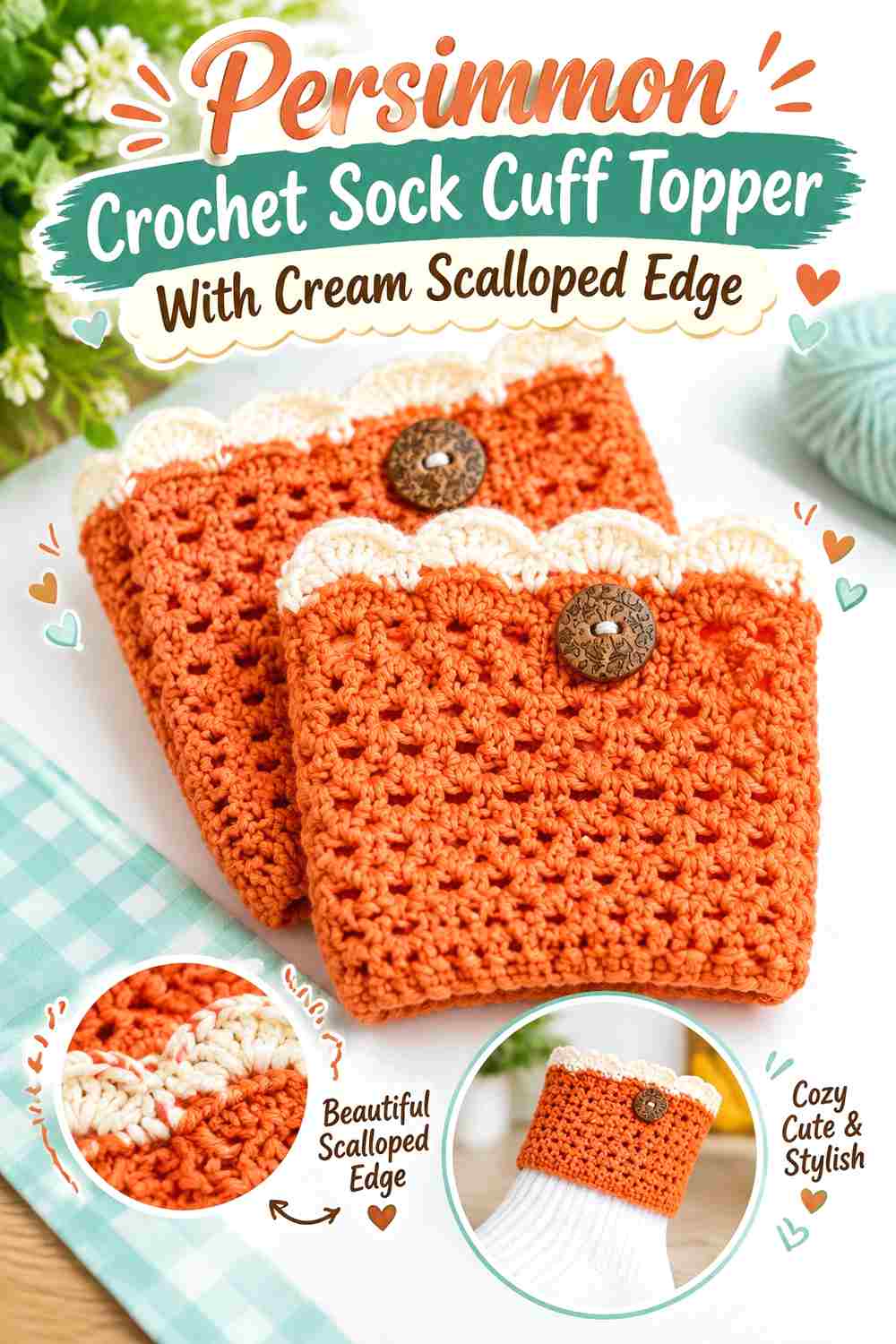
Let persimmon cover the main cuff and reserve cream for a scalloped upper edge. This keeps the topper warm and color-rich while the pale border creates a distinct finish where the crochet meets the leg or sock.
Scallops already introduce a shaped outline, so the cream color does not need to occupy much additional space. The contrast comes from both the lighter value and the change in edge shape.
Cream Scallops Should Stay Clear Against the Persimmon Cuff
Keep the cream concentrated in the decorative edge instead of repeating it immediately underneath in several additional bands. A solid persimmon section beneath the scallops gives each rounded cream detail a cleaner background.
If the scallops are small, check the cuff from normal standing distance. Cream should remain visible as an edge rather than disappearing into the texture.
Persimmon Can Carry the Sock Cuff Ribbing Below the Cream Edge
Using persimmon through the fitted or ribbed portion creates one continuous warm-color base beneath the lighter decoration.
This also prevents the cuff from becoming visually divided into too many narrow horizontal sections, which can make a short topper appear busier than intended.
Creator Credit: iKNITS
2. Cream Crochet Sock Cuff Topper With Persimmon Ribbing
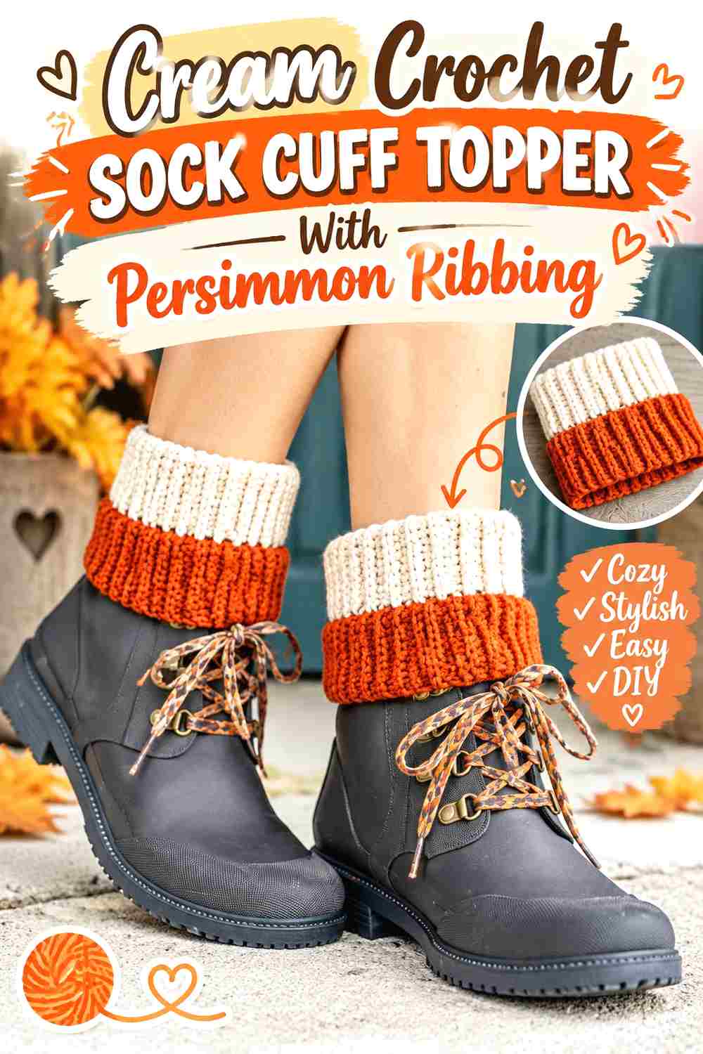
Reverse the balance by using cream across the main visible surface and persimmon through a defined ribbed section. The stronger color can sit at the upper band where the cuff needs a clear visual stopping point.
This is a useful direction when you want the accessory to remain mostly light but still show the persimmon color prominently.
Persimmon Ribbing Gives the Cream Sock Cuff a Strong Top Edge
Keep the persimmon ribbing continuous rather than interrupting it with several cream stripes. The uninterrupted band helps the cuff look finished and gives the warm color a clear structural role.
Because ribbing creates its own vertical shadows, check that your chosen persimmon does not become so dark in texture that the stitch definition disappears.
Cream Should Remain Broad Below the Persimmon Ribbing
Leave enough cream visible beneath the upper band for the two-color hierarchy to remain obvious.
If the cream area is reduced to a very narrow strip, the project will read as a persimmon cuff with cream trim instead of a cream-dominant topper.
Creator Credit: Yay For Yarn
3. Persimmon And Cream Striped Crochet Sock Cuff Topper
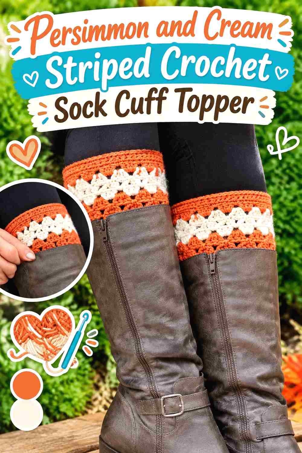
Use horizontal stripes when you want both colors to have repeated presence. Persimmon can form the wider bands, with narrower cream stripes acting as separators, or the proportions can be reversed for a lighter topper.
The key is controlling the number of changes. A short cuff can become visually fragmented if every small row switches color.
Persimmon Stripes Should Establish the Main Sock Cuff Rhythm
Choose a repeat that gives persimmon a predictable role instead of changing stripe widths randomly around the cuff.
Wider persimmon bands separated by narrower cream lines maintain warmth while keeping the individual stripes easy to distinguish.
Cream Stripes Can Separate Persimmon Texture Without Taking Over
Cream works especially well between two persimmon textured sections because the light line gives the eye a brief break.
Keep those separator stripes relatively consistent so they read as part of one planned color system.
Persimmon and Cream Stripes Should Match Across Both Sock Cuffs
Lay the first completed topper beside the second while working the stripe arrangement. Matching the visible order matters more than reproducing hidden sections that will sit inside a boot.
Concentrate accuracy on the part that will actually show above the footwear.
Creator Credit: Winding Road Crochet
4. Cream Crochet Sock Cuff Topper With Persimmon Picot Edge
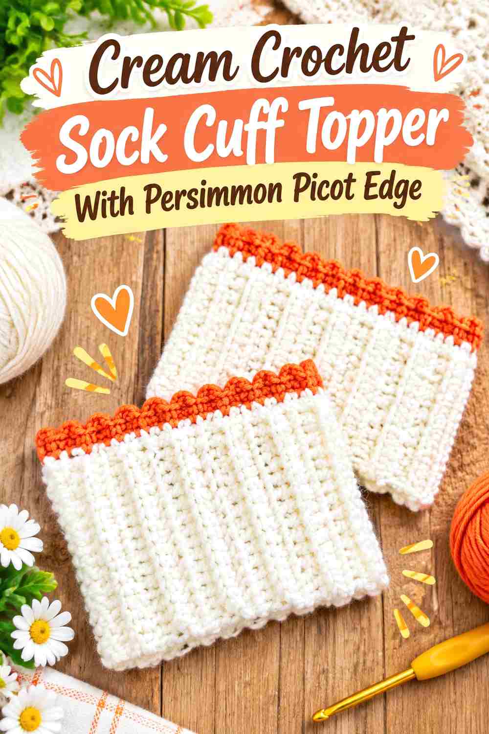
A cream cuff with a narrow persimmon picot finish gives the accent color a very small but recognizable role. This is one of the quieter ways to use the palette because the darker warm shade appears mainly in the silhouette of the upper edge.
It suits a topper where the cream fabric or ribbing should remain the primary visual feature.
Persimmon Picots Need Enough Contrast Against the Cream Cuff
A small decorative point depends on clear color separation. Compare the persimmon directly against the cream before finishing both cuffs.
If the colors are too close in value, the picot shape may still show through texture, but its two-color effect will be weaker.
Cream Should Stay Simple Beneath the Persimmon Picot Edge
Avoid adding several extra persimmon motifs immediately below the decorative top if you want the picot line to remain the primary accent.
A relatively uninterrupted cream field makes the shaped persimmon edge easier to notice.
Creator Credit: Sewrella
5. Persimmon Crochet Sock Cuff Topper With Cream Button Band
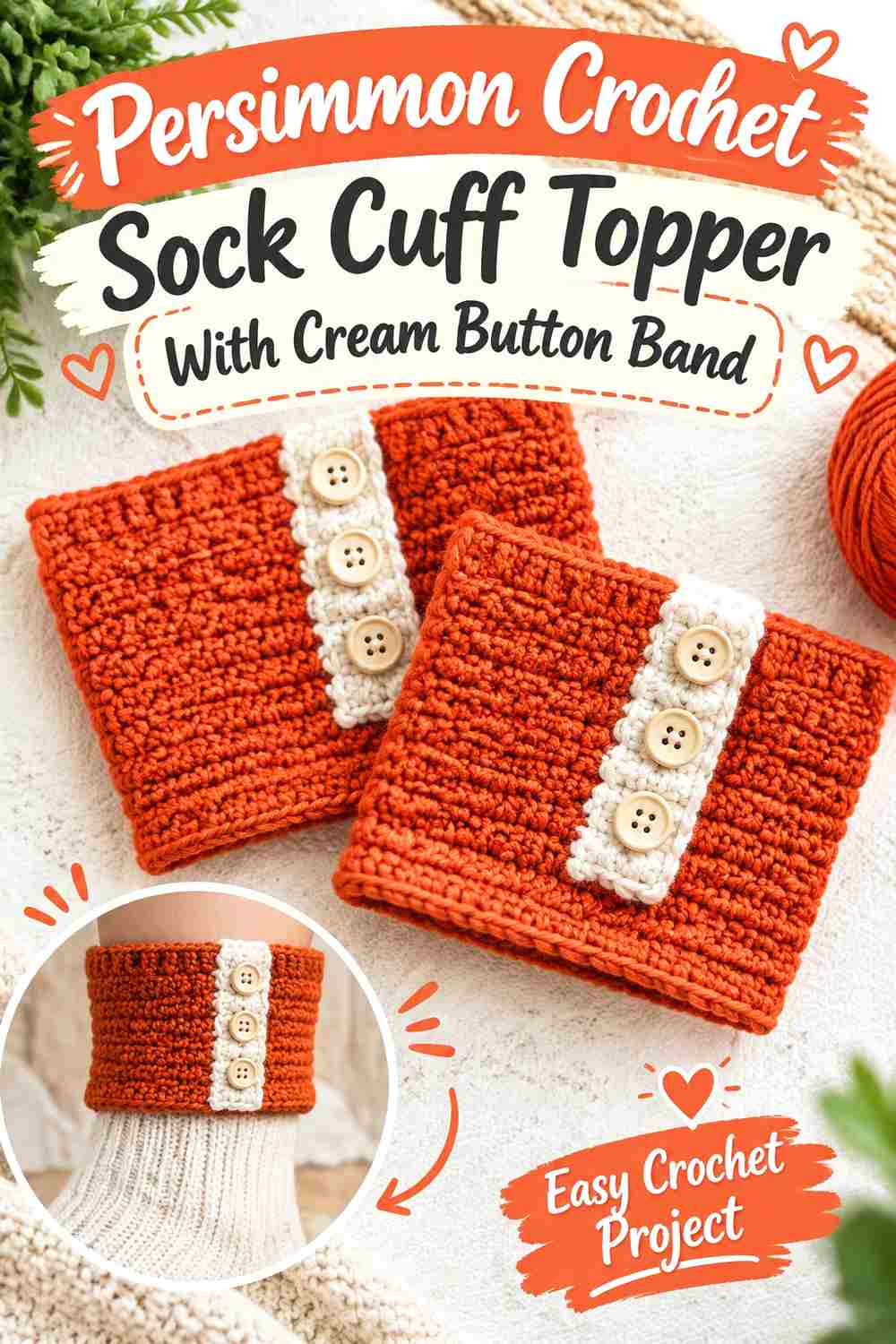
Make persimmon the main cuff color and introduce cream through a narrow button or overlap area. This moves the light accent to one vertical section instead of circling the entire cuff.
The resulting design feels different from a striped topper because most of the accessory remains one continuous persimmon field.
Cream Can Identify the Persimmon Button Area
Use cream around the closure or decorative button zone so that section has a clear visual purpose.
Keep the cream band narrow enough that it still reads as a feature on the persimmon cuff rather than dividing the topper into two equal color blocks.
Persimmon Should Remain Continuous Around the Rest of the Sock Cuff
Let the warm main color wrap around most of the leg. That uninterrupted area balances the concentrated cream detail on the front or side.
If you repeat cream elsewhere, one small edge detail is usually enough to connect the palette.
Creator Credit: Rainbow Warrior
6. Cream Crochet Sock Cuff Topper With Persimmon Textured Center
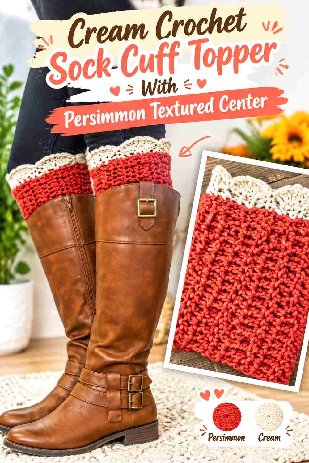
Instead of placing persimmon at an edge, use it inside the cuff’s central textured section. Cream can frame that feature above and below, giving the warm color a concentrated middle position.
This placement works particularly well when the topper has an obvious decorative stitch zone between simpler bands.
Persimmon Texture Should Stay Centered Between Cream Sections
Keep the persimmon band aligned consistently around the cuff. An uneven transition can make a deliberate texture feature look like an accidental color change.
If the stitch pattern itself has strong relief, use a solid persimmon area rather than additional narrow stripes inside it.
Cream Bands Can Give Persimmon Texture More Separation
A light band above and below the persimmon section creates clear boundaries around the texture.
This is useful when the cuff is short because each section has an immediately understandable role: cream frame, persimmon feature, cream frame.
Creator Credit: DIY FROM HOME CROCHET
7. Persimmon Crochet Sock Cuff Topper With Cream Ribbed Top

Use persimmon throughout the decorative body while cream forms the fitted ribbed upper section. Compared with Idea 2, the color hierarchy is reversed: here the cream ribbing is a secondary structural feature rather than the dominant field.
The pale upper band can also separate the warmer topper from similarly colored socks or clothing.
Cream Ribbing Can Finish a Persimmon Sock Cuff Without Extra Decoration
Allow the ribbing itself to provide the texture rather than adding another contrasting scallop or motif on top.
A clean cream band gives the persimmon body a defined stopping point while keeping the small accessory from becoming overloaded with details.
Persimmon Should Carry the Main Crochet Texture Below the Cream Band
Whether the lower area is smooth, clustered, or lightly textured, keeping it consistently persimmon preserves the dominant color.
If cream appears again, use it sparingly at the opposite edge so the upper ribbing remains the clearest pale section.
Creator Credit: Melanie Ham
8. Persimmon And Cream Reversible Crochet Sock Cuff Topper

A reversible construction gives the two colors a different opportunity: one surface or wearing direction can emphasize persimmon, while the other gives cream greater visual presence.
That makes this option useful when you want one pair of toppers to coordinate differently depending on the socks, boots, or outfit underneath.
Persimmon Should Have a Clear Role on One Reversible Sock Cuff Side
Avoid making both sides look almost identical in color balance. Let one orientation show noticeably more persimmon so turning the cuff changes more than a tiny detail.
That difference is what makes a reversible palette worthwhile rather than merely technical.
Cream Can Lead the Alternate Persimmon Sock Cuff View
On the second visible side, allow cream to occupy the larger field while persimmon becomes the border or texture accent.
Check both orientations before finishing the pair to make sure neither side has awkward color transitions at the fold or edge.
Persimmon and Cream Reversible Cuffs Need Matching Fold Placement
If part of the cuff is folded to reveal the alternate color treatment, make the fold depth consistent across the pair.
Different fold heights can expose unequal amounts of persimmon and cream even when the crochet itself matches.
Creator Credit: B.Hooked Crochet
9. Cream Crochet Chunky Sock Cuff Topper With Persimmon Accent Band

Chunkier texture gives each color more visual weight, so cream can be useful as the broad main surface while persimmon remains confined to one strong accent band.
This prevents a compact topper from becoming visually heavy through both dense texture and a dark warm color occupying the entire piece.
Persimmon Needs Less Surface Area on a Chunky Cream Sock Cuff
A relatively narrow persimmon band can have considerable impact when the stitches themselves are large and prominent.
Before widening the accent, look at the cuff from normal viewing distance. You may need less persimmon than you would on a finer crochet fabric.
Cream Can Keep Chunky Persimmon Details Visually Open
Use cream around the persimmon feature to create light space above and below it.
This helps separate the color bands and stops a chunky topper from looking like one dense block around the leg.
Creator Credit: Fuad Azmat / YARNutopia by Nadia
10. Persimmon Crochet C2c Sock Cuff Topper With Cream Border

A corner-to-corner-inspired texture introduces diagonal movement rather than simple horizontal ribbing. Keeping that textured field persimmon and adding cream around its outer edge lets the color scheme reinforce the distinction between center fabric and finishing.
The diagonal texture gives this idea a more geometric direction than scalloped, puffed, or conventionally ribbed cuffs.
Cream Can Frame the Persimmon C2C Texture
Use cream at the upper and lower boundaries to stop the diagonal persimmon surface cleanly.
A restrained border works better than inserting cream repeatedly inside every textured block when the goal is to showcase the C2C-style surface.
Persimmon Should Stay Continuous Across the Main C2C Sock Cuff
An uninterrupted persimmon field keeps the diagonal construction easier to read.
If you want a second cream feature, a small side seam or finishing detail can repeat the border without breaking the main texture.
Creator Credit: The Crochet Crowd
11. Cream Crochet Puff Texture Sock Cuff Topper With Persimmon Edging
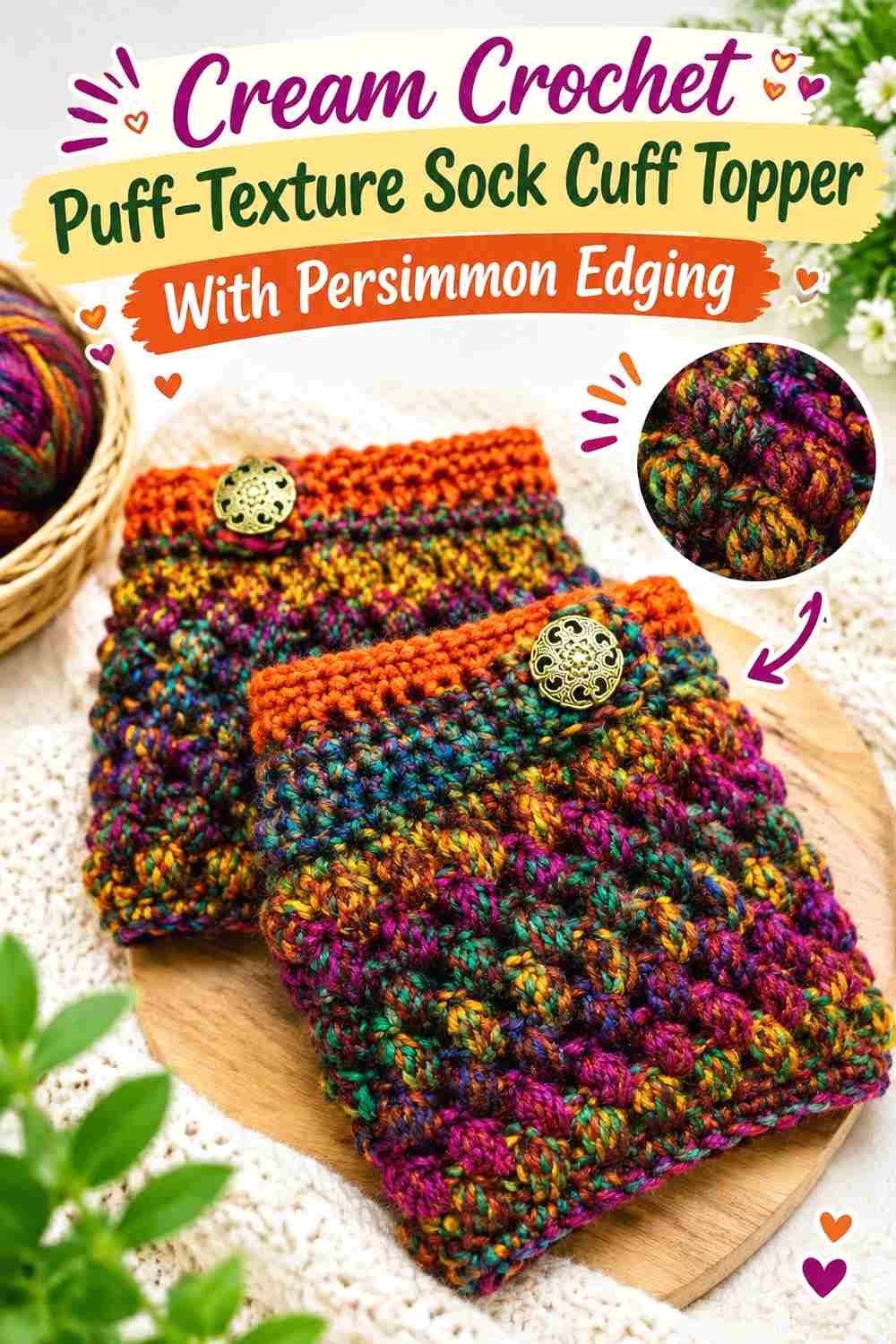
Use cream through the main puffed or raised texture and persimmon around a defined outer edge. The light body makes the shadows around raised stitches easier to notice, while the warmer border gives the topper a strong outline.
This is particularly useful when stitch texture, rather than broad color blocking, should be the central feature.
Cream Lets the Puff Texture Lead the Persimmon Sock Cuff Palette
Keep most raised stitches cream so the texture remains visually connected rather than broken into many color fragments.
The small shadows around the puffs supply their own variation, so they do not necessarily need alternating persimmon centers.
Persimmon Can Define the Cream Puff-Texture Edge
Use persimmon at one prominent boundary, such as the upper edge, or repeat it more subtly at both edges.
If both borders are wide, persimmon may begin to dominate the short cuff despite the cream center, so compare the complete proportions before duplicating the second topper.
Cream and Persimmon Should Remain Balanced Above the Sock Line
Try the cuff with the type of sock or boot you expect to pair with it. Make sure enough of the cream texture remains visible once the lower edge is covered.
If footwear hides most of the cream section, shift the persimmon border upward or reduce its width so the intended two-color relationship can still be seen.
Creator Credit: Bag-O-Day Crochet
Comparing Persimmon and Cream Sock Cuff Topper Color Layouts
For the strongest persimmon-dominant look, choose the scalloped-edge, cream-button-band, cream-ribbed-top, or C2C-border versions. These layouts leave most of the visible cuff warm and saturated while cream performs a clearly limited supporting role.
For a lighter result, start with cream and use persimmon through ribbing, picots, a central texture band, or the outer edge. Because persimmon is the stronger accent in these arrangements, relatively little is needed for the color to remain obvious.
Striped and reversible designs give the two colors the most equal roles. They also require the most careful planning across the pair because the sequence or fold can make one topper appear more persimmon-heavy than the other.
Texture should influence the decision too. Scallops and picots benefit from clear edge contrast, ribbing can carry a solid color cleanly, and puff or chunky stitches often need fewer color changes because the texture already contributes plenty of visual detail.
Conclusion
Persimmon and cream can change a crochet sock cuff topper substantially depending on which color occupies the main band and which one is reserved for finishing. A persimmon cuff with cream scallops creates a warm base with a lighter decorative edge, while a cream cuff with persimmon ribbing puts the stronger color at a structural point.
For a quiet two-color treatment, give one shade most of the surface and confine the second to the border, picot edge, button area, or ribbing. If you want both colors to have more equal influence, striped or reversible layouts provide a clearer split.
Before completing the pair, check how much of each topper will remain visible with the socks or footwear you plan to wear. A well-placed persimmon or cream detail is most useful when it sits above the line where it can actually be seen. Follow the linked creator tutorial for its exact cuff construction and use these palettes as color-placement adaptations.
Frequently Asked Questions
Should persimmon or cream be the main color in a crochet sock cuff topper?
Either can lead. Persimmon creates a warmer and stronger visible band, while cream produces a lighter base that makes small persimmon accents especially noticeable. Choose the dominant color according to how much contrast you want above the sock or boot.
Where should I place cream on a persimmon crochet sock cuff topper?
Cream works well on scallops, ribbing, picot-like finishing, borders, button areas, or narrow separator bands. On a short cuff, one or two cream locations are usually enough to create a clear relationship with the persimmon body.
How can I use persimmon on a mostly cream crochet sock cuff?
Try persimmon at the upper ribbing, around a decorative edge, through one central texture band, or along a button section. Concentrating persimmon in an identifiable feature gives it more impact than scattering tiny changes around the cuff.
Do persimmon and cream stripes work on a short sock cuff topper?
Yes, but keep the stripe plan simple enough for each color to remain readable. Several very narrow alternating stripes can make a short cuff look fragmented. Wider bands or an unequal stripe ratio generally create a clearer hierarchy.
How can I make cream scallops stand out on a persimmon cuff?
Leave a substantial persimmon area directly beneath them rather than adding more cream immediately below. The uninterrupted warm background gives the lighter shaped edge better visual separation.
Should both persimmon and cream sock cuff toppers have identical color placement?
Matching placement creates the most coordinated pair. This is especially noticeable with stripes, buttons, decorative edges, and contrasting texture bands. Deliberate reversed colors can also work, but make the reversal systematic rather than accidental.
What if only part of my persimmon and cream cuff shows above my boots?
Plan the visible area first. Place the main cream or persimmon feature near the top if the lower portion will be hidden. Trying the first cuff with the intended footwear before completing the second can help you judge whether the planned color feature actually remains visible.