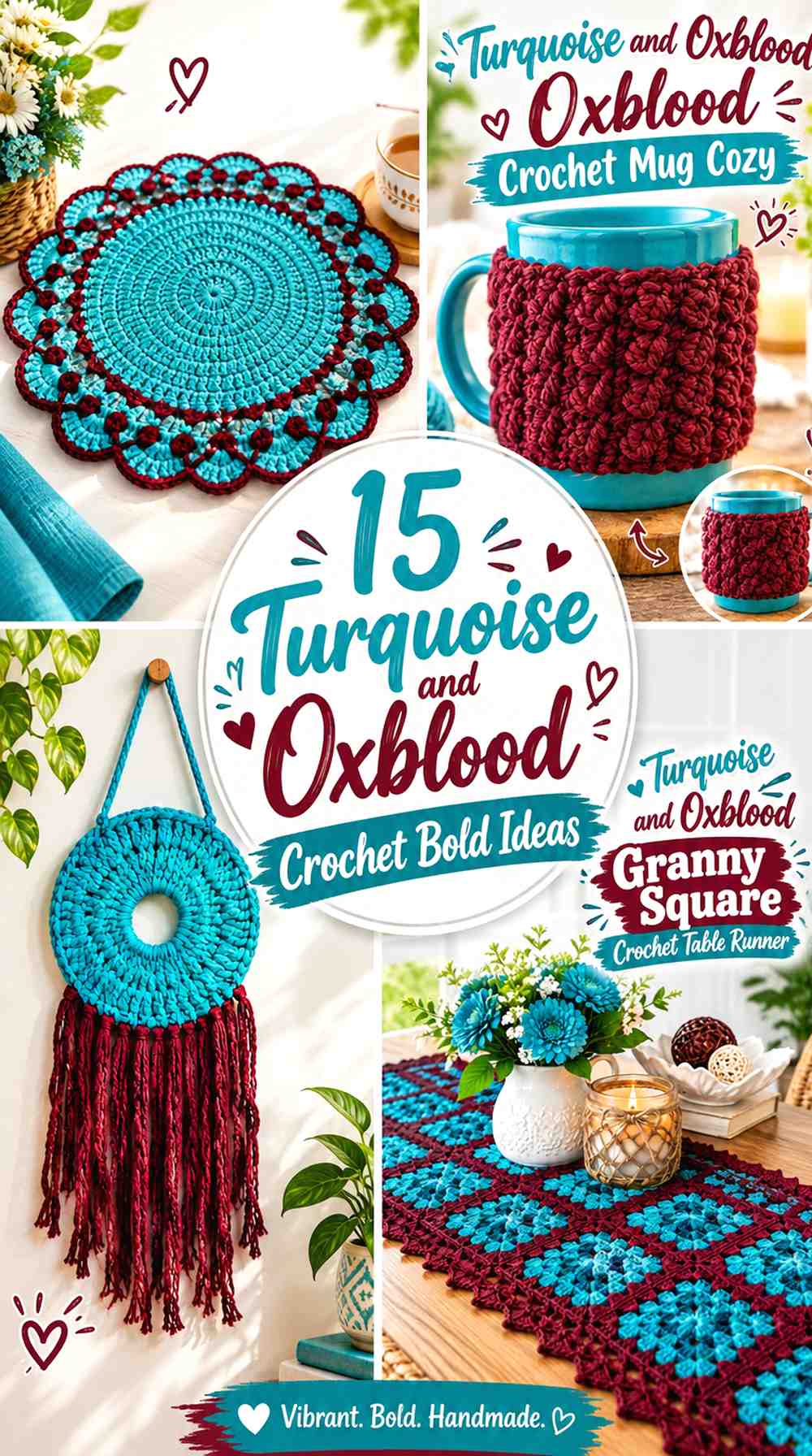
15 Turquoise and Oxblood Crochet Bold Ideas
Turquoise and oxblood make a strong crochet pairing because the colors bring very different visual weights to the same project. Turquoise can create the brighter, more noticeable field, while deep oxblood can supply a darker edge, concentrated block, motif half, or finishing detail.
The important decision is not simply whether to use both colors. It is how much space each color receives. Equal amounts can create a highly graphic two-color project, while a turquoise-dominant layout with smaller oxblood details feels brighter. Reversing that balance makes the finished crochet piece darker and more dramatic.
These 15 ideas apply the palette to different crochet objects so you can see how turquoise and oxblood can work across surfaces, motifs, garment panels, borders, accessories, and home decor.
Quick List
- Turquoise And Oxblood Color Block Crochet Tote Bag
- Turquoise And Oxblood Granny Square Crochet Cardigan
- Turquoise And Oxblood Interlocking Crochet Cushion Cover
- Turquoise And Oxblood Two Color Crochet Circle Scarf
- Turquoise And Oxblood Two Tone Crochet Beanie
- Turquoise And Oxblood Crochet Fingerless Gloves
- Turquoise And Oxblood Color Block Crochet Basket
- Turquoise And Oxblood Half And Half Crochet Granny Square
- Turquoise And Oxblood Two Color Crochet Coasters
- Turquoise And Oxblood Granny Square Crochet Table Runner
- Turquoise And Oxblood Two Color Crochet Cowl
- Turquoise And Oxblood Crochet Wall Hanging
- Turquoise And Oxblood Crochet Bucket Hat
- Turquoise And Oxblood Crochet Mug Cozy
- Turquoise And Oxblood Crochet Placemat
How to Balance Turquoise and Oxblood in Bold Crochet Projects
Before committing to equal amounts of both colors, decide which shade should control the project from a distance. A turquoise-majority tote, pillow, or cardigan will read quite differently from an oxblood-majority version even when exactly the same two colors are used.
For larger crochet surfaces, consider giving one color roughly the visual role of a background and letting the other create blocks, borders, cuffs, joins, or repeated details. On smaller pieces such as coasters and mug cozies, a closer split can work because the limited surface keeps the contrast contained.
Check the yarns beside each other before starting. Hue difference alone does not guarantee strong light-and-dark separation. A quick grayscale photo can help reveal whether your particular turquoise and oxblood yarns remain clearly distinct in value.
Use Turquoise and Oxblood Where Crochet Texture Can Support the Contrast
Color placement becomes more noticeable when it follows the structure of the project. Cardigan cuffs, pillow borders, granny-square halves, basket bands, scarf blocks, and hat brims all give the second color a defined place instead of scattering it randomly.
Texture also matters. If a project has raised stitches or strong geometric sections, placing turquoise and oxblood on opposite sides of those structural changes can make the construction easier to see. When the stitch texture itself is already busy, larger areas of each color may look clearer than frequent narrow changes.
1. Turquoise And Oxblood Color Block Crochet Tote Bag
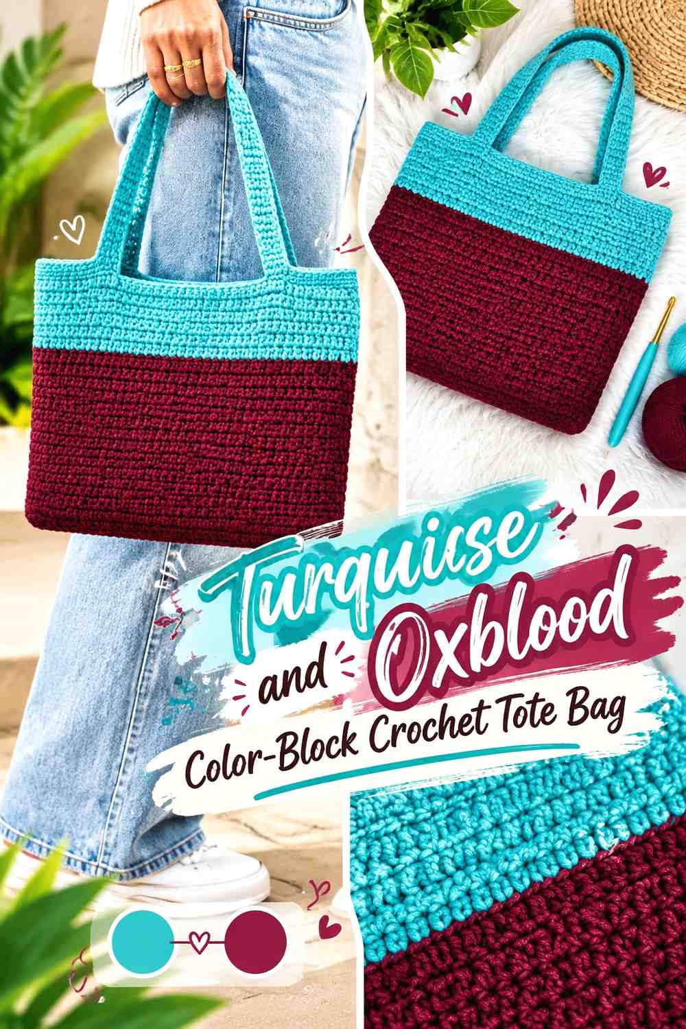
A tote gives this palette enough surface area for large, clean sections. Let turquoise cover most of the bag body if you want the project to stay bright, then place oxblood across the base, upper band, or handles so the darker color visually anchors the structure. Another option is a simple half-and-half arrangement with one large block of each shade.
Let Turquoise Control the Main Crochet Tote Surface
Turquoise works well across the largest uninterrupted section because it gives the tote a clear dominant color. Keeping the main body consistent also prevents the bag from looking fragmented when handles, edging, and seams already introduce additional lines.
If the turquoise and oxblood yarns are close in value, make the color blocks larger rather than relying on narrow stripes. Bigger areas preserve the distinction between the two shades.
Use Oxblood to Define the Crochet Tote Base or Handles
Oxblood can be concentrated where the tote naturally changes structure. A dark lower block creates a clear break before the turquoise body, while oxblood handles repeat the darker color near the top.
Try not to add a completely unrelated third accent unless it has a clear job. The strength of this tote idea comes from letting turquoise and oxblood carry the design themselves.
Creator Credit: Hopeful Turns
2. Turquoise And Oxblood Granny Square Crochet Cardigan
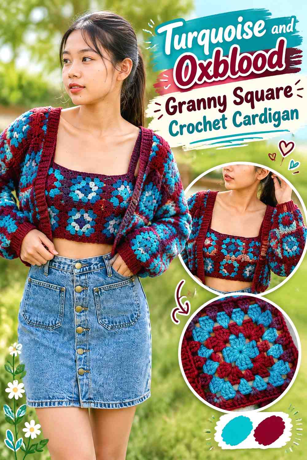
A granny-square cardigan can distribute turquoise and oxblood across separate motifs, making color placement part of the garment layout. Instead of alternating every square mechanically, consider whether turquoise should dominate the body while oxblood appears around cuffs, lower rows, or selected statement squares.
Keep Turquoise Repeated Across the Main Crochet Cardigan Panels
Repeating turquoise through both front panels and the back keeps the garment visually connected. If one side receives substantially more turquoise than the other, check the complete motif layout before joining so the imbalance is intentional.
For a brighter cardigan, turquoise can occupy the larger areas inside most motifs while oxblood appears in later rounds or neighboring squares.
Use Oxblood Around Crochet Cardigan Cuffs and Edging
Cuffs, lower edging, and the neckline are useful places to repeat oxblood because these areas already frame the garment. That lets the darker shade define the silhouette without requiring oxblood to cover half of every motif.
If oxblood becomes visually heavy across the sleeves, increase the turquoise share around the upper body to restore the brighter color as the main focus.
Creator Credit: Chenda DIY
3. Turquoise And Oxblood Interlocking Crochet Cushion Cover
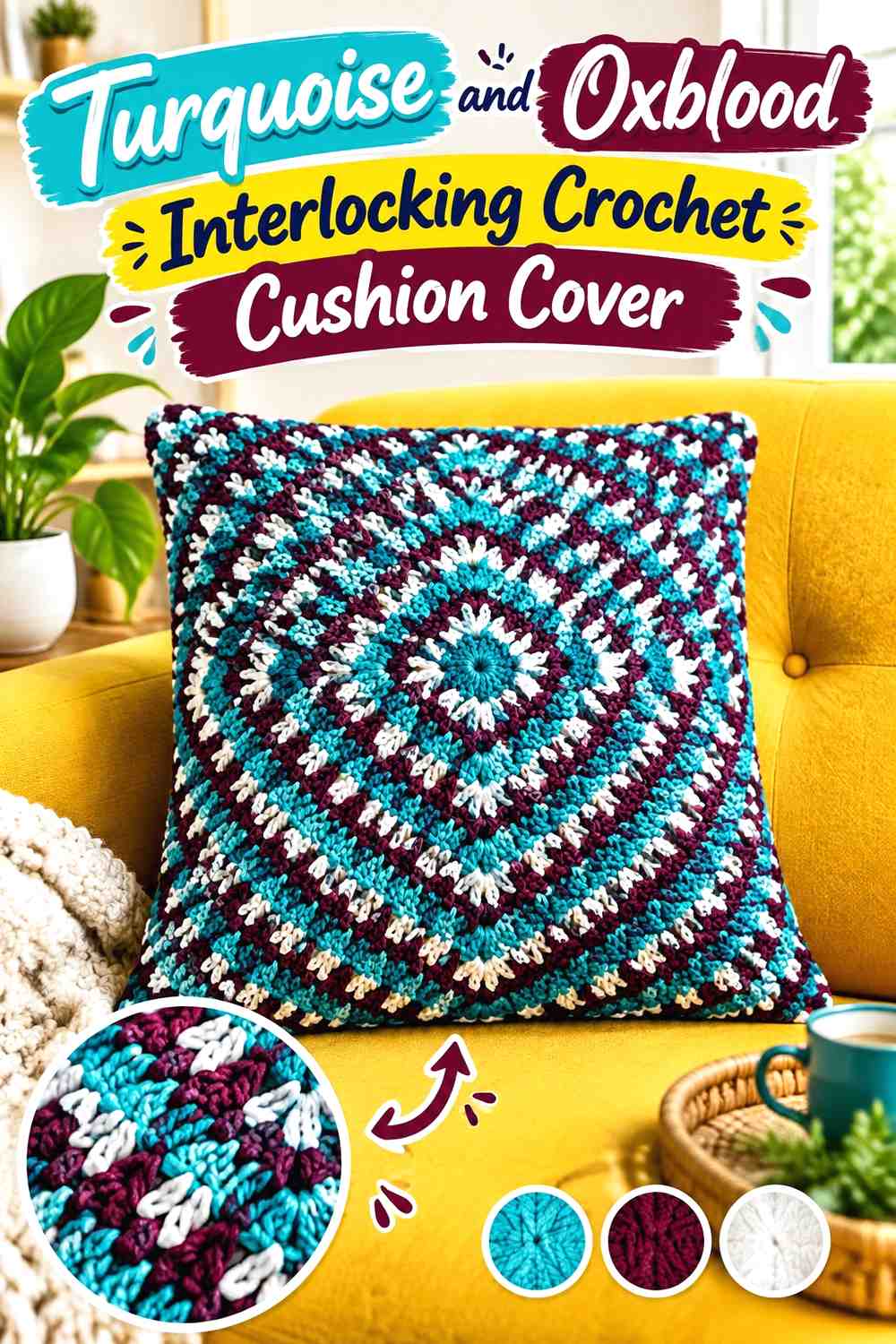
A cushion is ideal for a bold two-color scheme because the front face can display the contrast without other garment or accessory details competing with it. Interlocking or geometric crochet makes the turquoise-and-oxblood relationship especially visible because both shades can repeatedly cross the same surface.
Let Turquoise Open Up the Crochet Cushion Face
Using turquoise as the more frequent color can keep the center of the cushion from becoming overly dark. It is especially useful when the stitch pattern creates strong vertical, diagonal, or interlocking lines.
Before committing, view a small sample from several feet away. If the two shades visually merge, the geometric effect may be less distinct than it appears close up.
Use Oxblood to Strengthen the Crochet Cushion Geometry
Oxblood is useful where you want the pattern lines to appear heavier. It can outline repeated sections, form alternating stripes, or define the outer rounds before the cushion edge.
If the oxblood lines begin to dominate too strongly, reduce their width rather than introducing another color. That keeps the two-color concept clear.
Creator Credit: Blue Star Crochet | Veronika Cromwell
4. Turquoise And Oxblood Two Color Crochet Circle Scarf
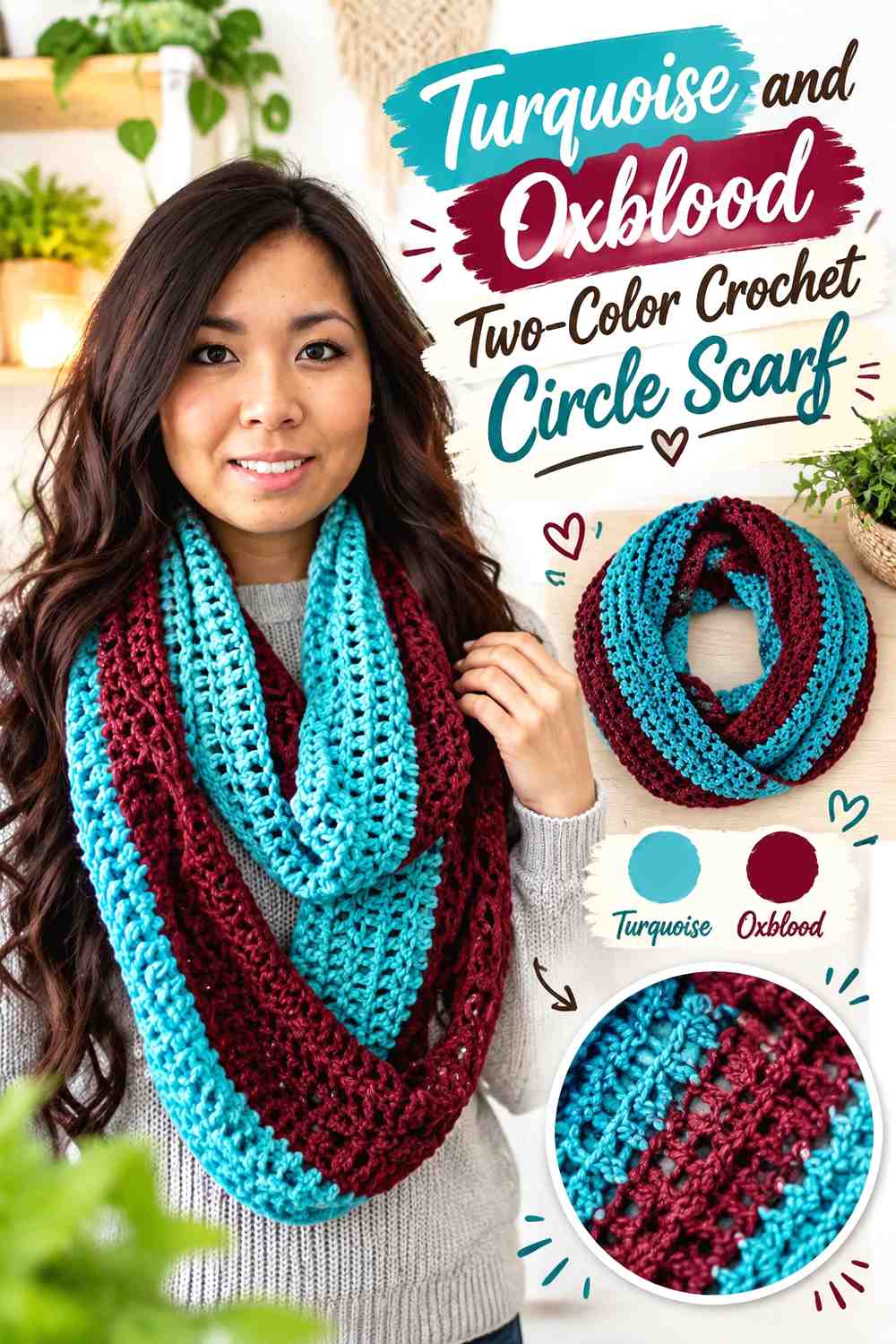
A circle scarf can show the palette as large blocks rather than frequent stripes. One turquoise section and one oxblood section create obvious contrast each time the scarf wraps, while keeping the construction visually simple.
Give Turquoise the Longer Crochet Scarf Color Block
Making turquoise the larger block creates a brighter overall scarf while still leaving enough oxblood to be clearly intentional. Because a circle scarf overlaps when worn, different sections of the two colors will appear together without needing constant color changes.
Check the block placement before finishing so one color does not disappear almost entirely when the scarf is doubled.
Let Oxblood Form a Concentrated Crochet Scarf Accent
A substantial oxblood block usually has more impact than several tiny oxblood stripes in this palette. The darker section becomes a clear focal area and provides separation against turquoise.
For a darker version, simply reverse the hierarchy and allow oxblood to cover the larger share while turquoise becomes the concentrated accent.
Creator Credit: TRACED traceybeauty
5. Turquoise And Oxblood Two Tone Crochet Beanie
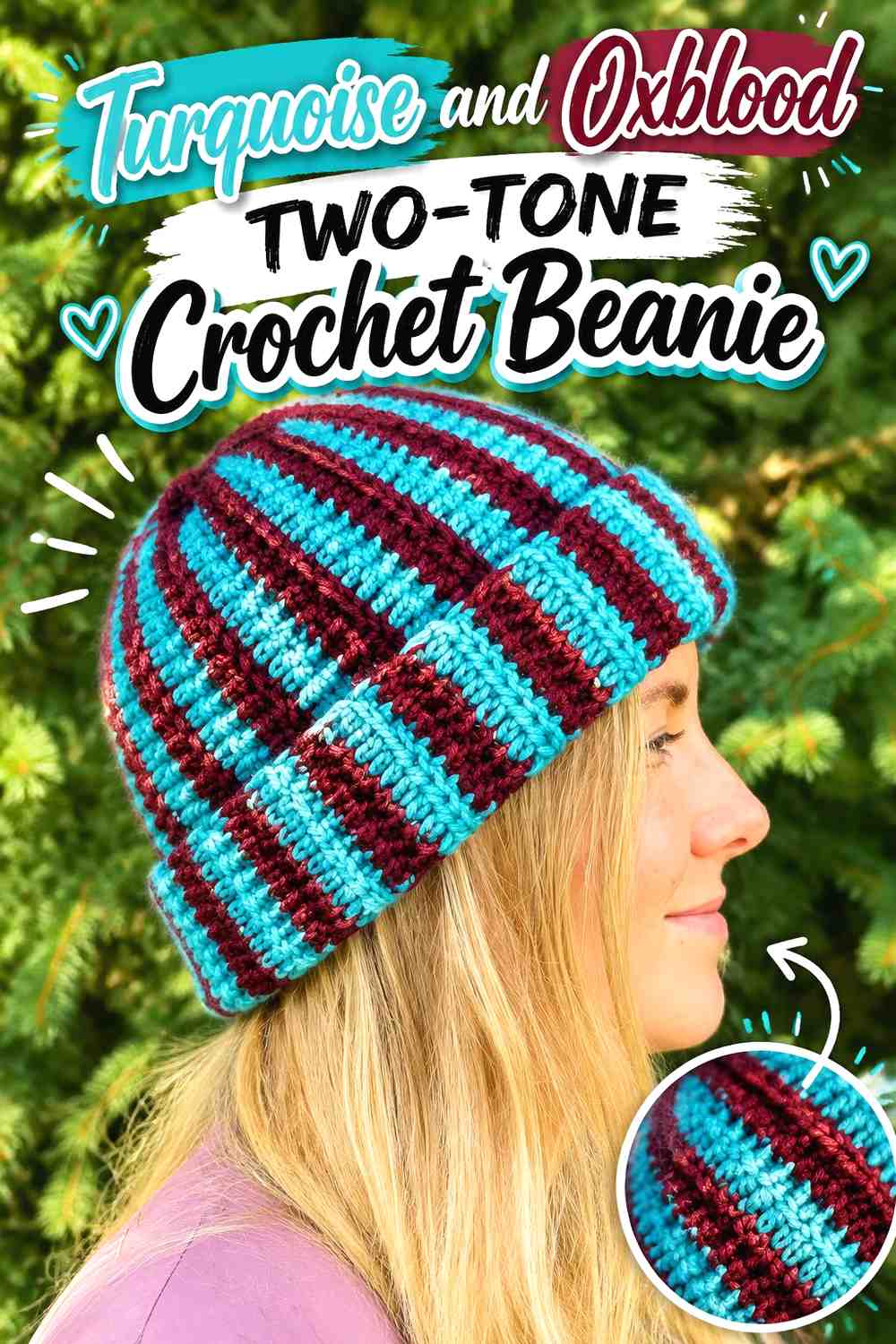
A beanie has less space than a scarf or cardigan, so the color division should be easy to read. Turquoise can cover the crown and upper body while oxblood forms the lower portion, or the two shades can alternate in larger bands.
Keep Turquoise Visible Across the Crochet Beanie Crown
Using turquoise around the upper half helps the brighter shade remain visible from multiple angles. It also prevents a darker oxblood section from occupying nearly the entire hat once the lower edge and any folded area are considered.
Avoid extremely narrow turquoise lines if your goal is a bold two-color result. Wider areas usually show the palette more clearly.
Use Oxblood to Ground the Crochet Beanie Lower Edge
Oxblood works naturally around the lower section because the dark band gives the hat a defined visual base. If the design includes ribbed-looking texture, the deeper color can make that structural change more obvious.
Repeat turquoise above the oxblood band rather than introducing another dark neutral, which could weaken the distinctive two-color pairing.
Creator Credit: lerugi crochets
6. Turquoise And Oxblood Crochet Fingerless Gloves

Fingerless gloves provide two useful color zones: the cuff and the hand. A turquoise hand with an oxblood cuff gives the darker color a functional-looking boundary, while the reverse creates a richer overall accessory with a brighter turquoise finish.
Put Oxblood Around the Crochet Glove Cuffs
Oxblood at the wrist can define the cuff clearly before the turquoise section begins. Keeping the color transition close to a natural construction change makes the palette look planned rather than randomly divided.
For a matching pair, check both cuffs side by side before continuing so the oxblood area remains visually consistent.
Let Turquoise Highlight the Crochet Glove Hand Section
Turquoise across the hand keeps the smaller accessory from feeling too dark and gives textured stitches more visible surface area when your particular yarns have enough value separation.
A tiny oxblood repeat near the upper edge can connect the cuff to the rest of the glove, but it is optional. Avoid adding it if it makes the small surface too busy.
Creator Credit: naztazia
7. Turquoise And Oxblood Color Block Crochet Basket
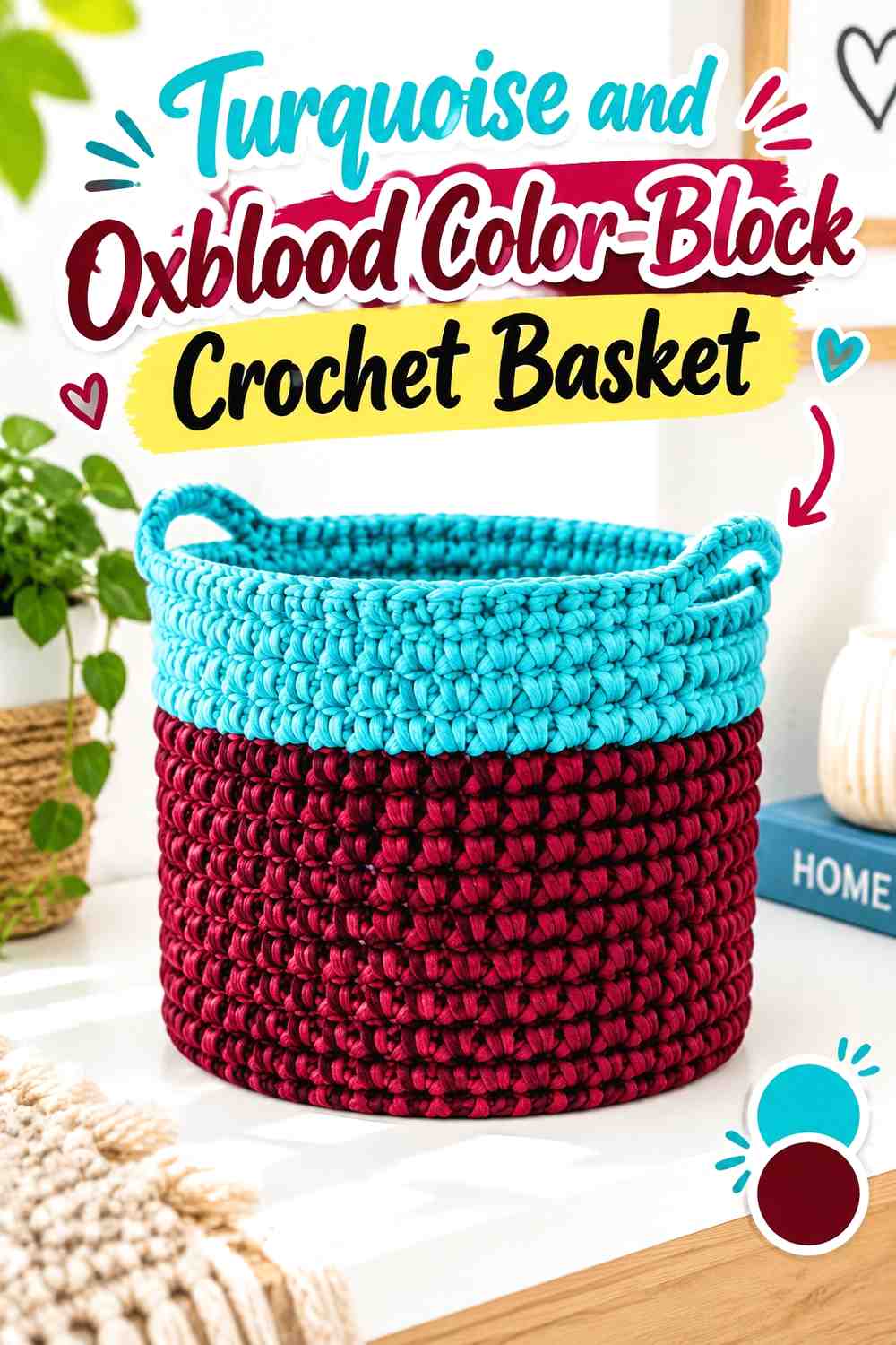
A crochet basket benefits from horizontal color planning because the base and walls already create natural sections. Turquoise can dominate the basket wall while oxblood forms the bottom band, or the darker color can sit across the middle as a single substantial stripe.
Use Turquoise Across Most of the Crochet Basket Wall
A broad turquoise wall keeps the basket visually open and gives you enough uninterrupted area to see the stitch texture. If the basket includes handles, keeping those sections turquoise can make them blend into the main body rather than becoming another focal point.
Place Oxblood Low on the Crochet Basket for Visual Weight
An oxblood base or lower band gives the basket a strong bottom edge. Because the shade is darker, it does not need to cover as much surface as turquoise to be noticeable.
If the basket looks divided exactly in half and that feels too rigid, move the color change lower so turquoise takes the dominant role.
Creator Credit: One Dog Woof
8. Turquoise And Oxblood Half And Half Crochet Granny Square

A half-and-half granny square is one of the clearest ways to use this palette because turquoise and oxblood receive deliberate, equal geometric roles. The motif can stand alone or become part of a larger project where rotating the squares changes the direction of the color movement.
Split Turquoise and Oxblood Clearly Across the Crochet Granny Square
Maintain a distinct division between the two colors if the geometric effect is the main attraction. A muddy transition weakens the half-and-half look, so check your color changes and yarn tension before producing a large batch of motifs.
Rotate Turquoise and Oxblood Crochet Squares Before Joining
Try arranging finished squares in several orientations before joining them. Turquoise can form larger diamonds, diagonals, or repeated corners depending on the rotation, with oxblood automatically creating the opposite shape.
This planning step can create substantial visual variety without adding any third color.
Creator Credit: Nana’s Crafty Home | Tonya Bush
9. Turquoise And Oxblood Two Color Crochet Coasters
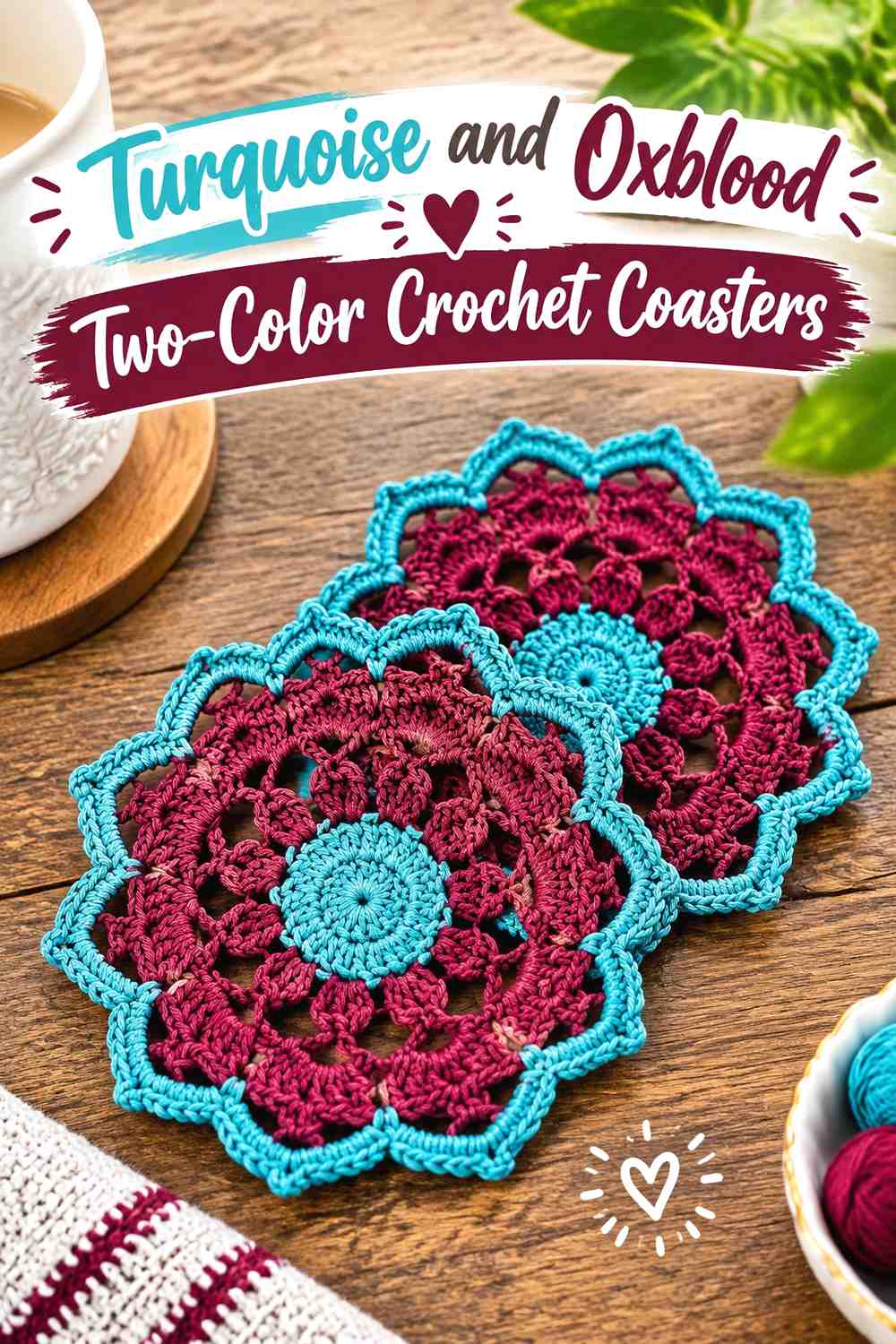
Coasters offer very little visual space, so the palette benefits from one simple hierarchy. A turquoise center with oxblood outer rounds produces a framed look, while an oxblood center surrounded by turquoise gives the darker shade a concentrated focal point.
Keep Turquoise Broad Enough on the Crochet Coaster to Stay Visible
If turquoise is meant to lead, do not confine it to a tiny center that becomes visually lost once the coaster expands. Give it enough rounds or surface area to remain clearly identifiable after the oxblood section is added.
Use Oxblood as a Defined Crochet Coaster Edge
An oxblood outer area can frame turquoise without making the coaster look overly complicated. This works particularly well when the outer rounds already contain decorative stitch changes.
For a coordinated set, keep the same two colors but alternate which one forms the center. The pieces will relate without being identical.
Creator Credit: Kristines Crochets
10. Turquoise And Oxblood Granny Square Crochet Table Runner
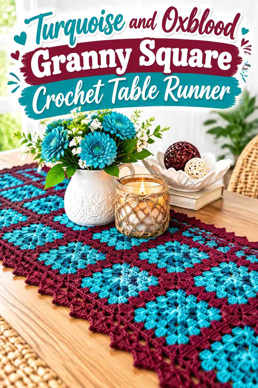
A table runner gives the palette a long horizontal path, so repeated motifs can create rhythm. Turquoise can dominate most squares while oxblood appears in selected centers, joins, or the final border.
Repeat Turquoise Down the Crochet Table Runner
Turquoise should appear consistently from one end of the runner to the other if it is your dominant shade. Large gaps without turquoise can make the runner feel like separate color sections rather than one connected design.
Use Oxblood to Connect the Crochet Table Runner Motifs
Oxblood can work effectively as a repeated joining or border color because it draws a darker line around turquoise motifs. If you instead use it in motif centers, repeat those centers at predictable intervals so the accent does not look accidental.
Place the finished motifs on the table before joining to check how the oxblood repetition reads across the full length.
Creator Credit: Yarn Crafts | EyeLoveKnots | Cre8tion Crochet
11. Turquoise And Oxblood Two Color Crochet Cowl

A cowl can support bolder color division than a small headband because both shades have room to form noticeable sections. Turquoise and oxblood can alternate through broad rounds or occupy separate upper and lower zones.
Let Turquoise Brighten the Upper Crochet Cowl
Keeping turquoise near the upper edge gives the brighter shade a prominent position. If the cowl folds or bunches when worn, make the turquoise section wide enough that it remains visible rather than disappearing into the fold.
Keep Oxblood Substantial in the Crochet Cowl Lower Section
A broad oxblood section creates a strong dark base and gives the palette more depth than a very thin accent stripe. If the two colors feel equally strong, that can be intentional on a two-tone cowl because the shape is compact and repetitive.
Creator Credit: crochetcakes
12. Turquoise And Oxblood Crochet Wall Hanging

A wall hanging allows more decorative freedom because the color placement does not need to account for garment fit or bag structure. Use turquoise across the main crocheted field, then place oxblood around lower sections, decorative bands, or fringe for a concentrated finish.
Make Turquoise the Main Crochet Wall-Hanging Field
A turquoise background gives the wall piece a clear dominant area and provides enough space for openwork or texture to remain visible. If the design contains lace-like openings, compare the turquoise against the wall color where the piece will actually hang.
Concentrate Oxblood Near the Crochet Wall-Hanging Fringe
Oxblood fringe or a lower oxblood section shifts the darkest visual weight toward the bottom. This can create a deliberate finish without breaking the main crochet surface into too many small stripes.
If you use oxblood in the fringe, repeat a smaller amount within the crocheted section so the lower color does not feel detached.
Creator Credit: Cara Martinez
13. Turquoise And Oxblood Crochet Bucket Hat
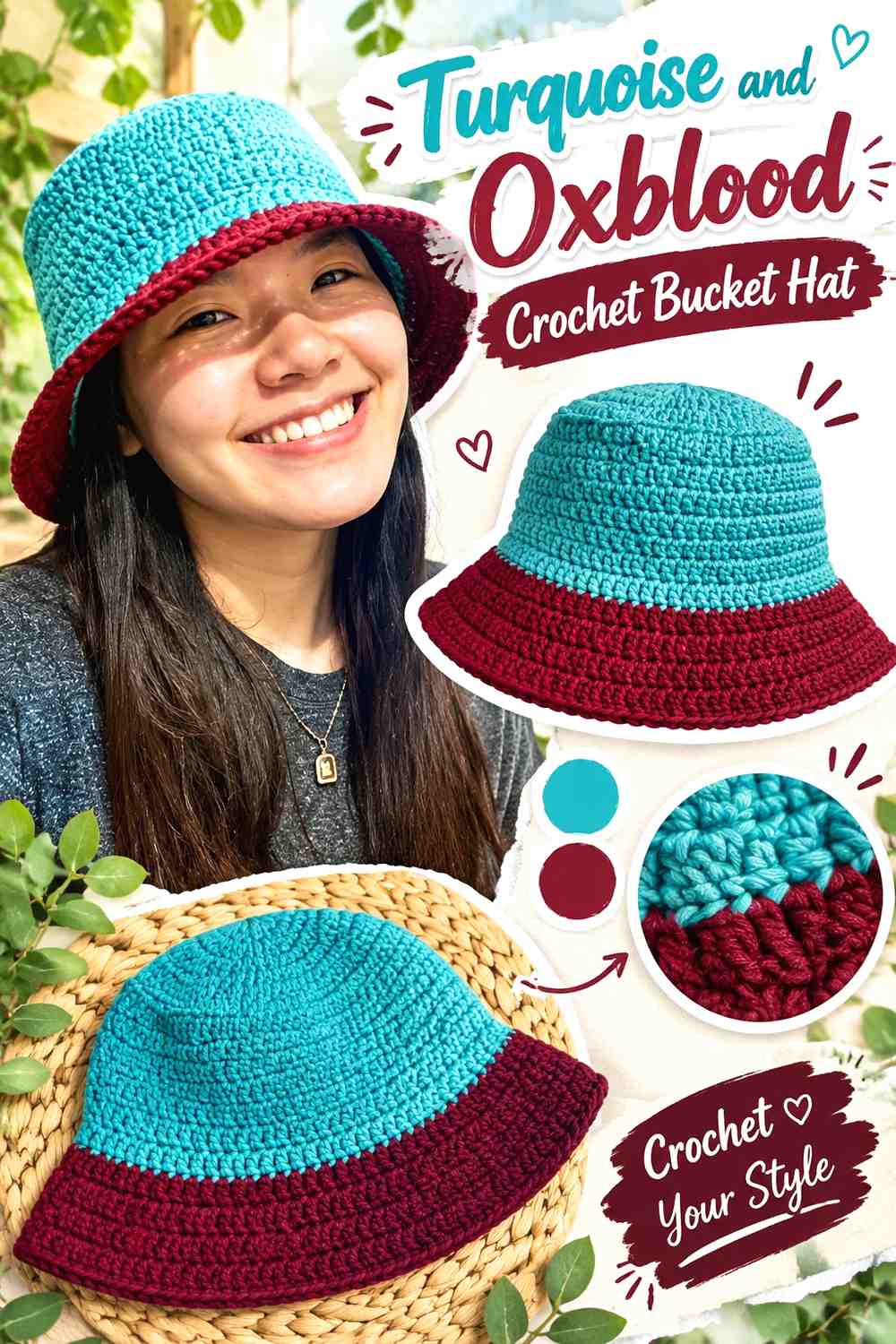
A bucket hat naturally divides into crown, side, and brim, giving you three places to plan the two colors. Turquoise can dominate the crown and sides while oxblood forms a strong brim, or an oxblood crown can be balanced with turquoise around the lower half.
Keep Turquoise Across the Crochet Bucket Hat Crown and Side
Using the same turquoise through the crown and side gives the upper hat one continuous visual field. This keeps the oxblood brim from competing with additional color changes higher up.
If turquoise is especially saturated, a solid block often looks cleaner than several narrow alternating bands.
Make Oxblood the Crochet Bucket Hat Brim Accent
The brim is an obvious place for oxblood because it creates a dark outline around the whole hat. That repeated edge gives the accent more impact than a small isolated stripe would.
Check the hat from the side as well as from above; the balance between turquoise and oxblood changes depending on the viewing angle.
Creator Credit: VivCrochets
14. Turquoise And Oxblood Crochet Mug Cozy
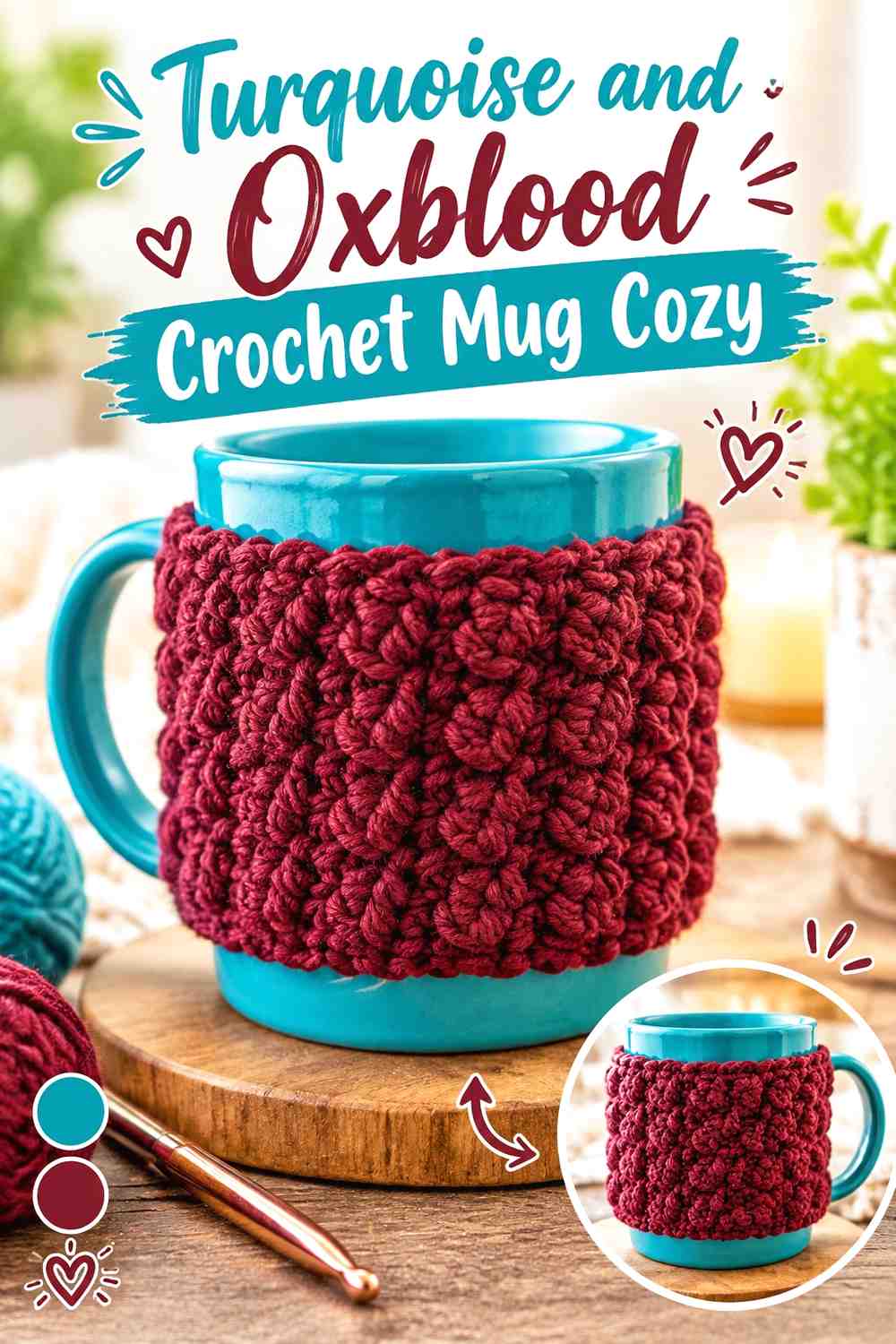
A mug cozy is small enough that the colors need clear jobs. Turquoise can cover most of the wrap while oxblood creates a narrow edge or fastening detail, or the cozy can be split into two larger blocks for a more graphic appearance.
Let Turquoise Lead the Crochet Mug Cozy Surface
A turquoise-majority wrap keeps the main stitch pattern readable instead of breaking it into several tiny color areas. On a small project, even a relatively narrow oxblood section will still be noticeable.
Repeat Oxblood Around a Crochet Mug Cozy Edge
Oxblood edging can frame the turquoise body without consuming much space. If the design includes a closure area, repeating oxblood there can connect the finishing detail to the border.
Keep functional clearance around the mug handle in mind when deciding where a bold color break should sit so the design still looks balanced once wrapped around the mug.
Creator Credit: A. LeLong
15. Turquoise And Oxblood Crochet Placemat
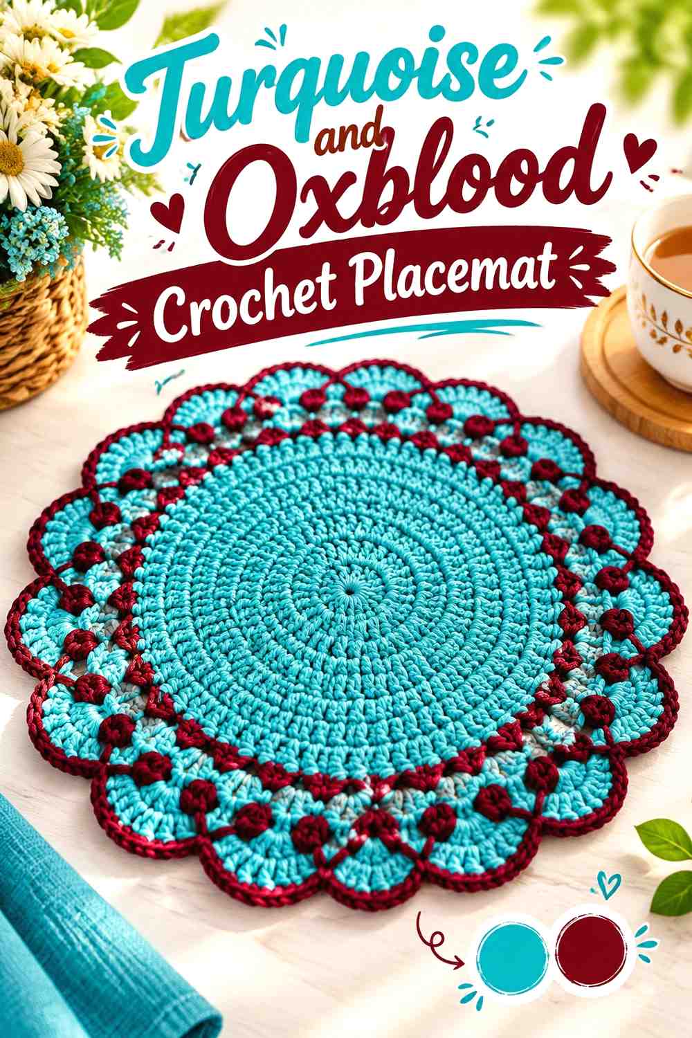
A placemat provides a broad flat surface that can support large blocks or concentric color areas. Turquoise can dominate the center while oxblood defines the outer portion, creating a strong framed effect without requiring complicated multicolor work.
Keep Turquoise Broad Across the Crochet Placemat Center
A generous turquoise center gives the brighter shade enough visual space to remain dominant once plates or tableware partially cover the mat. Very small central accents may disappear during actual use.
If the placemat has decorative texture, compare the yarns under normal room lighting before making a full set because dark oxblood can visually emphasize some areas more strongly than turquoise.
Give Oxblood a Clear Crochet Placemat Border
Using oxblood near the outer edge makes the placemat look deliberately framed. Keep the border proportionate to the center; an extremely wide dark edge may shift the entire project toward an oxblood-dominant palette.
For a coordinated table setting, reverse the colors on a few pieces only if you want deliberate variation. Otherwise, consistent turquoise centers and oxblood edges create the strongest repeated theme.
Creator Credit: Ateliê Isabela Fernanda
Conclusion
Turquoise and oxblood can create several very different crochet directions without changing the two-color palette. For brighter pieces, let turquoise cover the main surface and reserve oxblood for borders, cuffs, handles, brims, or concentrated blocks. For a darker result, reverse those roles and use turquoise as the sharper accent.
Projects with obvious structural divisions—such as bucket hats, baskets, cardigans, totes, and mug cozies—make it easy to assign each shade a clear location. Granny squares, cushion covers, coasters, and table runners are better choices when you want the color contrast itself to become part of a geometric motif.
Before starting a larger project, compare your actual turquoise and oxblood yarns side by side and make a small sample when practical. Shade labels vary, so preserving the intended contrast and color hierarchy matters more than finding one exact version of either color.
Frequently Asked Questions
Should turquoise or oxblood be the dominant crochet color?
Either can lead. Choose turquoise when you want the finished piece to appear brighter overall, and choose oxblood when you want a deeper, darker result. The important part is deciding the hierarchy before distributing the colors across the project.
How can I tell whether turquoise and oxblood have enough contrast?
Place the yarns together under the lighting where the finished project will usually be seen. A grayscale photo can also help reveal whether they have enough light-and-dark separation. Different hues can still appear similar in value.
Where should oxblood go in a turquoise-dominant crochet project?
Oxblood works particularly well in clearly defined areas such as borders, handles, cuffs, joins, brims, motif centers, basket bases, or larger color blocks. Concentrating it in structural areas usually produces a cleaner result than scattering tiny oxblood accents everywhere.
Can turquoise and oxblood be used equally in one crochet project?
Yes. Half-and-half granny squares, two-tone cowls, scarves, and geometric cushions can support an approximately equal split. On more complex objects, equal color coverage can become visually busy, so consider grouping each shade into larger sections.
What can replace turquoise if I cannot find the exact shade?
Choose another blue-green shade that preserves the role you want turquoise to play. If turquoise is meant to be the brighter color, the replacement should remain noticeably lighter or more visually prominent than the oxblood yarn.
What can replace oxblood without changing the overall crochet palette too much?
Look for another deep, muted red or red-brown that still provides a darker counterpoint to turquoise. The exact commercial shade name matters less than maintaining the intended dark-versus-bright relationship.
How can I keep turquoise and oxblood crochet from looking too busy?
Reduce the number of color changes. Use larger blocks, consistent borders, repeated motif placement, or one dominant color with one controlled accent. A bold palette usually needs clear placement more than it needs additional colors.


