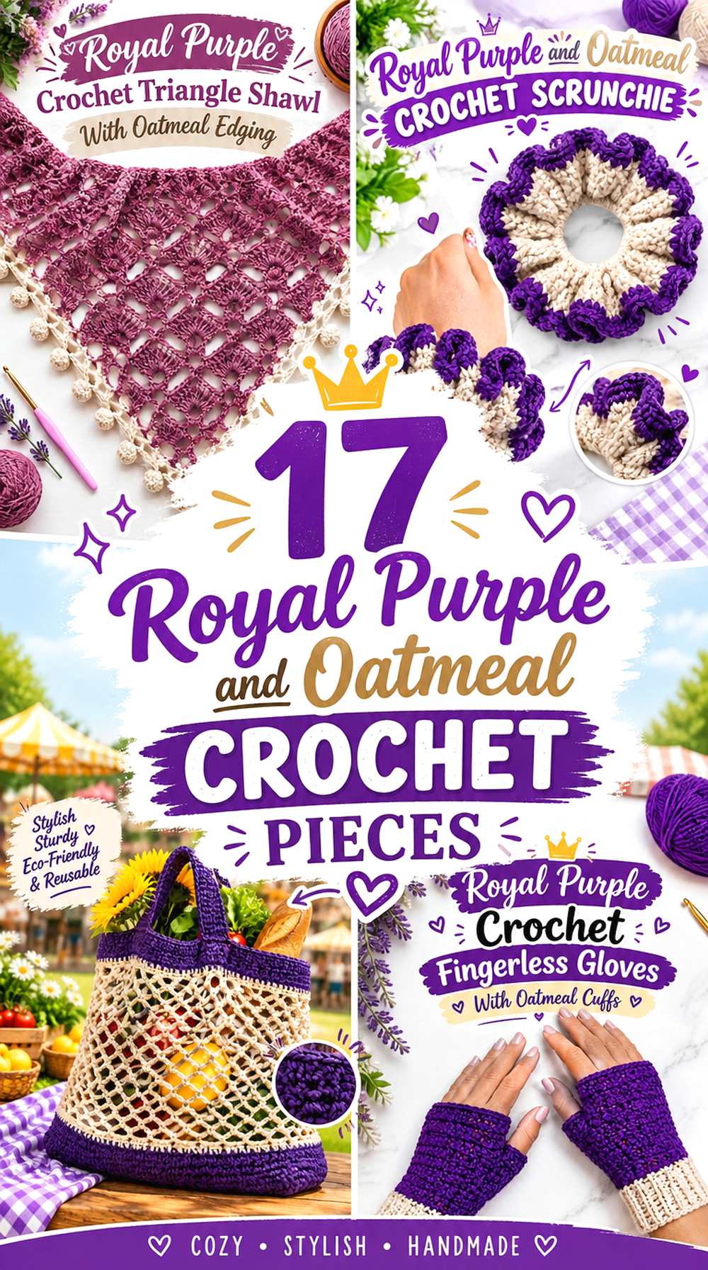
17 Royal Purple and Oatmeal Crochet Pieces
Royal purple and oatmeal create a useful two-color crochet palette because the two shades can take very different jobs. Royal purple has enough visual weight to define motifs, borders, cuffs, and statement sections, while oatmeal can open up the design and give textured crochet a quieter background.
The balance does not have to stay the same from project to project. A tote can use royal purple inside individual motifs and oatmeal between them, while a cardigan can reverse that relationship with an oatmeal body and controlled purple edging. Smaller pieces can use royal purple more heavily without overwhelming the object, while larger pieces often benefit from giving oatmeal more surface area.
The 17 ideas below use the same core palette in different ways so you can compare dominance, contrast, placement, edging, and repetition rather than simply switching between two yarn colors.
Quick List
- Royal Purple And Oatmeal Granny Square Crochet Tote
- Royal Purple Crochet Beanie With An Oatmeal Brim
- Oatmeal And Royal Purple Crochet Cardigan
- Oatmeal Crochet Basket With A Royal Purple Rim
- Oatmeal And Royal Purple Crochet Poncho
- Royal Purple Crochet Headband With Oatmeal Edging
- Oatmeal Crochet Mug Cozy With Royal Purple Details
- Oatmeal And Royal Purple Crochet Table Runner
- Royal Purple Crochet Scarf With Oatmeal Ends
- Oatmeal Crochet Sweater Vest With Royal Purple Ribbing
- Royal Purple Crochet Pillow With Oatmeal Ruffles
- Royal Purple Crochet Slippers With Oatmeal Trim
- Oatmeal Crochet Coasters With Royal Purple Borders
- Royal Purple Crochet Fingerless Gloves With Oatmeal Cuffs
- Oatmeal Crochet Market Bag With Royal Purple Structure
- Royal Purple And Oatmeal Crochet Scrunchie
- Royal Purple Crochet Triangle Shawl With Oatmeal Edging
How to Balance Royal Purple and Oatmeal Across Crochet Pieces
Start by deciding which color should occupy the largest uninterrupted areas. If royal purple covers most of a large cardigan, poncho, or shawl, the result will read much darker than the same purple used only for cuffs and borders. Oatmeal can therefore work as more than an accent: on larger pieces, it can provide enough light space to keep royal purple from visually dominating every detail.
Smaller accessories allow a different balance. A beanie, headband, coaster, or mug cozy can carry a larger percentage of royal purple because the total visual area is limited. In those projects, oatmeal is often most useful at an edge, cuff, center, or other location where a lighter value separates the shape of the piece.
Before committing to large color blocks, compare the yarns side by side and, if useful, view them in grayscale. Royal purple and oatmeal should usually retain a noticeable light-dark difference. That separation is especially valuable around motifs, ribbing, borders, and raised texture.
Use Oatmeal to Keep Royal Purple Crochet Texture Visible
Royal purple can make deeply textured crochet look rich and concentrated, but small surface details may become less obvious when both the stitches and surrounding areas are dark. Oatmeal placed beside those details creates a visual break without introducing a third competing hue.
Where you place oatmeal matters. On a pillow, it can frame the entire purple face. On gloves, it can define the cuffs. On a vest, it can become the main panel color so purple ribbing reads as a deliberate outline. Use the lighter shade where the construction naturally creates a boundary instead of scattering oatmeal randomly across a piece.
If your oatmeal yarn is much warmer, grayer, or lighter than expected, test a small section with the royal purple first. The important relationship is not an exact commercial shade name but a clearly lighter, quieter neutral that still leaves royal purple as the stronger color.
1. Royal Purple And Oatmeal Granny Square Crochet Tote
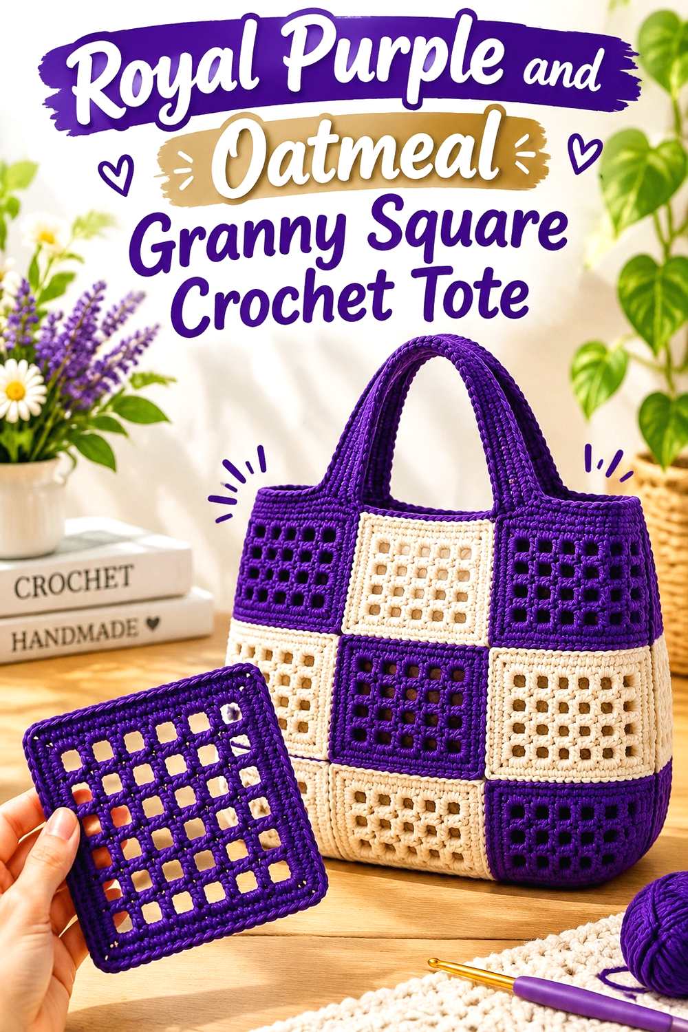
A granny square tote gives both colors repeated locations, making it a good project for a structured two-color arrangement. Let royal purple define the motif centers or larger colored sections, then use oatmeal repeatedly around those purple areas or at the joins. Repeating oatmeal between motifs prevents separate purple squares from turning into one visually heavy block.
Royal Purple Can Anchor Each Crochet Tote Motif
Use royal purple where you want the eye to land first within each square. Keeping that placement consistent creates rhythm across the tote body, which is particularly helpful when several motifs sit next to one another.
Avoid changing the purple position randomly from square to square unless a patchwork effect is intentional. A predictable royal purple center or band makes the finished bag look more coordinated.
Oatmeal Can Separate Royal Purple Across the Crochet Tote
Oatmeal is useful between neighboring purple sections because it gives each motif its own outline. It can also continue into the upper edge or straps so the neutral feels connected to the whole tote rather than appearing only in isolated joins.
If the tote starts looking too pale, reduce oatmeal inside the motifs before removing it from the joins. The separation between squares is one of the places where the lighter shade provides the most visual value.
Creator Credit: Knitting Love
2. Royal Purple Crochet Beanie With An Oatmeal Brim
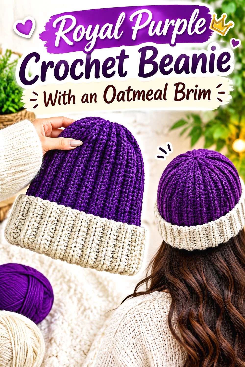
A beanie offers a simple way to divide the palette into body and edge. Royal purple can cover most of the crown and sides, while oatmeal marks the lower portion of the hat. Because the brim sits directly against the larger purple field, even a relatively narrow oatmeal section can create a clear two-color finish.
Royal Purple Works Well Across the Main Crochet Beanie
Keeping royal purple continuous over the crown avoids unnecessary interruptions in a compact accessory. It also allows ribbing or other surface texture to remain the main design feature rather than competing with frequent color changes.
If you want more oatmeal without making the hat look striped, reserve the neutral for one substantial lower section instead of adding several narrow bands.
Oatmeal Gives the Royal Purple Crochet Beanie a Defined Lower Edge
An oatmeal brim or lower band visually separates the purple hat body from the edge. This placement is especially useful when the beanie has pronounced ribbing because the lighter yarn creates an obvious transition at a construction feature that already exists.
Compare the two shades at the brim before finishing. A neutral that is too close to the purple in value will not provide the same clear division.
Creator Credit: VivCrochets
3. Oatmeal And Royal Purple Crochet Cardigan
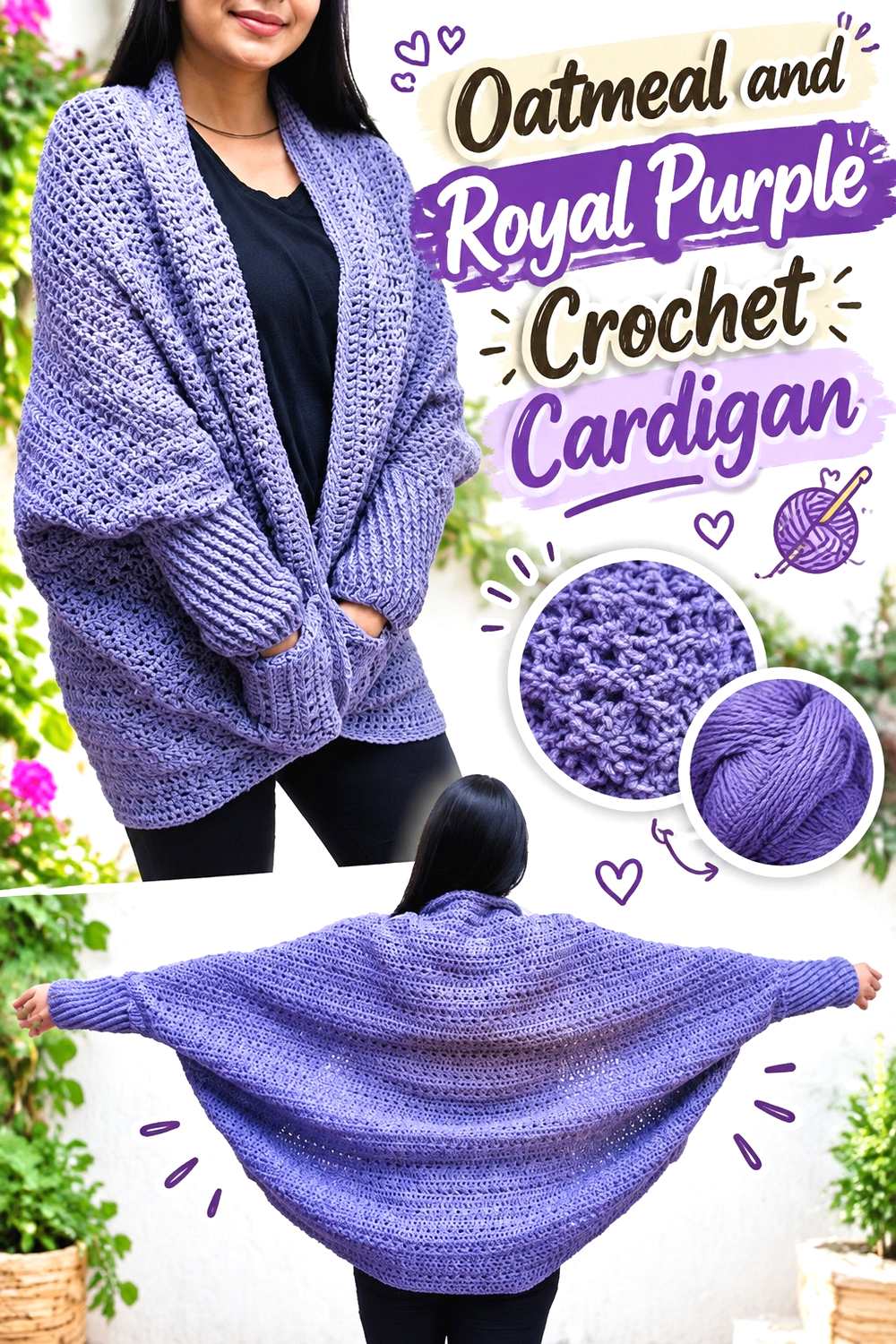
On a cardigan, oatmeal can carry the larger body panels while royal purple marks the smaller structural areas. This distribution keeps the garment lighter overall and gives purple enough concentration to define cuffs, edging, pockets, or other selected details without turning every panel into a competing color block.
Oatmeal Can Lead the Main Crochet Cardigan Panels
Using oatmeal across the front and back gives the garment a continuous neutral foundation. That makes it easier to repeat royal purple in several smaller locations without making the color arrangement look fragmented.
If sleeves and body panels are all oatmeal, purple details also become easier to balance from left to right.
Royal Purple Can Define Oatmeal Crochet Cardigan Edges
Royal purple works particularly well at places where the garment naturally changes direction, such as cuffs, front edging, or a neckline. Those narrow areas need relatively little yarn visually, yet they can outline the oatmeal body clearly.
Try to repeat purple in more than one structural location. One isolated purple cuff or pocket can look accidental, while several controlled repetitions establish an intentional color system.
Creator Credit: Nirvana Crochet
4. Oatmeal Crochet Basket With A Royal Purple Rim
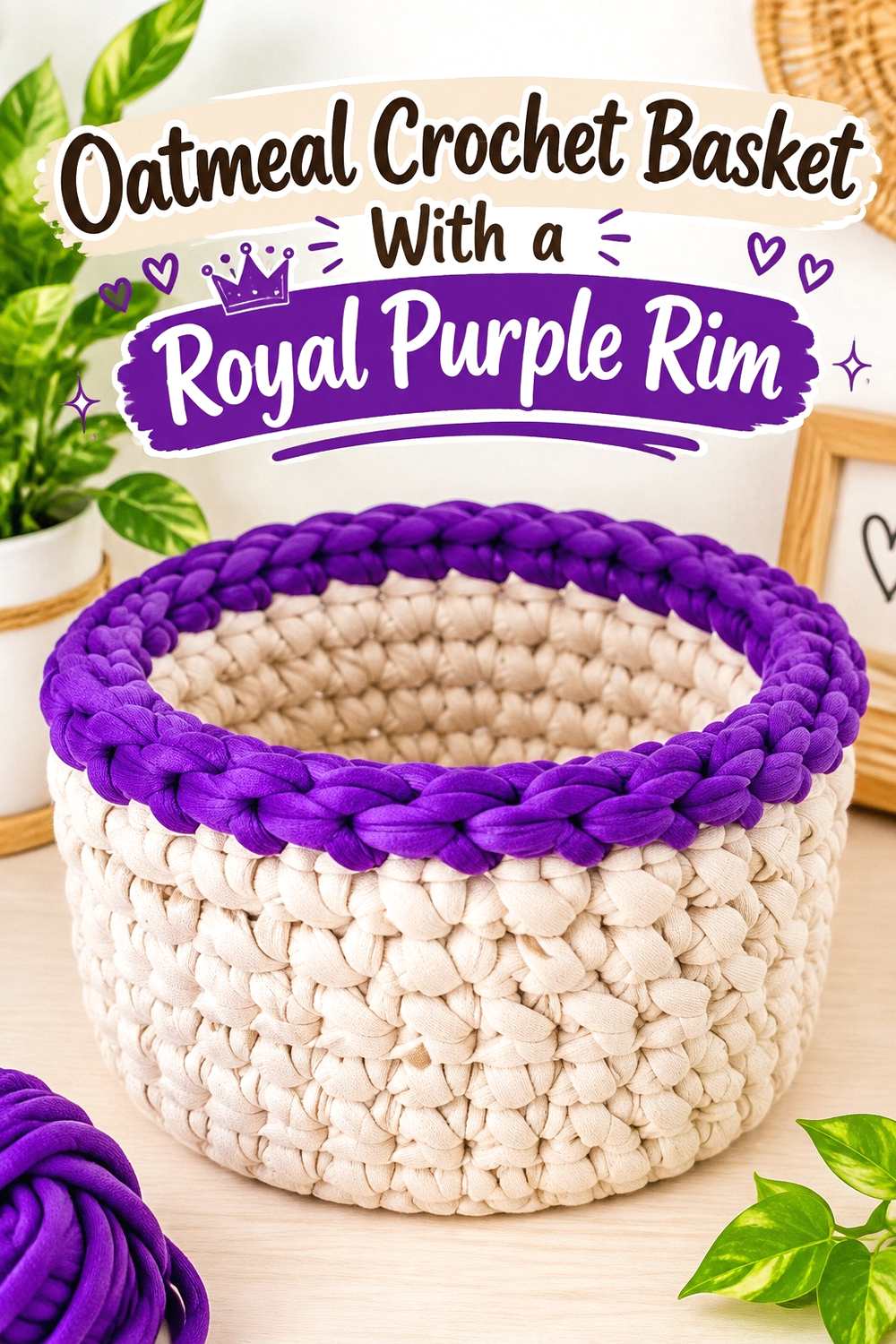
A basket benefits from a simple color division because its form is already strongly defined. Oatmeal can cover most of the sides, while royal purple appears near the upper edge. This keeps the body visually calm while placing the darker color where it can emphasize the opening.
Oatmeal Keeps the Crochet Basket Body Visually Quiet
Large uninterrupted oatmeal sections allow dense crochet texture to remain visible without adding another strong visual pattern. That can be useful on a storage piece where the shape and surface texture already provide plenty of detail.
If the basket feels too plain, add purple near an existing structural boundary rather than inserting scattered color changes through the middle.
Royal Purple Can Frame the Oatmeal Crochet Basket Opening
A royal purple upper band gives the basket a darker finishing line and helps distinguish the rim from the lighter sides. This is a good location for stronger color because the eye naturally follows the opening around the basket.
Keep the purple band proportional to the basket height. A very deep band changes the project into a nearly equal two-color block, while a narrower one leaves oatmeal clearly dominant.
Creator Credit: Lallaulab
5. Oatmeal And Royal Purple Crochet Poncho
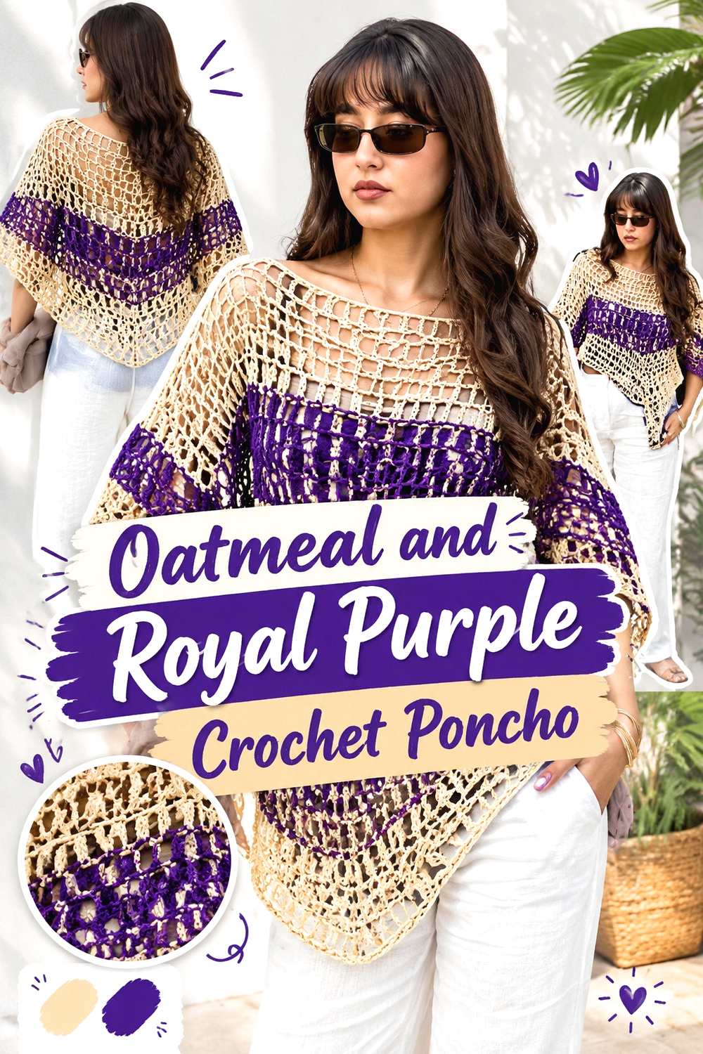
The broad surfaces of a poncho make color proportion especially noticeable. Letting oatmeal cover most of the panels produces a lighter overall garment, while royal purple can emphasize the neckline, lower edge, or another repeated boundary. The stronger shade then defines the silhouette instead of competing across the entire surface.
Oatmeal Gives the Crochet Poncho More Open Visual Space
Oatmeal is useful over broad panels because it prevents a large wearable from becoming one continuous dark field. If the stitch pattern has visible texture or openwork, the lighter neutral can also make those changes easier to see from a distance.
Keep the oatmeal distribution balanced between the front and back so the poncho does not appear color-heavy from only one angle.
Royal Purple Can Outline the Oatmeal Crochet Poncho
Use royal purple where the poncho already has a strong visual line, particularly around the neckline or outer edge. A repeated dark boundary can make the neutral center feel more deliberate without requiring complicated colorwork.
If the purple edge starts dominating, decrease its width rather than removing the contrast completely.
Creator Credit: Lorena
6. Royal Purple Crochet Headband With Oatmeal Edging
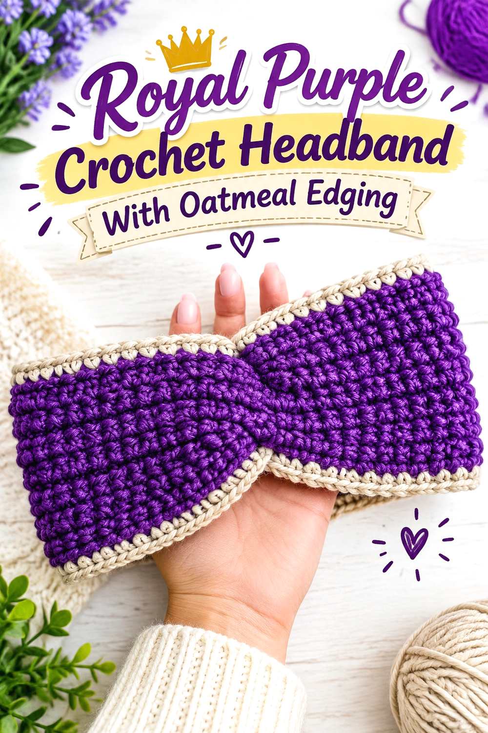
Because a headband has limited surface area, royal purple can dominate without feeling excessively heavy. Oatmeal is most effective when it stays close to an edge or other small detail, where it adds separation without breaking the band into too many short color sections.
Royal Purple Can Cover Most of the Crochet Headband
A continuous purple band emphasizes the texture and shape of the accessory. Keeping the main section in one color also avoids making a narrow project look visually chopped into several pieces.
For a stronger two-color effect, increase oatmeal at the border rather than introducing multiple stripes through the center.
Oatmeal Can Lighten the Royal Purple Crochet Headband Edge
A small oatmeal edge places the lightest color around the perimeter, which helps the purple interior stand out. It is an efficient use of the neutral because even a modest amount remains visible along the full length of the accessory.
Check that the oatmeal does not obscure any shaping or twist detail you want to remain visually dominant.
Creator Credit: Diving Ducks Crochet
7. Oatmeal Crochet Mug Cozy With Royal Purple Details
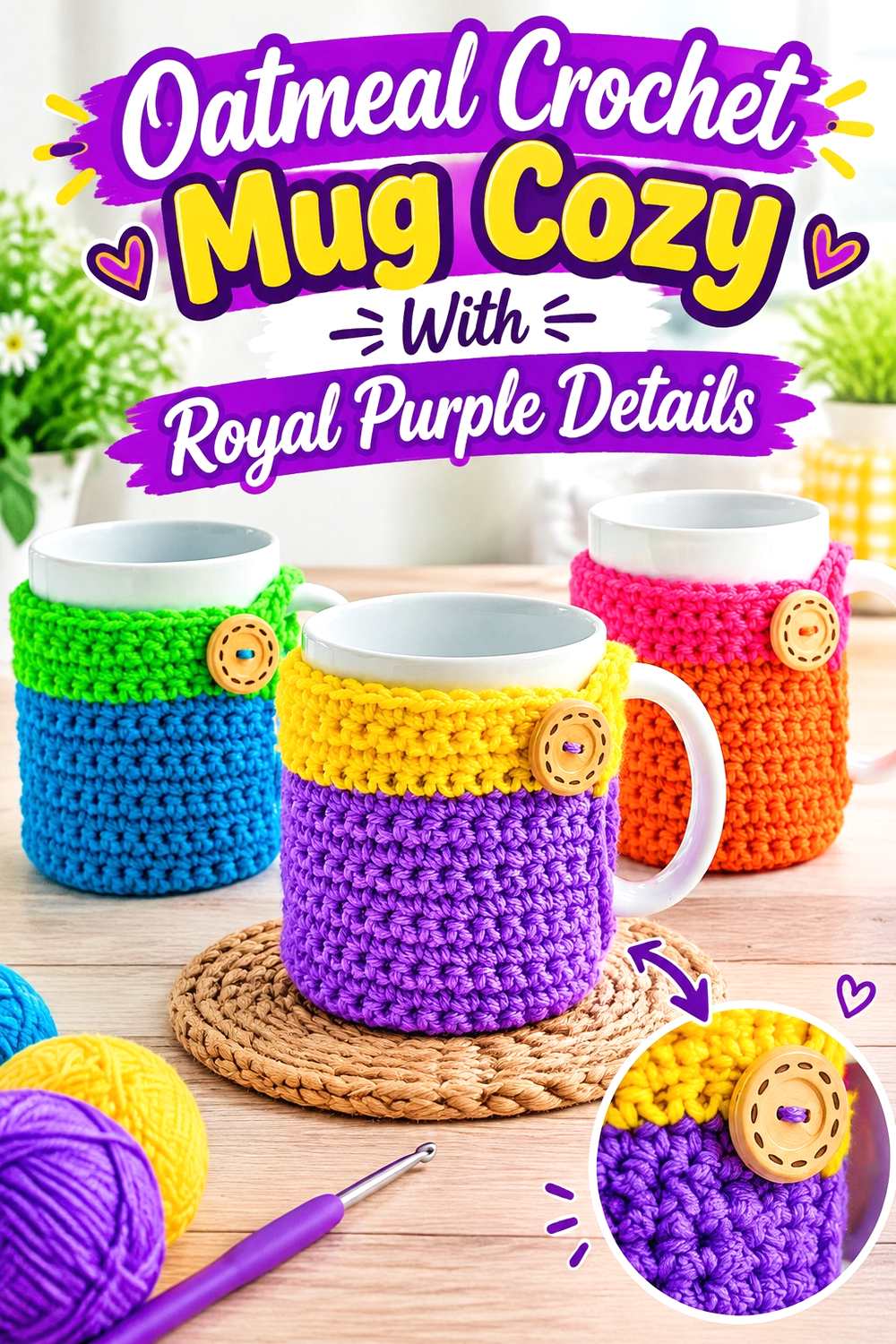
A mug cozy is small enough for oatmeal to serve as the main background while royal purple marks just a few details. The neutral keeps the piece understated, while purple can identify the fastening side, outer edge, or another repeated accent without overwhelming the limited surface.
Oatmeal Makes the Crochet Mug Cozy Texture Easy to Read
Using oatmeal across the main band keeps individual stitch texture visible and gives the cozy a clear neutral field. This is useful on a small object, where too many alternating color sections can quickly make the surface look busy.
If you want a softer result, keep most of the circumference oatmeal and limit purple to one or two intentional features.
Royal Purple Can Mark the Oatmeal Crochet Mug Cozy Details
Royal purple works well near a fastening area or along a narrow edge because the darker value immediately draws attention to that part of the cozy. If the design includes a connected base, a small repetition of purple there can help the accent feel integrated.
Avoid adding a third strong accent unless it has a clear role; this compact project usually does not need one.
Creator Credit: naztazia
8. Oatmeal And Royal Purple Crochet Table Runner
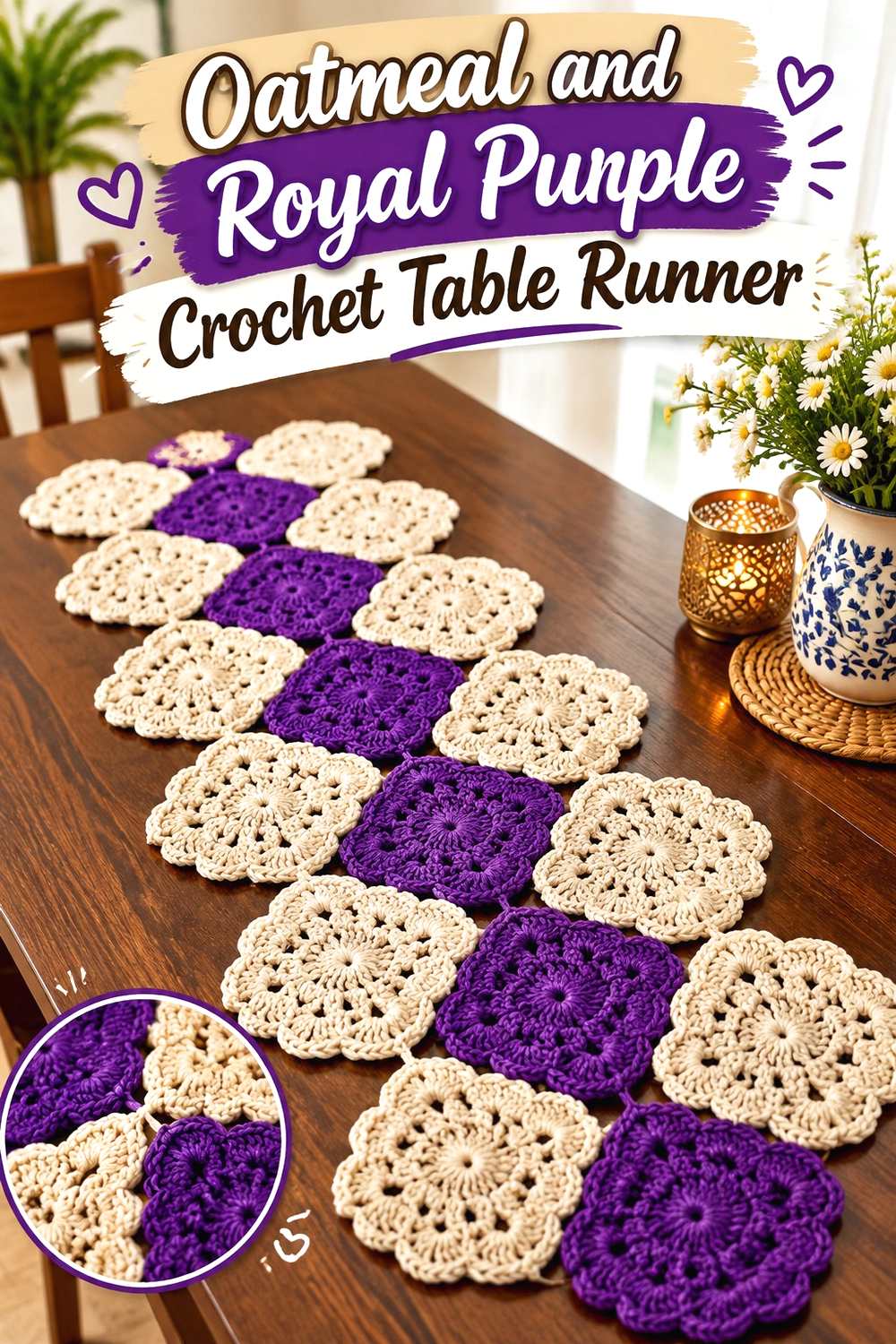
A table runner gives you enough length to repeat royal purple several times without using it continuously. Oatmeal can form the background or connective sections, while purple appears in motifs, bands, or the ends. Repetition matters here because a single purple section at one end would make the runner look visually unbalanced.
Oatmeal Can Connect Royal Purple Across the Crochet Table Runner
Use oatmeal as the recurring background so separate purple areas read as part of one organized sequence. This is especially effective on a long piece because the neutral gives the eye a break between stronger colored sections.
Keep the oatmeal intervals reasonably consistent if you want a formal, ordered appearance.
Royal Purple Needs Repetition Along the Oatmeal Crochet Table Runner
Repeat purple at more than one point rather than concentrating all of it in the center or at one end. Evenly distributed accents help the color feel intentional from different positions around the table.
For a quieter runner, reduce the width of the purple sections while preserving their repetition.
Creator Credit: Crochet by Glau
9. Royal Purple Crochet Scarf With Oatmeal Ends
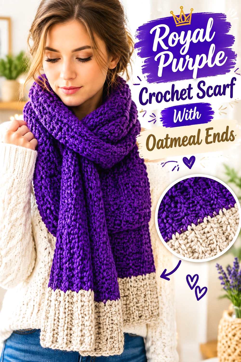
A long scarf can support a strong royal purple center because oatmeal at the ends creates two visible stopping points. This keeps the neutral balanced and avoids scattering it throughout the full length. The arrangement is particularly useful when you want the scarf to read primarily as purple while still including a noticeable second color.
Royal Purple Can Run Through Most of the Crochet Scarf
Keeping the main length royal purple creates continuity and allows stitch texture to carry the visual interest. Several short alternating stripes are not necessary unless a striped look is specifically desired.
If the purple appears too dense, widen the oatmeal end sections instead of interrupting the center repeatedly.
Oatmeal Can Balance Both Ends of the Royal Purple Crochet Scarf
Use oatmeal on both ends rather than only one so the color placement remains visually symmetrical when the scarf is worn or folded. The neutral can also be repeated in optional finishing details if the design allows them.
Match the oatmeal sections to one another in visual weight so one end does not appear noticeably heavier.
Creator Credit: B.Hooked Crochet
10. Oatmeal Crochet Sweater Vest With Royal Purple Ribbing
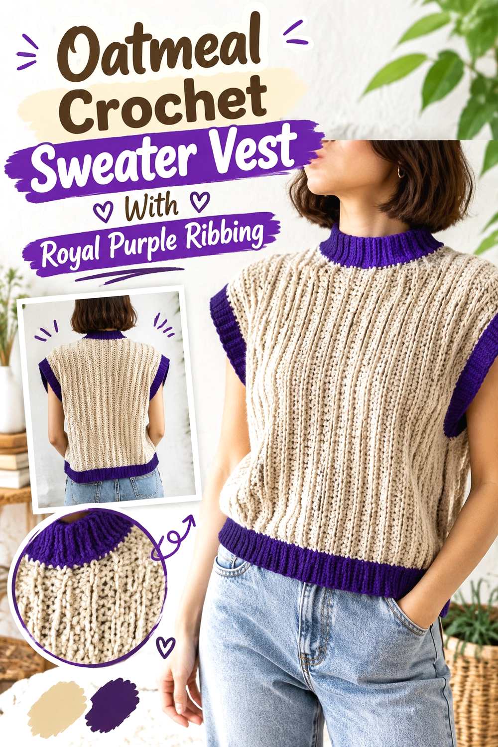
A sweater vest gives royal purple several natural places to appear without requiring large purple panels. Oatmeal can cover the front and back, while purple follows the neckline, armholes, or lower ribbing. The result keeps the garment neutral-led while using purple to trace its shape.
Oatmeal Should Carry the Main Crochet Vest Panels
Large oatmeal panels make the vest easier to coordinate with other clothing and give surface texture a lighter background. They also prevent royal purple from visually closing in the neckline and armholes when all of those edges use the darker shade.
Keep the main body consistently oatmeal if you want the edging to remain the defining color feature.
Royal Purple Can Trace the Oatmeal Crochet Vest Openings
Neck and armhole borders are natural locations for royal purple because they repeat around visible openings. Using the same accent at several edges connects the color placement across the entire garment.
If every border becomes wide and dark, the purple may start to compete with the oatmeal body. Narrower repeated edging can produce a clearer hierarchy.
Creator Credit: passtschon
11. Royal Purple Crochet Pillow With Oatmeal Ruffles
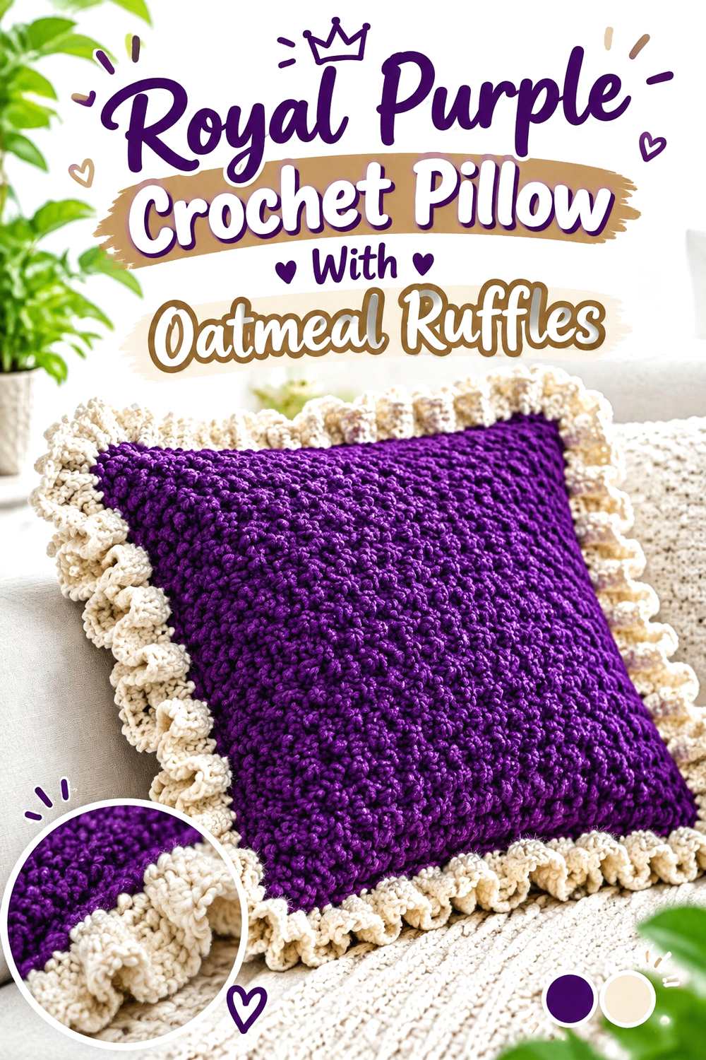
A pillow can carry more concentrated color than many larger home-decor pieces. Royal purple across the main face creates a strong central block, while an oatmeal ruffled or decorative edge softens that block and clearly outlines the pillow.
Royal Purple Can Fill the Main Crochet Pillow Surface
Using royal purple over most of the front lets stitch texture become part of one uninterrupted color field. If the pillow already includes pronounced texture, additional stripes may compete with that surface treatment.
The back can stay within the same two-color system instead of introducing a new hue that is visible from the sides.
Oatmeal Can Separate the Royal Purple Crochet Pillow From Its Ruffle
Oatmeal is particularly useful on a decorative edge because the lighter value makes the outline visible against the purple center. It also prevents a heavily textured or ruffled border from disappearing into the main face.
If the oatmeal ruffle feels too dominant, reduce its depth while keeping the contrasting edge intact.
Creator Credit: crochet daniela
12. Royal Purple Crochet Slippers With Oatmeal Trim
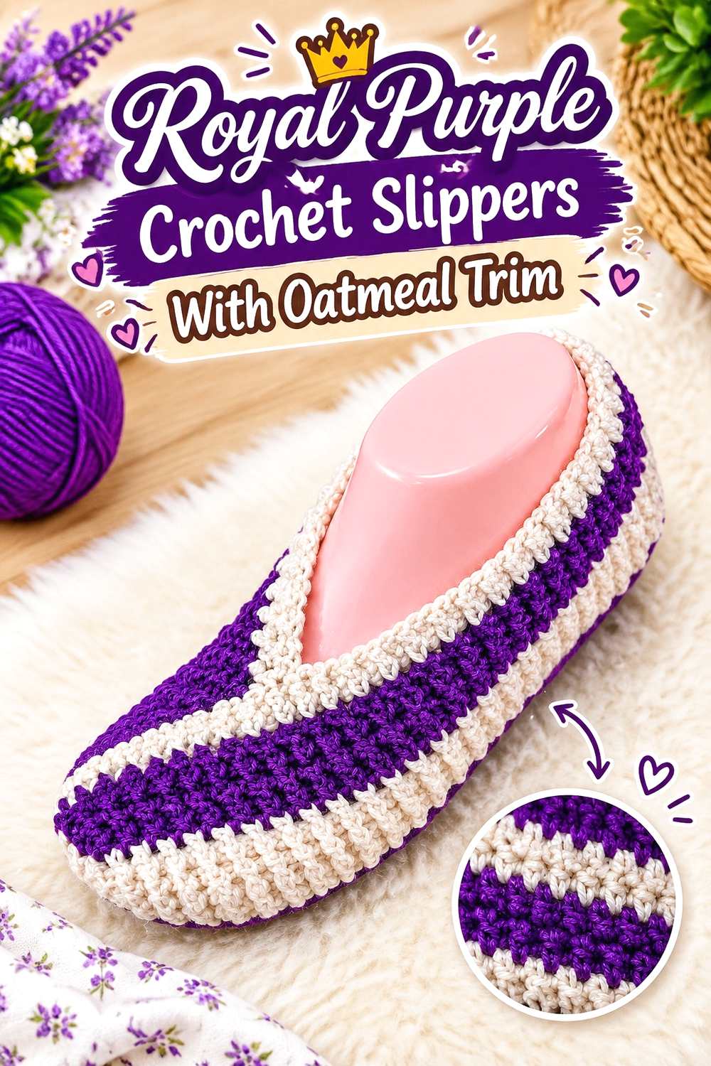
Slippers are viewed from several angles at close range, so a simple two-part color plan is usually enough. Royal purple can cover most of the upper, while oatmeal defines the opening or another narrow finishing area. Keeping oatmeal away from excessive scattered detailing makes the pair easier to match visually.
Royal Purple Can Keep the Crochet Slipper Uppers Consistent
Use the same royal purple distribution on both slippers so the pair reads as one set. A continuous main color is especially useful around shaped areas where frequent color changes could distract from the silhouette.
Check both slippers together before adding the contrasting finish so the purple placement remains comparable.
Oatmeal Can Define the Royal Purple Crochet Slipper Opening
A lighter oatmeal finish around the opening gives the upper edge a clear boundary and repeats around the foot without requiring a large amount of neutral yarn.
Because oatmeal is considerably lighter, small irregularities in the accent line may be more noticeable. Keep the contrasting edge visually even on both slippers.
Creator Credit: Di’s Handicrafts (Crochet and Knitting)
13. Oatmeal Crochet Coasters With Royal Purple Borders
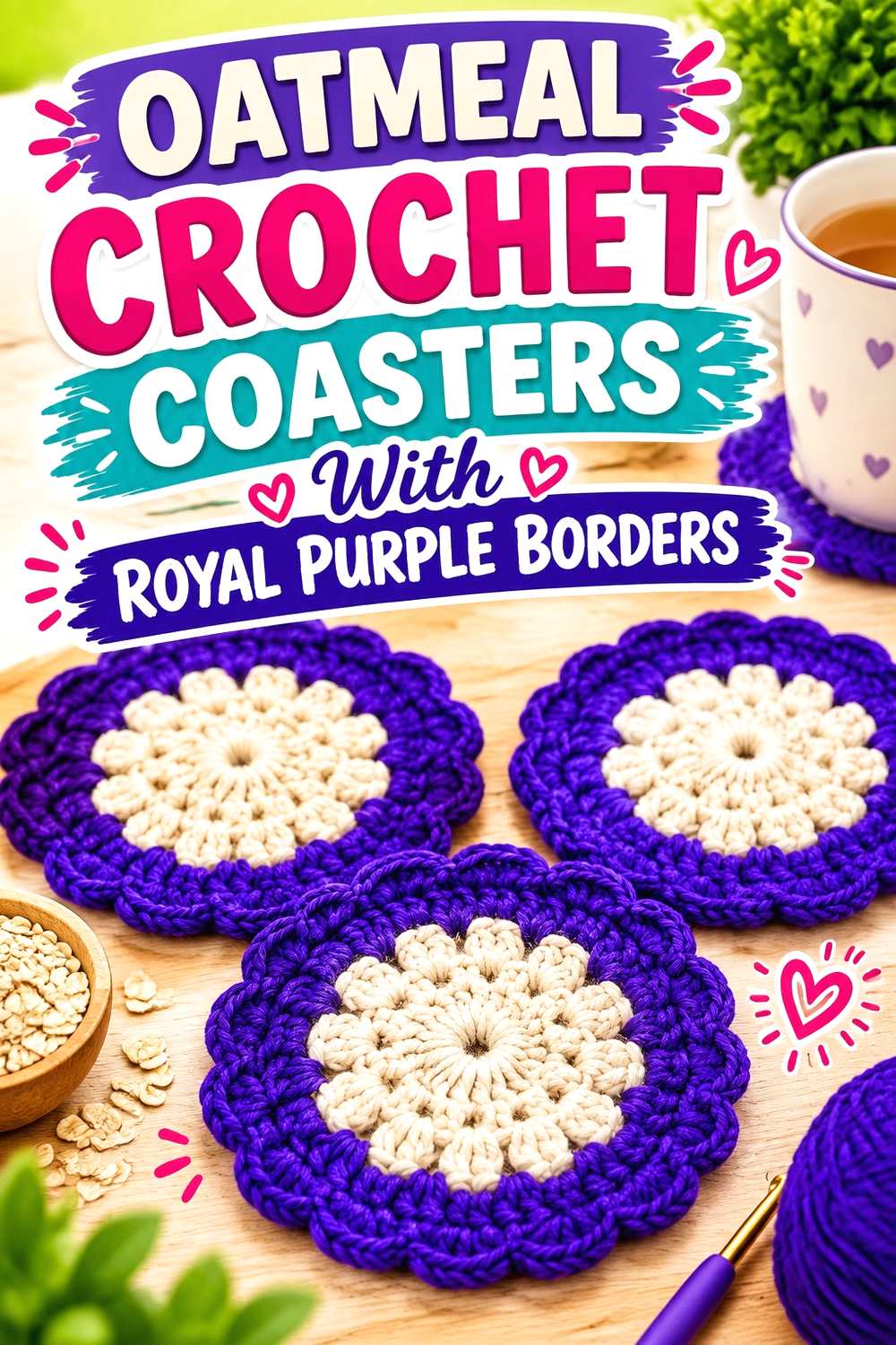
Coasters provide a compact place to reverse the usual purple-dominant arrangement. Oatmeal can fill the center while royal purple forms a darker outer frame. Repeating the same balance across a full set helps the individual coasters look coordinated even when minor stitch differences occur.
Oatmeal Can Keep the Crochet Coaster Centers Light
A broad oatmeal center creates enough quiet space for the coaster shape and stitch arrangement to remain easy to see. This is particularly useful if the outer portion already has decorative texture.
Keep the oatmeal center large enough that purple remains a border rather than taking over half the coaster.
Royal Purple Can Frame Every Oatmeal Crochet Coaster
Using royal purple consistently around the outer area visually ties a coaster set together. A darker perimeter also makes the overall shape more obvious when the coaster sits on a pale surface.
If you change the purple placement between coasters, repeat that variation systematically rather than using random border widths.
Creator Credit: Crochet Jewel
14. Royal Purple Crochet Fingerless Gloves With Oatmeal Cuffs
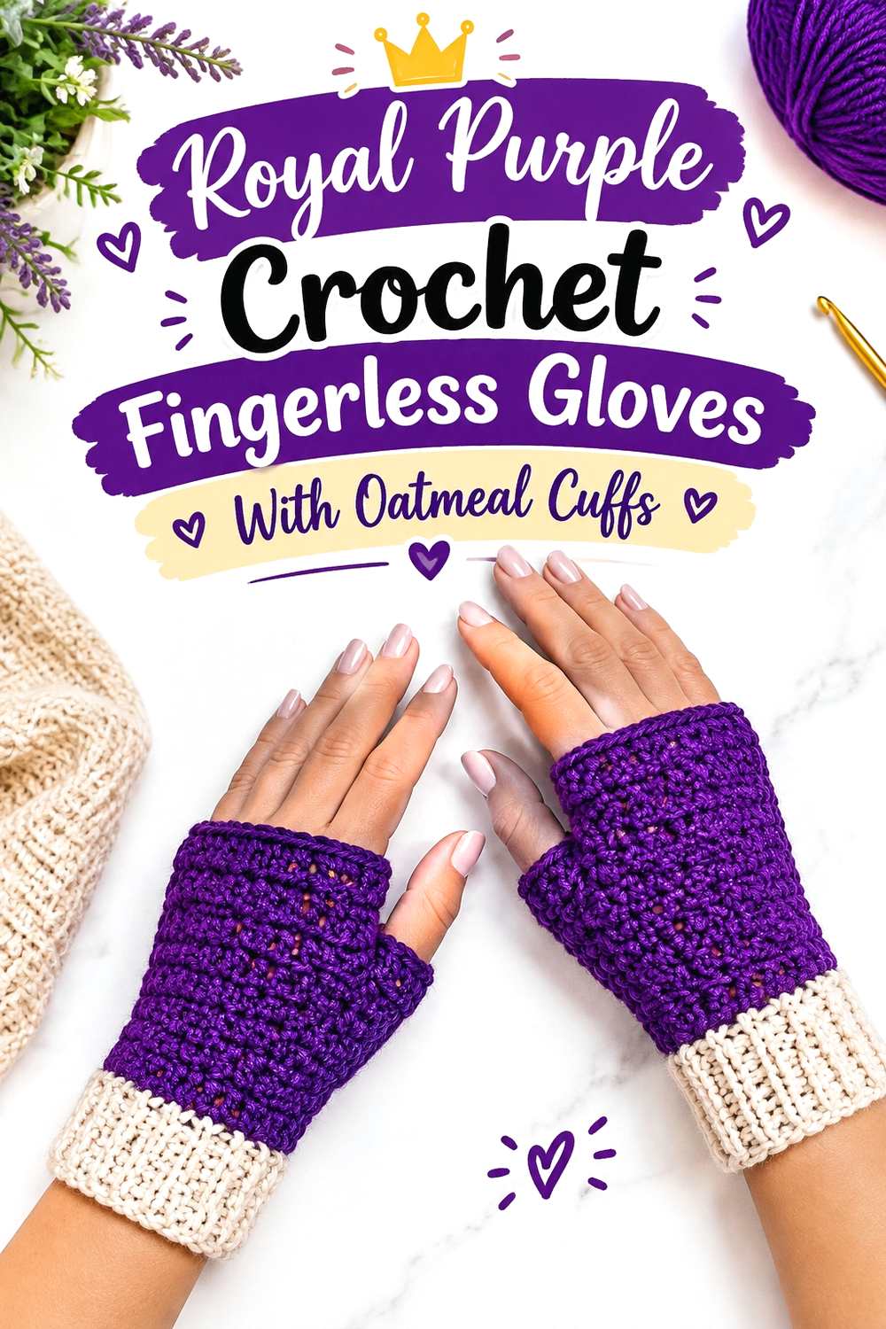
Fingerless gloves benefit from mirrored color placement. Royal purple can cover most of both hands, while oatmeal repeats at both cuffs. A small amount of oatmeal may also appear near another edge if you want the neutral repeated above the wrist.
Royal Purple Should Match Across Both Crochet Gloves
Keep the main purple sections similar on the right and left glove so the pair feels coordinated. This matters more than achieving an exact percentage of each color because mismatched accent placement is immediately visible when both hands are together.
Use the purple body as the stable element before deciding whether additional oatmeal is needed.
Oatmeal Can Separate Royal Purple Crochet Gloves From the Cuffs
An oatmeal cuff places the lighter color at the transition between glove and wrist. Because cuffs already have a distinct structural role, the color change feels purposeful rather than decorative for its own sake.
If you add oatmeal around another opening, keep that secondary accent narrower than the cuff so the visual hierarchy remains clear.
Creator Credit: Cherilyn Q
15. Oatmeal Crochet Market Bag With Royal Purple Structure
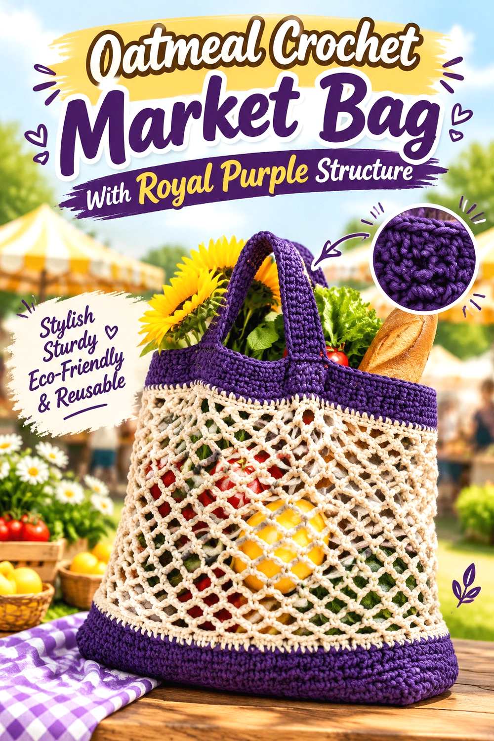
A market bag often combines open areas with more solid structural sections, which creates useful locations for two colors. Oatmeal can cover the larger open body, while royal purple is concentrated near the top, base, or carrying areas. That distribution gives the darker color visual purpose instead of scattering it throughout the mesh.
Oatmeal Keeps the Crochet Market Bag Body From Looking Heavy
Using oatmeal through the main bag body makes open spaces and repeated stitch patterns easier to distinguish. It can also keep the large central portion visually lighter when the bag is empty.
If purple is added through every repeat, the openwork can become secondary to the stripe pattern, so decide which feature you want to emphasize first.
Royal Purple Can Define the Oatmeal Crochet Market Bag Boundaries
Royal purple is useful at firmer-looking boundaries such as an upper band or other solid sections because the dark color visually anchors those areas.
Repeat purple where it makes sense structurally rather than adding one isolated patch. That keeps the color connected to how the bag is organized.
Creator Credit: The Crochet Crowd
16. Royal Purple And Oatmeal Crochet Scrunchie
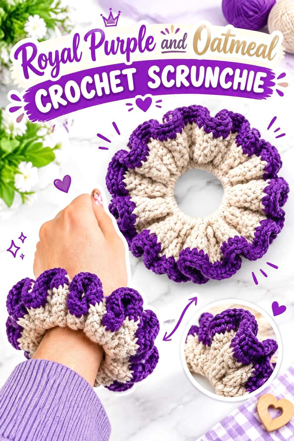
A scrunchie can use both shades in close proximity because the accessory is small and naturally gathered. One effective arrangement is an oatmeal inner section with royal purple becoming more visible toward the outer ruffle, giving the stronger color the largest visible role when the scrunchie expands.
Oatmeal Can Sit Beneath the Royal Purple Crochet Ruffle
Keeping oatmeal closer to the elastic gives the scrunchie a lighter inner layer without allowing the neutral to compete equally with the outer color. Portions of oatmeal remain visible as the fabric gathers and shifts.
Make sure enough oatmeal is exposed to look intentional rather than like an accidental color change hidden underneath.
Royal Purple Can Lead the Outer Crochet Scrunchie Edge
Royal purple works well on the outermost section because that is the area most visible when the scrunchie is worn. The stronger shade can therefore dominate even if oatmeal occupies part of the inner construction.
For a softer variation, reverse the colors, but keep the same inner-versus-outer logic rather than alternating randomly.
Creator Credit: ElyseCrochets 💌
17. Royal Purple Crochet Triangle Shawl With Oatmeal Edging
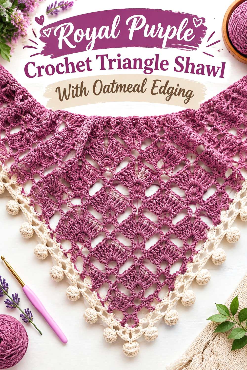
A triangle shawl offers a large uninterrupted surface where royal purple can become the main visual statement. Oatmeal is most useful along the expanding lower edge or another repeated boundary, where it lightens the perimeter without interrupting the triangular shape with numerous color changes.
Royal Purple Can Lead the Main Crochet Shawl Field
Allowing royal purple to cover most of the triangle emphasizes the expanding geometry of the shawl. It also gives lace, fans, or other repeated texture one consistent color background instead of dividing the surface into competing sections.
If the finished piece feels darker than intended, add more oatmeal near the outer portion rather than inserting isolated light rows near the center.
Oatmeal Can Open Up the Royal Purple Crochet Shawl Edge
A broader oatmeal finishing area creates a strong light-dark transition and gives the lower edge more visual separation. Because a triangle shawl widens as it grows, even a relatively short oatmeal section can occupy substantial visible area.
Check the balance before finishing: the farther oatmeal extends inward, the more the shawl shifts from purple-dominant to a true two-color design.
Creator Credit: Tuba Crochet
Conclusion
Royal purple and oatmeal can produce very different crochet results without changing the two-color palette itself. For the strongest purple emphasis, the beanie, scarf, pillow, gloves, scrunchie, and triangle shawl allow royal purple to occupy most of the visible surface. The cardigan, poncho, vest, basket, table runner, and market bag take the opposite approach by letting oatmeal provide more open visual space.
For projects where you want the color division to be especially clear, use the construction of the piece to guide placement. Cuffs, borders, rims, necklines, joins, ruffles, motif outlines, and outer edges already function as visual boundaries, so they are natural places to switch between royal purple and oatmeal.
Before committing to any of these adaptations, compare the two yarns directly and make sure the light-dark contrast is strong enough for the details you want to emphasize. Follow the credited tutorials for each project’s exact construction, then use the color placement ideas here to develop your own royal purple and oatmeal version.
Frequently Asked Questions
Does oatmeal create enough contrast with royal purple crochet?
It usually can when the oatmeal is noticeably lighter than the royal purple. Check the actual yarns together rather than relying only on the color names. If small motifs or textured borders seem to merge, viewing the yarns in grayscale can help you judge their light-dark separation.
Should royal purple or oatmeal dominate a large crochet piece?
Either can lead, but the proportion changes the finished appearance considerably. Royal purple across a large shawl or poncho produces a much darker result, while oatmeal across the main panels gives purple borders and trims stronger definition. Decide whether you want the piece to read primarily as purple or primarily as neutral before planning accents.
Where should oatmeal go on a royal purple crochet wearable?
Oatmeal is especially useful at cuffs, necklines, armhole borders, lower edging, or another repeated structural boundary. These locations make the color change look connected to the garment rather than randomly placed.
How can I stop royal purple and oatmeal crochet from looking too striped?
Use larger color zones instead of frequent alternation. For example, make a scarf mostly royal purple with oatmeal ends, or a vest mostly oatmeal with royal purple ribbing. Clear dominant and supporting roles generally create a calmer two-color arrangement.
Can I replace oatmeal with cream in these royal purple crochet pieces?
Yes, but expect the relationship to change. A lighter cream may produce stronger contrast with royal purple, while a deeper beige may create a softer transition. Preserve the role of the neutral—light, quiet, and supportive—rather than trying to match the word “oatmeal” exactly.
How can I keep royal purple texture visible in crochet?
Avoid relying on color contrast alone. Strong stitch texture can still be visible in royal purple, but placing oatmeal beside raised sections, borders, ribs, motifs, or other key details can give those areas clearer separation. Make a small sample if texture visibility is central to the design.