13 Pewter Gray and Burgundy Crochet Elegance Ideas
Pewter gray and burgundy give crochet projects a restrained light-and-dark relationship without relying on black, white, or brighter accent colors. Burgundy supplies the richer visual weight, while pewter gray can soften large surfaces, separate motifs, and keep garment or decor details from becoming too dark.
The most polished results usually come from giving the two colors different jobs. Burgundy might define a pillow motif, cardigan edging, shawl border, or bag base, while pewter gray occupies the larger background. Reversing that balance creates a deeper project with smaller gray highlights.
These 13 ideas apply the combination to different crochet items. The linked tutorials support the project construction; the pewter gray and burgundy arrangements are independent palette adaptations rather than claims about the colors used by the creators.
Quick List
- Pewter Gray And Burgundy Crochet Mosaic Pillow
- Burgundy And Pewter Gray Crochet Mesh Blanket
- Burgundy And Pewter Gray Crochet Pocket Cardigan
- Pewter Gray And Burgundy Crochet Tote Bag
- Burgundy And Pewter Gray Crochet Shawl
- Pewter Gray And Burgundy Crochet Lacy Scarf
- Burgundy And Pewter Gray Crochet Granny Square
- Pewter Gray And Burgundy Crochet Table Runner
- Burgundy And Pewter Gray Crochet Poncho
- Pewter Gray And Burgundy Crochet Bucket Hat
- Burgundy And Pewter Gray Crochet Clutch Bag
- Pewter Gray And Burgundy Crochet Mug Cozy
- Burgundy And Pewter Gray Crochet Vest
Decide Whether Burgundy or Pewter Gray Should Lead
Burgundy naturally carries more visual weight when paired with a medium gray, so it does not need to occupy half of every project to be noticeable. On a pewter-gray pillow, for example, a burgundy motif or border can become the main focal point even when most of the surface remains gray.
If burgundy covers the larger area, give pewter gray a clearly defined role such as cuffs, neckline edging, borders, motif centers, or a contrasting panel. Controlled placement keeps the two-color scheme sophisticated instead of making it look like every available section needed a different color.
Use Pewter Gray to Keep Burgundy Crochet Details Separated
Burgundy can lose definition when several dark sections sit directly beside one another. Pewter gray can act as visual space between burgundy motifs, stripes, garment panels, or raised texture.
Check the actual yarns together before starting. Burgundy and pewter gray can still be similar in value depending on the shades chosen. A grayscale photo is a useful check when small motifs, lettering, cables, or narrow borders need obvious separation.
1. Pewter Gray And Burgundy Crochet Mosaic Pillow

A pewter-gray pillow face gives burgundy enough quiet background space to become the decorative focal color. Use burgundy inside the mosaic-style design or around selected graphic areas, then keep the back or larger surrounding field gray. This prevents the rich accent from covering so much of the pillow that the motif loses its impact.
Pewter Gray Gives Burgundy Crochet Pillow Motifs Breathing Room
Let pewter gray occupy the larger background when the pillow already contains a strong repeating design. The neutral field helps individual burgundy areas stay recognizable instead of merging into one dark surface.
View the pillow from several feet away before deciding whether more burgundy is needed. Mosaic-style details that look small while crocheting can become much stronger once the full panel is assembled.
Burgundy Can Give the Pewter Gray Crochet Pillow a Defined Focal Pattern
Reserve burgundy for the motif, selected border details, or another repeated feature when you want the eye to move toward the front panel.
If the burgundy pattern already covers substantial space, keep additional burgundy edging restrained. A heavily patterned center plus a broad dark border can reduce the amount of pewter gray needed to separate the design.
Creator Credit: MJ’s Off The Hook Designs
2. Burgundy And Pewter Gray Crochet Mesh Blanket
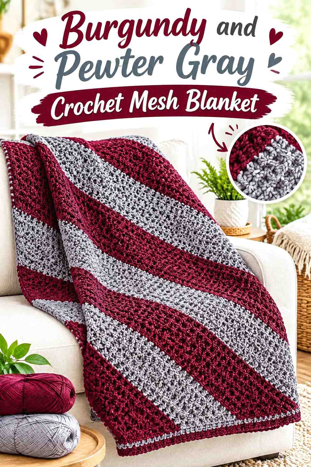
A blanket provides enough surface area for burgundy to repeat without dominating every section. Pewter gray can form the larger mesh field while burgundy appears in broader blocks, directional areas, or the border. The open structure makes consistent repetition especially useful because the colors are viewed across a large span.
Pewter Gray Keeps Burgundy Crochet Blanket Sections From Becoming Too Dense
Use gray between darker blocks when you want the blanket to retain an open, lighter appearance. The muted neutral separates burgundy sections while keeping the overall palette subdued.
Lay several completed sections beside one another before committing to the full sequence. Burgundy that seems modest in one area may become much more dominant once repeated across the complete blanket.
Burgundy Can Anchor the Edges of a Pewter Gray Crochet Blanket
Bringing burgundy back at the perimeter gives the accent color a clear final role and visually connects any burgundy used inside the blanket.
If the interior already contains large amounts of burgundy, a narrower edge may be enough. Border width should support the color hierarchy rather than automatically becoming another major block.
Creator Credit: Daisy Farm Crafts
3. Burgundy And Pewter Gray Crochet Pocket Cardigan
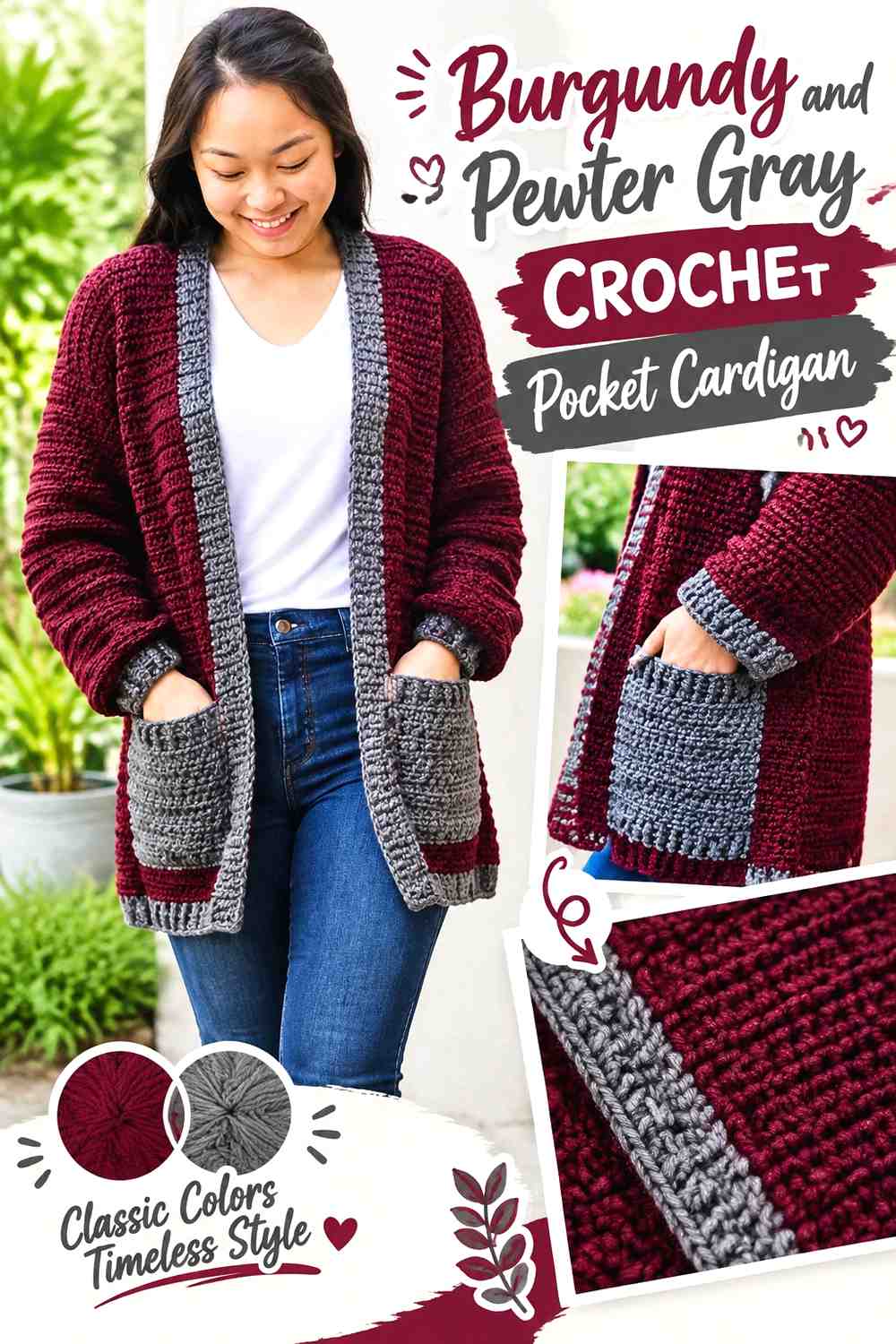
Burgundy can lead across the major cardigan panels while pewter gray marks cuffs, pocket details, neckline finishing, or front edging. The garment has several natural locations for a second color, so there is no need to introduce random gray stripes through the body.
Burgundy Keeps the Main Crochet Cardigan Panels Visually Connected
Use burgundy continuously across the front, back, and sleeves when you want the garment to read primarily as one rich color. Continuous panels also let pockets and texture remain noticeable without introducing another competing pattern.
If burgundy is very deep, check the fabric in normal indoor light. Texture and pocket edges may need more gray nearby if they begin to visually disappear.
Pewter Gray Can Define Burgundy Crochet Cardigan Pockets and Cuffs
Gray pocket edging, cuffs, or front bands can interrupt the large burgundy field in practical locations that repeat across the garment.
Choose two or three related areas rather than coloring every edge differently. Matching cuffs and pocket trim, for example, produces a clearer system than scattered gray patches.
Creator Credit: forthefrills
4. Pewter Gray And Burgundy Crochet Tote Bag
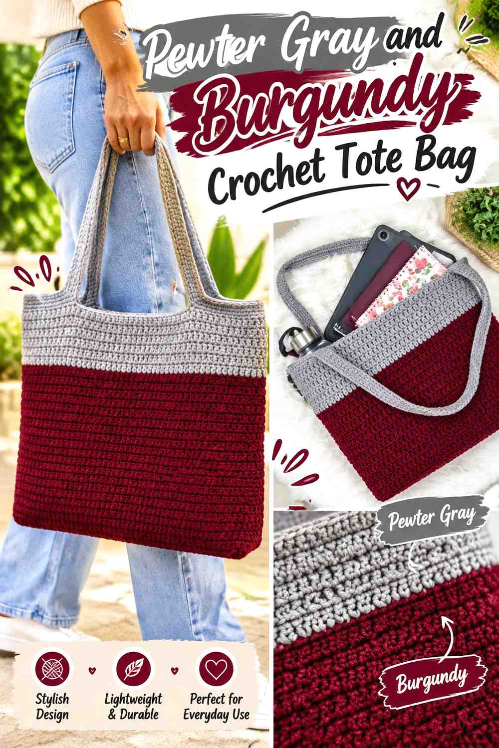
A pewter-gray tote body gives burgundy plenty of contrast for the base, handles, upper edge, or another structural section. The palette works particularly well when the darker shade follows the actual shape of the bag instead of appearing in isolated decorative stripes.
Pewter Gray Keeps the Burgundy Crochet Tote Accents Focused
Let gray cover most of the bag walls when burgundy is intended to define only a few areas. The larger neutral surface keeps the bag from becoming visually segmented.
If the stitch texture is an important feature, a medium pewter gray can also let shadows across the fabric contribute definition without introducing a third shade.
Burgundy Can Connect a Pewter Gray Crochet Tote Base and Handles
Repeating burgundy at the base and handles creates a visual relationship between the lower and upper sections of the tote.
If both areas together become too dominant, keep the base burgundy and use gray handles with a smaller burgundy detail. The important point is repetition, not equal amounts of color.
Creator Credit: Hopeful Turns
5. Burgundy And Pewter Gray Crochet Shawl
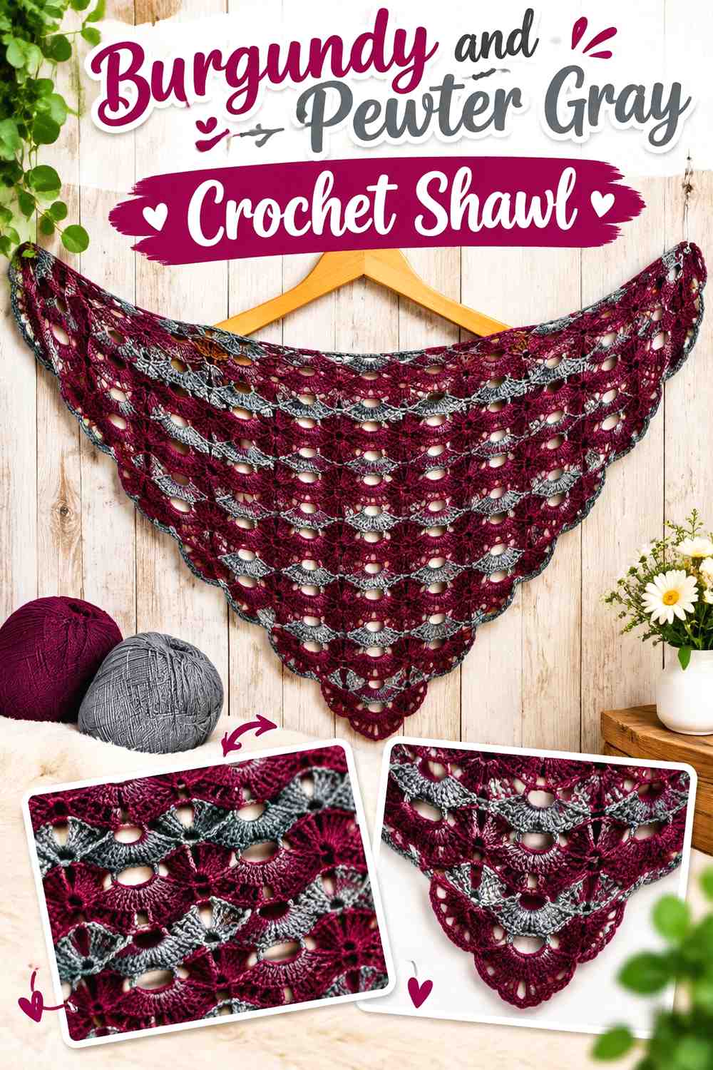
A shawl can carry a substantial burgundy center while pewter gray softens the outer sections or border. Because the fabric spreads across the shoulders, broad color areas usually look more intentional than frequent narrow changes.
Burgundy Gives the Crochet Shawl a Rich Central Color
Keeping burgundy through the main body lets the color remain continuous across the broadest part of the shawl. This gives any lace or repeated stitchwork room to create its own detail.
If the burgundy is very dark, examine the openwork against the clothing you expect to wear underneath. The background layer can noticeably affect how the crochet pattern reads.
Pewter Gray Can Soften the Burgundy Crochet Shawl Border
A pewter-gray border creates a gentler transition than finishing the entire piece in the darkest shade. It can also separate burgundy from darker coats, tops, or dresses.
Bring enough gray into the edging to make the color change deliberate, but avoid an oversized border if burgundy is meant to remain the primary impression.
Creator Credit: Bag-O-Day Crochet
6. Pewter Gray And Burgundy Crochet Lacy Scarf

Pewter gray can occupy most of a lacy scarf while burgundy appears at both ends or in widely spaced sections. This keeps the muted background light enough for open spaces and repeated stitchwork to remain part of the visual design.
Pewter Gray Helps Burgundy Crochet Scarf Accents Stay Refined
A long gray center gives burgundy accents space to stand apart rather than creating a heavily striped scarf.
When the stitch pattern is already decorative, keep color changes relatively broad. Fine texture plus many narrow stripes can make the scarf busier than the palette itself suggests.
Burgundy Can Balance Both Ends of a Pewter Gray Crochet Scarf
Use matching burgundy sections near each end when you want the scarf to look balanced as it hangs vertically.
Before finalizing the color lengths, drape the scarf approximately as it will be worn. Two burgundy areas that look distant on a flat scarf may sit close together after wrapping.
Creator Credit: Handwork diy
7. Burgundy And Pewter Gray Crochet Granny Square

Granny squares allow the palette to be redistributed from round to round. A burgundy center framed by pewter gray concentrates the rich color, while a gray center with burgundy outside gives each motif a stronger dark outline.
Burgundy Centers Give Pewter Gray Crochet Granny Squares a Clear Focal Point
Keep burgundy near the middle when you want each square to contain a small, repeated dark anchor. Pewter gray around it prevents adjacent centers from forming an overwhelmingly dark grid.
Make several squares before judging the final balance. Repeating one burgundy center dozens of times increases its visual presence considerably.
Pewter Gray Can Separate Burgundy Crochet Granny Square Borders
If burgundy appears near the outer part of each motif, insert enough pewter gray to keep neighboring dark sections distinct after joining.
The joining color matters too. A burgundy border combined with burgundy joins creates a stronger grid, while pewter gray joins allow the motifs to blend together more softly.
Creator Credit: Bella Coco
8. Pewter Gray And Burgundy Crochet Table Runner
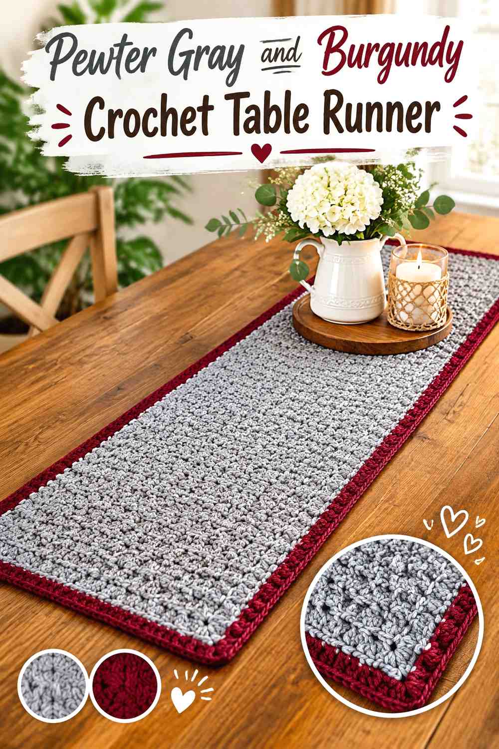
A long table runner benefits from a restrained layout. Pewter gray can extend through most of the center while burgundy anchors the ends or runs along a controlled border. This avoids turning the length of the runner into a sequence of many small stripes.
Pewter Gray Keeps the Burgundy Crochet Table Runner Visually Calm
Use gray through the central area when the stitchwork or open spaces already add plenty of surface interest. The neutral field keeps attention on the construction instead of requiring frequent color changes.
Check the gray against the actual table surface. A pewter shade very close to the tabletop may need more burgundy around the edges to create sufficient separation.
Burgundy Can Anchor Both Ends of a Pewter Gray Crochet Table Runner
Mirrored burgundy sections at the two ends provide clear balance along the long shape.
If you also use burgundy for a complete outer border, keep the end blocks proportionate. Too many dark framing areas can make the gray center appear much smaller than planned.
Creator Credit: B.Hooked Crochet
9. Burgundy And Pewter Gray Crochet Poncho
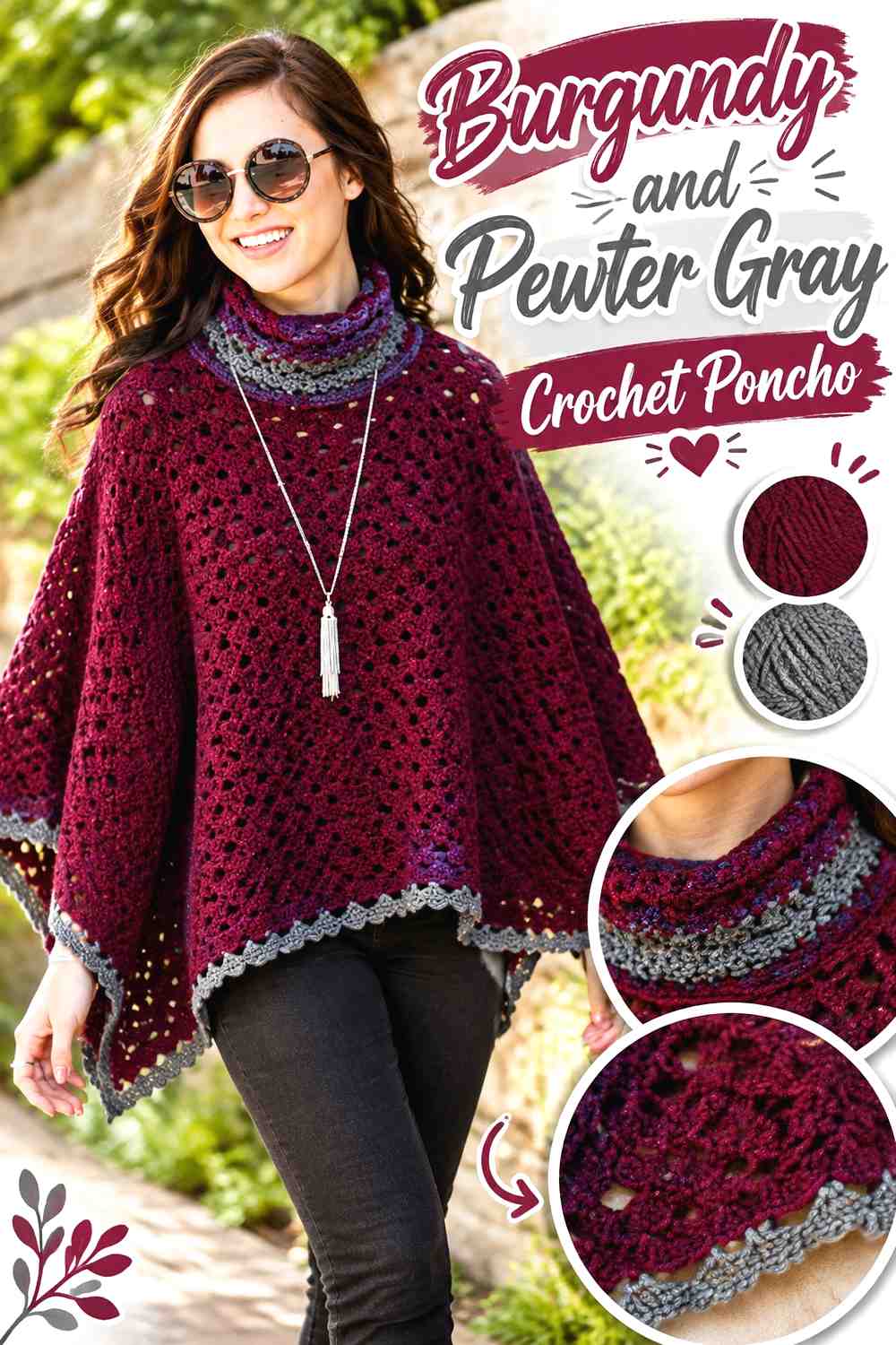
A poncho gives burgundy enough uninterrupted surface to act as a strong garment color. Pewter gray can then define the neckline, cowl, lower edge, or a limited set of bands without disrupting the main drape.
Burgundy Keeps the Main Crochet Poncho Surface Cohesive
Use burgundy across broad body sections when the crochet fabric already contains visible texture or openwork. One consistent main color allows the shape and drape to remain easy to read.
For open fabric, consider what will be worn underneath. A contrasting layer can change how deep the burgundy appears through the spaces.
Pewter Gray Can Frame a Burgundy Crochet Poncho Neckline
Gray around the neckline creates a softer break between the garment and face than continuing the burgundy uninterrupted.
Repeating a smaller gray section near the lower edge can connect the palette from top to bottom. Keep the two gray areas proportionate so they do not compete with the burgundy body.
Creator Credit: Marly Bird
10. Pewter Gray And Burgundy Crochet Bucket Hat

A bucket hat already divides naturally into crown, sides, and brim, making those sections useful color boundaries. Pewter gray can cover the crown and sides while burgundy defines the brim, producing a clear two-color design without additional striping.
Pewter Gray Keeps the Burgundy Crochet Bucket Hat Brim Distinct
A gray upper portion gives the burgundy brim enough contrast to outline the hat’s silhouette.
Avoid adding extra narrow burgundy bands through the crown unless you intentionally want a striped effect. The darker brim alone may provide enough color emphasis.
Burgundy Gives a Pewter Gray Crochet Bucket Hat a Strong Outer Edge
Because the brim projects outward, burgundy placed there can appear more prominent than the same amount of color used on the crown.
If you want a subtler version, limit burgundy to the outer part or final edge of the brim rather than coloring the entire section.
Creator Credit: VivCrochets
11. Burgundy And Pewter Gray Crochet Clutch Bag
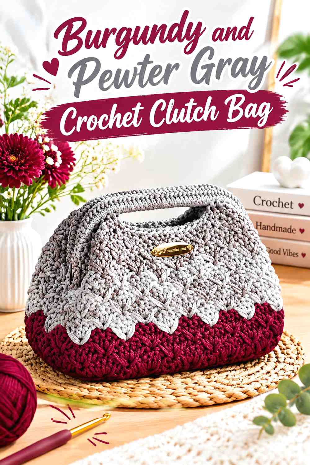
A compact clutch can carry a larger proportion of burgundy without becoming visually heavy because the overall surface is limited. Pewter gray can define the flap, frame area, edge, or a selected front section.
Burgundy Gives the Crochet Clutch a Concentrated Main Color
Use burgundy across most of the body when you want the accessory to retain one continuous rich field. This also prevents the small bag from being broken into too many short color sections.
If the clutch already includes noticeable texture or hardware, keep the gray placement simple so those features do not compete with multiple color transitions.
Pewter Gray Can Define the Opening of a Burgundy Crochet Clutch
A gray flap, upper edge, or narrow frame area visually identifies the opening while reducing the amount of dark color near the top.
Keep the gray accent connected to an actual structural feature. A color change that follows the opening generally looks more intentional than an isolated rectangle in the middle of the bag.
Creator Credit: Pamucni rad Biljana
12. Pewter Gray And Burgundy Crochet Mug Cozy

A mug cozy needs very little color variation to establish this palette. Pewter gray can form the main wrap while burgundy highlights the border, button area, fastening tab, or another small finishing detail.
Pewter Gray Keeps the Burgundy Crochet Mug Cozy Accent From Becoming Busy
Because the finished surface is small, a gray main field leaves enough room for one burgundy feature to have impact.
Avoid introducing burgundy in several unrelated locations simply because they are available. A border plus fastening detail may already be sufficient.
Burgundy Can Highlight Pewter Gray Crochet Mug Cozy Edges
A narrow burgundy edge gives the gray wrap a definite boundary and can be repeated near the fastening area for continuity.
Test the color placement while the cozy is wrapped around the intended mug. Sections that appear well spaced when flat can move close together on the curved surface.
Creator Credit: love.life.yarn. by Amanda Saladin
13. Burgundy And Pewter Gray Crochet Vest
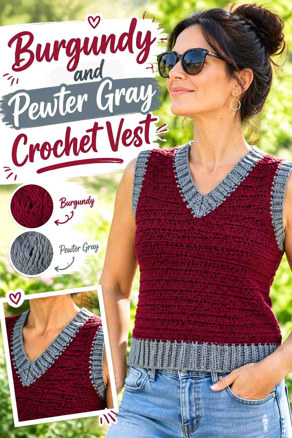
A burgundy vest body creates a rich layering piece, while pewter gray can be used for the waist, neckline, and armhole finishing. Those repeated edges give the supporting color a clear role and help define the garment shape.
Burgundy Keeps the Main Crochet Vest Panels Visually Unified
Use burgundy across the front and back panels when you want the vest to read primarily as one continuous color.
This is particularly useful when the fabric already contains visible texture. The garment does not need extra gray blocks through the body if the edges will carry the contrast.
Pewter Gray Can Define Burgundy Crochet Vest Ribbing and Necklines
Pewter gray around the neckline, armholes, and lower edge creates a repeated frame around the burgundy body.
Look at all three finishing areas together before deciding how wide to make the gray sections. Substantial ribbing on every edge can shift the vest toward a much more evenly divided palette than a narrow trim would.
Creator Credit: Leelee Knits
Comparing Pewter Gray and Burgundy Crochet Color Placement
Choose a pewter-gray-led palette when you want the finished project lighter and the burgundy to function as a controlled focal shade. This direction suits the mosaic pillow, tote, scarf, table runner, bucket hat, and mug cozy especially well because each provides specific areas where burgundy can be repeated without covering the entire object.
Choose a burgundy-led palette when you want more depth across a garment or larger surface. Cardigans, shawls, ponchos, clutches, and vests can carry substantial burgundy areas while pewter gray separates edges and finishing details.
For granny squares and blankets, consider the complete repeated layout rather than judging one motif or section. A small amount of burgundy multiplied across many repeats can become one of the strongest colors in the finished project.
Conclusion
Pewter gray and burgundy are most effective in crochet when their roles stay clear. Pewter gray can provide the quiet field around mosaic motifs, scarf texture, table-runner openwork, and small accessories, while burgundy supplies controlled visual anchors.
For deeper projects, let burgundy lead across cardigan panels, shawls, ponchos, clutches, or vests and use pewter gray to define edges, openings, cuffs, and neckline finishing. Whichever color dominates, check the actual yarns for enough light-and-dark separation before committing to a large project.
Frequently Asked Questions
Does pewter gray have enough contrast with burgundy crochet yarn?
It can, but the exact contrast depends on the shades selected. Some pewter grays are fairly dark, and some burgundies are muted enough that their values become similar. Compare the yarns together or view a grayscale photo if clear separation is important.
Should burgundy or pewter gray dominate an elegant crochet palette?
Either can dominate. Pewter gray creates a quieter overall field with burgundy acting as the focal color. Burgundy creates a richer, darker project, with pewter gray useful for borders, garment finishes, and areas where additional separation is needed.
Where should burgundy go in a mostly pewter gray crochet project?
Place burgundy where a visual anchor makes sense for the object: a pillow motif, bag base, scarf ends, blanket border, bucket-hat brim, table-runner ends, or mug-cozy trim. Repeating the color in related locations helps the accent feel intentional.
How can I stop pewter gray and burgundy crochet from looking too dark?
Increase the proportion of pewter gray rather than adding another color immediately. You can also move burgundy away from the largest surface areas and concentrate it around borders, motifs, cuffs, or other smaller details.
Can I replace pewter gray with another gray?
Yes. Choose the replacement according to its role. If the gray needs to separate burgundy motifs or edging, preserve enough lightness difference. A much darker charcoal could reduce the contrast and make the whole project visually heavier.
Can burgundy and pewter gray work in granny squares?
Yes. A burgundy center with pewter gray surrounding it concentrates the stronger color, while a gray center with burgundy outer sections produces a darker frame. Arrange several squares together before choosing the joining color because repeated borders and joins can change the overall balance.