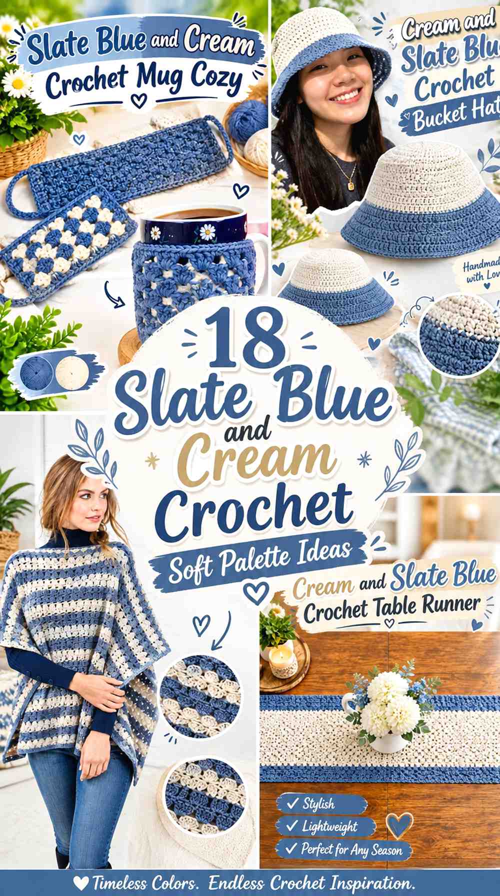
18 Slate Blue and Cream Crochet Soft Palette Ideas
Slate blue and cream create a softer crochet palette than combinations built around bright white or vivid blue. Slate blue brings muted depth, while cream introduces enough lightness to separate stitches, motifs, borders, and garment details without creating an overly sharp contrast.
The balance between the two colors matters more than simply alternating them. A cream-led blanket with slate blue motifs feels very different from a slate-blue cardigan finished with narrow cream edging. These 18 ideas show how to adapt the palette to different crochet items while keeping one shade dominant and giving the second color a specific role.
The linked tutorials support the construction concept for each project. The slate blue and cream arrangements are independent color adaptations, so they should not be taken as claims that the creators used this exact palette.
Quick List
- Slate Blue And Cream Crochet Cable Pillow
- Cream And Slate Blue Crochet Blanket
- Slate Blue And Cream Crochet Cardigan
- Cream And Slate Blue Crochet Tote Bag
- Slate Blue And Cream Crochet Beanie
- Cream And Slate Blue Crochet Granny Square
- Cream And Slate Blue Crochet Headband
- Cream And Slate Blue Crochet Flower Coaster
- Slate Blue And Cream Crochet Basket
- Cream And Slate Blue Crochet Scarf
- Cream And Slate Blue Crochet Placemat
- Cream And Slate Blue Crochet Vest
- Slate Blue And Cream Crochet Pouch
- Cream And Slate Blue Crochet Table Runner
- Slate Blue And Cream Crochet Poncho
- Cream And Slate Blue Crochet Bucket Hat
- Slate Blue And Cream Crochet Mug Cozy
Let Slate Blue and Cream Have Different Crochet Roles
A two-color palette becomes clearer when one shade occupies most of the project and the other performs a supporting job. Slate blue can cover cardigan panels, pillow faces, basket bases, and hat crowns, while cream handles edging, cuffs, borders, or smaller motifs. Reverse that balance when you want the finished piece to appear lighter.
Avoid automatically dividing every project fifty-fifty. Equal color blocks can work when the construction supports them, but on smaller accessories they can make the item look visually chopped up. A dominant, supporting, and occasionally repeated accent relationship usually gives this subdued palette more continuity.
Use Cream to Protect Slate Blue Crochet Texture
Muted colors can visually blend when their values are close, especially across textured crochet. Place cream beside slate blue cables, motif edges, ribbing, or openwork when you want those details to remain easier to distinguish.
Before committing to a large project, compare the yarns side by side and take a grayscale photo if contrast is important. Two yarns can look clearly blue and cream in color while still being closer in lightness than expected.
1. Slate Blue And Cream Crochet Cable Pillow
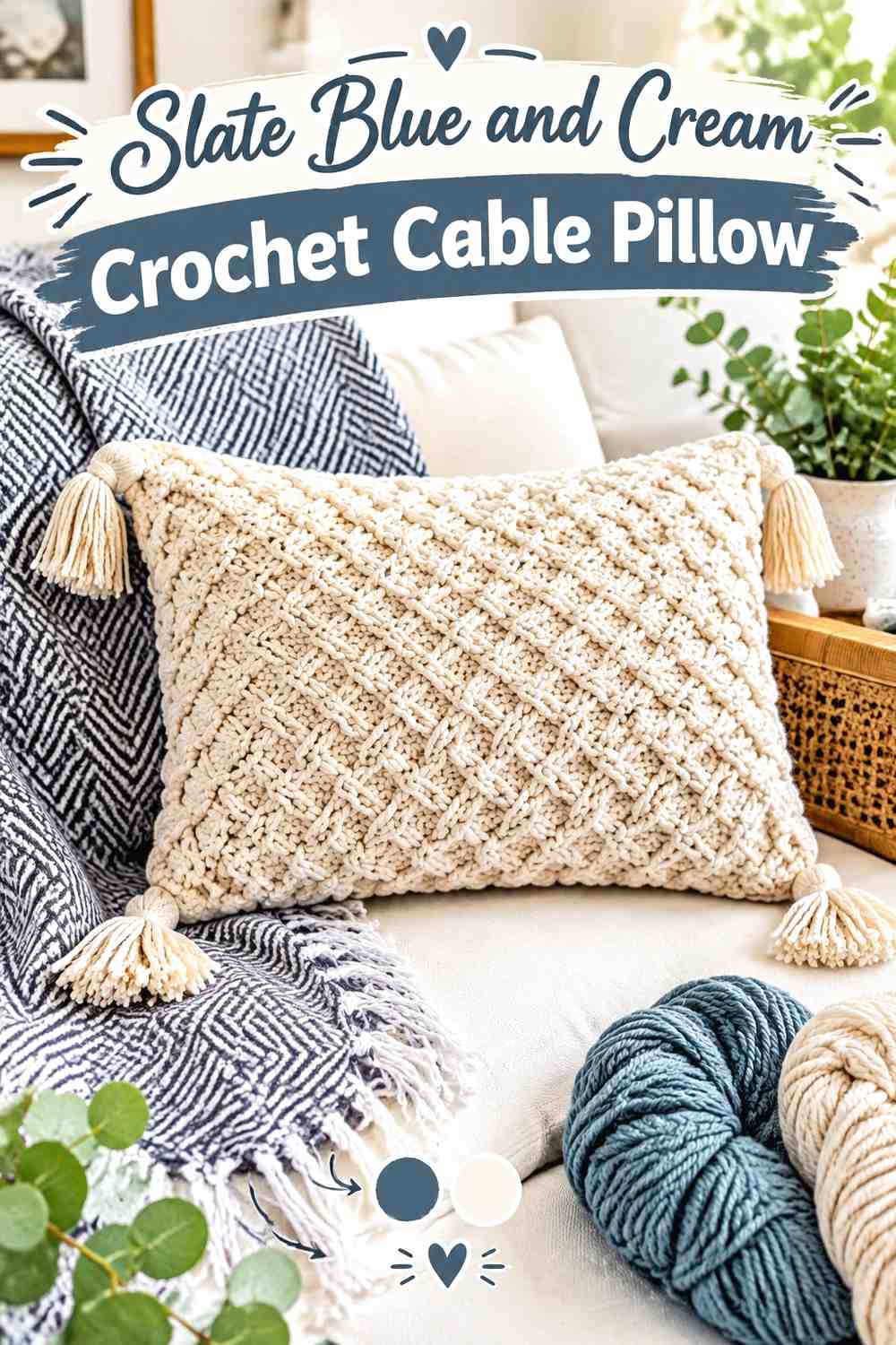
Slate blue suits a textured pillow face because it gives the surface more depth without relying on a very dark color. Let slate blue cover most of the front, then introduce cream around the outer border, back panel, or another controlled finishing area. The light edge can separate the pillow from a dark sofa while leaving the cable texture as the main feature.
Slate Blue Gives the Crochet Pillow Cables a Calm Main Field
Keep large raised sections in slate blue when you want the stitch texture rather than frequent color changes to carry the pillow design. Muted blue allows shadows from the raised fabric to contribute additional definition.
Check the swatch in the room where the pillow will be used. If the cable structure becomes difficult to see in lower light, increasing the amount of cream around the textured area can create clearer separation.
Cream Can Frame the Slate Blue Crochet Pillow Face
A cream border gives the slate blue center a distinct stopping point. This is especially useful when the pillow will sit against navy, charcoal, or another medium-to-dark background.
Keep the cream concentrated rather than scattering small accents over every raised section. One clear frame generally preserves the soft palette better than many high-frequency color changes.
Creator Credit: MJ’s Off The Hook Designs
2. Cream And Slate Blue Crochet Blanket
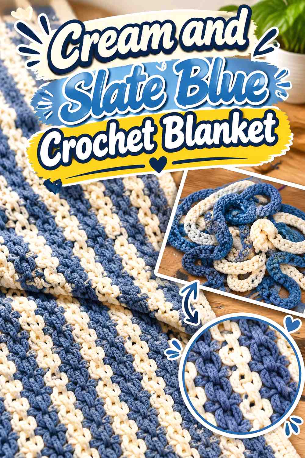
A cream-dominant blanket keeps a large project visually light, while slate blue can define repeating links, squares, stripes, or other structural areas. Because a blanket is viewed both close up and from across a room, repeat the blue at predictable intervals instead of allowing one dark section to become isolated.
Cream Gives Slate Blue Crochet Blanket Motifs More Space
Use cream between slate blue sections when the construction contains repeated motifs. The lighter gaps keep adjoining blue shapes from merging into one larger area when the blanket is viewed from a distance.
If you want a quieter result, increase the cream coverage rather than choosing a nearly white blue. Preserving a recognizable difference between the two shades keeps the motif structure intact.
Slate Blue Can Repeat Through a Cream Crochet Blanket Without Taking Over
Slate blue works well as a returning secondary color: motif outlines, intermittent bands, selected centers, or the final border can all carry it.
Choose one repetition strategy before making a large number of sections. Randomly increasing the blue later can make one end of the blanket appear heavier than the other.
Creator Credit: Sooz In The Shed
3. Slate Blue And Cream Crochet Cardigan
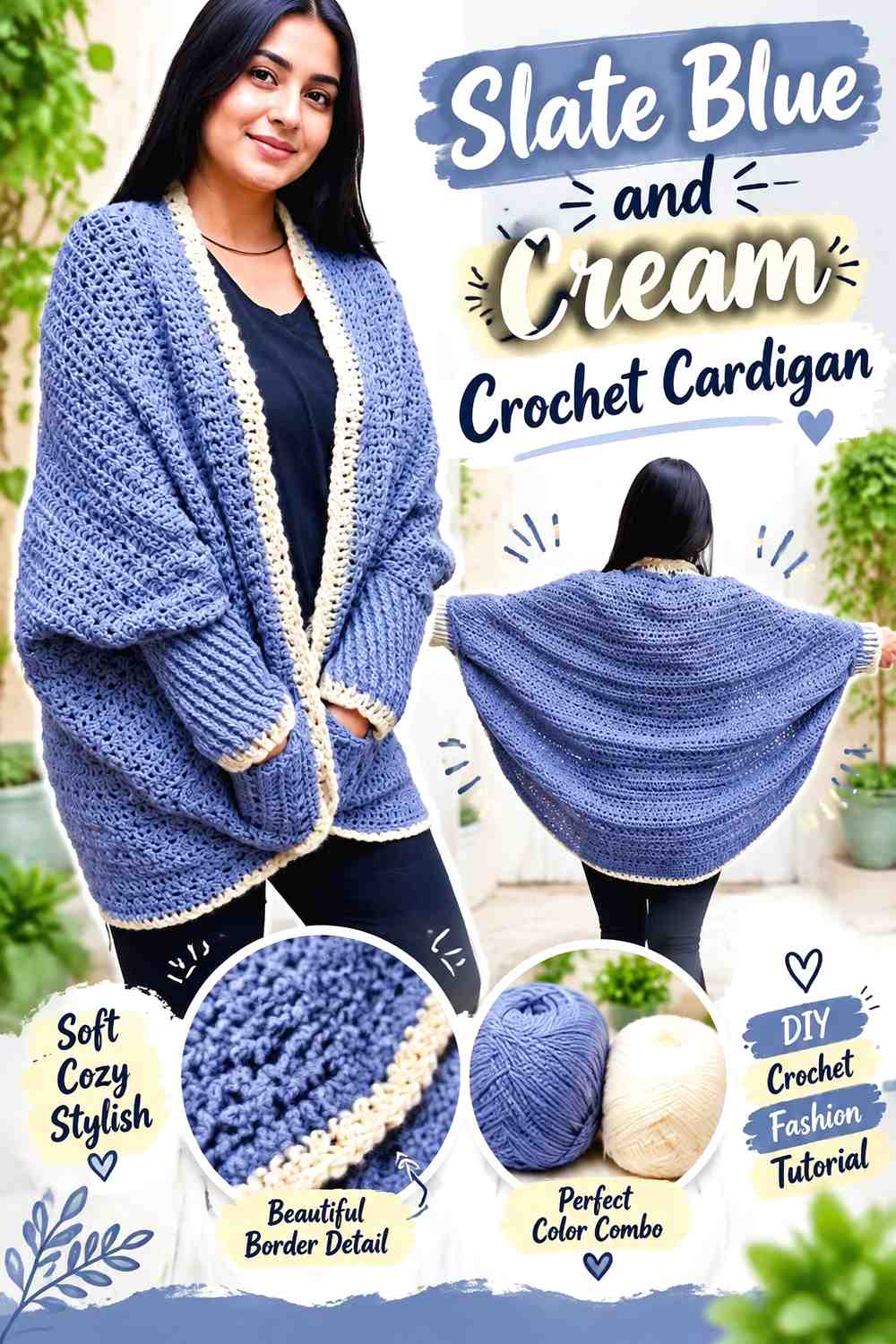
Slate blue can cover the main cardigan body while cream picks out garment edges that naturally repeat, such as cuffs, neckline finishing, front bands, or pocket trim. This gives the wearable a soft two-tone appearance without breaking the body panels into many small color blocks.
Slate Blue Keeps the Main Crochet Cardigan Panels Cohesive
Use slate blue continuously across larger front and back sections when the cardigan already includes visible texture, pockets, or seam lines. One main color prevents those structural elements from competing with additional color changes.
If sleeves are also slate blue, the garment reads as one connected shape even when cream is later introduced around the edges.
Cream Can Clarify Slate Blue Crochet Cardigan Cuffs and Edging
Cream works particularly well on repeated finishing areas. Matching cream cuffs and neckline edging creates a recognizable system rather than a collection of unrelated accents.
If the cardigan includes pockets, decide whether their trim should join that system. Adding cream to every small detail can shift the garment away from a slate-blue-led palette.
Creator Credit: Nirvana Crochet
4. Cream And Slate Blue Crochet Tote Bag

A cream tote body gives the muted blue enough contrast to work effectively at the base, upper edge, or handles. Because bags have obvious structural zones, the darker color can follow those zones rather than appearing as decorative stripes with no connection to the shape.
Cream Keeps the Crochet Tote Body Visually Light
Use cream for most of the bag walls when you want stitch texture or an open pattern to remain noticeable. The pale field also makes a slate blue base or strap look deliberate rather than incidental.
Consider where the bag will receive the most handling before choosing the final color distribution. The palette should support the practical layout rather than color placement alone determining the structure.
Slate Blue Can Connect the Crochet Tote Base and Handles
Repeating slate blue at both the base and handles visually links the lower and upper portions of the bag. It gives the darker shade a structural purpose.
If that creates too much blue, keep the base slate and use cream handles with narrow blue edging. The repeated relationship can remain without giving both areas equal visual weight.
Creator Credit: Toh Handmade
5. Slate Blue And Cream Crochet Beanie
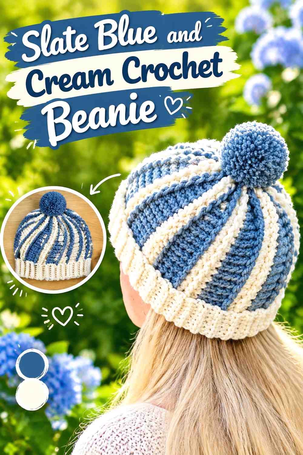
A compact beanie benefits from broad color areas. Slate blue can cover most of the crown, while cream appears around the lower band or another narrow repeated detail. This keeps the soft palette from turning into a series of busy stripes.
Slate Blue Gives the Crochet Beanie Crown One Continuous Color
Keeping the main hat body slate blue allows ribbing or other texture to remain the visual focus. It also makes the muted color feel intentional rather than like one of several competing bands.
Check the yarn under ordinary indoor light before committing to the whole hat. Some subdued blue-gray shades can appear darker once worked into dense texture.
Cream Can Define the Lower Edge of a Slate Blue Crochet Beanie
A cream band creates a clean transition at the lower edge and provides more contrast near the face without interrupting the crown.
If you want an even softer version, keep the cream band narrow. A broad cream section may make the hat read as equally divided instead of primarily slate blue.
Creator Credit: Di’s Handicrafts (Crochet and Knitting)
6. Cream And Slate Blue Crochet Granny Square

A granny square makes color hierarchy especially visible because centers, intermediate sections, and outer rounds can each have a separate role. Cream in the center with slate blue outside creates a light focal point, while the reversed order makes the blue center the visual anchor.
Cream Centers Keep Slate Blue Crochet Granny Squares Airier
Place cream near the center when many squares will eventually sit beside one another. Repeating a pale center across a large grid can prevent the complete project from becoming darker than expected.
The effect becomes more important as the number of motifs increases. Judge several squares together instead of relying only on one sample.
Slate Blue Borders Give Cream Crochet Granny Squares Clear Edges
Using slate blue around the outer portion can make individual cream-led squares easier to distinguish after joining.
If slate blue is also used for the join, test a small group first. Dark outer rounds plus dark joins can produce a stronger grid than the single motif suggests.
Creator Credit: Crochet with Tuula Maaria
7. Cream And Slate Blue Crochet Headband
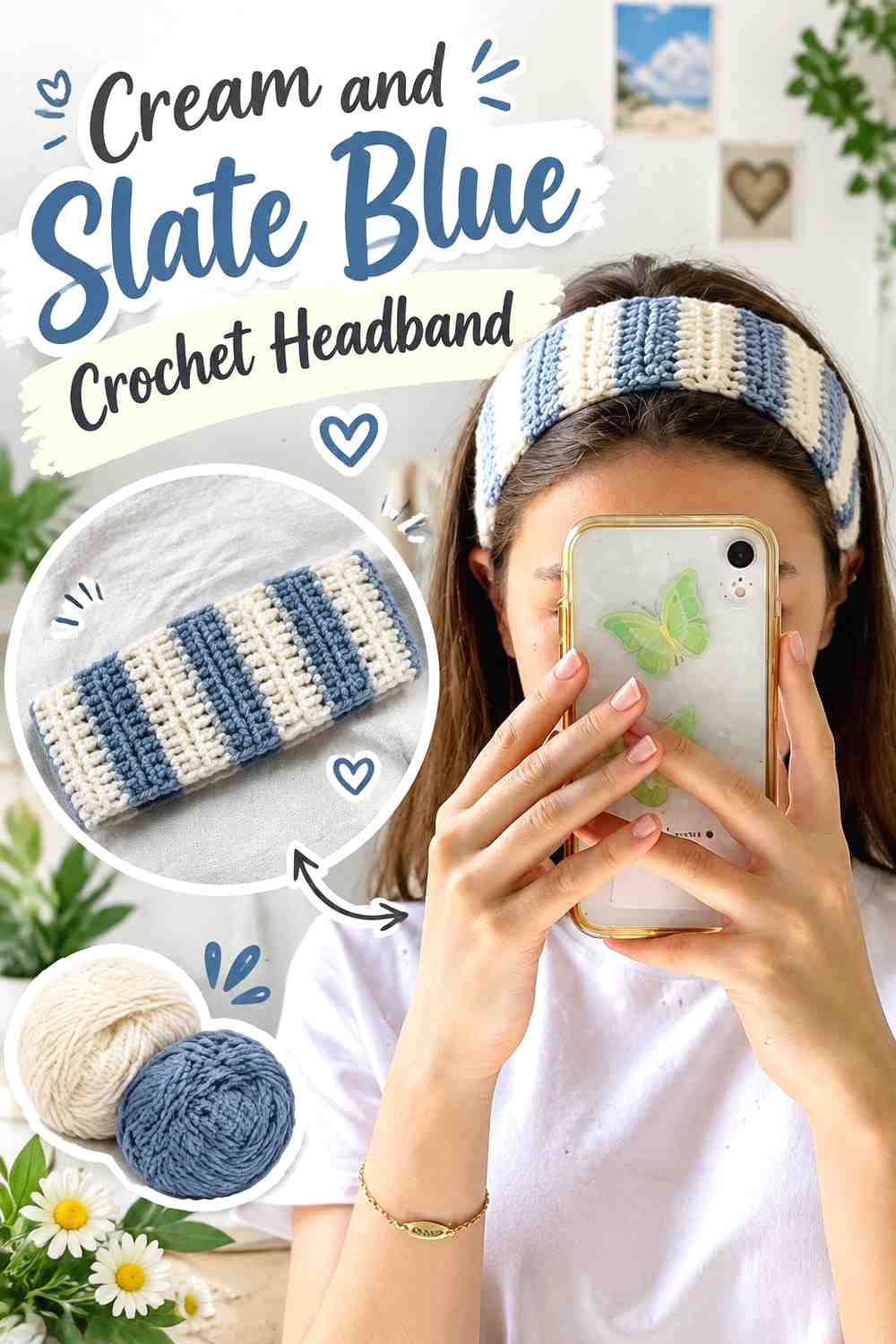
A headband has little surface area, so one color should clearly lead. Cream can form the majority of the band while slate blue is concentrated near the central crossing, twist, or another repeated feature.
Cream Keeps the Slate Blue Crochet Headband Accent Controlled
A cream main band leaves enough light space for a relatively small slate blue section to remain noticeable. It also avoids turning the accessory into multiple short stripes.
If the headband includes strong ribbing, the pale color can help that texture remain visible without introducing additional shades.
Slate Blue Can Mark the Center of a Cream Crochet Headband
Concentrate slate blue near the visual center when the design has a twist, overlap, or crossing point. The darker color naturally directs attention there.
Check that the color block remains centered when the headband is worn. Against cream, even a small alignment difference can become more obvious.
Creator Credit: carla.bycarla
8. Cream And Slate Blue Crochet Flower Coaster
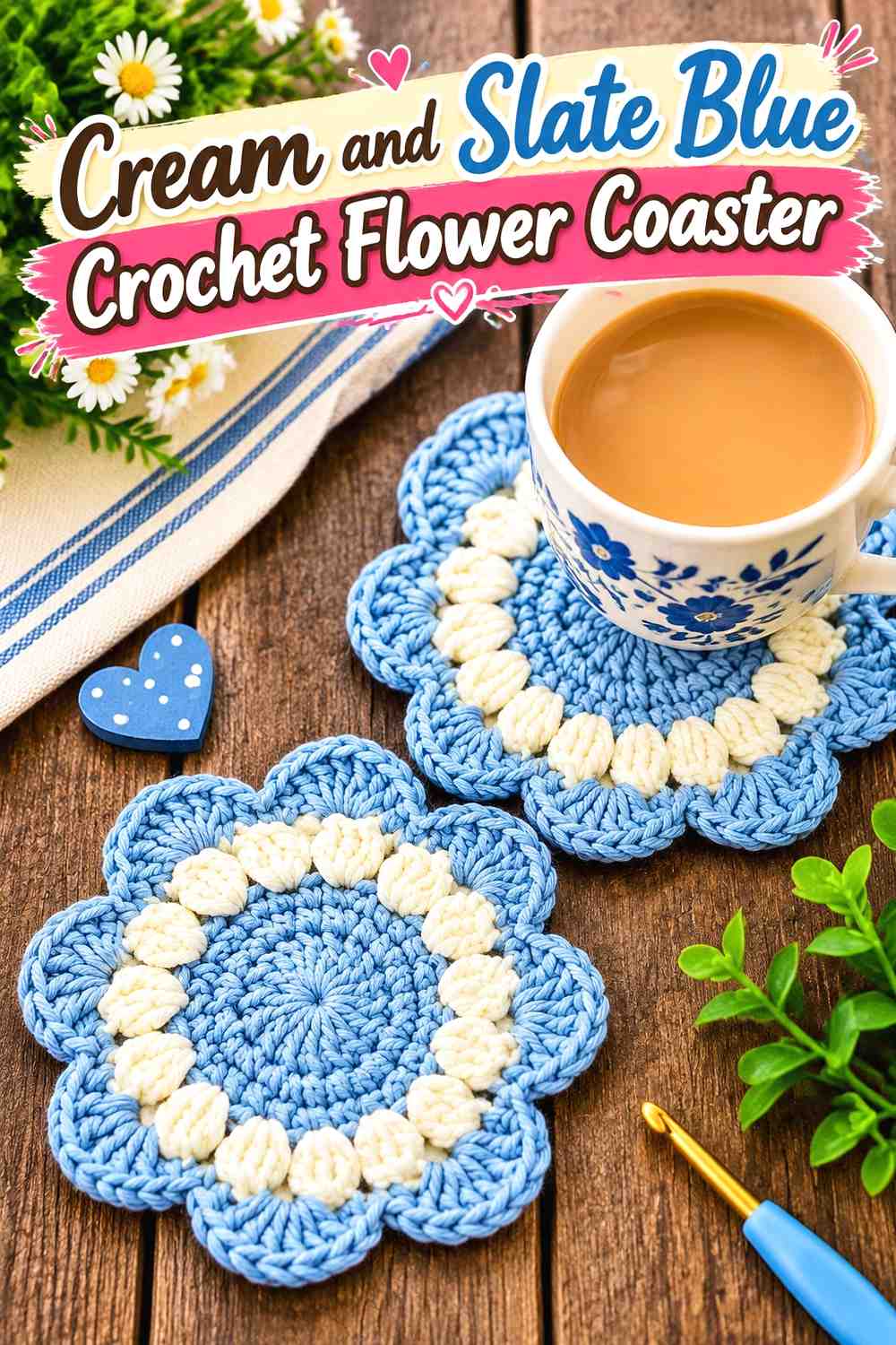
Flower coasters give the two colors naturally separate areas. Cream petals with a slate blue center create a light flower with a muted focal point, while slate petals with a cream center produce a stronger outline.
Cream Petals Keep the Slate Blue Crochet Coaster Center Visible
Using slate blue only in the flower center gives the darker color impact without requiring much of it. Cream petals maintain the soft overall appearance.
Place one finished sample on the intended table before making a set. Cream petals can nearly disappear against very pale surfaces.
Slate Blue Petals Can Give Cream Crochet Coasters More Definition
Reverse the arrangement when stronger outlining is needed. Slate blue petals create a more substantial silhouette around a small cream center.
For a coordinated set, you can alternate the two arrangements while maintaining the same pair of yarns. Repetition of the palette keeps the variations connected.
Creator Credit: A Little Crab Crochet
9. Slate Blue And Cream Crochet Basket
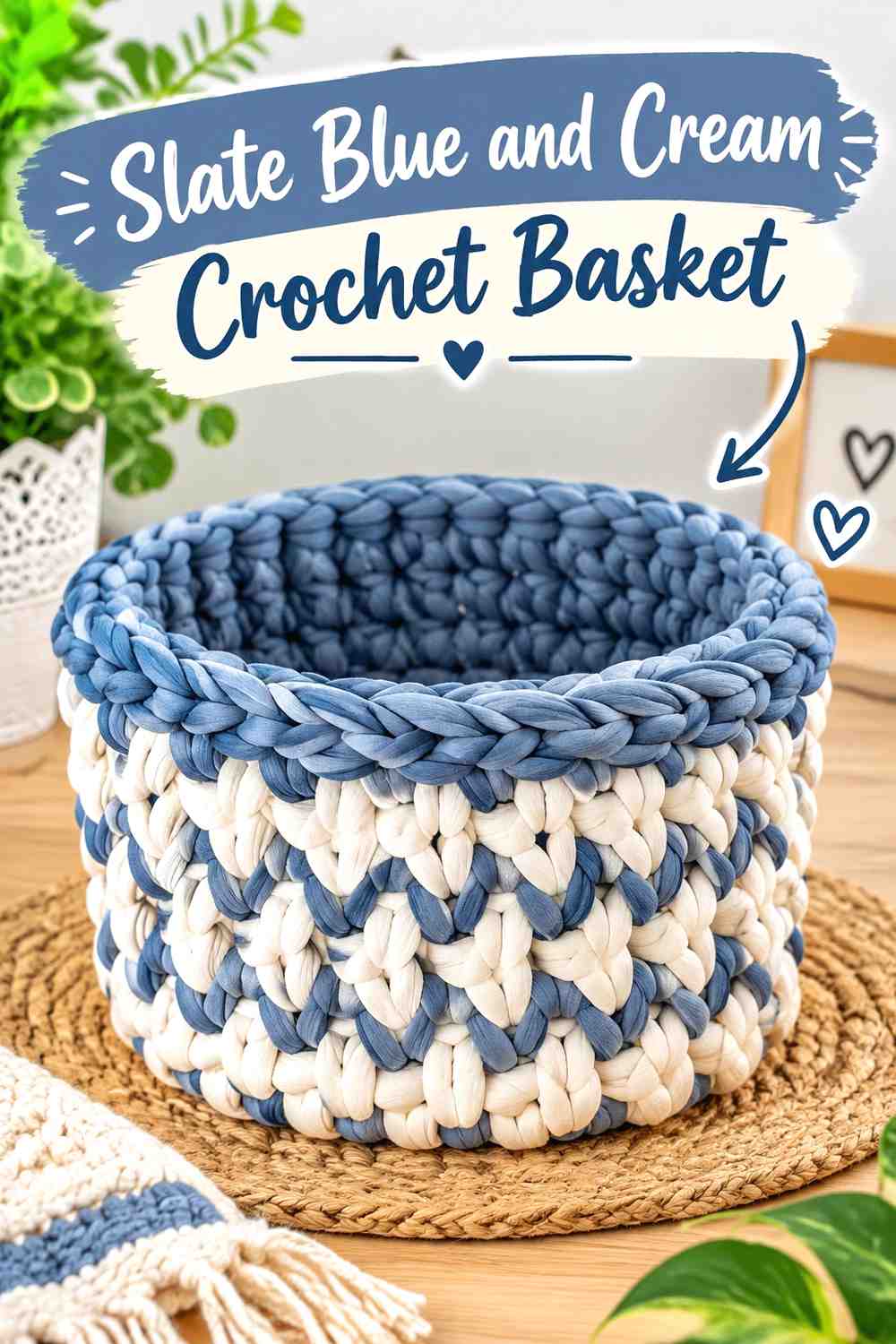
A basket provides an obvious base, wall, and rim, making color placement easier to organize. Slate blue can ground the lower portion while cream takes over above it, or cream can be limited to the rim when a darker basket is preferred.
Slate Blue Grounds the Base of a Cream Crochet Basket
Using slate blue across the lower portion connects the deeper shade with the physical base of the basket. The placement looks more intentional than adding an unrelated dark stripe halfway up the walls.
Use the natural change between base and sides as a possible color transition point.
Cream Can Lighten the Upper Slate Blue Crochet Basket Walls
Cream above a blue base reduces the amount of medium-dark color visible when the basket is viewed on a shelf.
If you want slate blue to dominate instead, reverse the proportion and use cream only along the opening. Even a narrow cream rim can give the top edge a clear finish.
Creator Credit: Lallaulab
10. Cream And Slate Blue Crochet Scarf
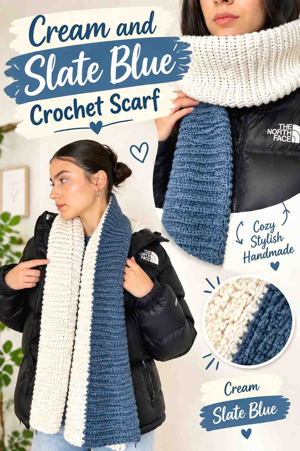
A scarf gives you enough length to repeat slate blue without crowding the palette. Cream can occupy the central body while slate blue defines both ends or appears as several widely spaced bands.
Cream Keeps a Long Slate Blue Crochet Scarf Palette Soft
Large cream sections prevent repeated blue from turning the scarf into a high-frequency striped piece. This is especially useful when the stitch pattern already has plenty of visible texture.
Choose broader color zones when you want the palette itself to stay understated.
Slate Blue Can Balance Both Ends of a Cream Crochet Scarf
Repeating the same slate blue treatment at each end visually balances the scarf when it hangs down the front of an outfit.
Drape the work before settling on the final blue proportion. Sections that appear far apart on a flat scarf may sit directly beside one another when it is wrapped.
Creator Credit: crochet daniela
11. Cream And Slate Blue Crochet Placemat

A placemat is well suited to a cream center and slate blue border because the two colors can follow the object’s natural frame. This allows the darker shade to define the perimeter while leaving the central surface quieter.
Cream Gives the Slate Blue Crochet Placemat Border Room to Show
Keep most of the placemat cream when the border is intended to be the main color feature. A larger pale center makes even a relatively narrow slate blue edge easy to notice.
View several placemats together before increasing the border width. Repeated dark frames become much more prominent across an entire table setting.
Slate Blue Can Frame a Cream Crochet Placemat Without Sharp Contrast
Slate blue provides a softer outline than very dark navy or black while still separating the cream center from many tabletop colors.
If the exact slate shade is unavailable, look for another muted medium blue-gray that remains clearly darker than the cream.
Creator Credit: The Turtle Trunk
12. Cream And Slate Blue Crochet Vest
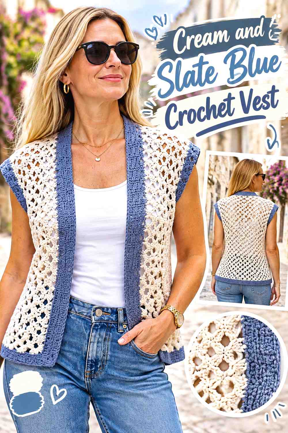
A cream-led vest creates a light base that can support slate blue around the neckline, armholes, lower ribbing, or selected panels. Because a vest has fewer garment sections than a cardigan, color placement needs to be especially deliberate.
Cream Keeps Slate Blue Crochet Vest Details Separated
Use cream across the larger front and back areas if slate blue is intended to work mainly as trim. The pale body gives each darker edge enough surrounding space.
If you introduce a large slate blue chest or center panel, reconsider the remaining accents so the garment does not become evenly divided by accident.
Slate Blue Can Link Cream Crochet Vest Armholes and Neckline
Repeated blue edging around the armholes and neckline creates a recognizable frame. The lower edge can join that system when stronger outlining is wanted.
Keep additional blue motifs limited if all major edges already use the color. Too many separate dark features can weaken the soft quality of the palette.
Creator Credit: Handwork diy
13. Slate Blue And Cream Crochet Pouch
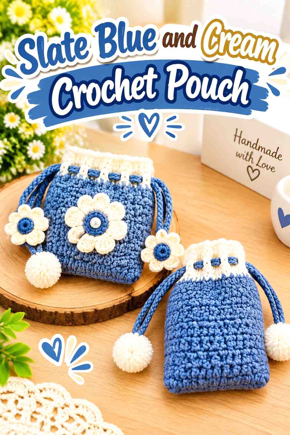
A small pouch can comfortably use slate blue over most of its body because the total surface is limited. Cream then works well around the opening, flap, drawstring area, or another finishing feature.
Slate Blue Gives the Crochet Pouch a Clear Main Color
Keeping most of the pouch one color prevents a small accessory from being broken into several short sections. It also leaves enough contrast for a cream closure detail.
Use a natural structural transition near the opening as the color-change point instead of inserting an arbitrary stripe in the middle.
Cream Can Define the Opening of a Slate Blue Crochet Pouch
A cream upper edge makes the opening easy to distinguish from the pouch body. If the construction includes ties, repeating cream there can connect the finishing details.
Keep the pale section narrow if you want slate blue to remain clearly dominant.
Creator Credit: Shivani Creations
14. Cream And Slate Blue Crochet Table Runner
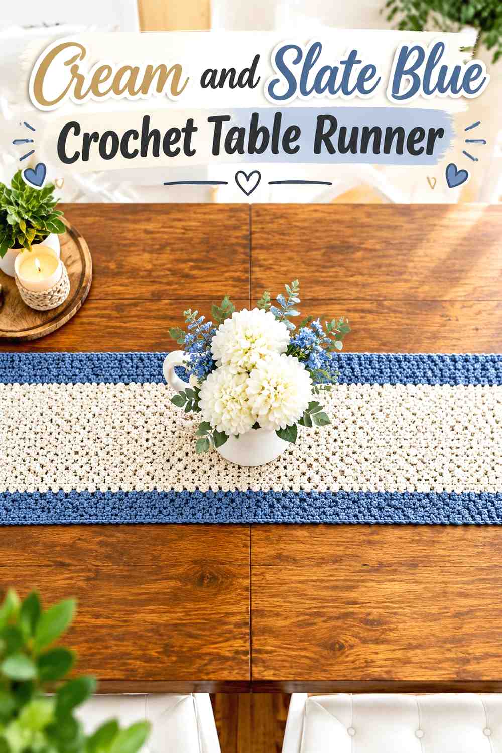
A long table runner benefits from broad areas rather than many rapid color changes. Cream can lead through the center while slate blue appears at both ends or along a restrained border.
Cream Keeps the Slate Blue Crochet Table Runner Light Across Its Length
A cream center prevents the runner from becoming a long dark band down the table. It also gives openwork or repeated texture more opportunity to remain visible.
Compare the cream directly with the table surface before committing. A runner needs enough visual separation from the furniture beneath it.
Slate Blue Can Anchor Both Ends of a Cream Crochet Table Runner
Matching slate blue end sections provide balance across a long rectangle. They also make the darker color noticeable without interrupting the central area repeatedly.
If a blue border is added too, keep the end sections proportionate so the cream center remains the dominant field.
Creator Credit: B.Hooked Crochet
15. Slate Blue And Cream Crochet Poncho
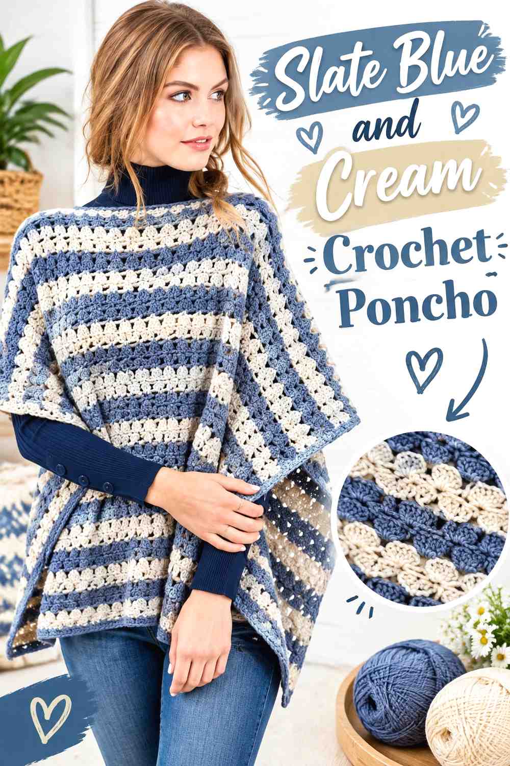
A poncho gives slate blue plenty of room to act as the main color while cream identifies the neckline, cowl, hem, or selected bands. Larger color fields usually work better here than many narrow stripes because the fabric drapes across a broad area.
Slate Blue Keeps the Crochet Poncho Body Visually Continuous
Use slate blue across most of the main panels if the stitch pattern or openwork already supplies visual interest. Continuous color allows that construction to remain easy to read.
If the fabric is open, remember that clothing underneath may affect the perceived depth of the slate blue.
Cream Can Separate a Slate Blue Crochet Poncho Neckline and Hem
Cream near the neckline creates a light break beside the large blue body. Repeating a smaller cream section at the lower edge can connect the top and bottom.
Lay the major sections together before finishing. A large cream cowl plus a wide cream hem can occupy much more of the garment than either section appears to individually.
Creator Credit: Marly Bird
16. Cream And Slate Blue Crochet Bucket Hat
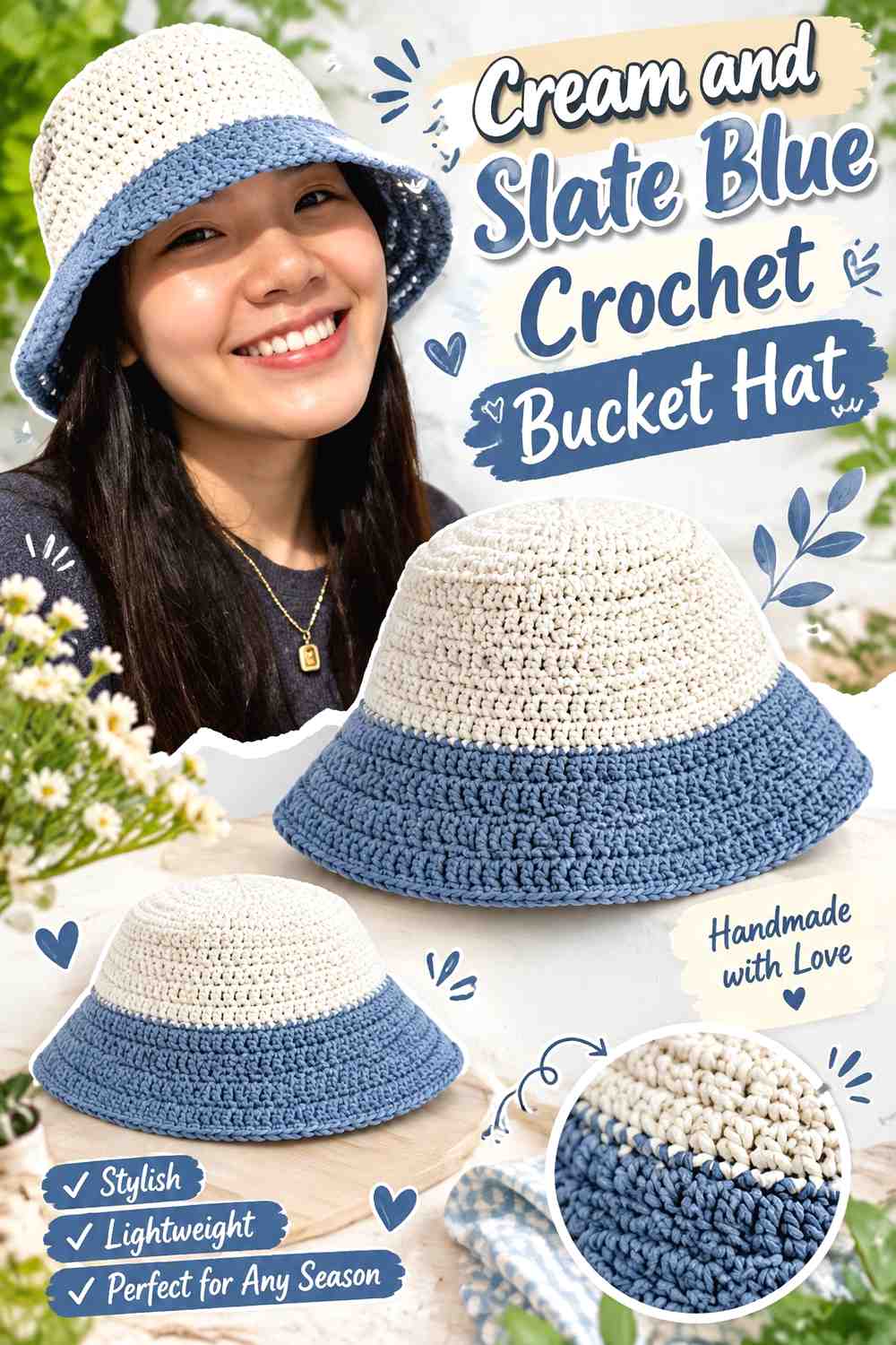
A bucket hat naturally divides into crown, sides, and brim, giving the two-color palette useful structural boundaries. Cream can cover the crown and upper body while slate blue defines the brim, or the colors can be reversed for a deeper overall result.
Cream Keeps the Slate Blue Crochet Bucket Hat From Feeling Too Dark
A cream upper section lightens the hat while allowing slate blue to concentrate around the edge where the brim changes the silhouette.
Avoid several narrow alternating bands unless striping is the intended design. The hat already has enough visible sections to organize two broad colors clearly.
Slate Blue Gives a Cream Crochet Bucket Hat Brim More Definition
A slate blue brim creates a noticeable frame around a cream body and emphasizes the change from vertical sides to the outward brim.
For a subtler version, use slate blue only on the outer portion or final edge of the brim rather than across the entire section.
Creator Credit: VivCrochets
17. Slate Blue And Cream Crochet Mug Cozy

A mug cozy is small enough that simple color placement is usually stronger. Slate blue can make up the main wrap while cream appears around the edge, closure, granny-square center, or another compact feature.
Slate Blue Gives the Crochet Mug Cozy a Calm Main Surface
Keep the largest part slate blue if the cozy includes texture that you want to remain continuous around the mug.
Because the project is compact, one or two cream areas are usually enough to establish the two-color palette. Several separate accents can quickly make the surface look crowded.
Cream Can Highlight the Slate Blue Crochet Mug Cozy Edges
Cream edging provides a light boundary at the top or bottom of a slate blue wrap. When the construction has a fastening or handle opening, a repeated cream detail there can make the color placement feel connected.
Test the cozy on the intended mug before deciding where the light color should stop. The visible proportions change once the flat piece wraps around a curved surface.
Creator Credit: Katia Creates
Conclusion
Slate blue and cream work particularly well when the palette stays restrained. For a lighter result, use cream across blankets, scarves, placemats, vests, table runners, headbands, and bucket hats, then let slate blue mark borders, motifs, or structural details. For more muted depth, reverse the relationship on pillows, cardigans, baskets, pouches, beanies, ponchos, and smaller accessories.
The most important step is deciding what the second color is supposed to accomplish. It might frame an edge, define a motif, mark a garment finish, ground a basket base, or repeat across both ends of a long project. When cream and slate blue each have a clear job, the finished crochet piece remains soft without becoming visually flat.
Frequently Asked Questions
Is slate blue dark enough to contrast with cream crochet yarn?
It can be, but slate blue covers a range of muted blue-gray shades. Compare your specific yarns side by side. If small motifs or detailed edging need strong separation, a slightly deeper slate blue may work better than one that is close to cream in value.
Should cream or slate blue dominate a soft crochet palette?
Either can lead. Cream creates the lighter version of the palette, while slate blue produces more visual depth. Choose the dominant shade according to the finished item and use the second color on specific areas such as borders, cuffs, motifs, handles, or trim.
How do I keep slate blue and cream crochet from looking too plain?
Use placement and crochet texture rather than adding unnecessary colors. Raised stitches, granny-square centers, borders, ribbing, openwork, or repeated edging can create enough visual variation while keeping the palette limited to two shades.
Can I replace slate blue with another muted blue?
Yes. Look for a softened blue or blue-gray with similar visual depth. If slate blue is being used to define cream motifs or borders, make sure the replacement remains noticeably darker than the cream.
Where should cream go in a mostly slate blue crochet project?
Cream works particularly well around edges and areas that benefit from definition: cardigan cuffs, pillow borders, pouch openings, beanie bands, poncho necklines, basket rims, or the centers of small motifs.
Can slate blue and cream work in the same granny-square project?
Yes. Decide first whether you want cream or slate blue to dominate the overall grid. Cream centers with slate blue borders create one effect, while slate centers surrounded by cream make the blue more concentrated. Arrange several completed squares together before choosing a joining color.