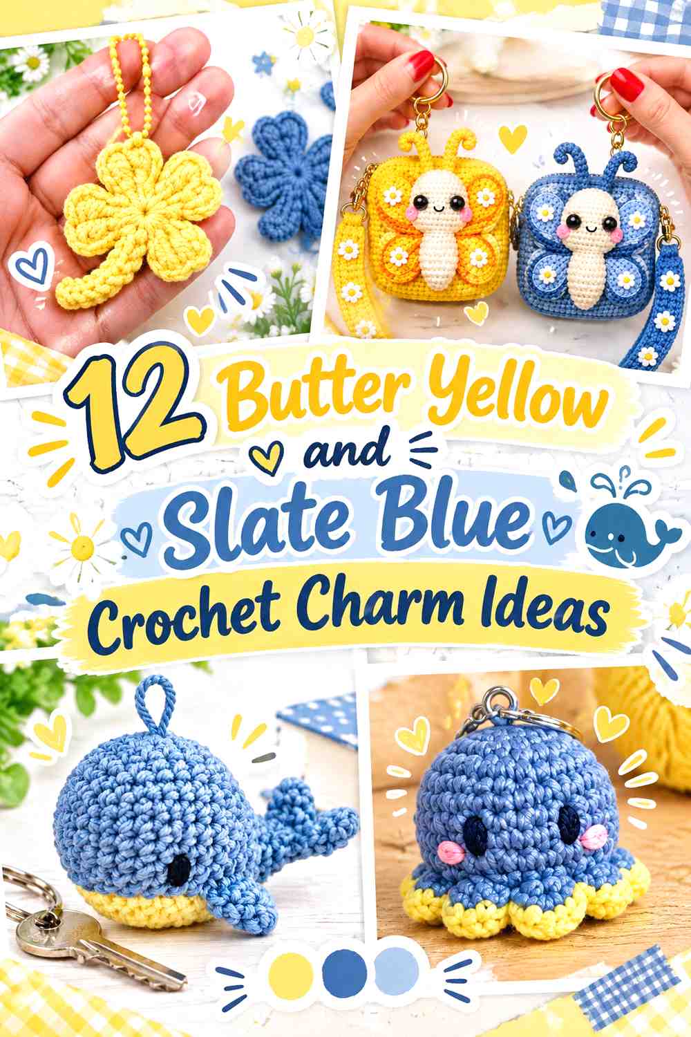
12 Butter Yellow and Slate Blue Crochet Charm Ideas
Butter yellow and slate blue create useful contrast on small crochet charms because the lighter yellow can bring attention to tiny centers, petals, faces, and decorative details, while slate blue gives those areas a darker visual boundary. The combination can feel especially effective on projects that need to remain recognizable when hanging from a bag, key ring, or backpack.
These colors do not need equal coverage. Butter yellow can dominate cheerful flower and fruit motifs, while slate blue works well across animals, outlines, stems, straps, and secondary sections. Reversing that balance produces a quieter charm with just a small yellow focal point.
The tutorials below support the crochet charm concepts. The butter yellow and slate blue palettes are independent color adaptations, so the creators do not necessarily use these exact colors in their tutorials.
Quick List
- Butter Yellow And Slate Blue Crochet Flower Charm
- Slate Blue And Butter Yellow Crochet Heart Charm
- Slate Blue And Butter Yellow Crochet Mushroom Charm
- Butter Yellow And Slate Blue Crochet Cherry Charm
- Butter Yellow And Slate Blue Crochet Sunflower Charm
- Slate Blue And Butter Yellow Crochet Bow Charm
- Slate Blue And Butter Yellow Crochet Mini Bag Charm
- Slate Blue And Butter Yellow Crochet Turtle Charm
- Slate Blue And Butter Yellow Crochet Octopus Charm
- Slate Blue And Butter Yellow Crochet Whale Charm
- Butter Yellow And Slate Blue Crochet Butterfly Charm
- Butter Yellow And Slate Blue Crochet Clover Charm
Use Butter Yellow Where Small Crochet Charm Details Need Attention
Small charms give each color less surface area than a garment or home-decor project, so placement matters. Butter yellow is useful around flower centers, small accent patches, bows, wings, or other details that could disappear when the charm is viewed from several feet away.
That does not mean every tiny detail should be yellow. Pick one or two focal areas and let slate blue provide the darker surrounding field. A concentrated yellow feature usually communicates the palette more clearly than many unrelated specks of color.
Let Slate Blue Give Butter Yellow Crochet Charms a Stronger Outline
Slate blue can act as the visual anchor when butter yellow occupies the lightest areas. Use it for bodies, outer petals, borders, stems, straps, or surrounding sections when you want the silhouette to remain distinct.
Check your actual yarns side by side before starting several matching charms. Color names do not guarantee light-and-dark contrast. If your slate blue is unusually pale, the boundary against butter yellow may be softer than expected.
1. Butter Yellow And Slate Blue Crochet Flower Charm

A flower charm gives the two colors obvious jobs. Butter yellow can dominate the petals while slate blue defines the center, selected petal details, or hanging loop. Because the motif is small, keeping the main petal color consistent usually makes the flower easier to recognize than alternating every petal.
Butter Yellow Keeps the Crochet Flower Petals Visually Connected
Using butter yellow across the petals creates one clear flower shape rather than several separate color blocks. This is particularly useful when the charm will hang against a patterned backpack or bag where tiny color changes can become harder to see.
If you want more slate blue, add it around the center or another repeated structural detail instead of changing individual petals randomly.
Slate Blue Gives the Butter Yellow Flower Center More Definition
A slate blue center provides a darker anchor inside the lighter petals. You can repeat a small amount of blue in the hanging loop if the center otherwise feels isolated.
If your chosen slate blue and butter yellow are close in value, enlarge the central color area slightly rather than relying on a very narrow outline.
Creator Credit: sherrscrochet
2. Slate Blue And Butter Yellow Crochet Heart Charm

A heart charm can reverse the balance and let slate blue occupy the main shape. Butter yellow then becomes a smaller highlight around an edge, joining area, or hanging detail. This arrangement keeps the heart recognizable as one solid form while giving the lighter color a clear purpose.
Slate Blue Lets the Crochet Heart Read as One Strong Shape
Covering most of the heart in slate blue avoids dividing a compact motif into too many sections. It also gives the curved outline enough dark visual weight to remain visible when the charm hangs against light fabric.
If the heart construction creates prominent texture, check whether your particular slate blue still shows that texture clearly before making it the only body color.
Butter Yellow Can Highlight the Slate Blue Heart Edge
Butter yellow edging can separate the heart from a dark bag or backpack, particularly if the slate blue is close to the background color.
You do not need to outline every part of the charm. A yellow joining detail or hanging loop can provide a lighter break if a complete border feels too strong.
Creator Credit: Tabilaco
3. Slate Blue And Butter Yellow Crochet Mushroom Charm
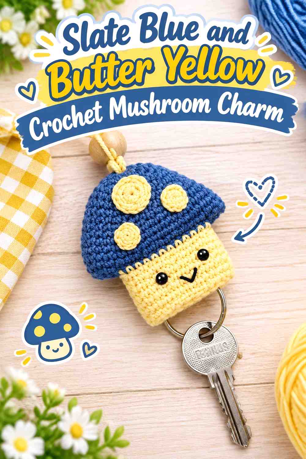
A mushroom offers a natural two-part division between cap and lower section. Slate blue can cover the cap while butter yellow appears underneath or in small cap details. Keeping those roles consistent makes the mushroom shape clearer than scattering both colors evenly across every section.
Slate Blue Makes the Crochet Mushroom Cap the Visual Anchor
The cap usually occupies a prominent part of a mushroom motif, making it a logical place for the darker shade. A slate blue cap gives the charm enough visual weight to remain recognizable among other hanging accessories.
If you add butter yellow spots or patches, space them deliberately rather than trying to fill every available area.
Butter Yellow Separates the Slate Blue Mushroom Sections
Butter yellow can lighten the lower portion and prevent the cap and stem area from reading as one continuous dark object. It can also be repeated in selected cap details to connect the two sections.
Preserve a noticeable light-dark difference if you substitute either shade. The color division is most useful when it helps explain the mushroom shape.
Creator Credit: Hopeful Turns
4. Butter Yellow And Slate Blue Crochet Cherry Charm
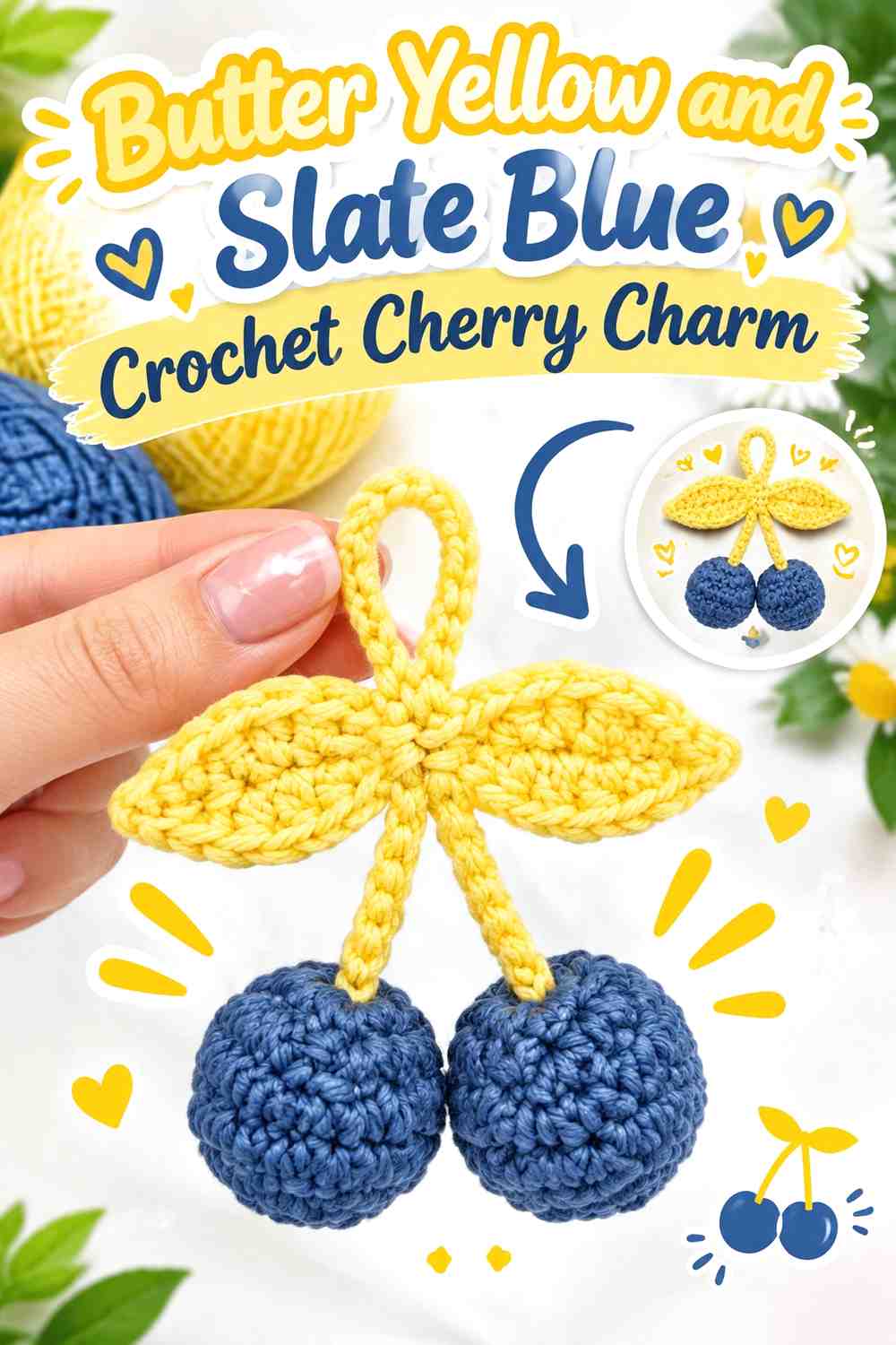
A cherry charm normally depends on repeated rounded forms and a connecting stem. Butter yellow can take over the fruit shapes for a playful color adaptation, while slate blue handles the connecting section and any small leaf or attachment details.
Butter Yellow Makes the Crochet Cherry Pair the Main Feature
Using the same butter yellow across both fruit shapes establishes them immediately as a pair. Keep that repetition rather than making one cherry yellow and one blue unless you intentionally want two equal focal colors.
A consistent main color is especially useful once the charm begins moving on a bag, where tiny differences are less noticeable than the overall silhouette.
Slate Blue Connects the Butter Yellow Crochet Cherries
The stem or connector gives slate blue a functional visual role between the two yellow forms. Because this section is narrower, the blue can look dark and distinct without competing for equal surface area.
If you add another blue detail, repeat it sparingly. The narrow connector may already provide enough slate blue to establish the two-color palette.
Creator Credit: ElyseCrochets 💌
5. Butter Yellow And Slate Blue Crochet Sunflower Charm
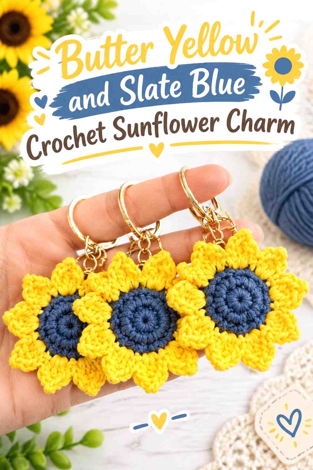
A sunflower-shaped charm is particularly suited to butter yellow because the color can cover the repeated petal area. Slate blue offers an alternative to the expected dark or earthy center, giving the motif a cooler central anchor while preserving a clear petal-versus-center distinction.
Butter Yellow Should Carry the Crochet Sunflower Petals
Keeping every main petal butter yellow lets the flower remain visually unified. Since the petal ring already contains substantial repetition, alternating yellow and blue petals could make a small charm busier than necessary.
If you want more blue, add it to another structural area rather than interrupting every few petals.
Slate Blue Creates a Defined Center Inside Butter Yellow Petals
A slate blue center creates a concentrated dark area surrounded by lighter yellow. This makes the center easy to identify even when the finished charm is viewed at a distance.
Compare the two yarns before committing to several matching flowers. A deep slate blue will create stronger separation than a pale gray-blue.
Creator Credit: Shelen Crochet
6. Slate Blue And Butter Yellow Crochet Bow Charm
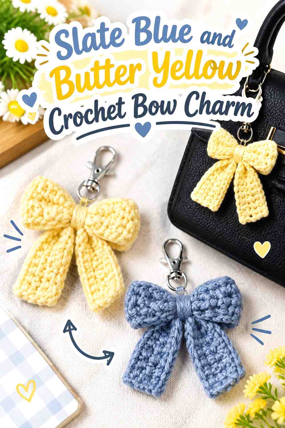
A bow contains broad loops, a center wrap, and often trailing sections, which gives the palette several possible divisions. Slate blue can form the loops and tails while butter yellow emphasizes the center. That keeps the bow predominantly blue while making the point where the shape gathers easy to see.
Slate Blue Keeps the Crochet Bow Loops Visually Unified
Using slate blue across both sides of the bow establishes symmetry and prevents the loops from appearing unrelated. If tails are included, continuing the same shade into them strengthens the overall silhouette.
Avoid alternating colors between left and right unless deliberate asymmetry is the goal. On a small charm, consistent sides tend to make the bow shape easier to read.
Butter Yellow Makes the Slate Blue Bow Center More Noticeable
A butter yellow center provides a small but high-impact contrast point. Because it sits where the bow visually gathers, the yellow does not need to cover much surface area to be noticeable.
A yellow hanging loop can repeat the accent, but keep it secondary so the center remains the main light-colored feature.
Creator Credit: VivCrochets
7. Slate Blue And Butter Yellow Crochet Mini Bag Charm
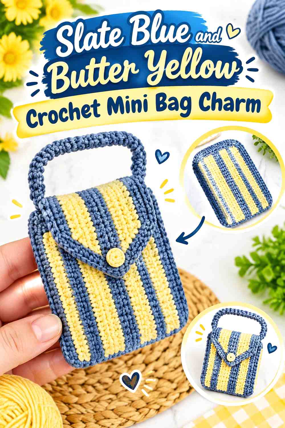
A miniature bag charm provides the same color-placement opportunities as a larger bag in a much smaller area: body, flap, handle, and edge. Slate blue can dominate the mini bag body while butter yellow defines the handle or flap.
Slate Blue Gives the Crochet Mini Bag Body Enough Visual Weight
Keeping the main bag shape slate blue creates an uninterrupted area that remains easy to identify even at miniature scale. The darker field can also make the silhouette stand out on lighter handbags.
If the mini bag includes several small construction details, resist assigning a new color to every section. Two clearly defined color roles generally keep the tiny form easier to read.
Butter Yellow Can Emphasize the Slate Blue Mini Bag Handle
The handle sits above the main body, making it a useful butter yellow accent. Because it has a different shape from the bag itself, the color change reinforces rather than obscures the structure.
You can repeat yellow on the flap or upper edge if the handle alone feels disconnected. Keep the main body slate blue so the color hierarchy remains clear.
Creator Credit: Örgü Aşkım
8. Slate Blue And Butter Yellow Crochet Turtle Charm
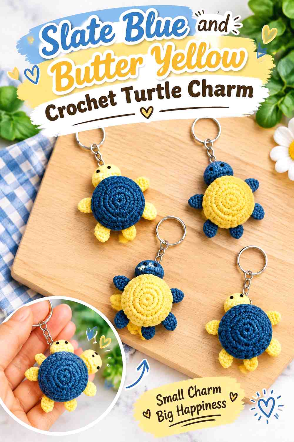
A turtle charm has a central shell surrounded by smaller body sections, providing a natural way to reverse the expected color hierarchy. Slate blue can cover the shell while butter yellow defines the head or smaller outer areas.
Slate Blue Makes the Crochet Turtle Shell the Main Color Area
The shell provides enough surface area for slate blue to establish itself as the dominant shade. Keeping it relatively uninterrupted also prevents decorative shell details from competing with the overall turtle silhouette.
If you want a two-tone shell, use butter yellow selectively rather than dividing every small section equally.
Butter Yellow Separates the Slate Blue Turtle Body Details
Butter yellow around the head or other small outer areas can keep those parts from visually disappearing into a dark shell.
Because the details are small, make sure the actual yellow-blue contrast remains visible from more than arm’s length. If it does not, preserve butter yellow for the largest of the secondary areas.
Creator Credit: Arifah Crochet
9. Slate Blue And Butter Yellow Crochet Octopus Charm
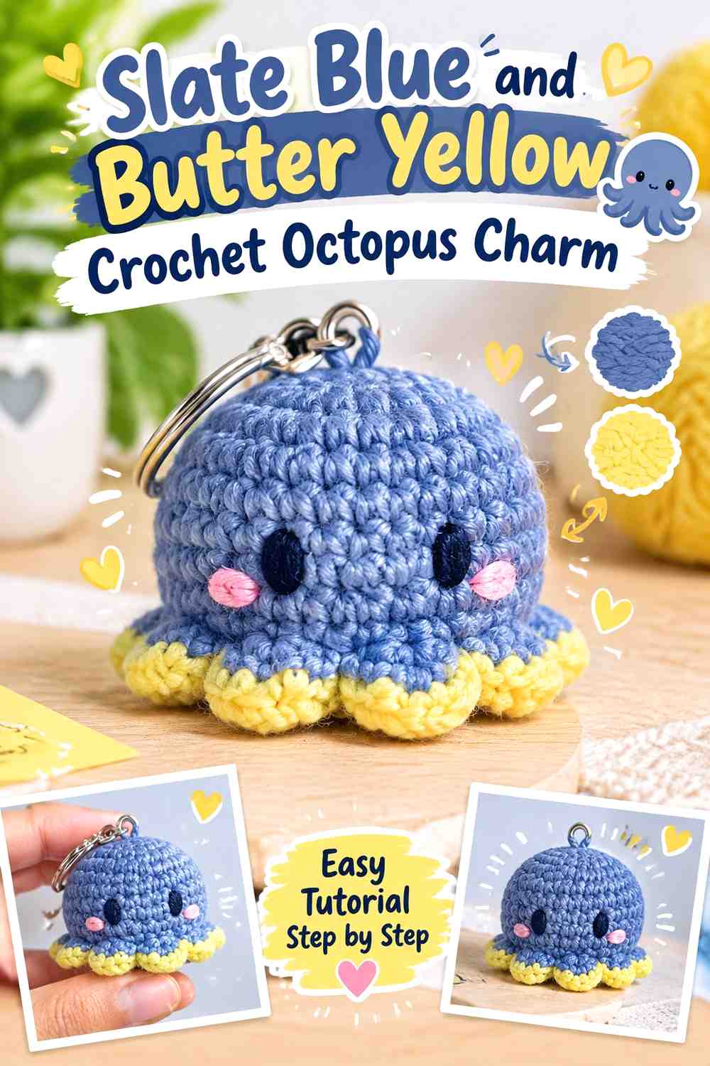
An octopus charm can use slate blue over the rounded body while butter yellow appears around selected lower details. The multiple arms already create plenty of visual activity, so a controlled palette helps the silhouette remain understandable.
Slate Blue Keeps the Crochet Octopus Body From Becoming Too Busy
Use slate blue across most of the body and arms if you want the shape itself to provide the complexity. Frequent yellow-blue changes across every arm could make a very small charm look fragmented.
If you want more yellow, concentrate it near the lower area rather than assigning a different combination to every arm.
Butter Yellow Can Highlight the Slate Blue Octopus Face or Lower Details
Butter yellow works best when it has a specific focal job. A lower accent area or another deliberate repeated feature can break up the slate blue without competing with the rounded body.
If the charm includes facial details, make sure any yarn or embellishment colors remain distinguishable from both palette shades rather than assuming yellow automatically provides enough contrast.
Creator Credit: Divine Crochets
10. Slate Blue And Butter Yellow Crochet Whale Charm

A whale charm has a broad body and relatively small fins or tail details, making slate blue a natural dominant shade. Butter yellow can then highlight the underside, tail, fin, or attachment area without interrupting the smooth body shape.
Slate Blue Keeps the Crochet Whale Silhouette Clear
A continuous slate blue body makes the curved whale form easier to recognize than multiple narrow stripes would. This is especially important on a small charm, where the overall outline communicates more than subtle internal color changes.
If your slate blue is dark, check whether any surface stitching you want to emphasize remains visible under normal lighting.
Butter Yellow Can Separate the Slate Blue Whale Fins or Tail
A butter yellow fin or tail area creates a small high-contrast break at the edge of the silhouette. Because those features already project from the body, color can make them even easier to distinguish.
Use the same yellow consistently on related features rather than adding isolated accents without a repeated logic.
Creator Credit: DIY Fluffies
11. Butter Yellow And Slate Blue Crochet Butterfly Charm
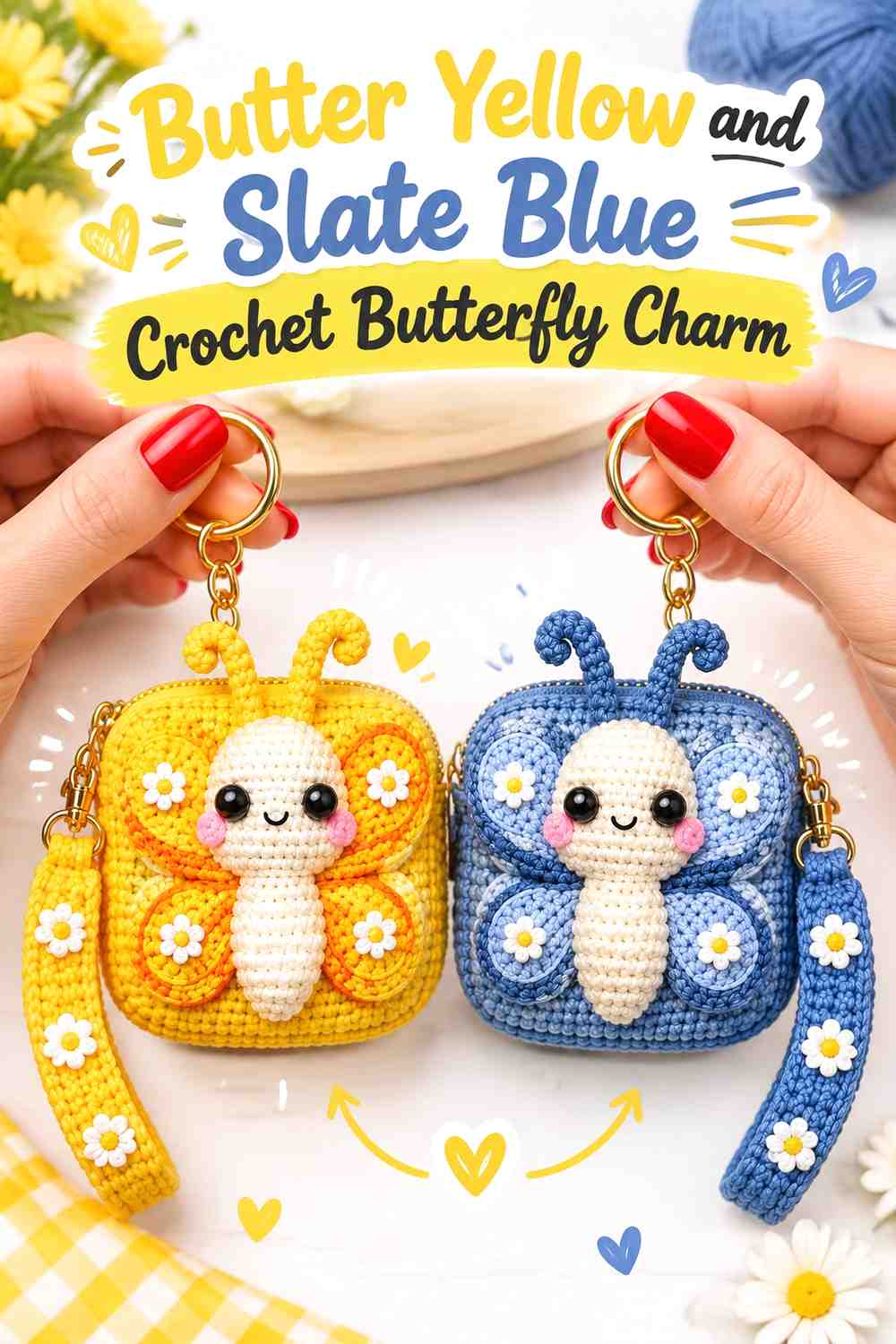
Butterflies allow a more balanced use of both shades because the wings naturally repeat on two sides. Butter yellow can lead across the wings, while slate blue defines the body, inner wing areas, or selected repeated markings.
Butter Yellow Makes the Crochet Butterfly Wings the Main Feature
Use butter yellow consistently on corresponding areas of both wings. Mirroring the color placement helps the small butterfly remain visually balanced when hanging vertically.
If you want substantial slate blue in the wings, repeat the same blue section on each side rather than changing the placement from wing to wing.
Slate Blue Can Outline Butter Yellow Butterfly Wing Details
Slate blue provides a useful darker boundary around yellow wing sections or across the central body. Since the butterfly already has several visual components, blue is most useful when it clarifies the divisions rather than adding more independent spots.
Check the finished arrangement from a distance before adding further details. The two main colors may already create enough interest.
Creator Credit: NakhArt🪡🧶
12. Butter Yellow And Slate Blue Crochet Clover Charm
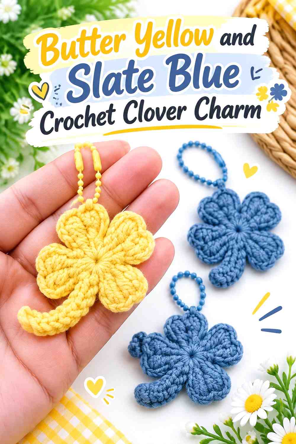
A clover charm offers repeated leaves arranged around a center, making color consistency particularly important. Butter yellow can give the leaves an unexpected warm treatment while slate blue anchors the center, stem, or outer detail.
Butter Yellow Keeps the Crochet Clover Leaves Connected
Using the same butter yellow across each leaf ensures the repeated shapes still read as one motif. Alternating every leaf between yellow and blue produces a stronger multicolor effect, but it can shift attention away from the clover silhouette itself.
For a clear butter-yellow-led charm, keep most of the leaf area consistent and introduce blue only where the shape naturally changes.
Slate Blue Gives the Butter Yellow Clover a Defined Center
A slate blue center or stem gives the lighter leaves a visual anchor. Repeating blue in the hanging connection can extend that color through the charm without dividing the leaves.
If the blue center seems too small to register, increase one existing blue area instead of scattering many tiny accents around the leaves.
Creator Credit: Jesuecrochet
Comparing Butter Yellow and Slate Blue Crochet Charm Directions
For a lighter, more butter-yellow-forward set, start with the flower, cherry, sunflower, butterfly, or clover. These motifs give the yellow enough repeated or broad surface area to become their main visual identity.
The heart, mushroom, bow, mini bag, turtle, octopus, and whale work well in a slate-blue-led direction. Their larger central forms provide enough room for the deeper shade, while butter yellow can clarify smaller structural details.
You can also use the collection as a coordinated mixed set. Keeping the same two yarns while reversing which color dominates from charm to charm creates variety without abandoning the overall palette.
Conclusion
Butter yellow and slate blue work particularly well for crochet charms when each color receives a clear job. Butter yellow can highlight petals, wings, centers, handles, stems, and small structural details, while slate blue can establish darker bodies, outlines, shells, caps, and central shapes.
For the clearest small-scale designs, avoid trying to divide every charm into equal amounts of both colors. Give one shade enough surface area to establish the motif, then place the second color where it helps explain the shape or highlight a feature.
Before making a complete matching set, crochet one sample and view it on the bag, backpack, or key setup where it will actually hang. A color relationship that looks obvious at close range can become much softer once the charm is viewed in use.
Frequently Asked Questions
Should Butter Yellow or Slate Blue Dominate a Crochet Charm?
It depends on the motif. Butter yellow works naturally across repeated areas such as petals, butterfly wings, or clover leaves, while slate blue can give rounded animal bodies, hearts, mushroom caps, and mini bags a stronger visual anchor.
The main goal is a clear hierarchy rather than an exact 50/50 split.
How Can I Keep Butter Yellow Details Visible Against Slate Blue?
Compare the actual yarns side by side. A noticeable light-and-dark difference helps small centers, borders, fins, stems, and other details remain recognizable.
If the two shades are closer in value than expected, enlarge the butter yellow area instead of relying on an extremely narrow stripe or tiny accent.
Can I Reverse Butter Yellow and Slate Blue on These Crochet Charms?
Yes. A slate blue flower with a butter yellow center, for example, creates a very different visual balance from a yellow flower with a blue center.
When reversing the colors, reconsider their proportions as well. A shade that works nicely as a small accent may feel much stronger when it suddenly covers most of the charm.
How Do I Make Several Butter Yellow and Slate Blue Crochet Charms Look Like a Set?
Repeat the same two yarn colors and give at least one placement rule some consistency. You might use slate blue for every hanging loop, for example, while allowing the motif bodies to alternate between yellow-led and blue-led arrangements.
That small repeated feature can connect different flowers, animals, symbols, and mini objects without forcing them to use identical layouts.
Can I Add a Third Color to Butter Yellow and Slate Blue Crochet Charms?
Yes, particularly when a motif needs a tiny feature that would otherwise disappear. Keep the third color limited and decide whether butter yellow or slate blue still has the dominant role.
Adding several equally strong colors to a very small charm can make the motif harder to read, so use additional shades where they clarify a specific detail.
How Do I Substitute a Different Yellow or Blue Yarn?
Preserve the relationship between the shades. If butter yellow is intended to be the lighter focal color, choose another softened yellow that remains visibly lighter than the slate blue. If slate blue provides the dark anchor, choose a muted blue that can still create that separation.
Compare substitute yarns together rather than relying only on their shade names.