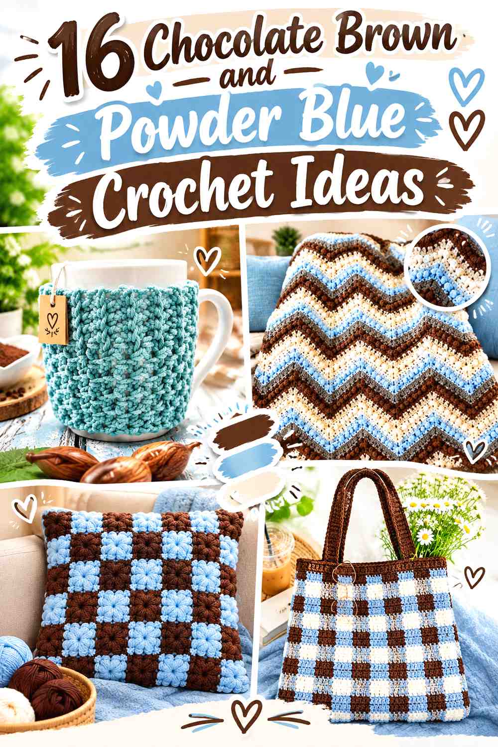
16 Chocolate Brown and Powder Blue Crochet Ideas
Chocolate brown and powder blue create a crochet palette built around contrast in temperature as well as lightness. Chocolate brown brings a deep, earthy foundation, while powder blue introduces a lighter, cooler break that can make borders, motifs, stripes, and textured areas easier to distinguish.
The balance matters as much as the colors themselves. A chocolate-brown cardigan with powder-blue cuffs feels very different from a powder-blue vest framed with chocolate-brown edging. On smaller projects, the darker shade may work better as a controlled accent; on blankets and garments, there is enough surface area to let both colors take substantial roles.
The tutorials below support the crochet project and construction concepts. The chocolate-brown-and-powder-blue palettes are independent color adaptations, so the linked creators should not be assumed to have used these exact color combinations.
Quick List
- Chocolate Brown And Powder Blue Crochet Baby Blanket
- Powder Blue And Chocolate Brown Crochet Market Bag
- Chocolate Brown Powder Blue And Cream Crochet Hexagon Cardigan
- Powder Blue And Chocolate Brown Crochet Ear Warmer
- Chocolate Brown And Powder Blue Crochet Textured Market Bag
- Chocolate Brown And Powder Blue Crochet V Neck Sweater Vest
- Powder Blue And Chocolate Brown Crochet Fingerless Gloves
- Chocolate Brown And Powder Blue Crochet Beanie
- Powder Blue And Chocolate Brown Crochet Block Stitch Cowl
- Chocolate Brown Powder Blue And Cream Crochet Gingham Tote
- Powder Blue And Chocolate Brown Crochet Pocket Cardigan
- Chocolate Brown And Powder Blue Crochet Puff Square Cushion
- Powder Blue Chocolate Brown And Cream Crochet Textured Blanket
- Chocolate Brown Powder Blue And Oatmeal Crochet Striped Cardigan
- Powder Blue And Chocolate Brown Crochet Mug Cozy
- Chocolate Brown And Powder Blue Crochet Hooded Pocket Scarf
How to Balance Chocolate Brown and Powder Blue in Crochet
Chocolate brown is visually heavier than most powder blues, so equal amounts do not necessarily look equally dominant. On a cardigan or blanket, chocolate brown can appear to occupy more visual space even when the actual stripe widths are the same.
Decide which shade should lead before planning the placement. Use chocolate brown across larger surfaces when you want a darker, grounded project, or let powder blue cover the main field when you want a lighter result with clearly defined brown borders, cuffs, handles, or motifs.
Keep Powder Blue Details Visible Against Chocolate Brown
The pairing usually offers useful light-and-dark separation, but yarn choice can change that relationship. A grayish powder blue and a softened medium brown may be closer in value than expected.
Compare the yarns side by side before committing to small motifs or narrow colorwork. If the distinction looks weaker than you want, introduce cream, oatmeal, or another light neutral around the most detailed areas rather than adding more competing colors.
1. Chocolate Brown And Powder Blue Crochet Baby Blanket
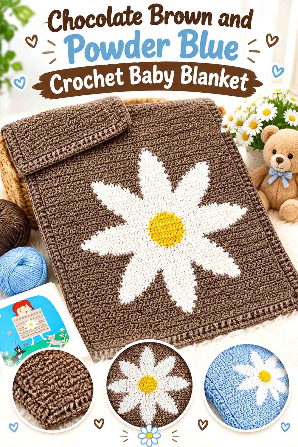
Chocolate brown can form a strong framework for a baby blanket, while powder blue lightens the surface and keeps the darker shade from occupying every large area. Instead of alternating both colors in many narrow bands, consider giving powder blue the broader field and using chocolate brown where the blanket needs clear definition.
Powder Blue Can Keep the Chocolate Brown Crochet Blanket Visually Lighter
Use powder blue across substantial center sections when you want the blanket to retain an airy appearance. Chocolate brown can then appear in spaced bands or repeated details, creating contrast without dividing the blanket into too many dark areas.
Chocolate Brown Can Give the Powder Blue Crochet Blanket a Defined Border
A chocolate-brown outer border gives a pale blue center a clear stopping point. If the blanket includes pronounced stitch texture, keep enough powder blue beside the dark edge that the final textured rows do not disappear into one deep frame.
Creator Credit: Daisy Farm Crafts
2. Powder Blue And Chocolate Brown Crochet Market Bag
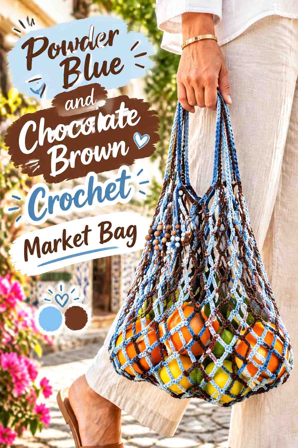
A powder-blue market bag body creates a lighter base, while chocolate brown works well around areas that need visual definition, such as the base, upper edge, or handles. Because an openwork bag already has plenty of visual movement, controlled color zones are usually clearer than frequent narrow changes.
Powder Blue Gives the Crochet Market Bag Body More Continuity
Let powder blue cover most of the openwork body so the stitch pattern remains readable across the bag. Breaking every few rows with chocolate brown can make both the holes and the stripes compete for attention.
Chocolate Brown Can Define Powder Blue Crochet Bag Handles
Handles provide a natural place for the deeper color. Repeating chocolate brown at the base or upper border helps the handles feel connected to the rest of the bag rather than looking like an unrelated final addition.
Creator Credit: Home Handwork Diy
3. Chocolate Brown Powder Blue And Cream Crochet Hexagon Cardigan

A hexagon cardigan gives all three colors substantial room to repeat. Chocolate brown can establish the strongest bands, powder blue can lighten the expanding hexagon sections, and cream can prevent the two main colors from becoming visually dense where several bands meet after folding and assembly.
Chocolate Brown Should Repeat Consistently Across Both Crochet Hexagons
Plan the chocolate-brown sections in the same relative places on both major pieces. When the two hexagons become sleeves and body sections, inconsistent dark-color placement can make one half of the cardigan look noticeably heavier.
Cream Can Separate Powder Blue and Chocolate Brown Crochet Cardigan Bands
Use cream between selected brown and blue areas rather than after every color change. Strategic separation preserves the chocolate-brown-and-powder-blue identity while giving the eye a lighter pause around especially busy sections.
Creator Credit: Make & Do Crew
4. Powder Blue And Chocolate Brown Crochet Ear Warmer
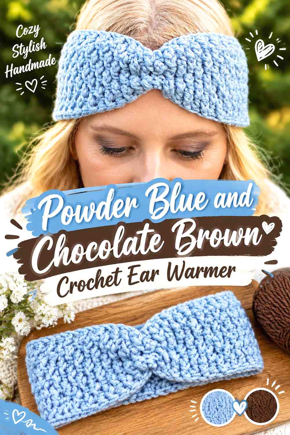
An ear warmer has limited surface area, so simple placement gives the two colors more impact. Powder blue can lead across the textured band, while chocolate brown emphasizes the front gather, edging, or a controlled stripe.
Powder Blue Lets Crochet Ear-Warmer Texture Stay Easy to Read
Keeping most of the band powder blue gives raised or ribbed texture a light background where shadows remain visible. That can be more effective than constantly switching between light and dark yarn within a narrow accessory.
Chocolate Brown Can Emphasize the Powder Blue Crochet Ear-Warmer Center
If the construction creates a gathered or twisted focal area, place chocolate brown near that feature rather than scattering tiny brown sections along the entire band. The darker shade then directs attention toward the front without overpowering the powder-blue field.
Creator Credit: naztazia
5. Chocolate Brown And Powder Blue Crochet Textured Market Bag
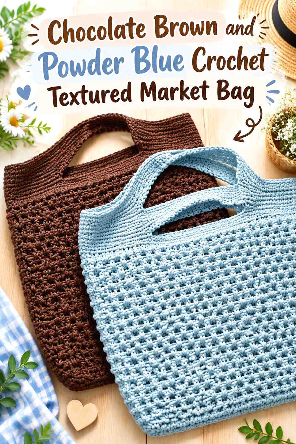
This version reverses the lighter market-bag idea by letting chocolate brown dominate the body. Powder blue becomes the contrast color that lifts selected textured bands, handles, or the upper finishing area.
Chocolate Brown Can Anchor a Heavily Textured Crochet Market Bag
A continuous chocolate-brown field works well when the stitch pattern already supplies strong surface variation. The solid dark color allows texture, rather than frequent striping, to become the main visual feature.
Powder Blue Can Break Up Chocolate Brown Around the Crochet Bag Top
Place powder blue near the upper bag section or handles where it stays visible when the bag is carried. Repeating a smaller amount near the base can connect the light accent from top to bottom without turning the whole body into stripes.
Creator Credit: Rich Textures Crochet
6. Chocolate Brown And Powder Blue Crochet V Neck Sweater Vest
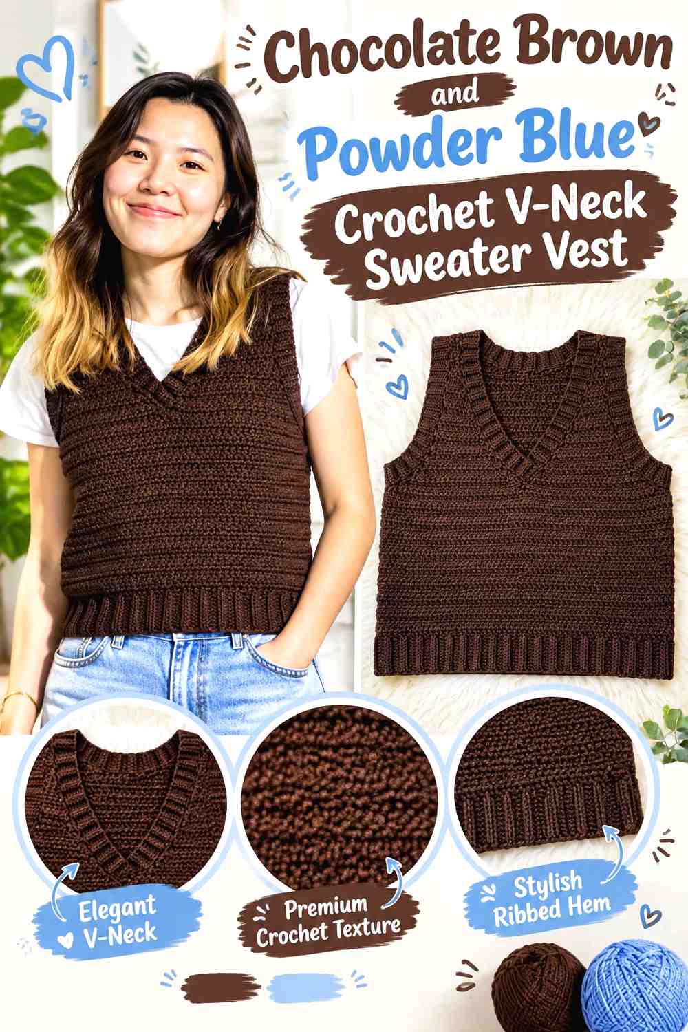
A chocolate-brown body gives this vest a deeper overall direction, while powder blue can draw attention toward the V-neck and ribbed finishing. The strong difference in lightness can be especially useful because the neckline is a prominent part of the garment’s shape.
Chocolate Brown Can Carry the Main Crochet V-Neck Vest Panels
Keeping the body predominantly chocolate brown lets the vest silhouette remain uninterrupted. Powder blue then has more visual impact when it appears around the neckline instead of competing across equally wide stripes.
Powder Blue Can Clarify the Chocolate Brown Crochet V-Neck
A powder-blue neckline creates a distinct line against the dark body. If you repeat the blue at the lower ribbing or armholes, keep those areas secondary so the V-neck remains the strongest light-colored feature.
Creator Credit: VivCrochets
7. Powder Blue And Chocolate Brown Crochet Fingerless Gloves

Fingerless gloves need matched placement because two separately made pieces are viewed together. Powder blue can cover the hand area, while chocolate brown gives both cuffs a darker visual base.
Chocolate Brown Can Ground Powder Blue Crochet Glove Cuffs
A chocolate-brown cuff creates a strong transition at the wrist and makes the lighter hand section easy to distinguish. Repeat the same depth of cuff on both gloves so one does not appear more visually weighted than the other.
Powder Blue Keeps Chocolate Brown Crochet Glove Texture From Feeling Heavy
Use powder blue where puffed or raised texture occupies most of the hand. The lighter shade allows shadows within the stitchwork to show without combining a dark yarn and dense-looking texture across the entire glove.
Creator Credit: B.Hooked Crochet
8. Chocolate Brown And Powder Blue Crochet Beanie

A beanie offers a straightforward way to divide the pair into crown and brim roles. Chocolate brown can cover the crown, with powder blue introducing a lighter band around the face, or the arrangement can be reversed for a much lighter finished hat.
Chocolate Brown Gives the Crochet Beanie Crown a Strong Base
Keeping most of the crown brown creates continuity from top to brim. If the hat has visible vertical or ribbed texture, avoid adding narrow blue stripes everywhere because they can compete with that directional stitch pattern.
Powder Blue Can Lift the Chocolate Brown Crochet Beanie Brim
A powder-blue brim places the lighter shade at the most visible lower edge. Repeat a small amount of blue near the crown only if needed; the brim alone can provide enough contrast on a relatively compact item.
Creator Credit: Bella Coco
9. Powder Blue And Chocolate Brown Crochet Block Stitch Cowl
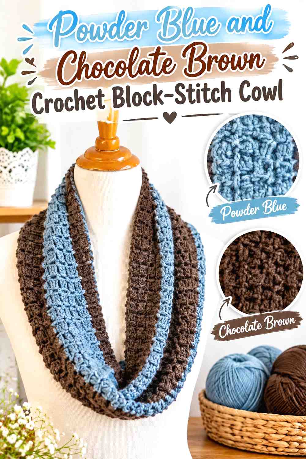
Block-style texture creates natural places for alternating color, but powder blue and chocolate brown do not need to occupy every small section equally. Let one shade form the visual background and use the other to emphasize the rhythm of the stitch pattern.
Powder Blue Can Lead the Crochet Cowl Without Hiding Block Texture
A lighter powder-blue field allows recessed and raised areas to remain visible. Chocolate brown can then mark selected rows or blocks, creating structure without making the cowl look like a sequence of unrelated dark squares.
Chocolate Brown Needs Controlled Repetition Across the Powder Blue Crochet Cowl
Because a cowl wraps into a loop, repeat chocolate brown often enough that it appears from several viewing angles. Concentrating all of the brown in one location may cause the two-color concept to disappear when that section rotates toward the back.
Creator Credit: Fiber Flux
10. Chocolate Brown Powder Blue And Cream Crochet Gingham Tote
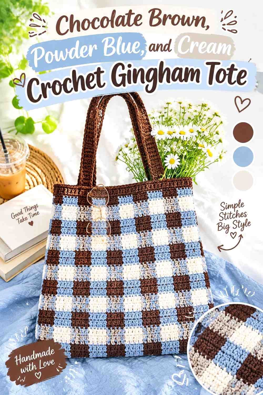
Gingham depends on a clear relationship among three visible tones. Chocolate brown can supply the deepest square, powder blue the cooler middle color, and cream the lightest area. The important point is maintaining enough value separation for the checked layout to remain readable.
Chocolate Brown Should Be the Darkest Crochet Gingham Tote Color
Choose a chocolate brown that is clearly darker than both powder blue and cream. If brown and blue are too close in value, the checked effect can flatten and the tote may read as irregular striping instead of a distinct color grid.
Cream Can Keep Powder Blue and Chocolate Brown Crochet Checks Separate
Cream provides the lightest reference point in the palette. Use it consistently within the repeated check arrangement rather than moving it randomly, since the success of gingham depends on predictable color relationships.
Creator Credit: HayHay Crochet
11. Powder Blue And Chocolate Brown Crochet Pocket Cardigan

A pocket cardigan has several useful color zones without requiring complicated colorwork. Powder blue can dominate the body and sleeves, while chocolate brown turns the pockets, ribbing, or cuffs into deliberate darker features.
Powder Blue Can Keep the Crochet Cardigan Body Light for Layering
Using powder blue across the largest panels gives the cardigan a lighter overall appearance even when the silhouette is oversized. Chocolate-brown details then stay visible instead of disappearing into another dark garment layer.
Chocolate Brown Can Make Powder Blue Crochet Cardigan Pockets Intentional
Brown pockets placed on a powder-blue body immediately become focal points. Repeat brown at the cuffs or hemline so the pockets connect to the rest of the garment rather than looking like two isolated patches.
Creator Credit: forthefrills
12. Chocolate Brown And Powder Blue Crochet Puff Square Cushion
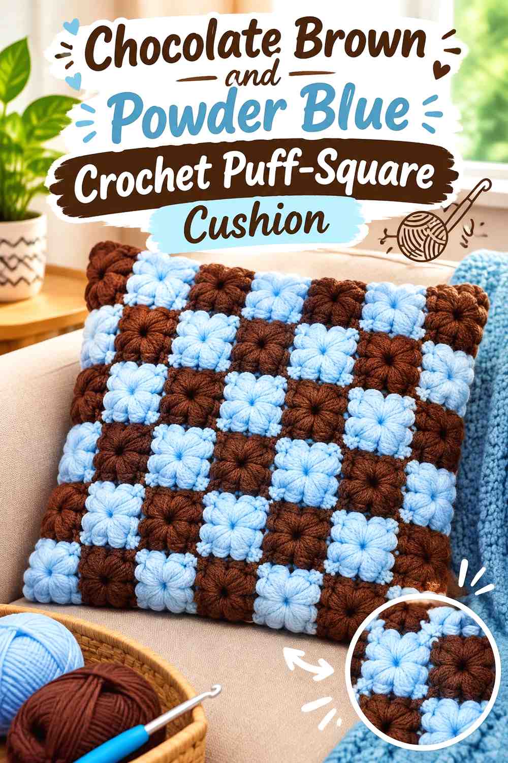
Puff squares give both colors repeated opportunities to appear across the cushion surface. Chocolate brown can create the darker motif centers or alternate squares, while powder blue keeps the raised texture from becoming visually dense.
Powder Blue Can Make Chocolate Brown Crochet Puff Texture Easier to Separate
Place powder blue beside or around darker puff motifs when the raised surface creates strong shadows of its own. The lighter color provides negative space that helps individual square boundaries remain visible.
Chocolate Brown Should Repeat in a Predictable Crochet Cushion Layout
Instead of placing brown squares wherever they fit, establish a repeated grid, diagonal, or alternating arrangement. Predictable placement makes the cushion face feel planned and stops the color distribution from looking random.
Creator Credit: Hooked by Robin
13. Powder Blue Chocolate Brown And Cream Crochet Textured Blanket
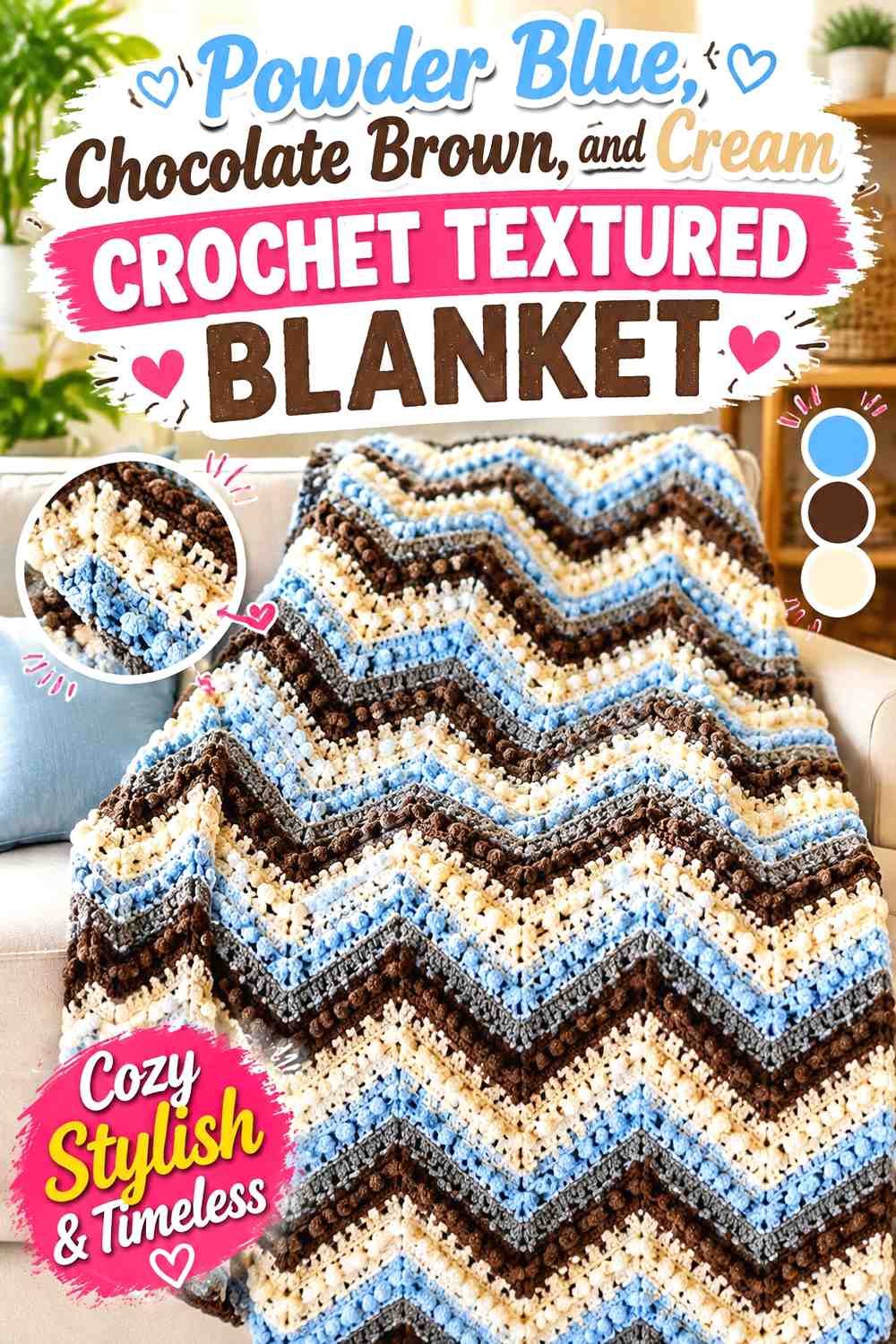
A highly textured blanket can carry all three shades, but the stitchwork should remain the priority. Powder blue can establish broad lighter areas, chocolate brown can emphasize selected texture bands, and cream can separate sections where the two main colors would otherwise create too much visual weight.
Powder Blue Can Give Chocolate Brown Crochet Texture More Breathing Room
Use powder blue across substantial sections instead of treating it only as a narrow accent. That lighter area prevents the blanket from becoming dominated by the combination of dark yarn and raised texture.
Cream Can Separate Powder Blue and Chocolate Brown Crochet Blanket Sections
Cream is most useful where one textured section transitions into another. A lighter dividing band can clarify the structure of the blanket while leaving chocolate brown and powder blue as the principal color relationship.
Creator Credit: The Crochet Crowd
14. Chocolate Brown Powder Blue And Oatmeal Crochet Striped Cardigan

A striped cardigan provides enough surface area to use both main colors repeatedly without reducing them to tiny accents. Chocolate brown can establish the deeper bands, powder blue can create lighter interruptions, and oatmeal can prevent the contrast from becoming too abrupt.
Chocolate Brown Can Give the Crochet Cardigan Stripes a Visual Anchor
Use chocolate brown in wider or regularly repeated bands so the garment does not become predominantly pale. Keep the placement consistent across front panels and sleeves where possible so the dark color feels connected around the entire cardigan.
Oatmeal Can Moderate Powder Blue and Chocolate Brown Crochet Stripes
Insert oatmeal selectively between the strongest brown-and-blue transitions. It does not need to appear between every stripe; too much oatmeal can shift the cardigan from a two-color concept with a neutral accent into a neutral cardigan with scattered color.
Creator Credit: MJ’s Off The Hook Designs
15. Powder Blue And Chocolate Brown Crochet Mug Cozy
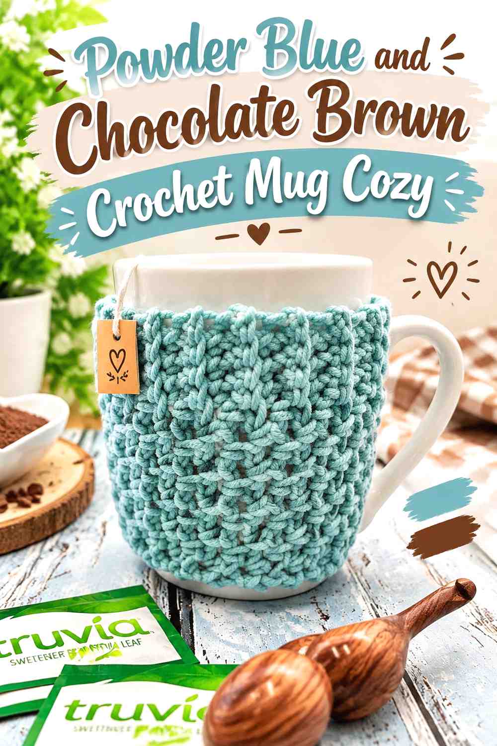
A mug cozy has very little room for complicated color distribution, so the pair benefits from a straightforward hierarchy. Powder blue can cover most of the cozy, while chocolate brown defines the fastening area, edging, or one strong contrasting band.
Powder Blue Can Cover Most of the Crochet Mug Cozy Surface
A continuous powder-blue body keeps the small project visually clear and gives stitch texture enough space to show. Numerous narrow brown stripes can make a compact cozy appear more fragmented than intended.
Chocolate Brown Can Define the Powder Blue Crochet Mug Cozy Closure
Place the darker shade near the closure or button area if the construction makes that section visible. Brown used there gives the functional feature visual definition without requiring the dark shade to cover half of the cozy.
Creator Credit: love. life. yarn.
16. Chocolate Brown And Powder Blue Crochet Hooded Pocket Scarf
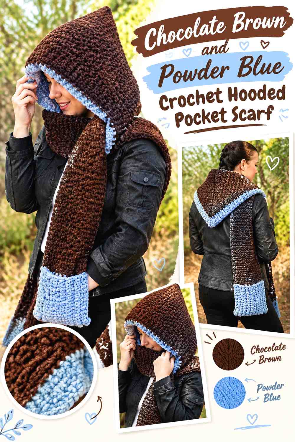
A hooded pocket scarf has more color zones than a standard scarf because the pockets and hood can carry their own visual roles. Chocolate brown can establish the long scarf body, while powder blue highlights the hood edge, pocket sections, or repeated bands.
Chocolate Brown Can Keep the Crochet Hooded Scarf Length Visually Connected
Use chocolate brown across much of the long scarf section so the project still looks cohesive once the ends hang separately. Powder blue can appear at repeated intervals without breaking the scarf into many unrelated blocks.
Powder Blue Can Connect Chocolate Brown Crochet Pockets and Hood
Repeating powder blue around both pocket areas and part of the hood gives the lighter shade a clear path through the project. If blue appears only at one end, the scarf can look visually unbalanced when worn.
Creator Credit: Winding Road Crochet
Comparing Chocolate-Brown-Led and Powder-Blue-Led Crochet Ideas
Chocolate-brown-led projects give the palette more visual depth. The beanie, V-neck vest, textured market bag, puff-square cushion, striped cardigan, and hooded scarf are useful directions when you want the brown to occupy substantial areas rather than function as edging alone.
Powder-blue-led projects feel lighter because the paler shade occupies more of the visible surface. The modern vest, pocket cardigan, cowl, mug cozy, ear warmer, and market bag use chocolate brown more selectively to define edges, handles, cuffs, or other features.
For the strongest light-to-dark separation, keep the palette primarily chocolate brown and a noticeably pale powder blue. Cream and oatmeal are useful when texture or multicolor construction needs more space between those two shades.
Conclusion
Chocolate brown and powder blue are flexible because either color can lead. A chocolate-brown body with powder-blue edging emphasizes the depth of the brown, while a powder-blue body with chocolate-brown borders makes the darker shade function more like a frame.
Choose the dominant color according to the crochet surface you want to emphasize. Large garment panels and blanket fields can support broad areas of either shade, while smaller projects such as mug cozies, gloves, and ear warmers usually benefit from simpler color zoning.
For motif or highly textured projects, check the colors together before committing to the full project. If the contrast is weaker than expected, use cream or oatmeal selectively around details rather than adding multiple unrelated accent colors. Follow the linked creator tutorial for exact construction, then adapt the chocolate-brown-and-powder-blue placement to the project’s panels, borders, motifs, cuffs, handles, or finishing areas.
Frequently Asked Questions
Does powder blue have enough contrast with chocolate brown in crochet?
It often does because chocolate brown is typically much darker, but the exact yarns still matter. A muted powder blue and a medium brown may have less value contrast than expected. Compare the yarns side by side or look at a grayscale photo before using the combination for small motifs.
Should chocolate brown or powder blue be the dominant crochet color?
Either works. Chocolate brown produces a deeper overall project, while powder blue creates a lighter field and makes brown edging or details especially noticeable. Base the choice on where the largest surfaces occur on the specific item.
What third color works with chocolate brown and powder blue crochet?
Cream and oatmeal are useful when you need a lighter separator. They can sit between brown and blue stripes, surround motifs, or appear in joins without competing strongly with the main pairing.
How can I use chocolate brown and powder blue in crochet granny squares?
Give the colors defined roles before making multiple motifs. For example, powder blue can occupy the center while chocolate brown frames the outer motif, or the arrangement can alternate between squares. Keep the joining color consistent if you want the finished grid to look connected.
Should a chocolate brown crochet border be darker than the powder blue center?
It can be when you want the border to frame the project clearly. On blankets and cushions, a darker chocolate-brown edge can give a pale blue center a strong outline. If the border feels too heavy, repeat a little powder blue within the outer finishing area.
How do I substitute another powder blue without changing the whole crochet palette?
Preserve its role as the lighter, cooler shade. Choose another softened light blue that remains clearly lighter than the chocolate brown. Recheck the pair together because changing the blue’s depth can alter how strongly the motifs, stripes, or edging separate.
Can chocolate brown and powder blue work on the same crochet garment without stripes?
Yes. Use color blocking through garment features instead. A powder-blue body can have chocolate-brown cuffs, pockets, neckline, and hem, or a chocolate-brown vest can use powder blue only around the V-neck and armhole finishing. This keeps the pairing visible without turning the garment into a striped design.